Turning the work of iconic artists into beautifully considered books.
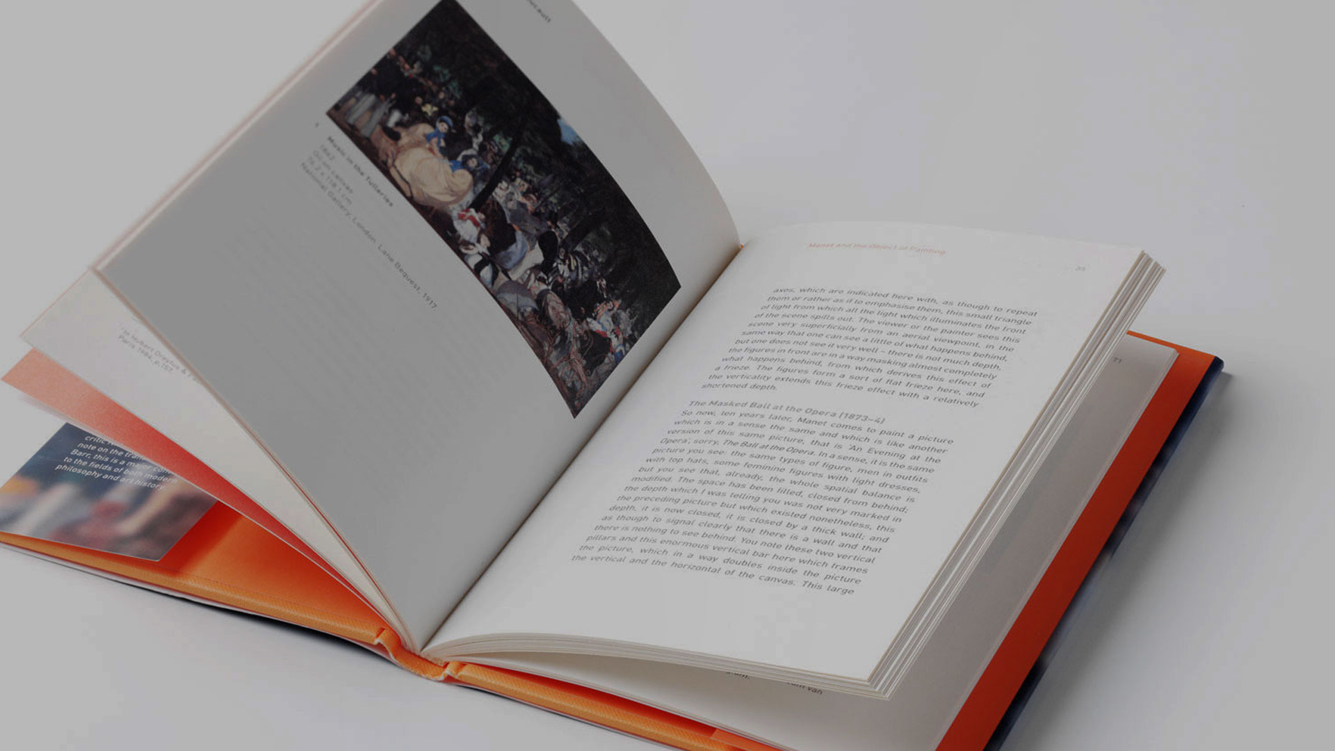
Tate’s publishing programme brings art, ideas and cultural history to audiences far beyond the gallery.
As part of a series of important relaunches from the Tate library, we were invited to redesign two publications celebrating very different figures: Édouard Manet and Henry Moore.
Our approach was equally individual. Rather than imposing a single visual style, we looked to the work itself for inspiration – creating two distinctive books that gave the art, ideas and personalities behind them the space to come through.
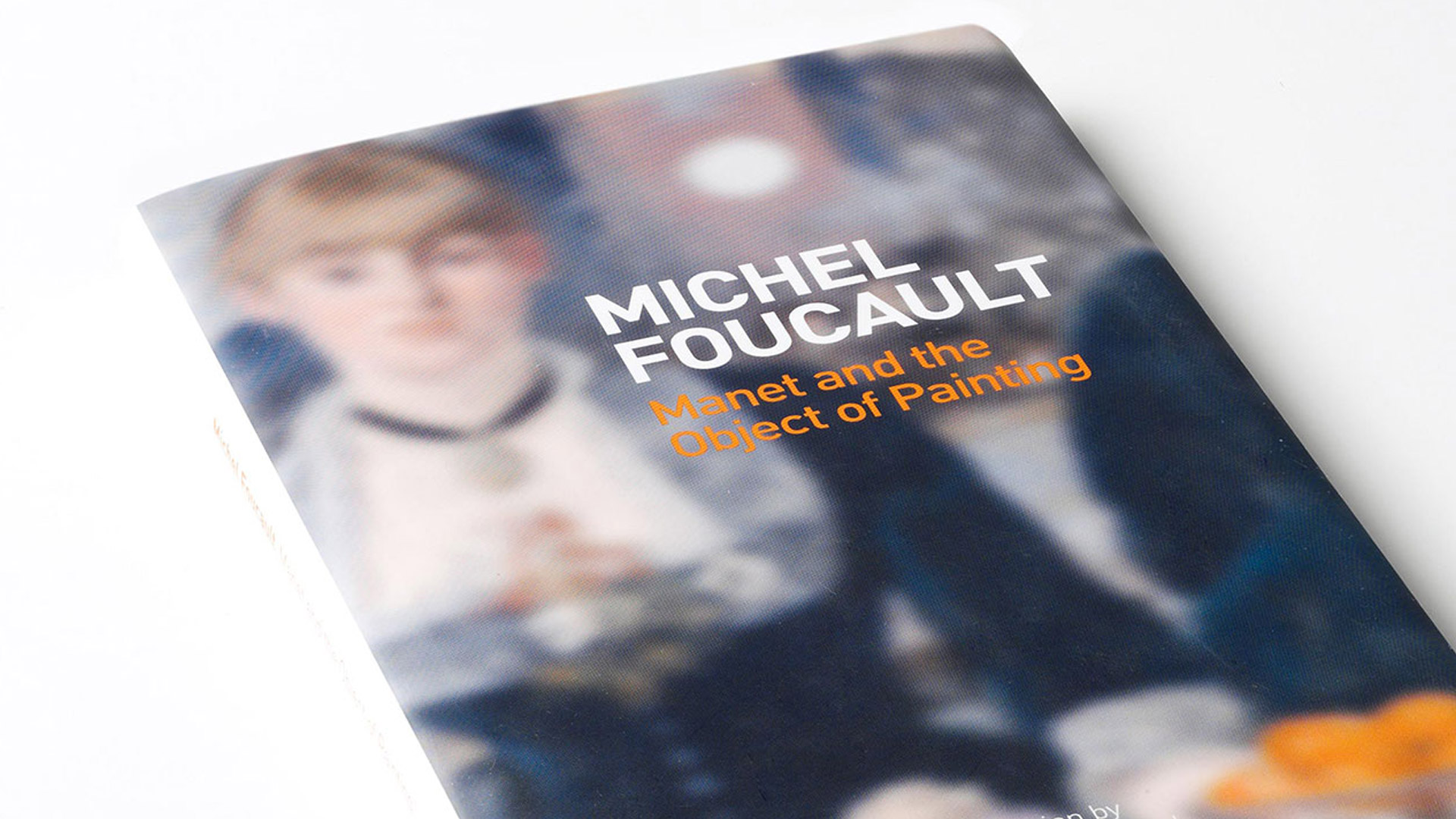
Reframing Manet
Manet and the Object of Painting presents Michel Foucault’s influential interpretation of Édouard Manet and the artist’s role in challenging the traditional conventions of painting.
For the relaunch, we wanted the design to feel intrinsically connected to Manet’s work while allowing Foucault’s writing to remain at the heart of the publication.
Colour provided the starting point.
Drawing directly from Manet’s paintings, we developed a palette that runs throughout the book, creating a subtle visual relationship between the artwork and the editorial design.
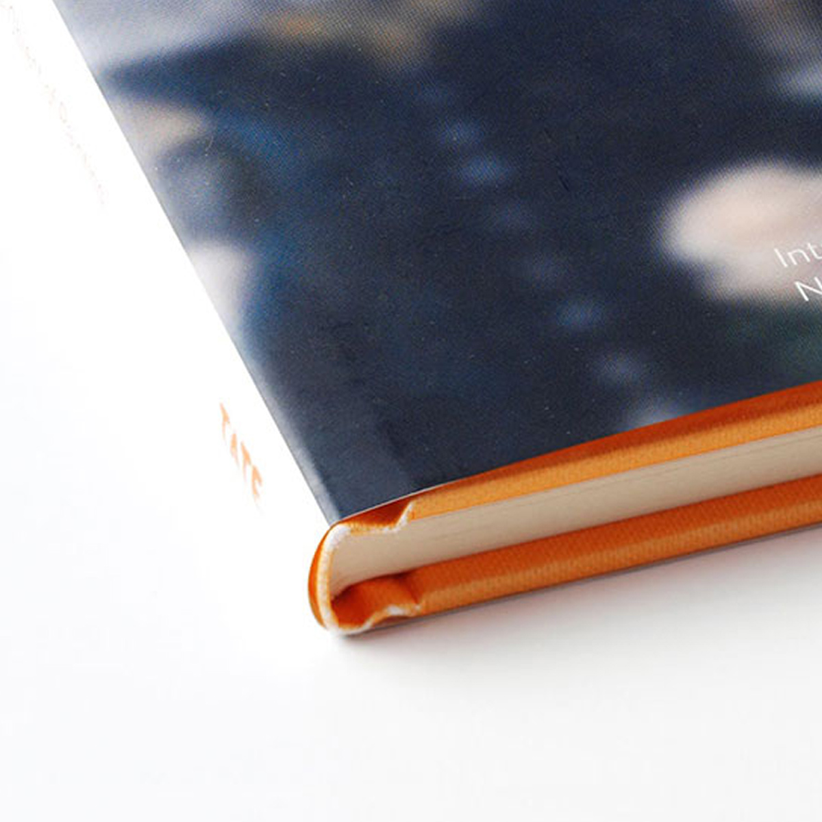
From the cover and binding through to the smallest details inside, every element was carefully considered to create a publication that felt both beautiful and purposeful.

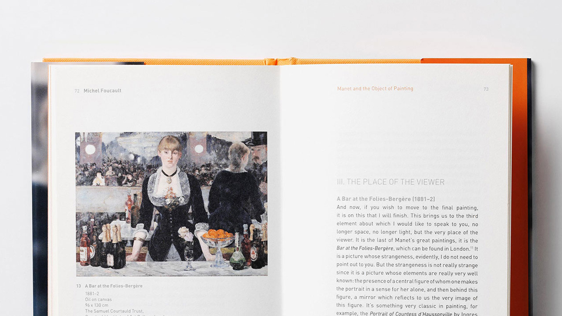
Rather than allowing the design to compete with the artwork, we used typography, colour and layout to frame it. This creates rhythm throughout the publication while giving individual pieces the space they deserved.
The result is a book that feels contemporary while remaining sensitive to both Manet’s work and Foucault’s writing.
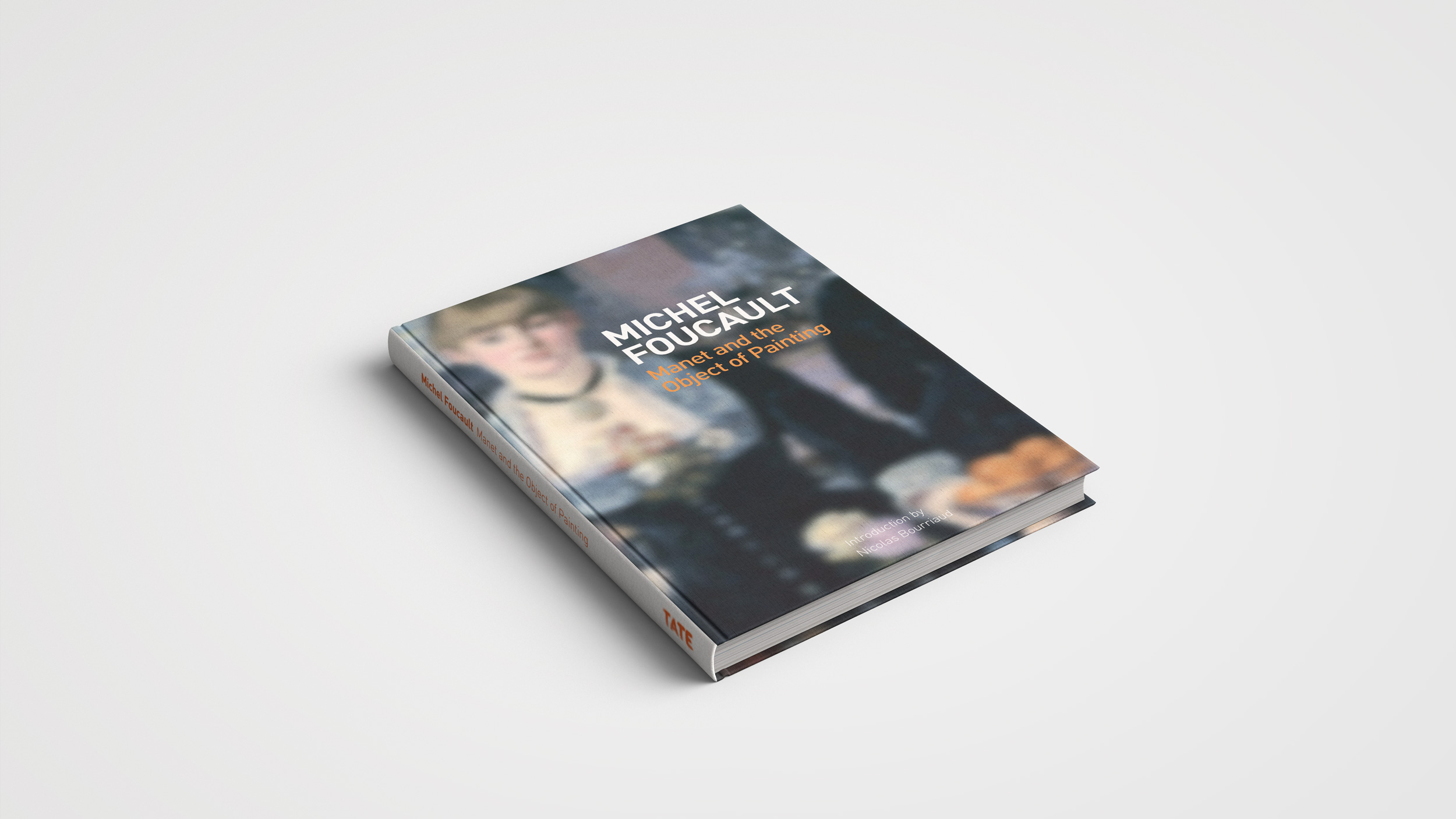
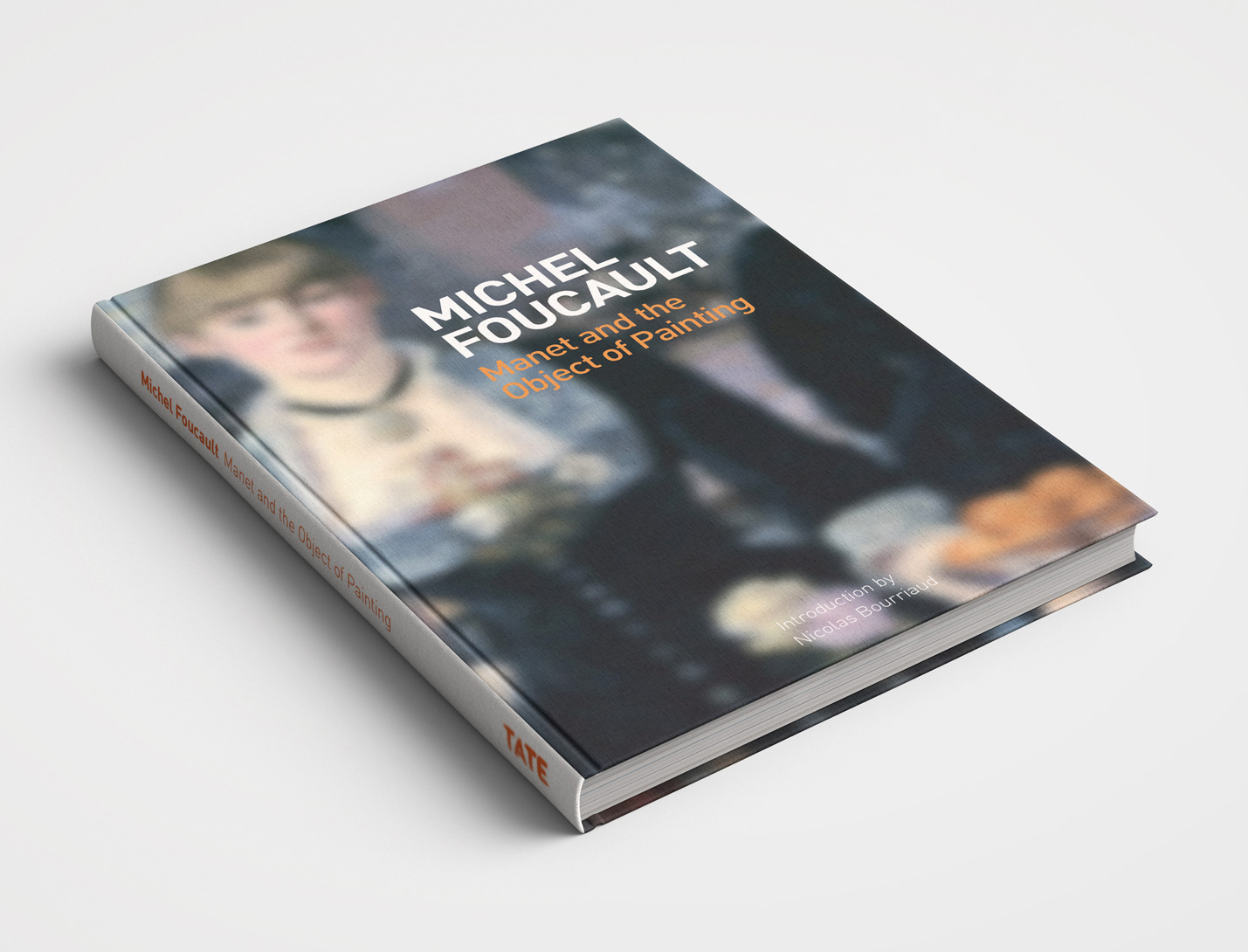
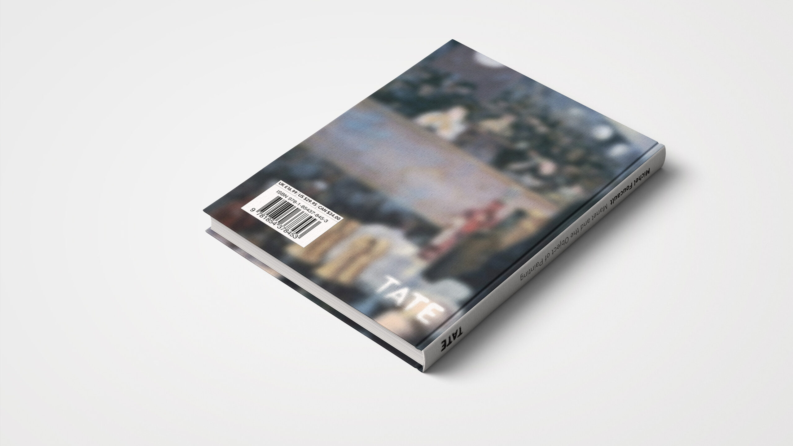
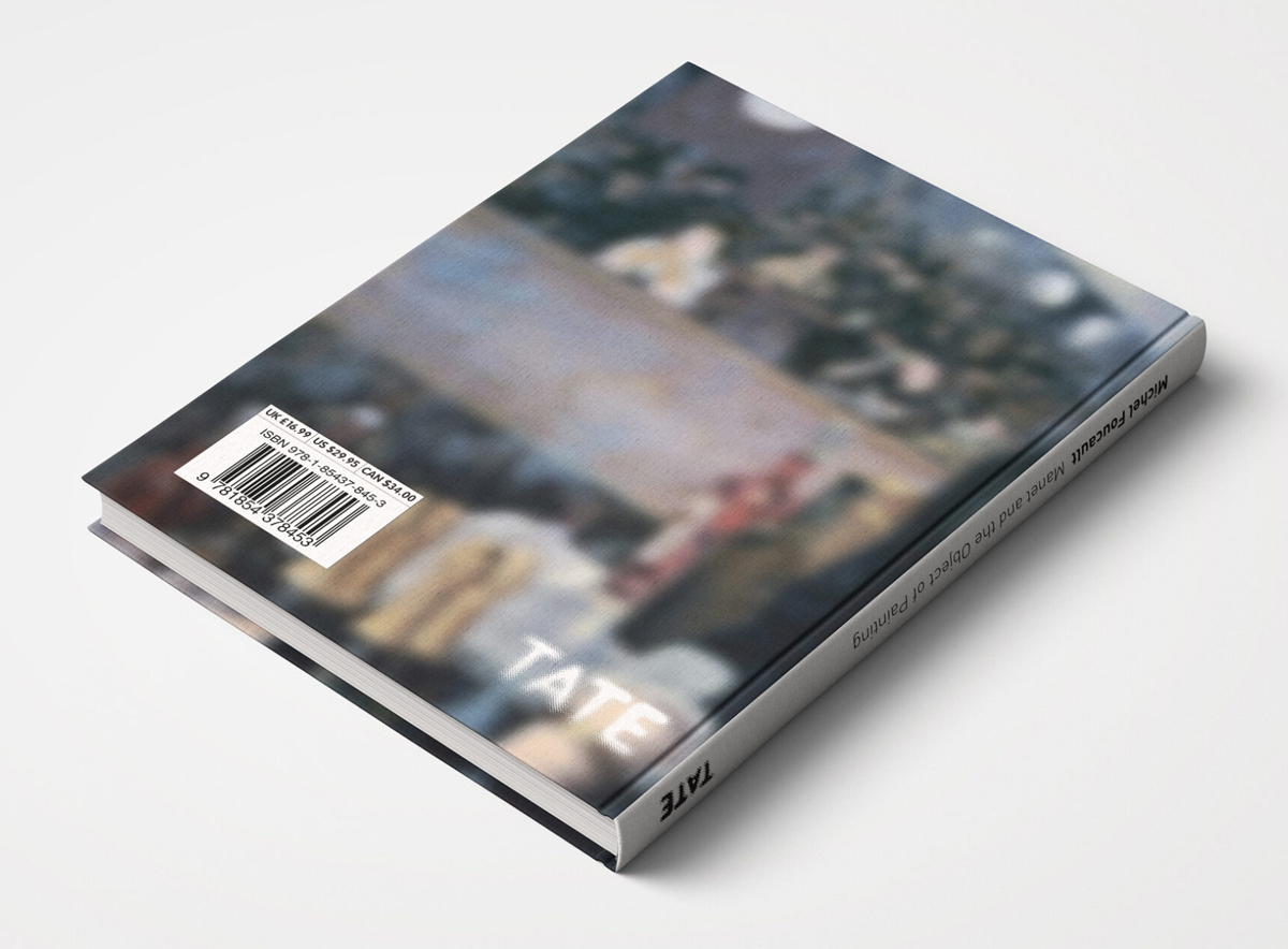

The redesigned publication was embraced by students and educational institutions, with strong sales leading Tate to take it to international book fairs and extend its availability both online and offline.
Giving form to Henry Moore
Our approach to Henry Moore began somewhere very different.
The publication brings together the renowned sculptor’s theories, thoughts, inspirations and experiences, accompanied by a rich collection of historic imagery.
We wanted the design to reflect the physicality of Moore’s work – translating ideas of form, structure and space from sculpture onto the printed page.
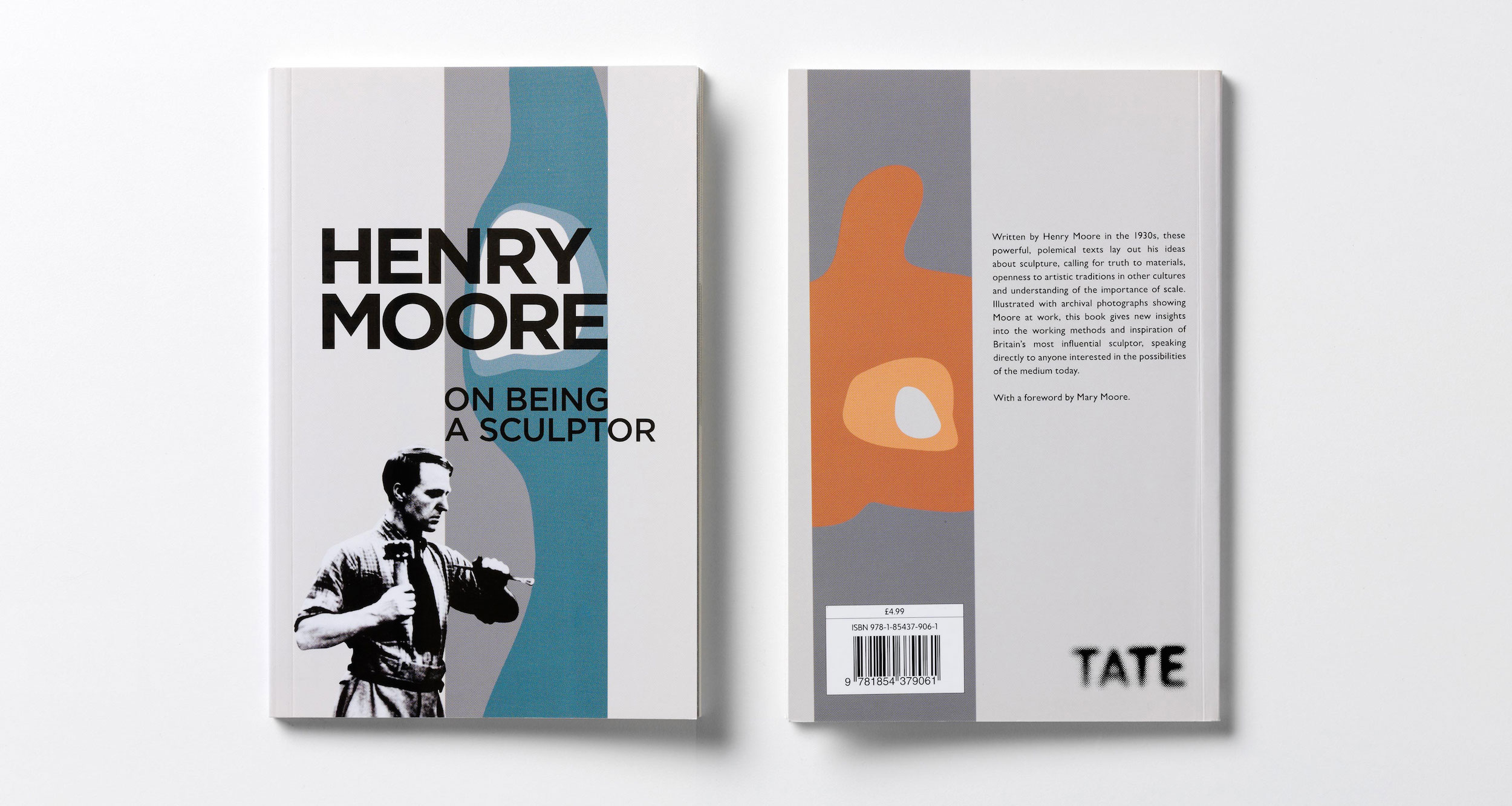
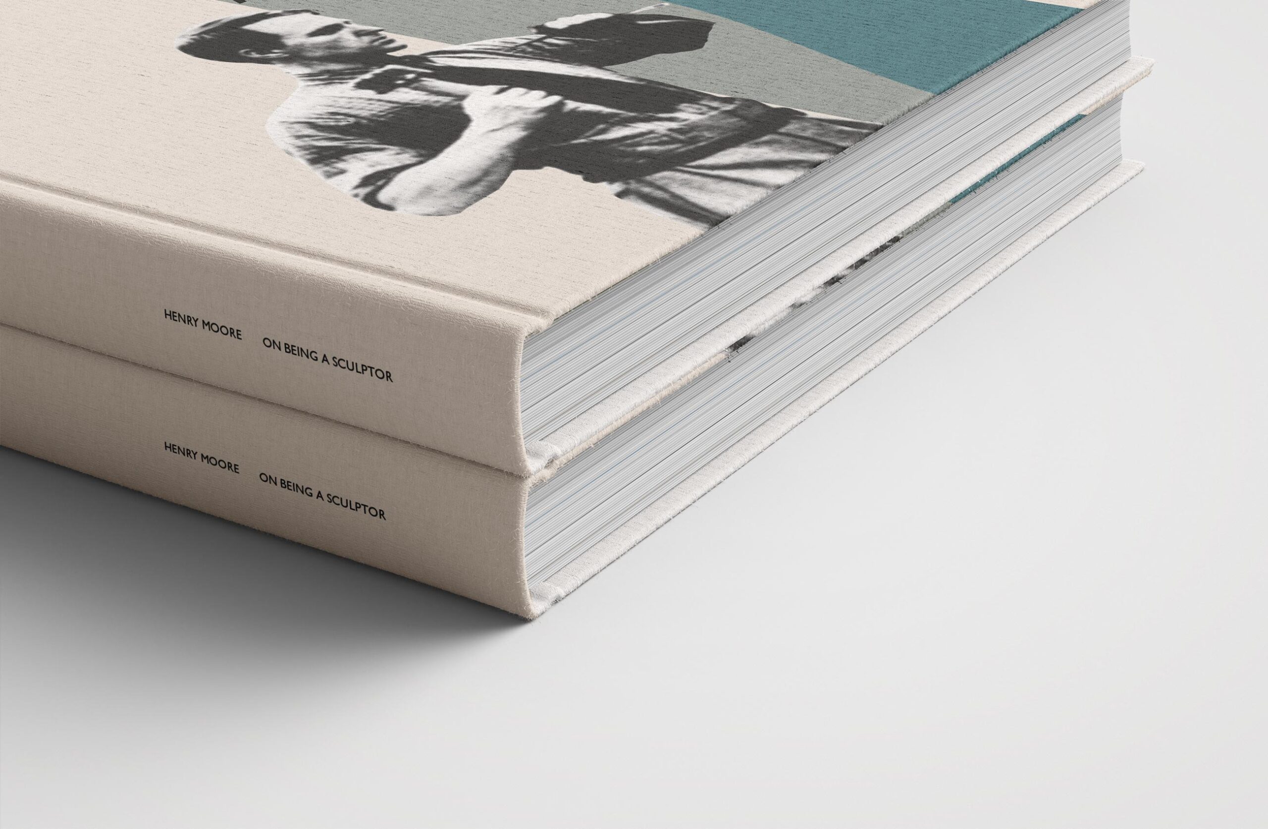

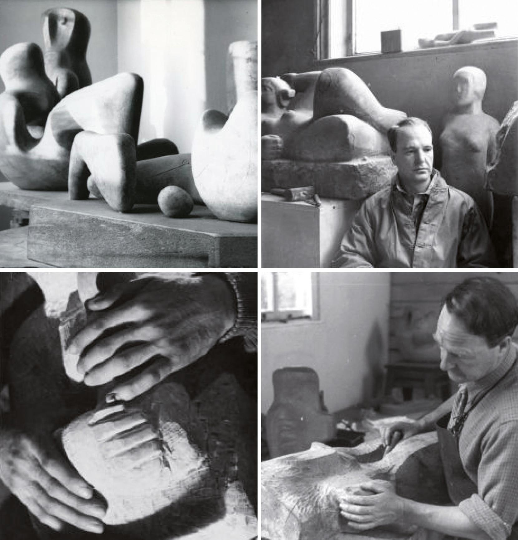
Historic photographs were carefully restored, preserving the integrity of the original imagery while giving it new life within the publication.
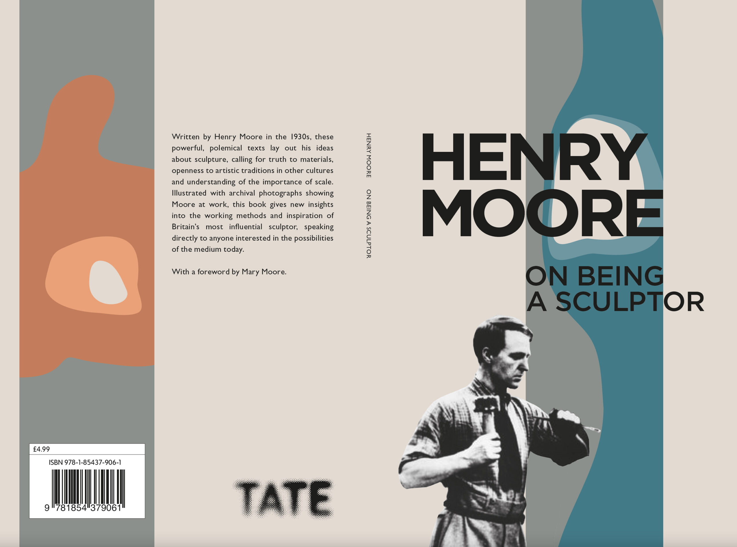
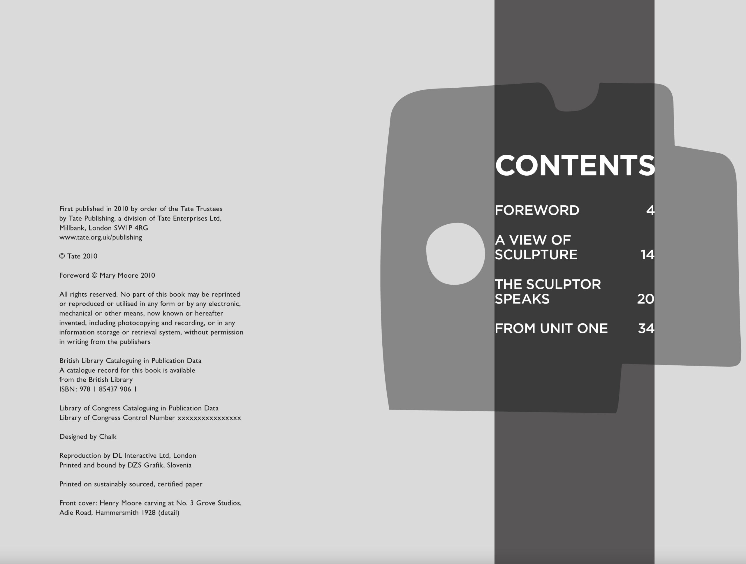
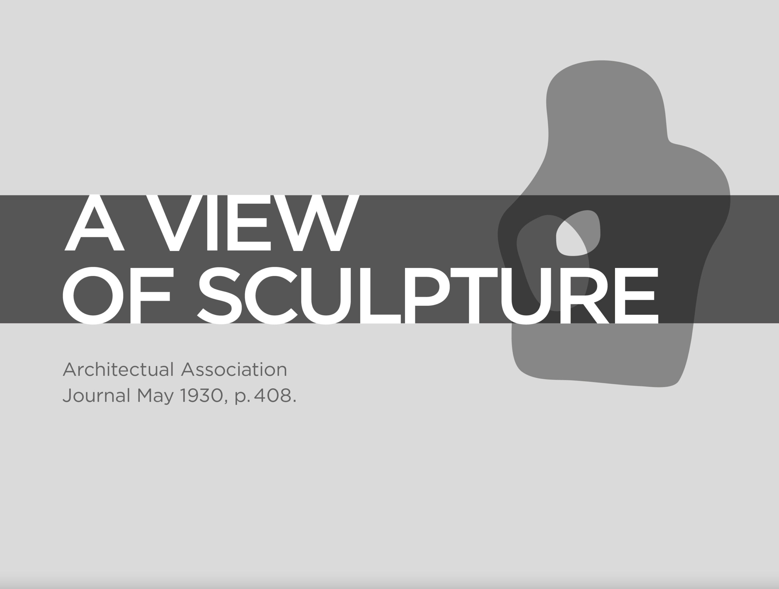
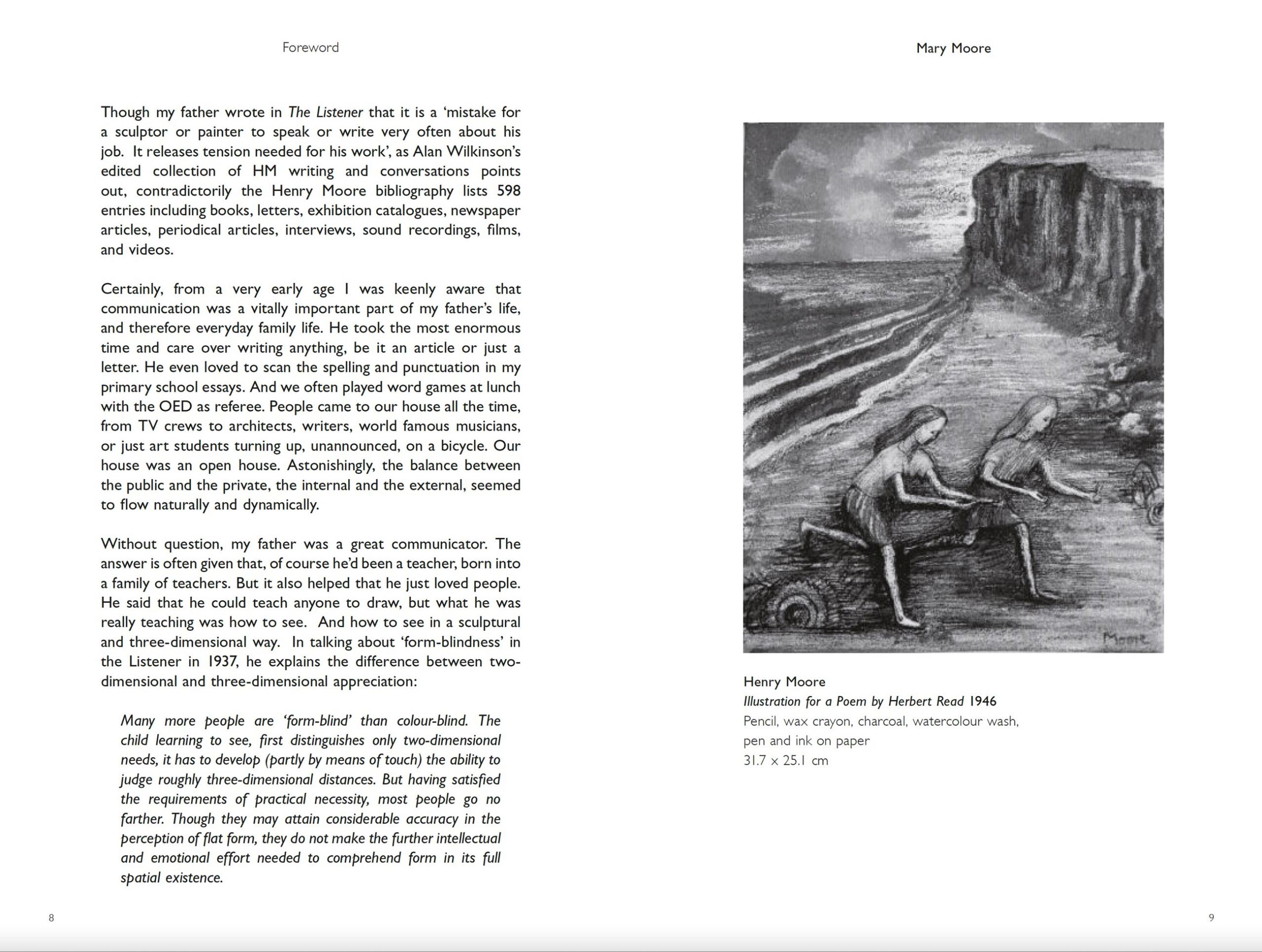
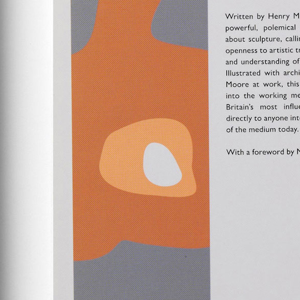
Around them, we created a visual language inspired by Moore’s sculptural forms.
Typography was deliberately bold and structural, while a simple, flexible grid allowed imagery and graphic elements to interact in different ways throughout the book.
The system provided consistency without becoming repetitive – giving us the freedom to change scale, pace and composition while retaining a strong underlying structure.
The result is a publication that doesn’t simply document Moore’s work. Its design takes inspiration from the same ideas of shape, space and form that defined it.

Two artists. Two distinct approaches.
Manet and Moore demanded very different creative responses.
For Manet, colour created the connection between art and page. For Moore, it was form, structure and typography.
What connects the two is a belief that editorial design should never simply decorate its subject. It should help people experience it.
By allowing each artist’s work to shape the design itself, we created two distinctive publications for Tate – each with its own visual language, but both designed with the same attention to detail, craft and respect for the work at their heart.