Reimagining a trusted global research brand for a new generation.
EndNote is a world-leading reference management tool used by researchers, academics and students to organise research, manage references and simplify the process of academic writing.
But despite its established reputation, the market was changing.
Competition was increasing, sales were declining and the EndNote brand was beginning to feel dated. With the launch of EndNote x8, Clarivate saw an opportunity to do more than introduce another product update.
It was time to reposition the brand for a new generation of researchers.




Building on trust
EndNote already had what many competitors were still working to establish: heritage, recognition and trust. Our challenge was to make those strengths feel relevant to a new generation of researchers.
Through in-depth market research and brand workshops, we explored the competitive landscape, EndNote’s audiences and the qualities that set the product apart. This led to a clear creative brief: build a more innovative, contemporary brand without losing the credibility earned over many years.
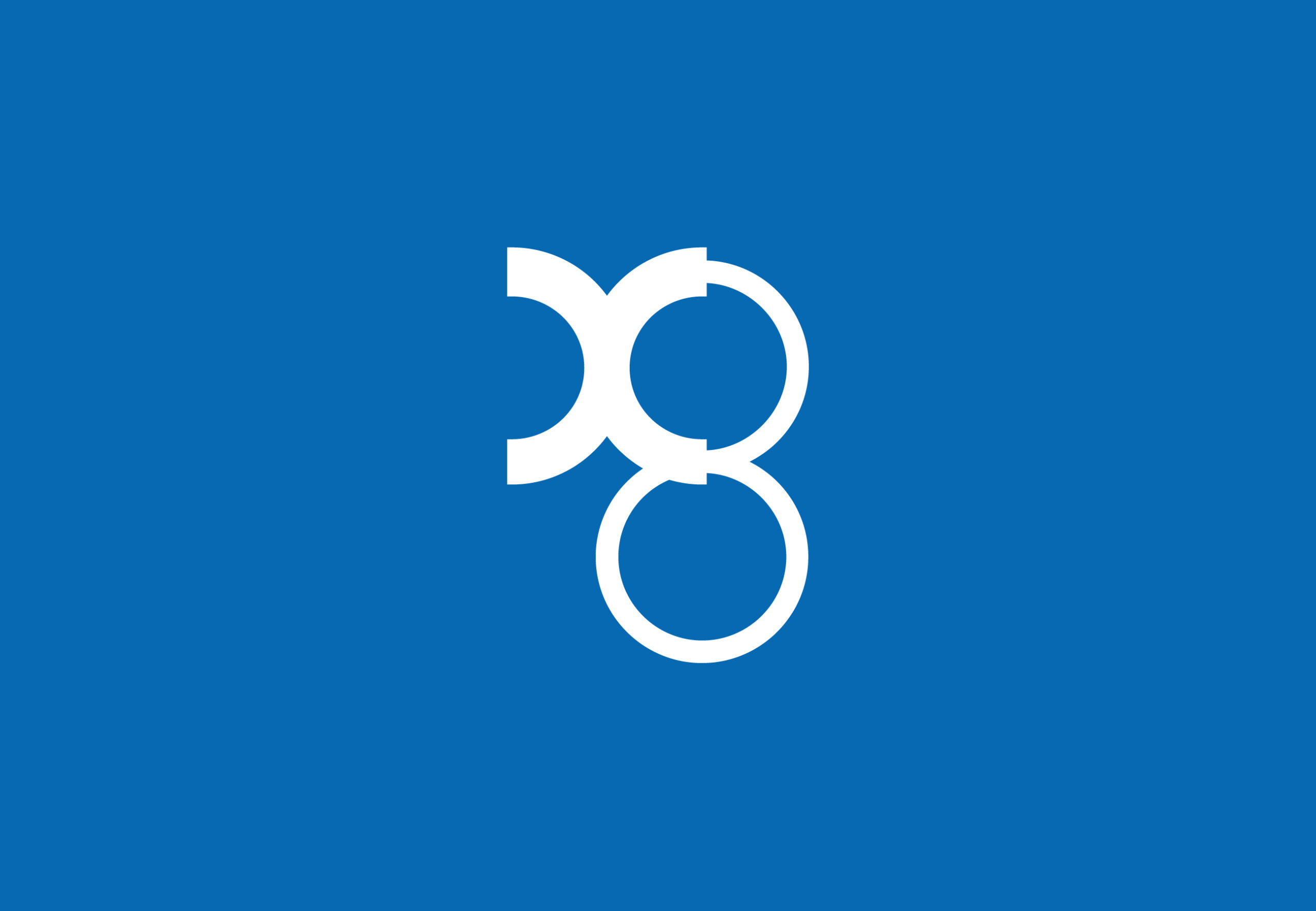
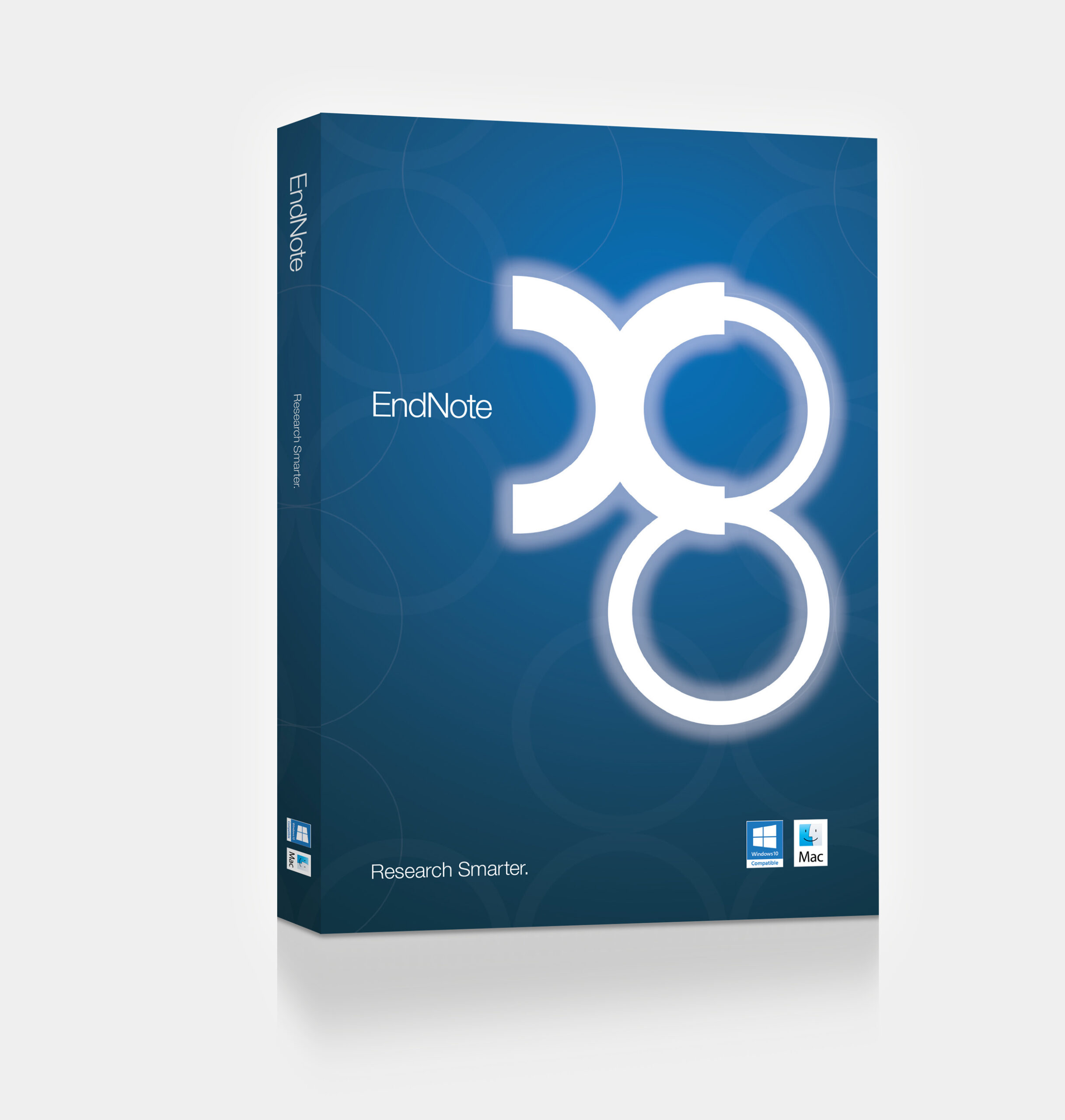
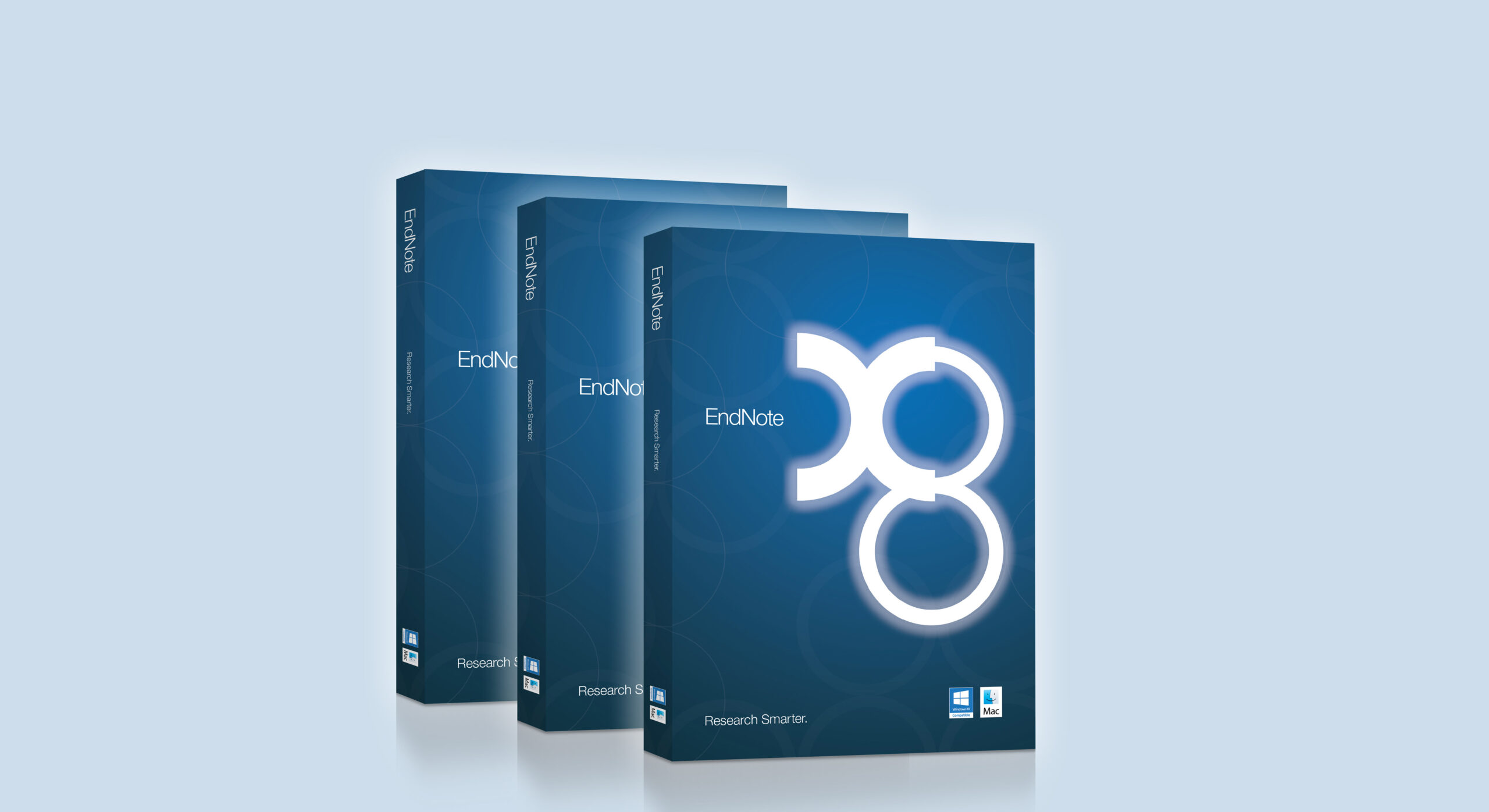
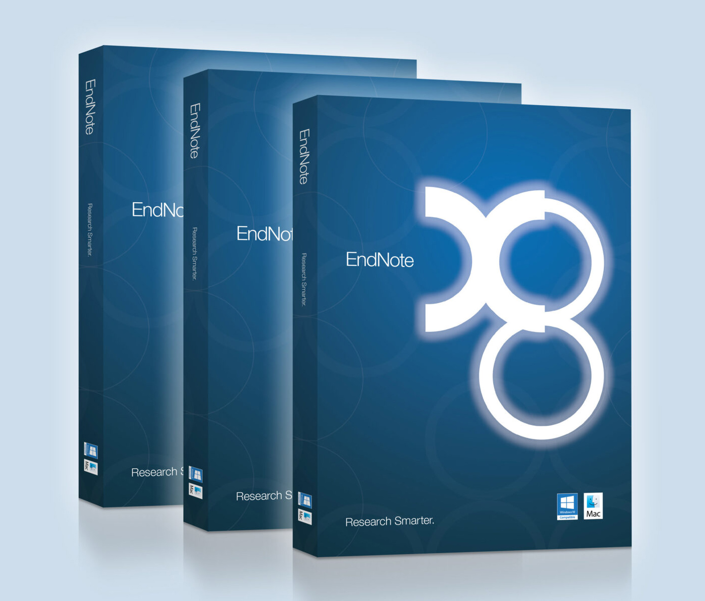
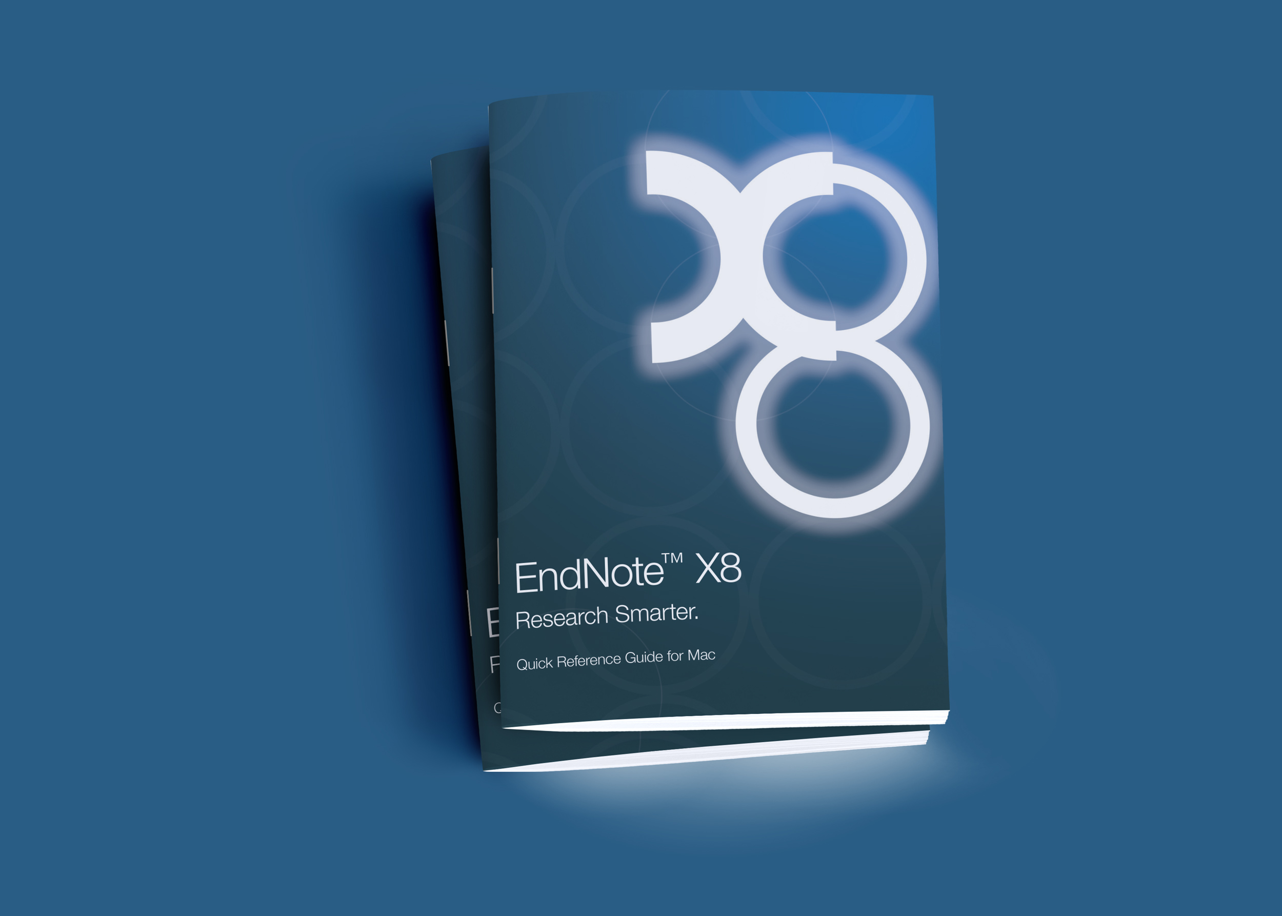
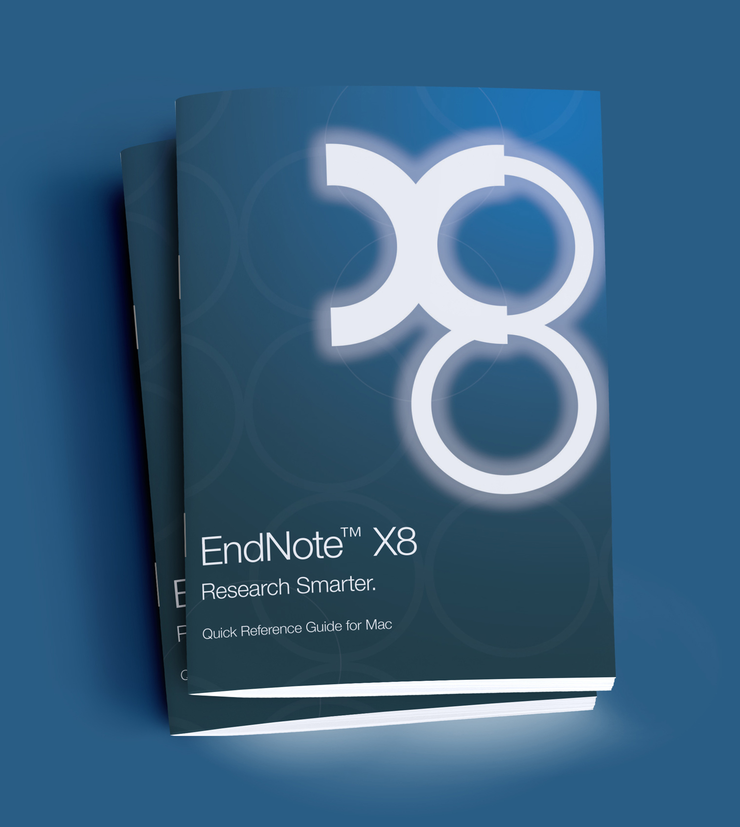
At the heart of the new identity was x8. Rather than treating it simply as a version number, we transformed it into a distinctive graphic device representing both EndNote’s evolution and the connected nature of research. The curves of the x and 8 create a sense of linkage and continuity — connecting previous generations with the future.
Simple, recognisable and flexible, the device became a strong visual signature for the new EndNote brand.
Creating a complete visual language
A refreshed identity needed more than a new logo.
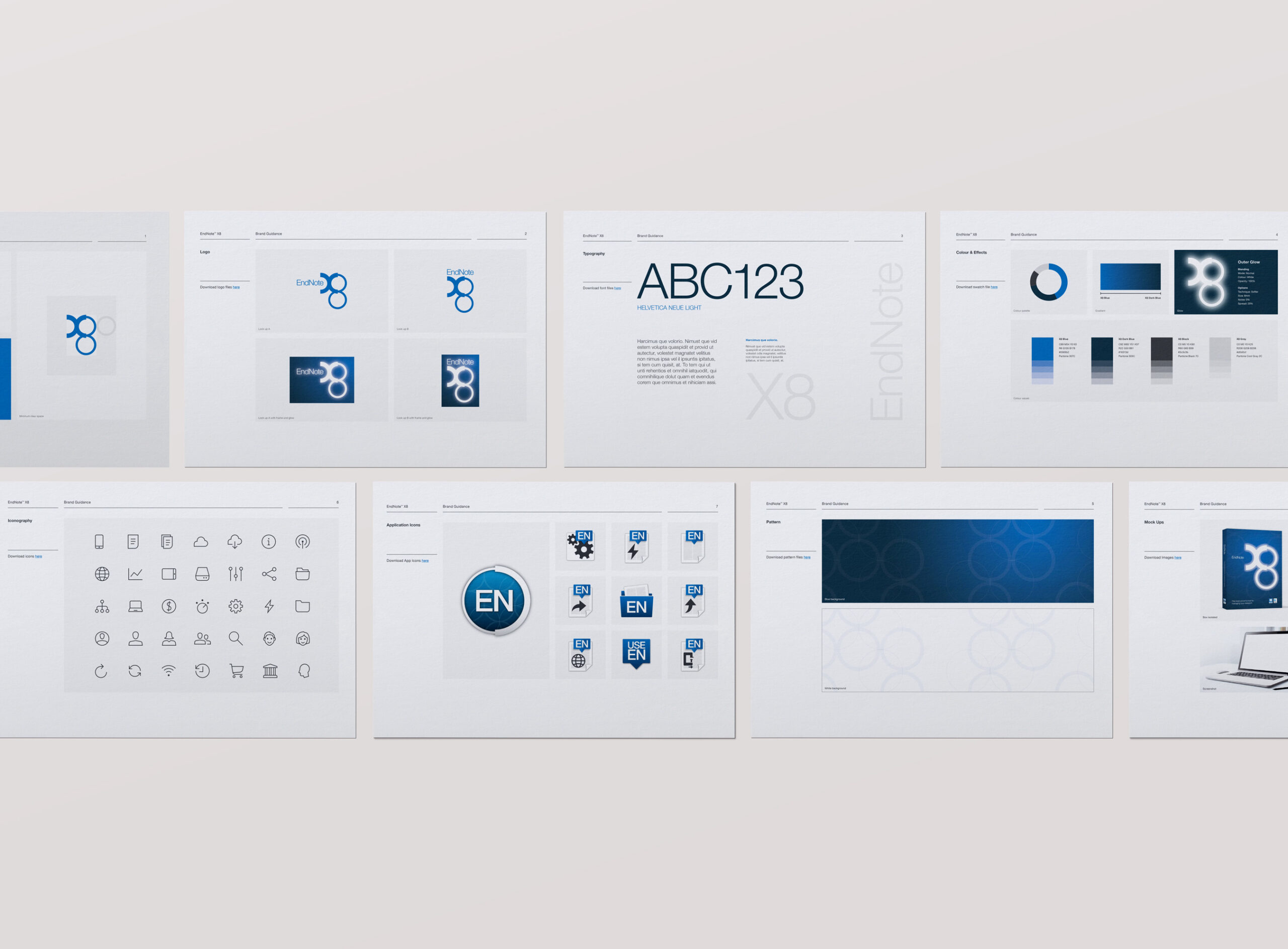
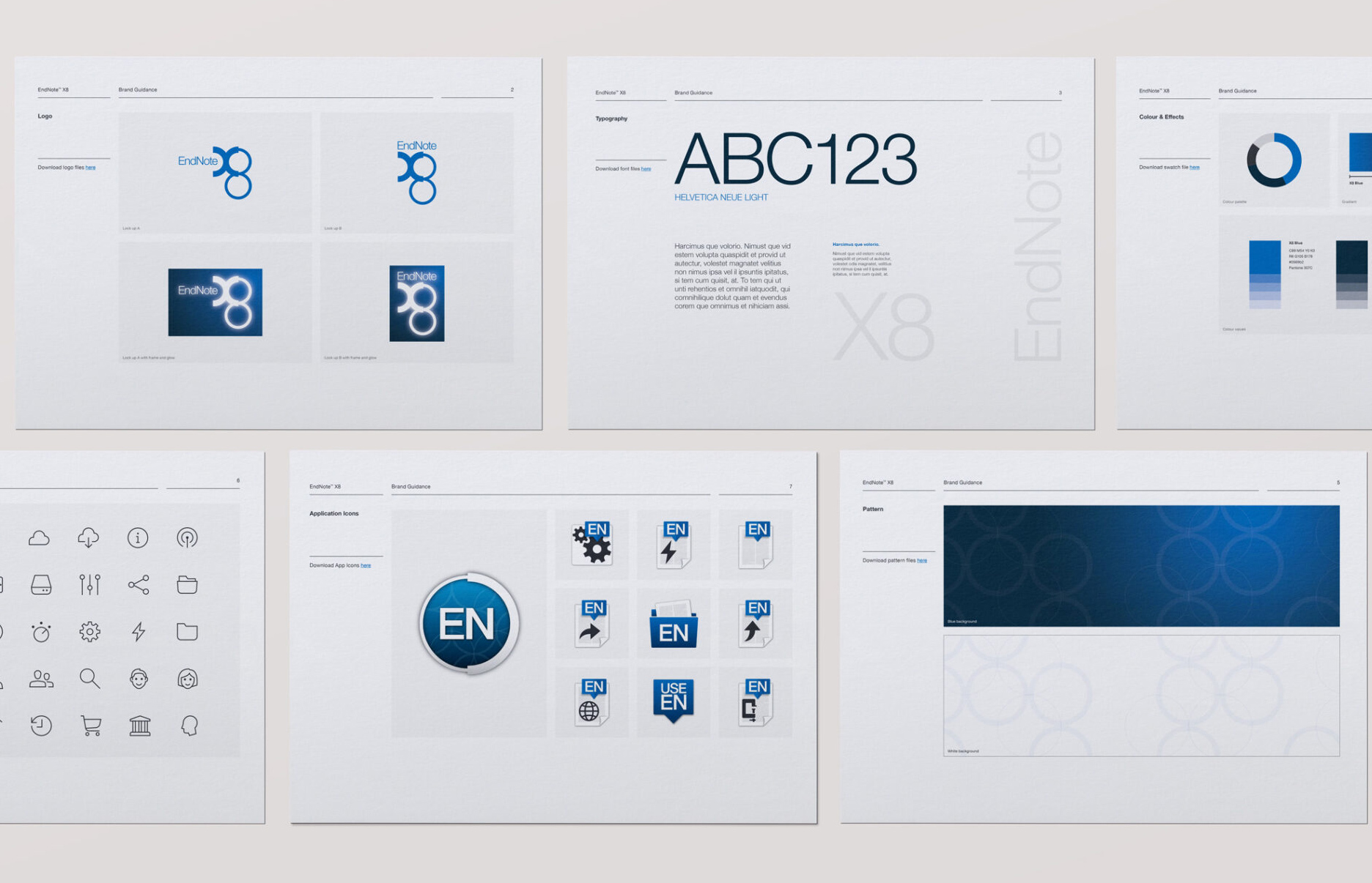
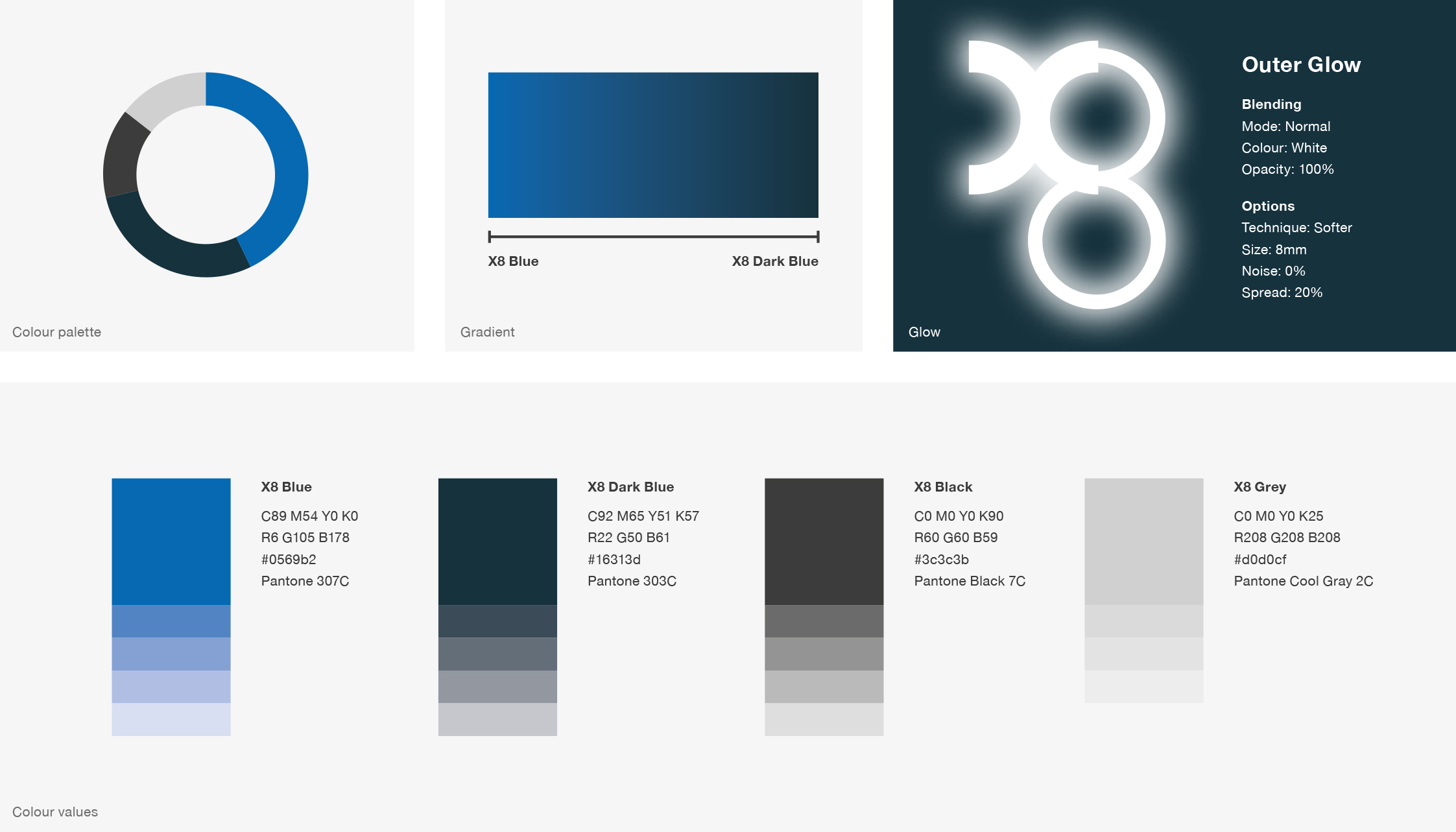
We developed a comprehensive visual system designed to work consistently across every interaction with the EndNote brand.
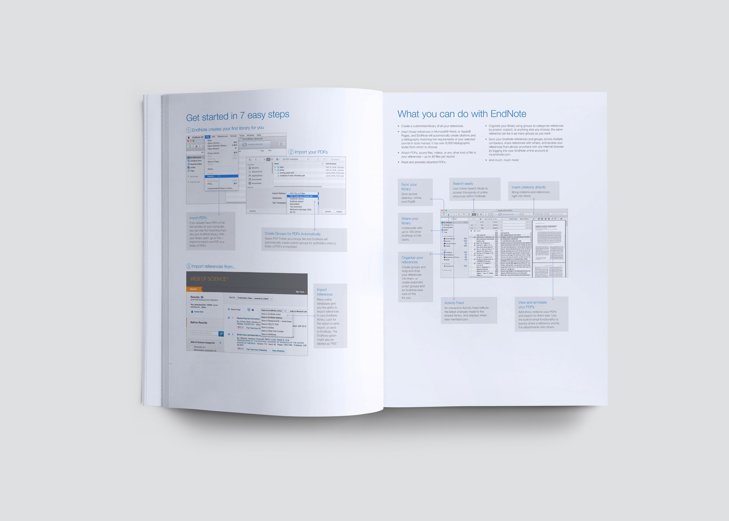
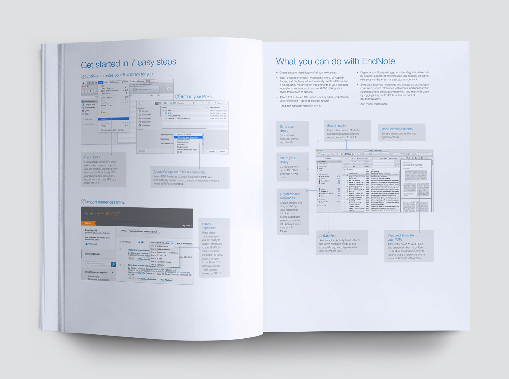
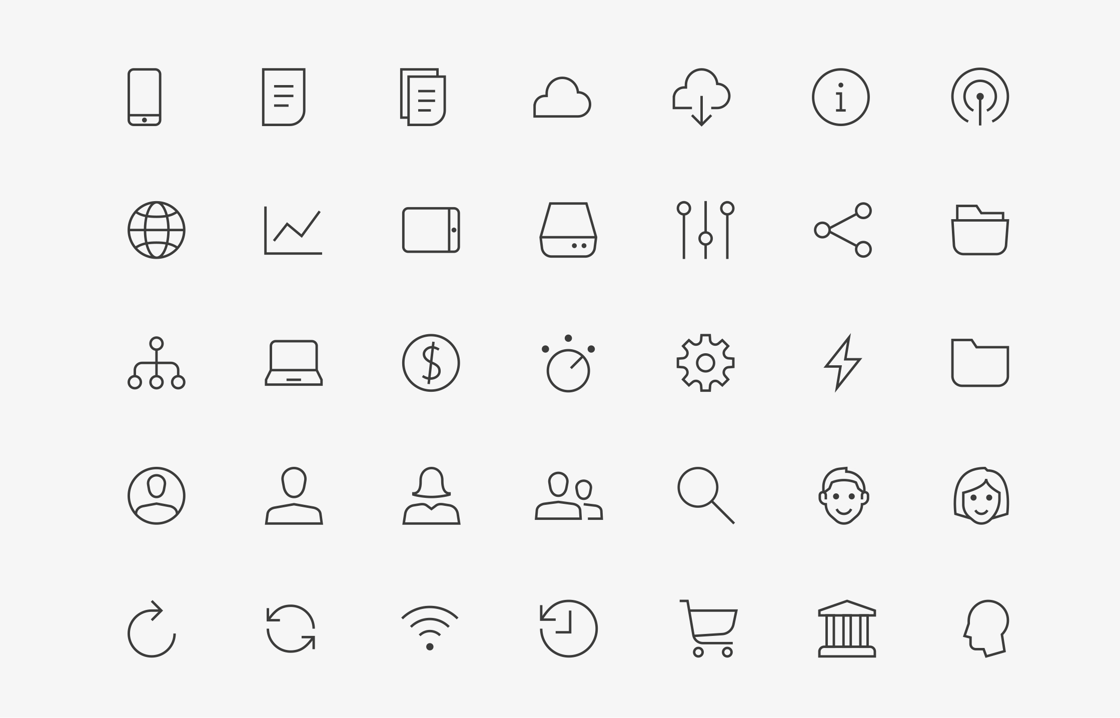
From typography, grids and bespoke iconography to digital interfaces, heading styles and interactive states, every detail was considered.
The result was a clear and flexible design language that could move seamlessly between print and digital while making the product feel simpler, more contemporary and easier to engage with.
Detailed brand guidelines brought everything together, giving teams a practical toolkit for maintaining consistency as the brand continued to evolve.
Making innovation intuitive
EndNote’s sophisticated functionality didn’t need to feel complicated. We created a simple, confident visual language that let the product’s capabilities take centre stage, positioning EndNote x8 as a modern research tool while retaining the authority of an established global brand.
The refreshed identity gave Clarivate a stronger, more consistent presence in an increasingly competitive market — building on the recognition and trust EndNote had earned while preparing it for a new generation of users.
EndNote x8 showed that evolution can be more powerful than reinvention: protecting what made the brand successful while giving it the confidence to move forward.