Creating a distinctive welcome for an icon of King’s Cross.
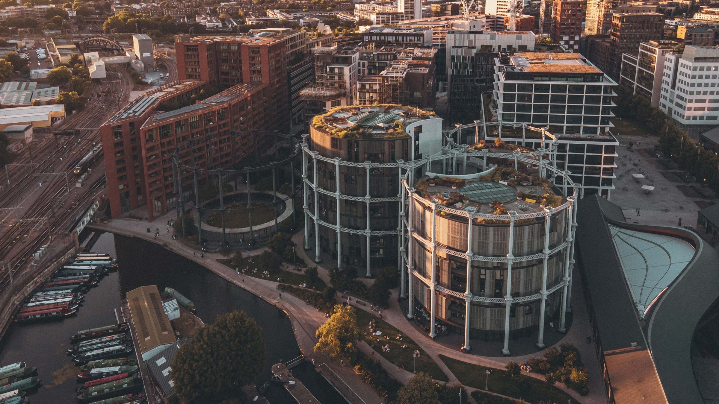
Transforming industrial heritage into a premium residential experience
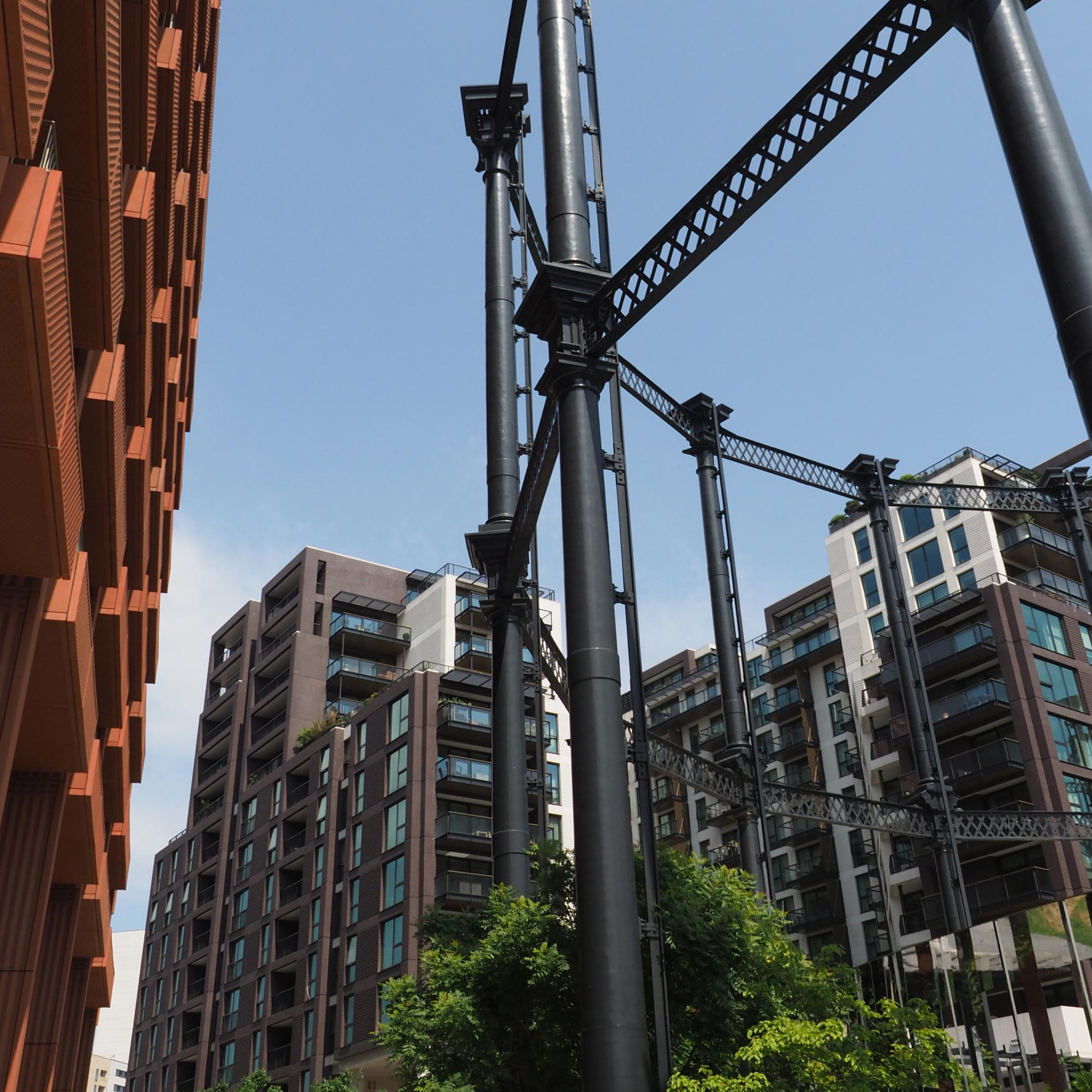
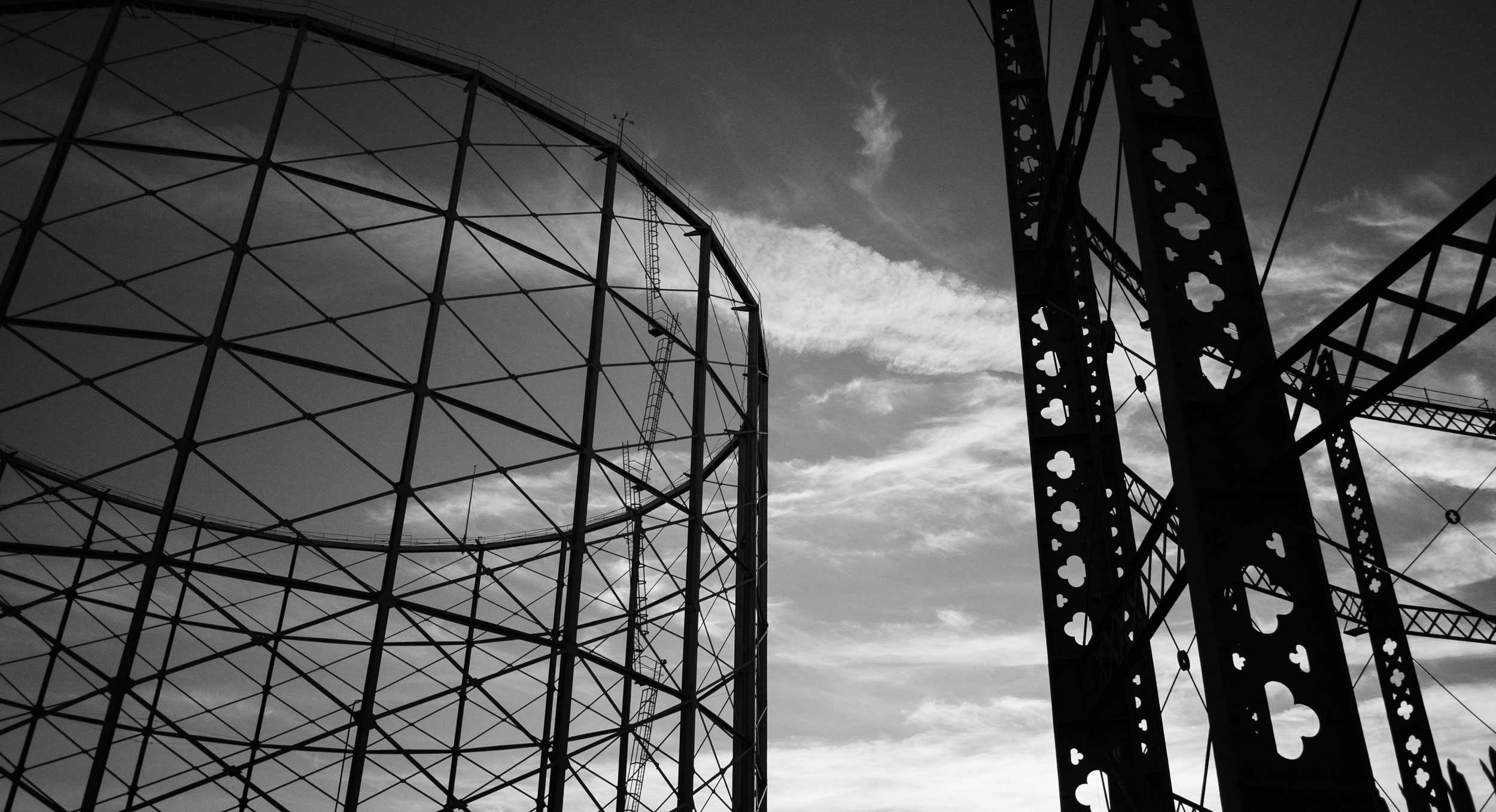
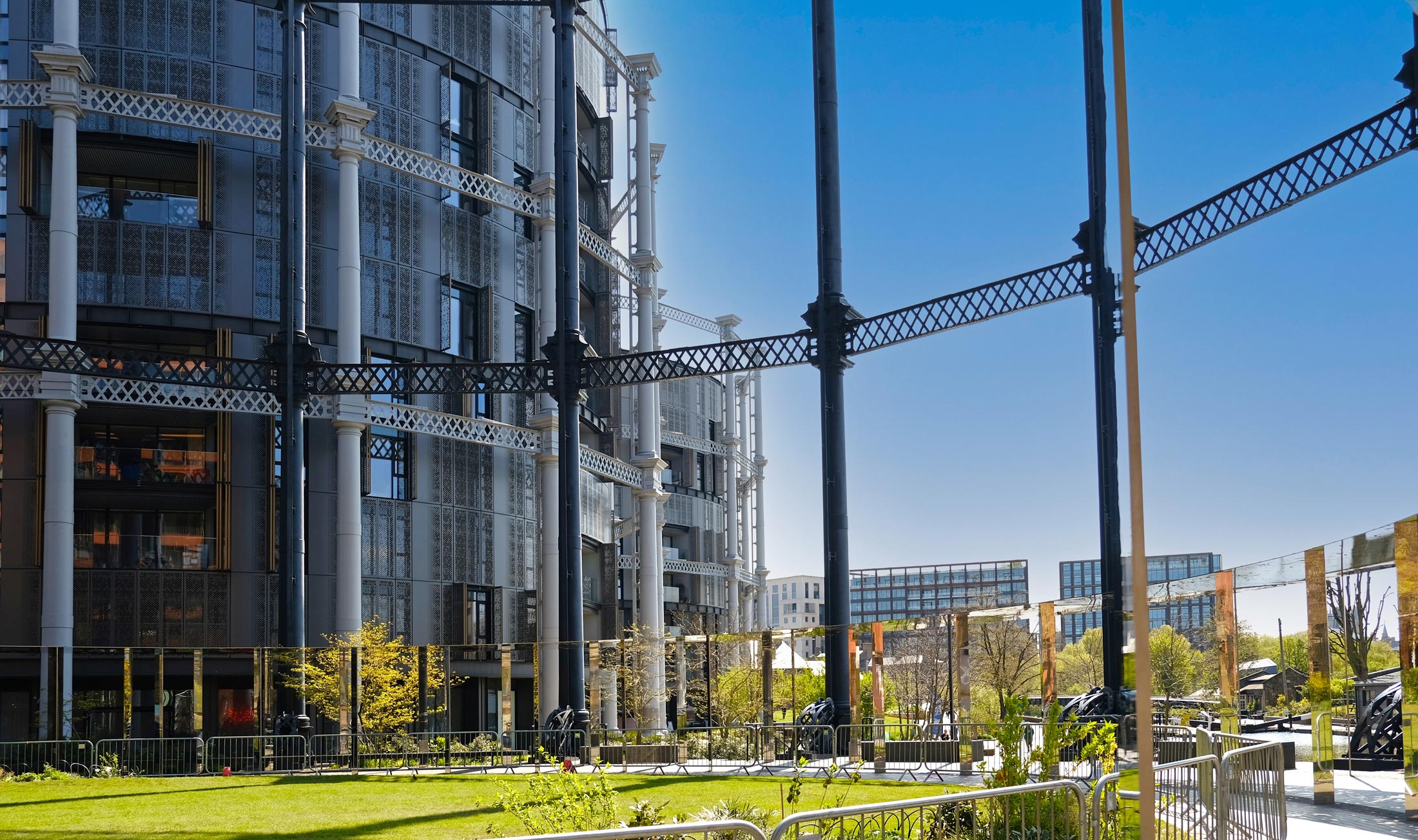
Few developments capture the transformation of King’s Cross quite like Gasholders. Three contemporary residential buildings sit within the restored cast-iron frames of the area’s industrial past, reimagining a defining local landmark as a distinctive place to live.
Working with Argent, the brief was to create a suite of premium materials to attract prospective buyers off-plan and welcome new residents to this remarkable part of London.
The challenge was to capture what makes Gasholders unique: a development that honours the industrial heritage of King’s Cross while embracing a bold, contemporary vision for urban living.
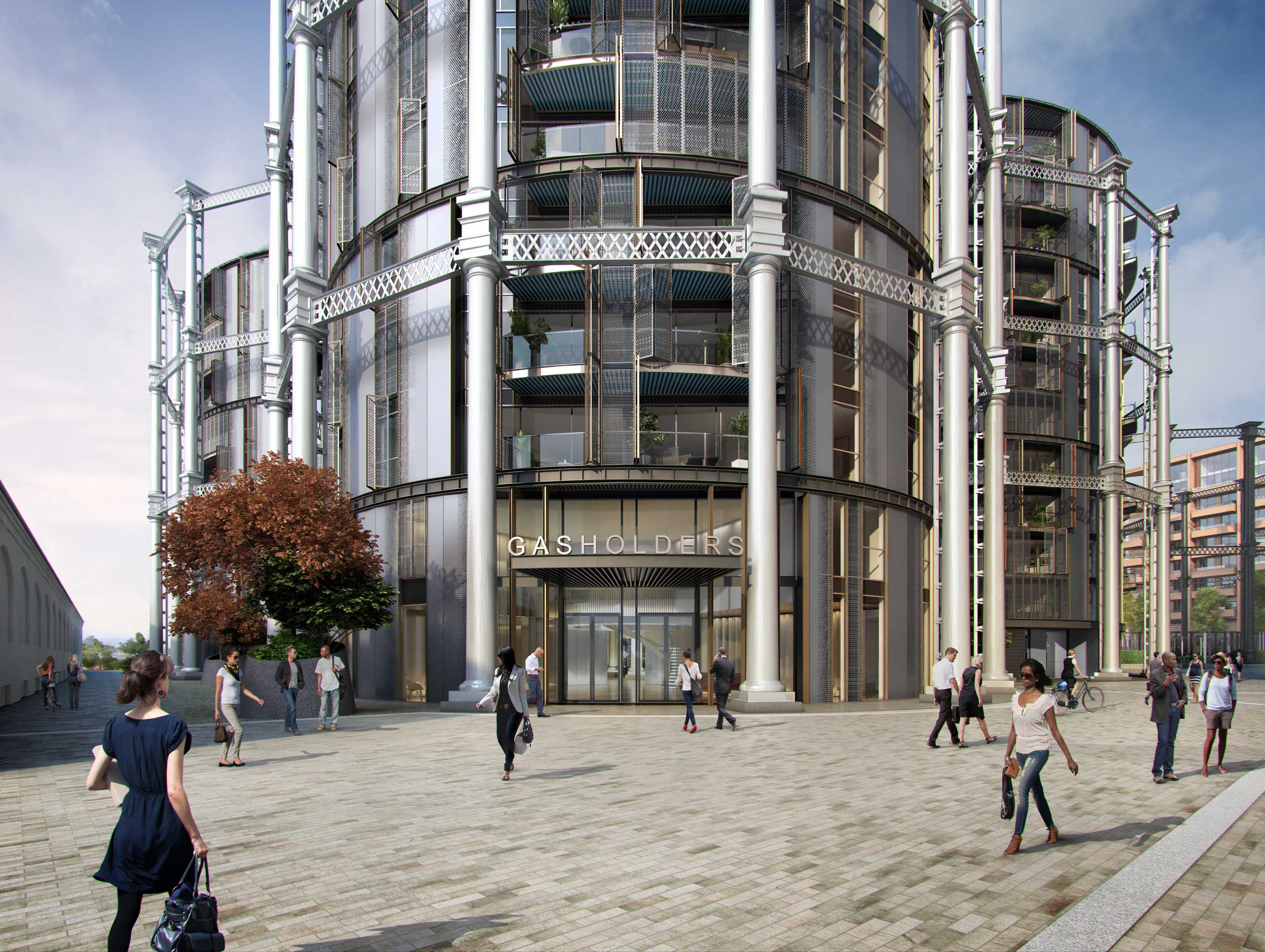
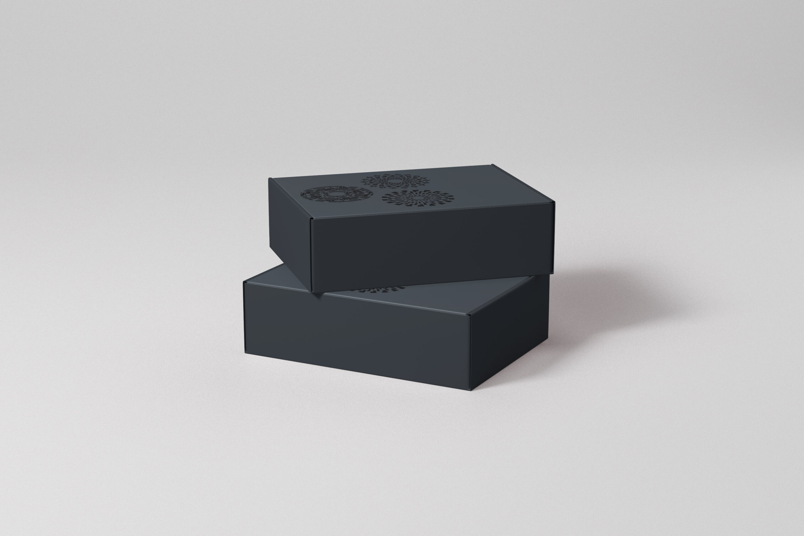
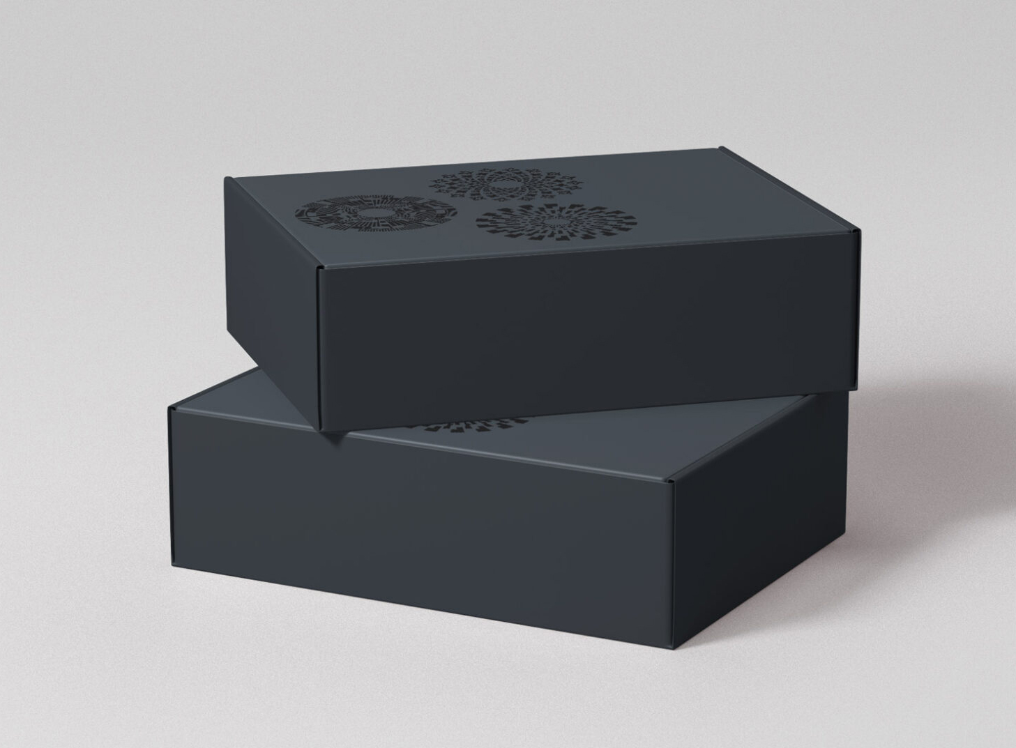
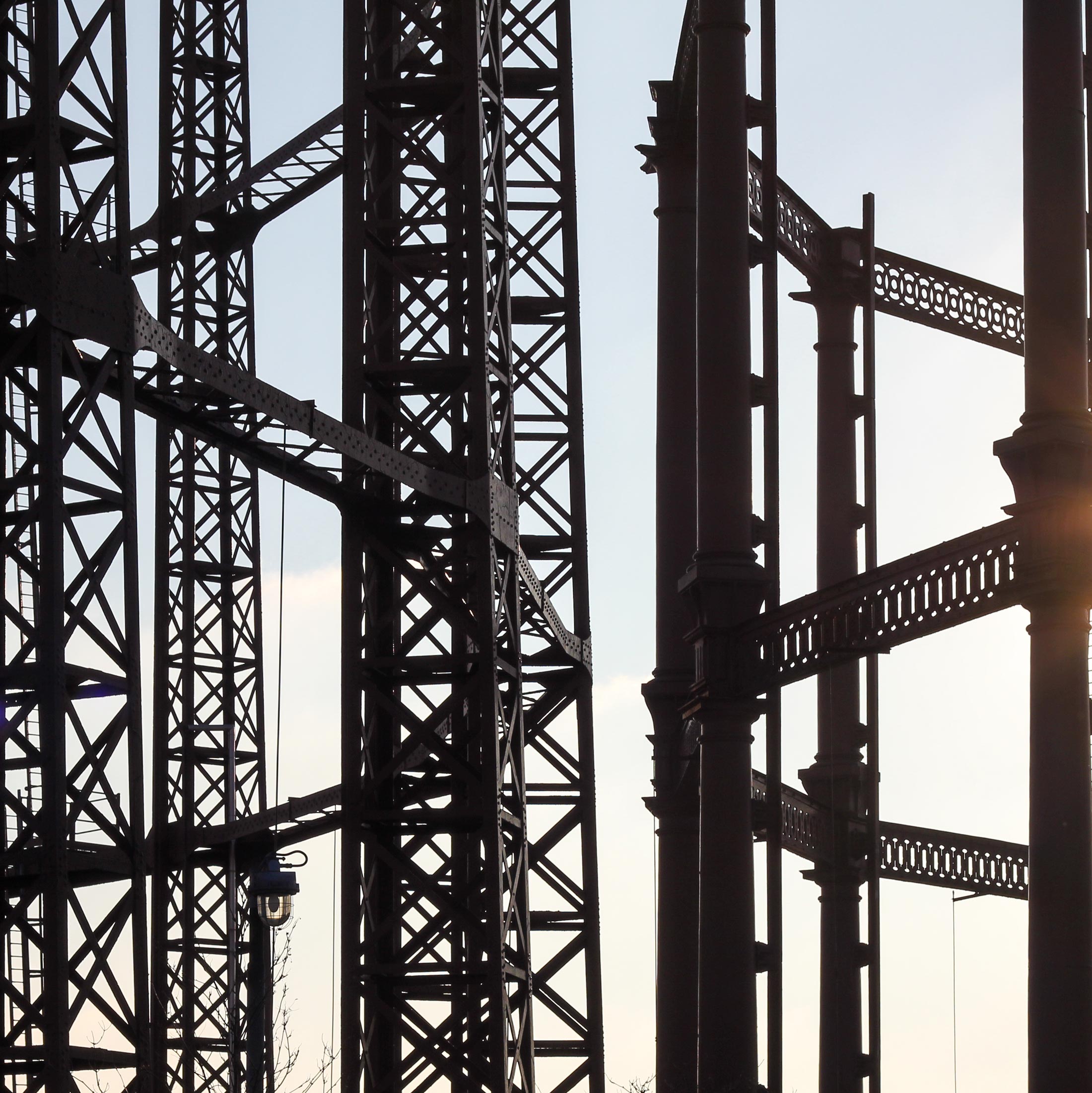
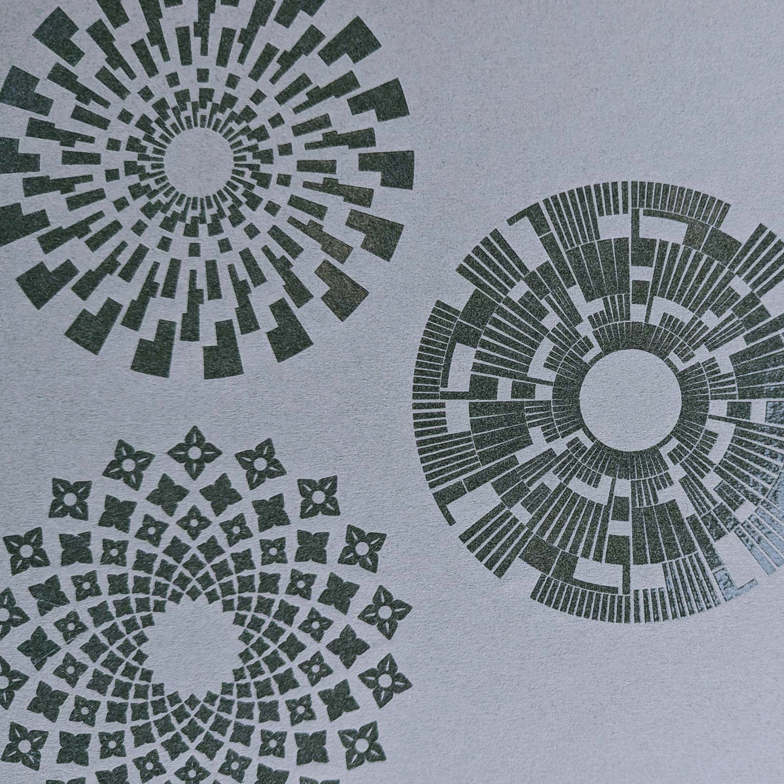
Circular graphic elements were drawn directly from the form of the buildings, creating a visual thread that could run throughout the materials.
Using insight to shape the creative approach
With the apartments being marketed off-plan, every touchpoint needed to bring Gasholders to life, helping prospective buyers imagine not just the architecture, but the experience of living there.
Market research and detailed audience personas revealed what mattered most to prospective buyers, shaping a creative direction that captured the development’s distinctive character and aspirations.
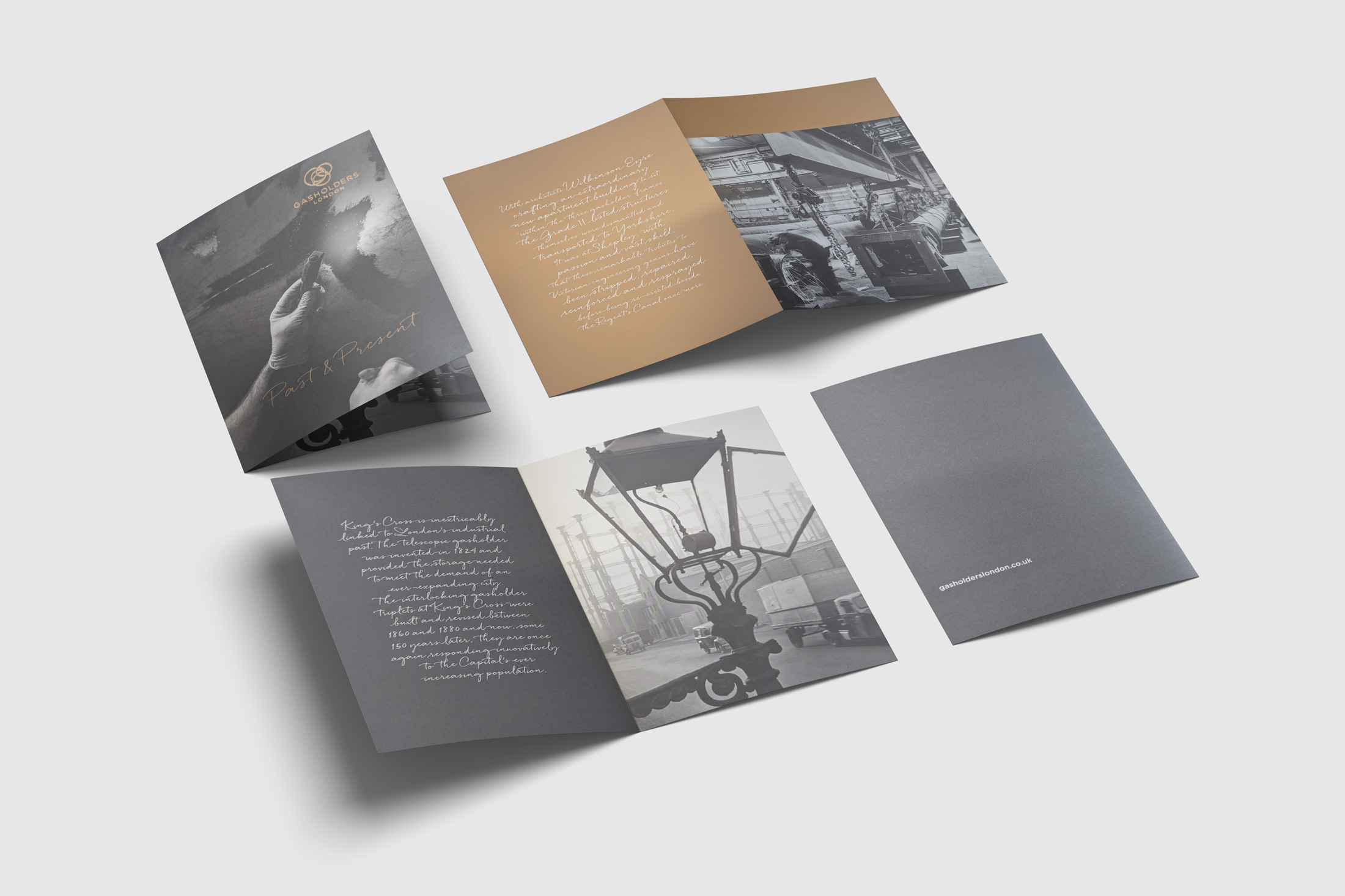
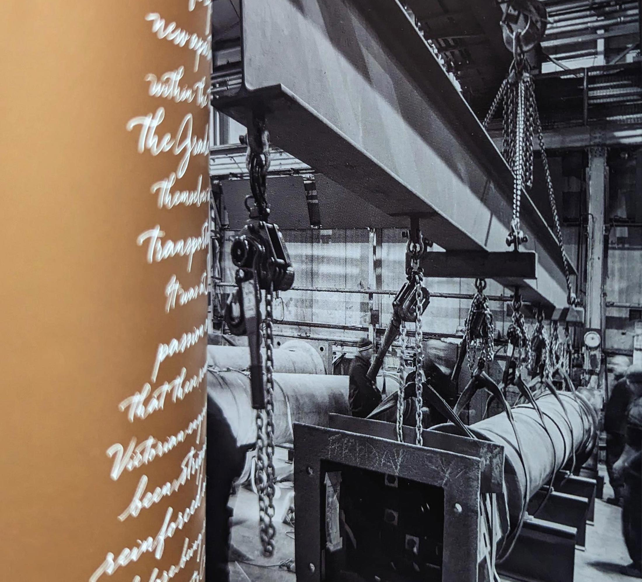
Drawing on the contrast between King’s Cross’s industrial heritage and Gasholders’ contemporary architecture, the creative approach paired robust, industrial references with refined typography, tactile finishes and a restrained, premium aesthetic.
The result was a suite of materials that reflected the development’s unique identity, connecting its historic setting with a compelling vision of modern London living.
Where history meets the future
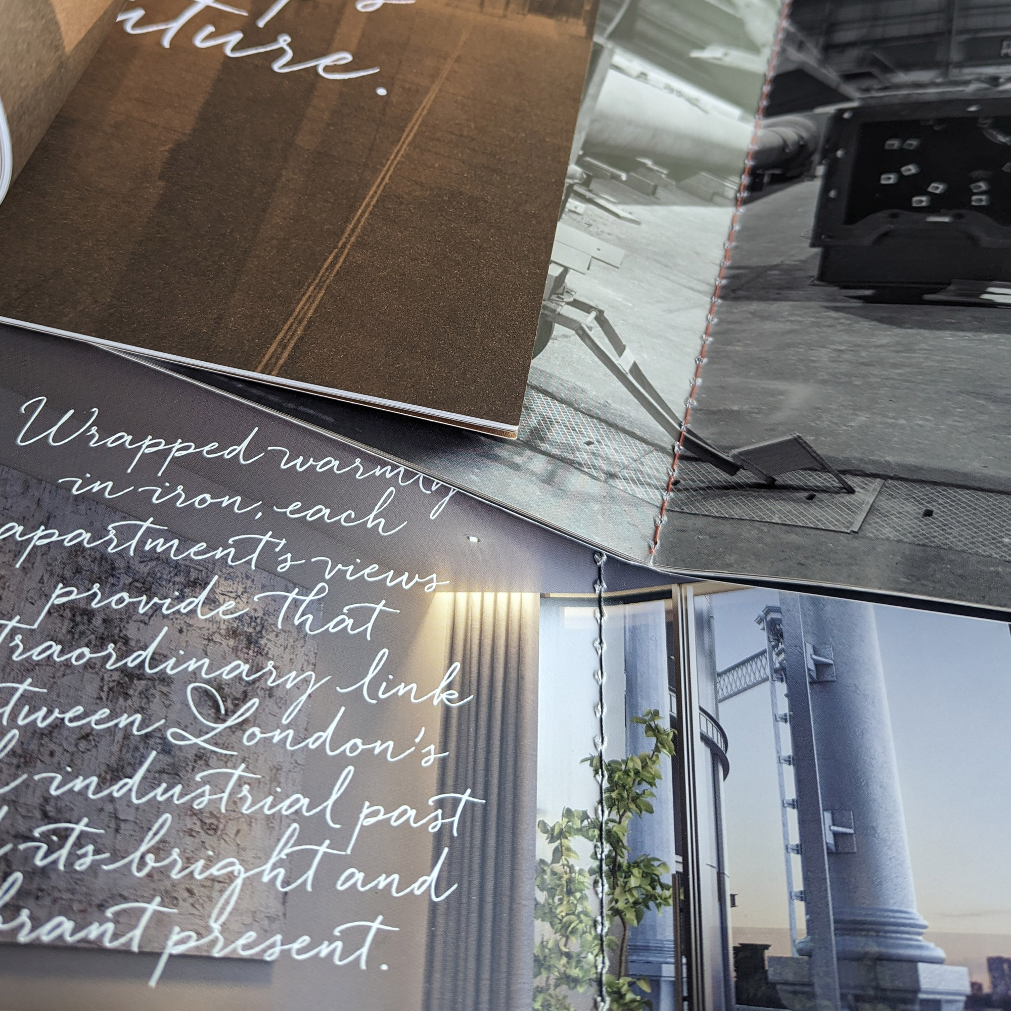
Gasholders’ striking architecture provided the starting point for a distinctive visual identity, drawing on the contrast between its industrial heritage and contemporary design.
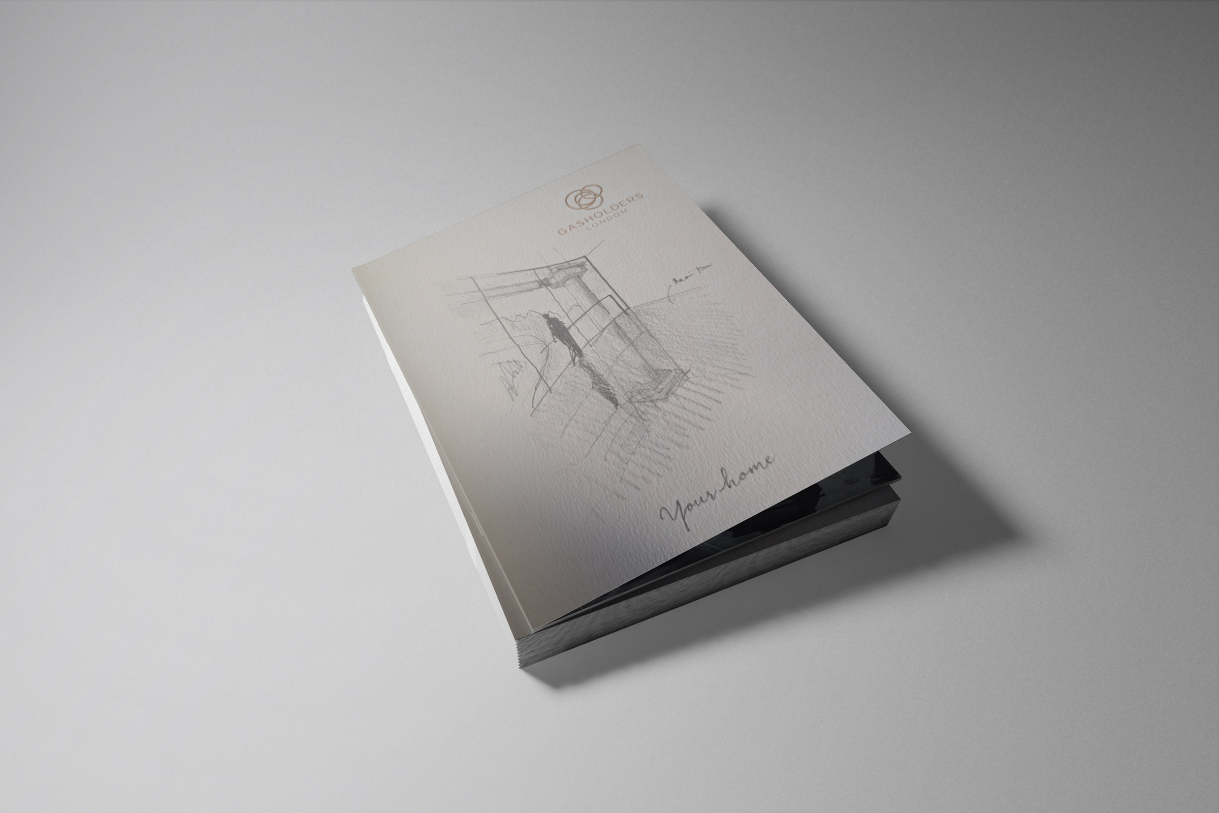
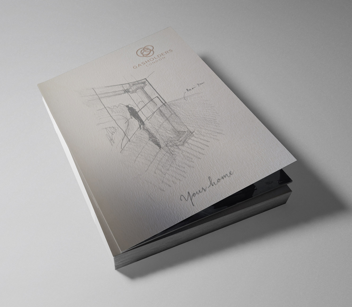
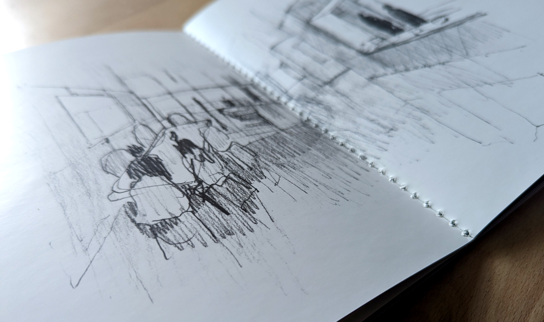
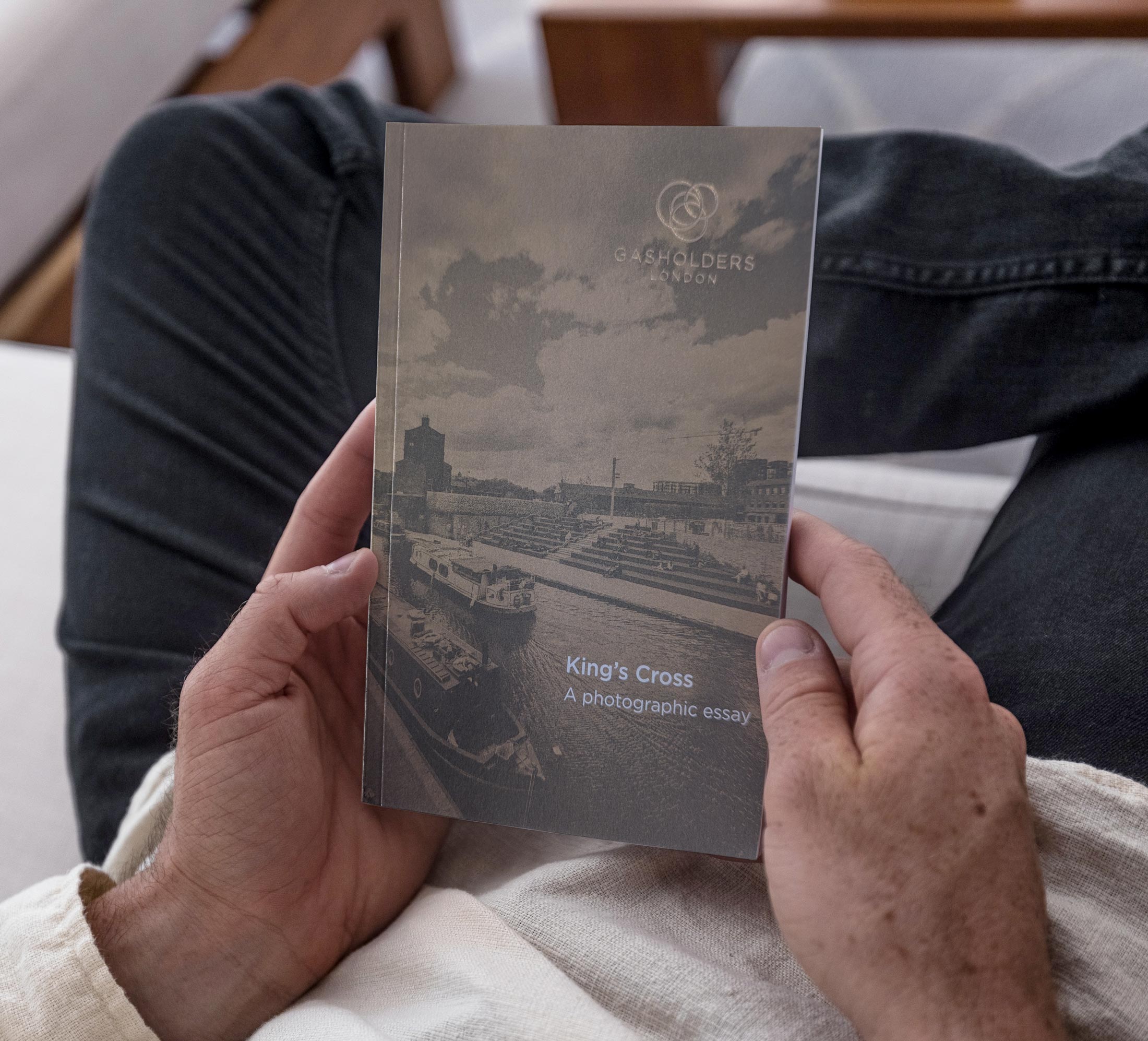
The development’s circular forms and intricate cast-iron framework informed a graphic language that brought past and present together. Historic photography and illustration rooted the identity in the story of King’s Cross, while clean layouts and refined typography echoed the precision and elegance of the architecture.
The result was an identity shaped by the building itself, translating its distinctive character into a cohesive visual language across every touchpoint.
Making every detail count
For a development of this calibre, the tactile experience of the marketing materials was as important as their visual impact.
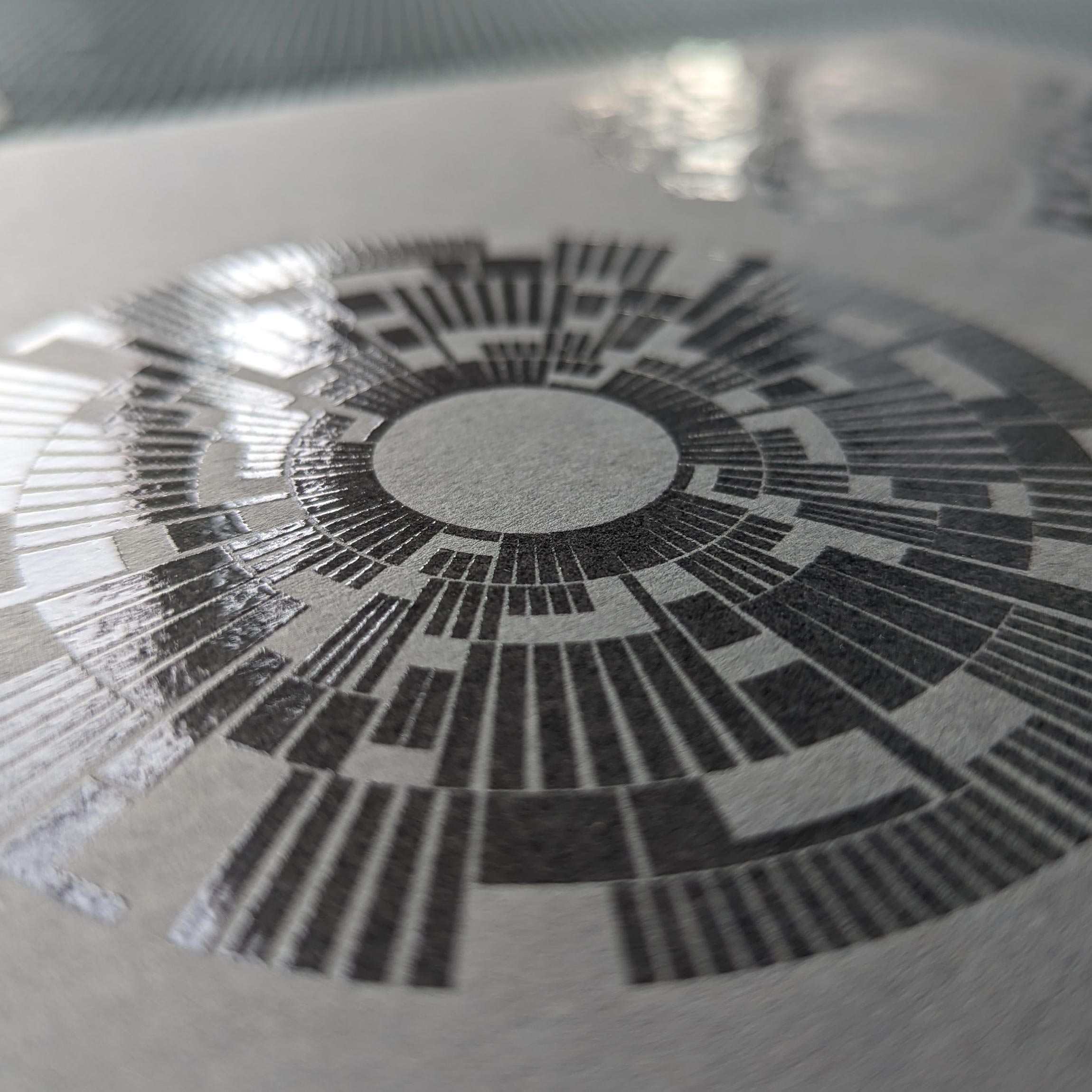
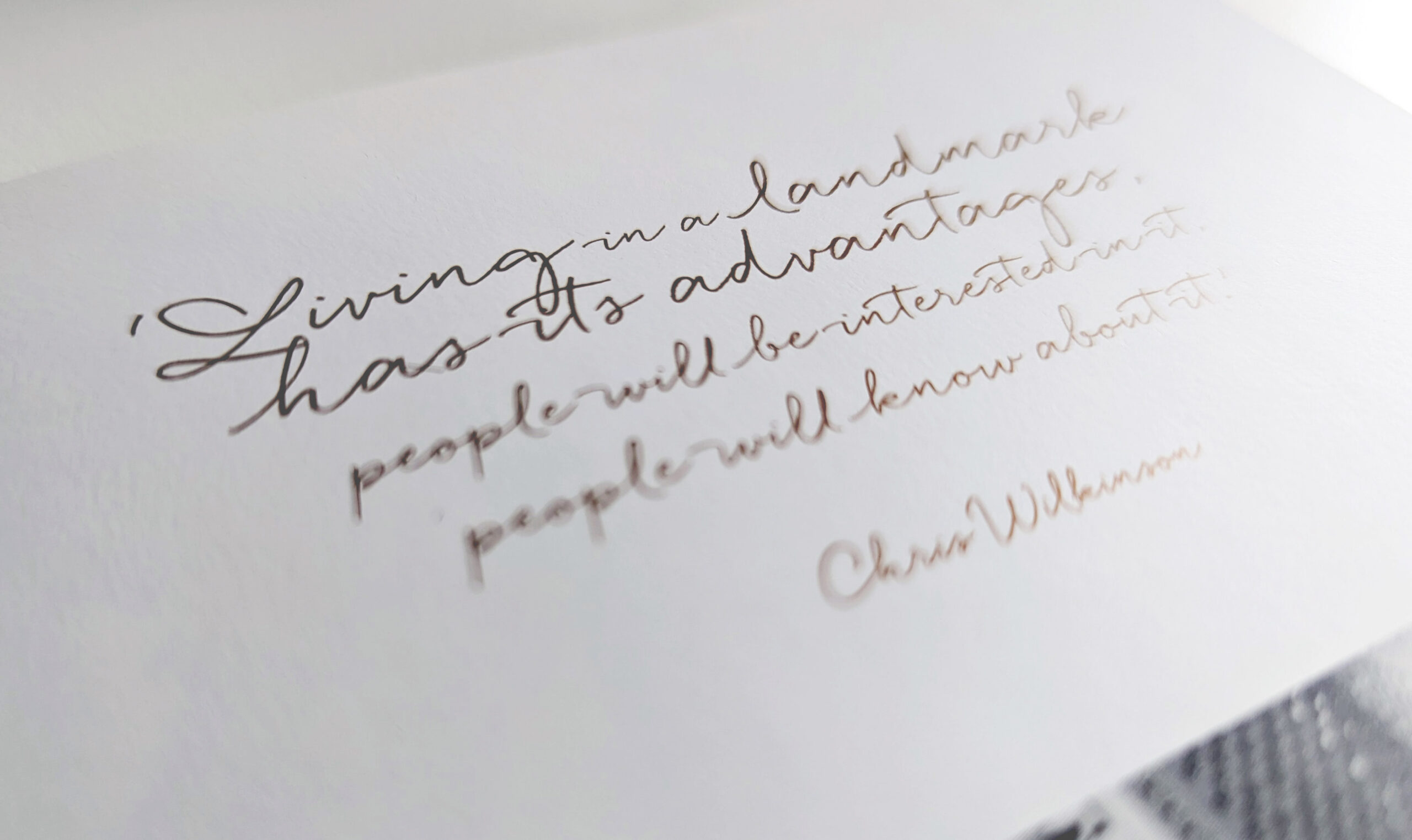
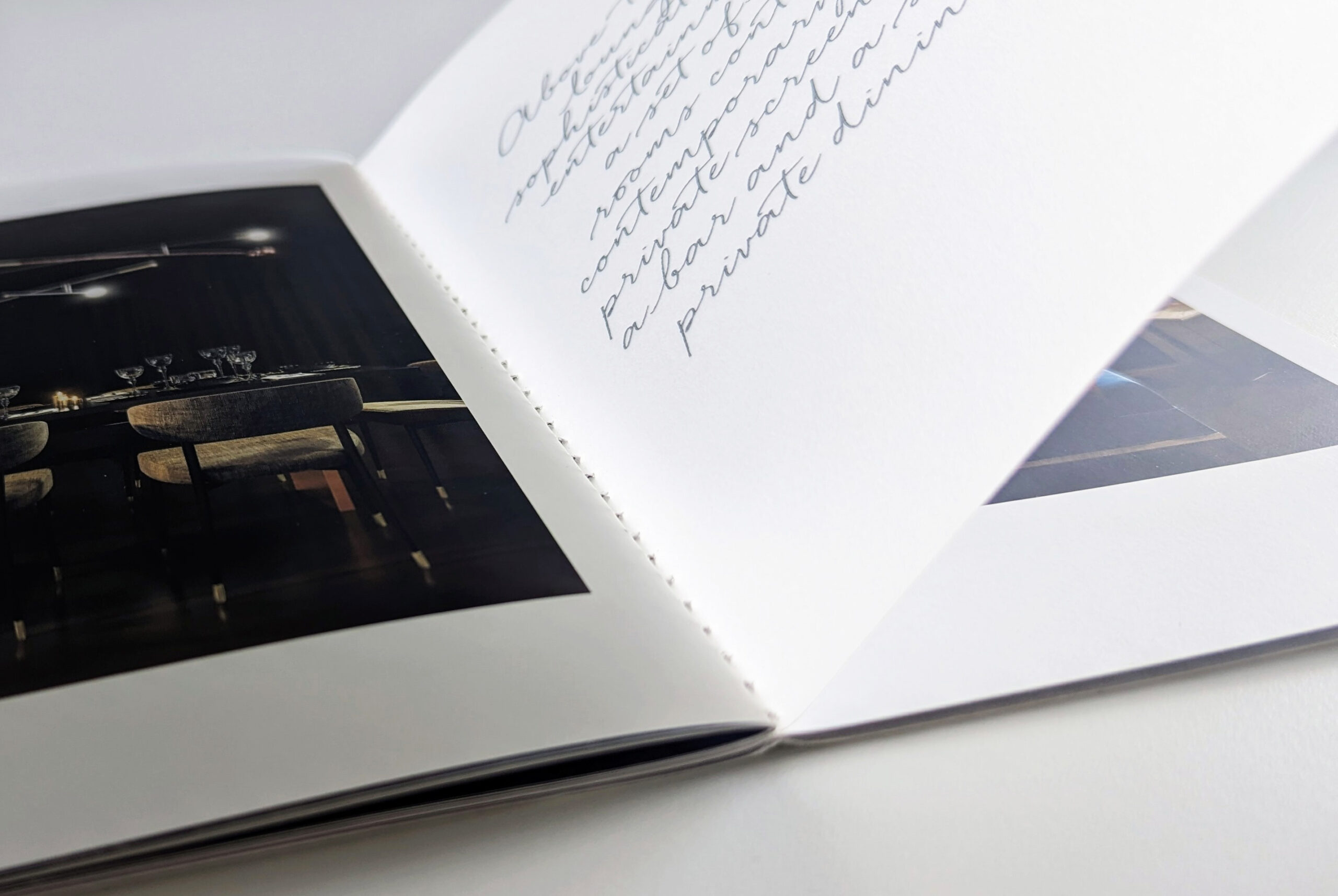
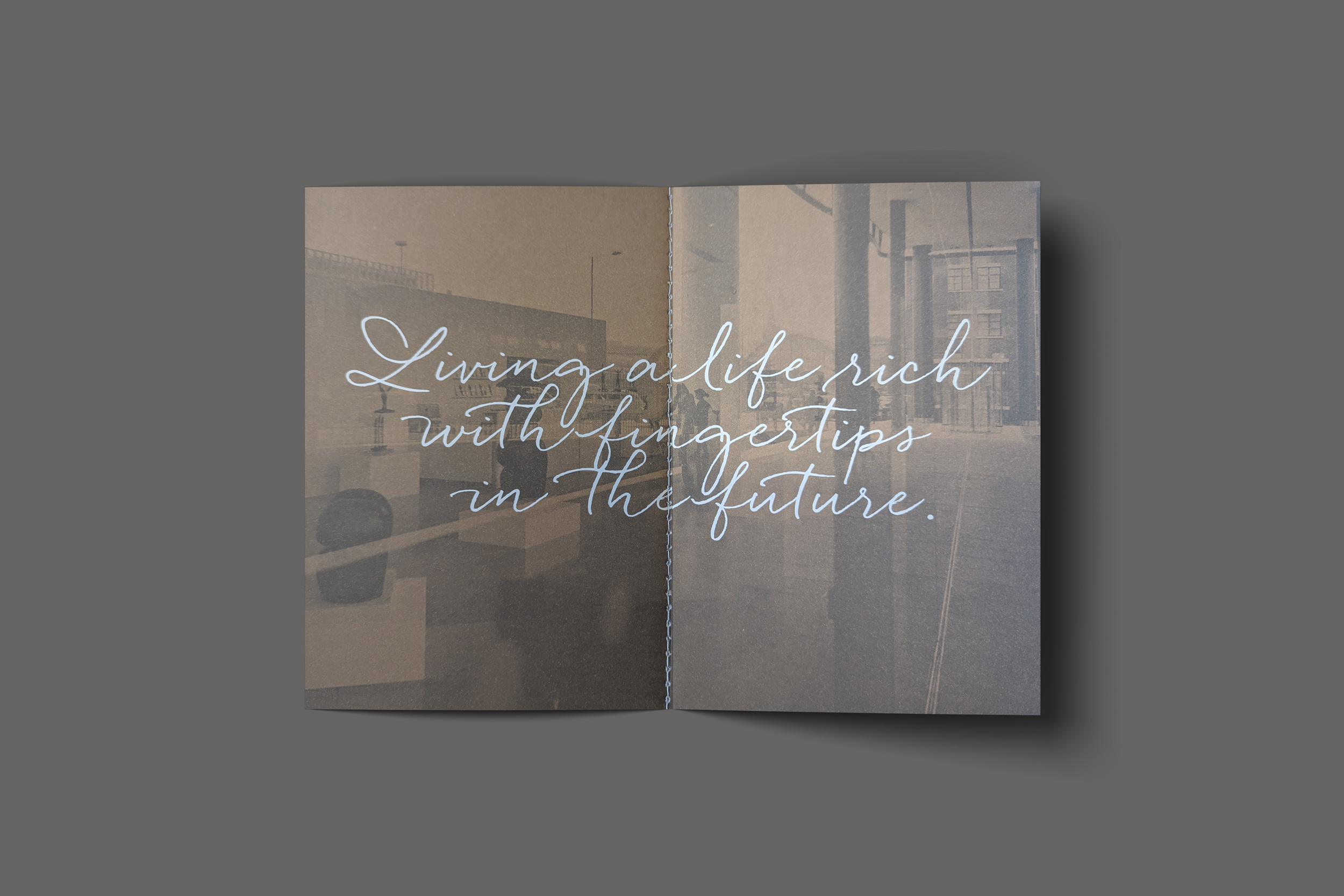
Specialist paper stocks, refined finishes and considered print techniques brought a sense of quality and permanence to every piece. Deep-toned Colorplan stocks provided a rich, sophisticated foundation, while spot UV detailing revealed subtle architectural forms as the materials caught the light.
A handwritten typeface introduced a more personal note, balancing the precision of the architecture with warmth and individuality.
Every detail worked together to reflect the development’s premium character, creating a distinctive and memorable experience for prospective buyers.
An iconic development, captured in print
Gasholders is a building defined by contrasts: heritage and innovation, industrial structure and refined interiors, history and a new chapter for King’s Cross.
Our approach embraced those contrasts, creating a suite of materials that felt as distinctive and considered as the development itself – and helped turn an ambitious architectural vision into a place people wanted to call home.