Showcasing a global portfolio powering the energy transition.
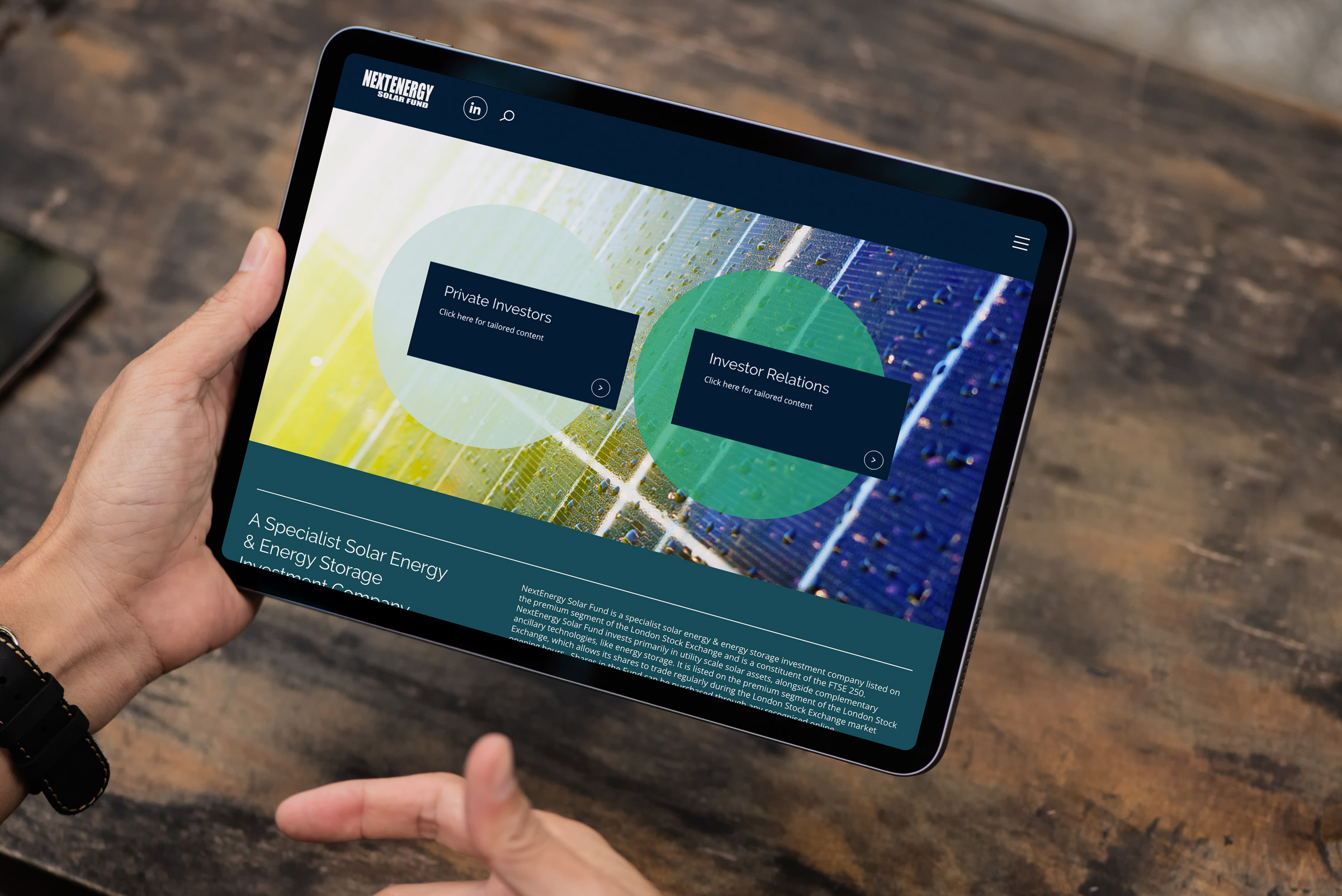
A clearer digital presence for a cleaner energy future
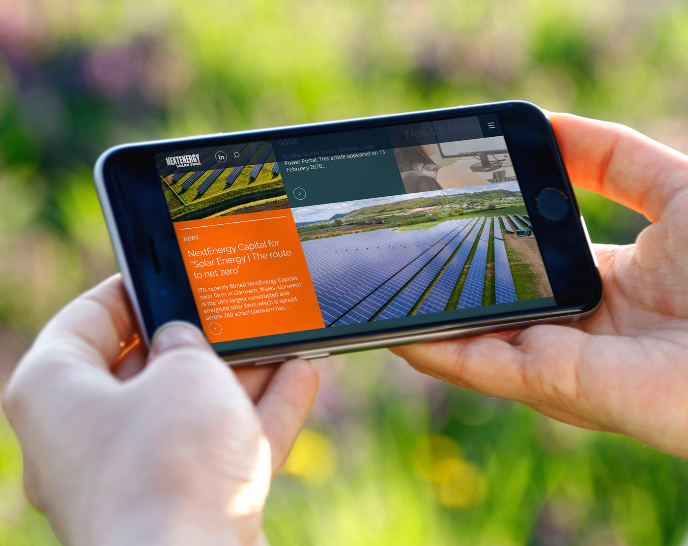
NESF supports the shift to clean energy by funding renewable energy projects. The redesigned website makes its purpose and strategy easier to understand, helping audiences explore its portfolio and access key information.
By presenting its performance, impact and approach more clearly, the site supports informed stakeholder engagement and demonstrates NESF’s contribution to a lower-carbon energy system.
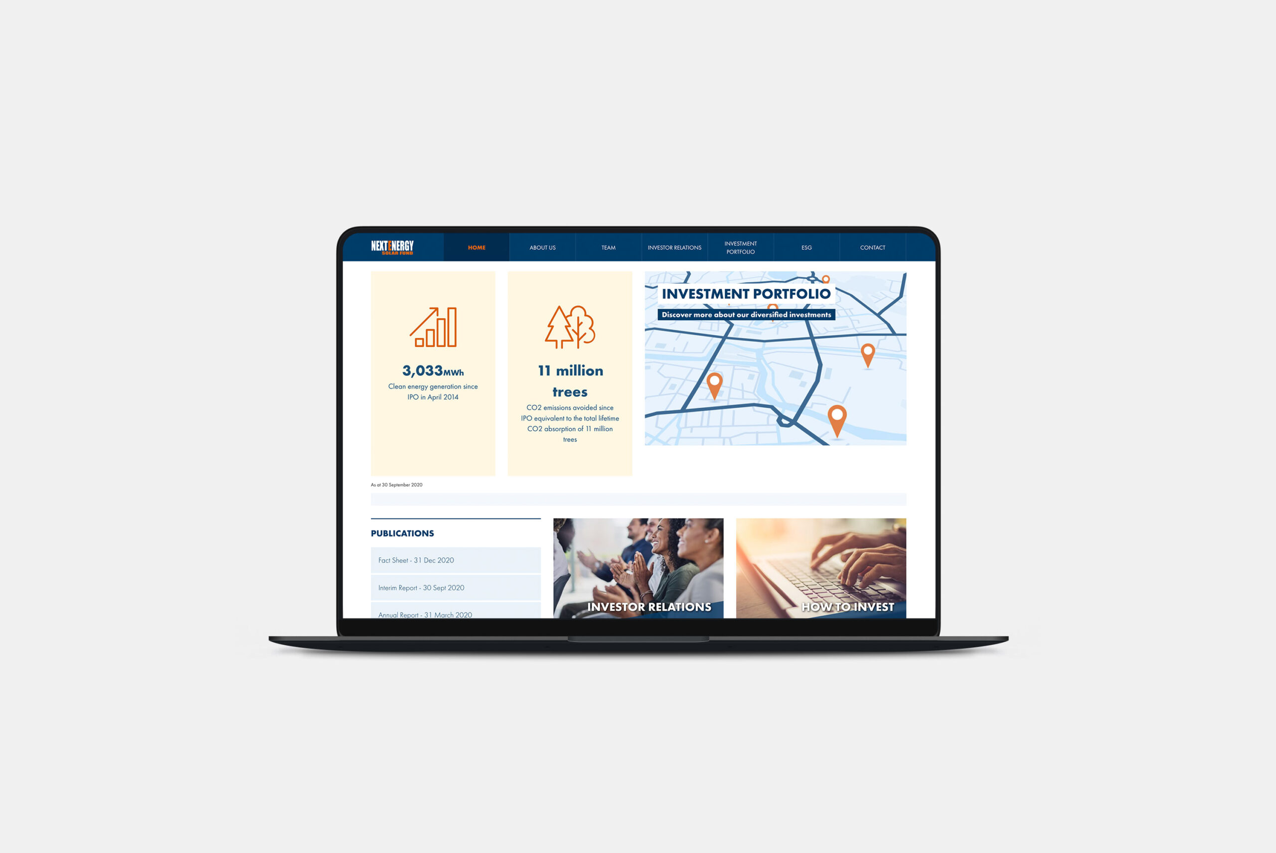
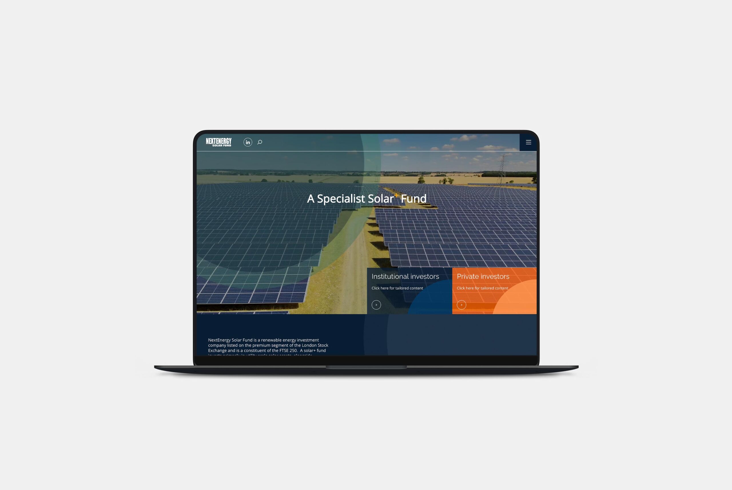
Following consultation with key members of the NESF team, the website’s core objectives were established: to create a more contemporary digital presence, showcase its global renewable energy assets and communicate investment opportunities more clearly. A review of the existing brand identified opportunities to modernise its visual language while retaining recognisable elements and aligning the identity with NESF’s evolving ambitions.
Designed around investor needs
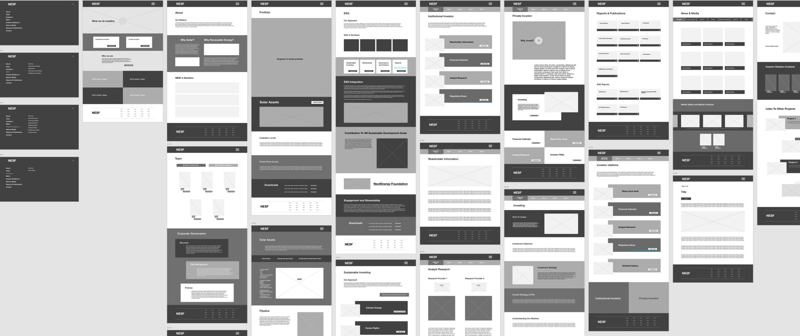
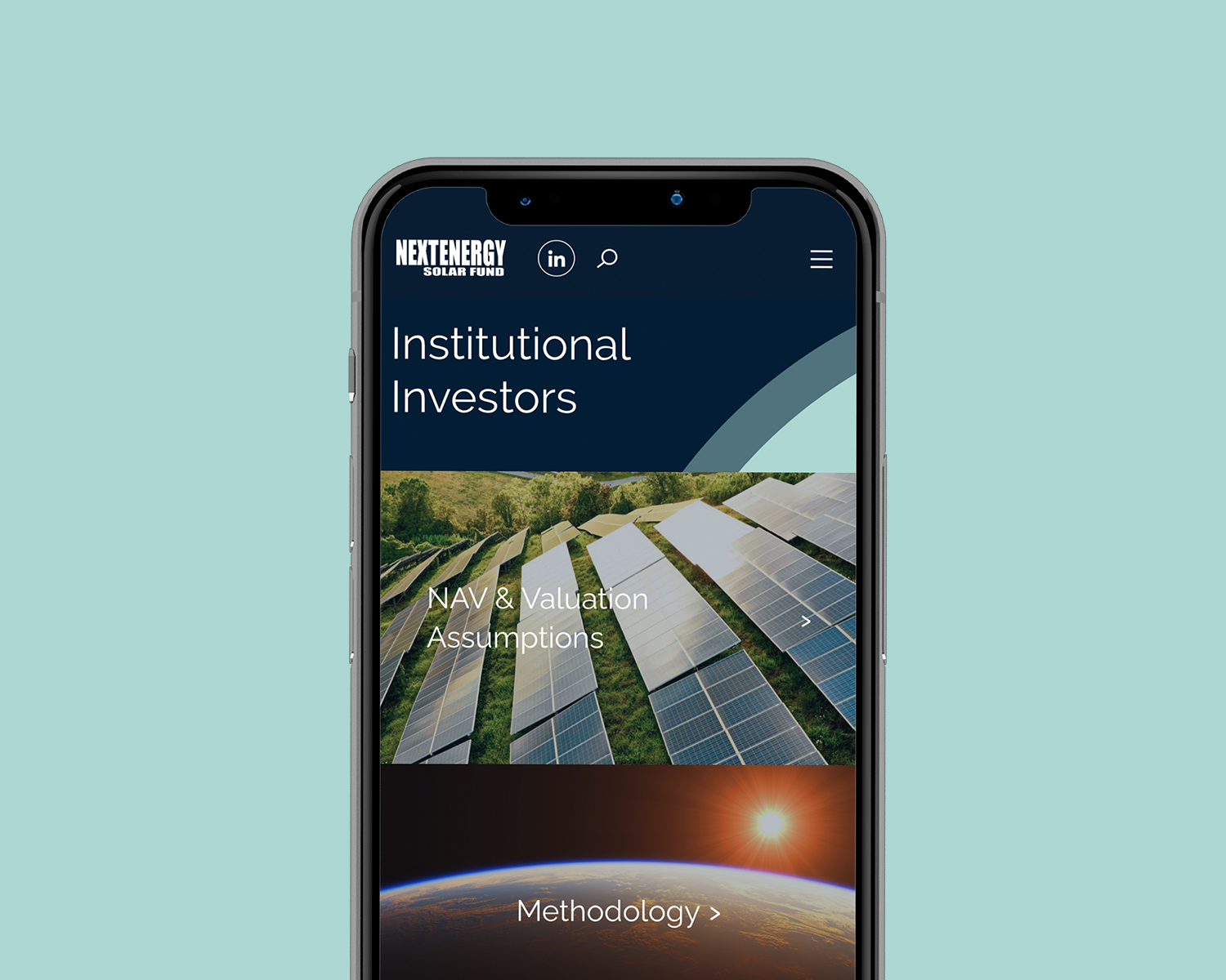
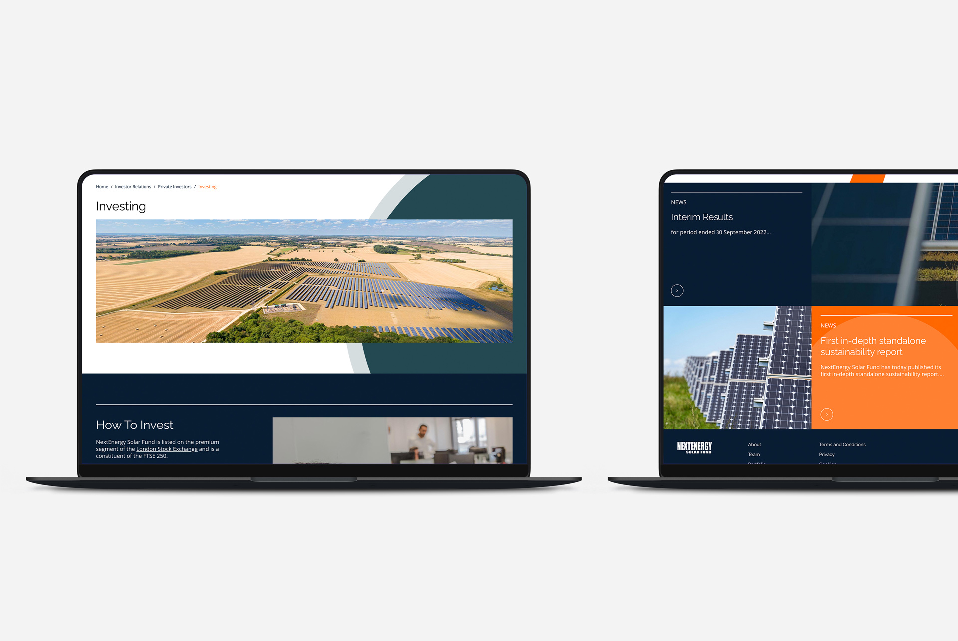
With distinct audiences and complex information to navigate, understanding user needs was central to the website’s structure. Dedicated landing pages were developed for institutional and private investors, each with tailored content and in-section navigation. This makes relevant information easier to find, helping visitors move through the site more intuitively and engage with the opportunities most relevant to them.
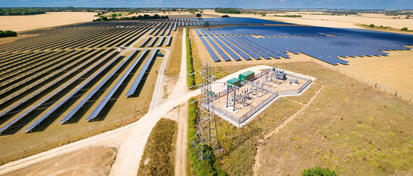
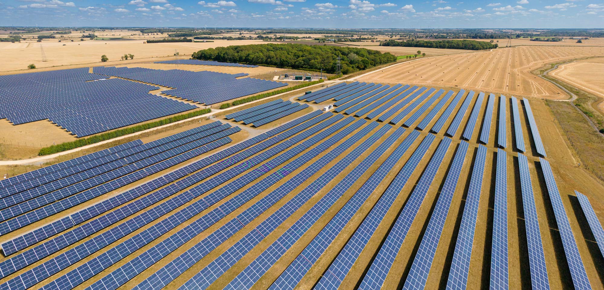
A commissioned video shoot at one of NESF’s solar sites provided the homepage hero footage, giving visitors an immediate sense of the organisation’s work. Showcasing a live site brings NESF’s renewable energy activity to the forefront, creating a more tangible connection between its investment proposition and its real-world contribution to the energy transition.

Evolving the brand
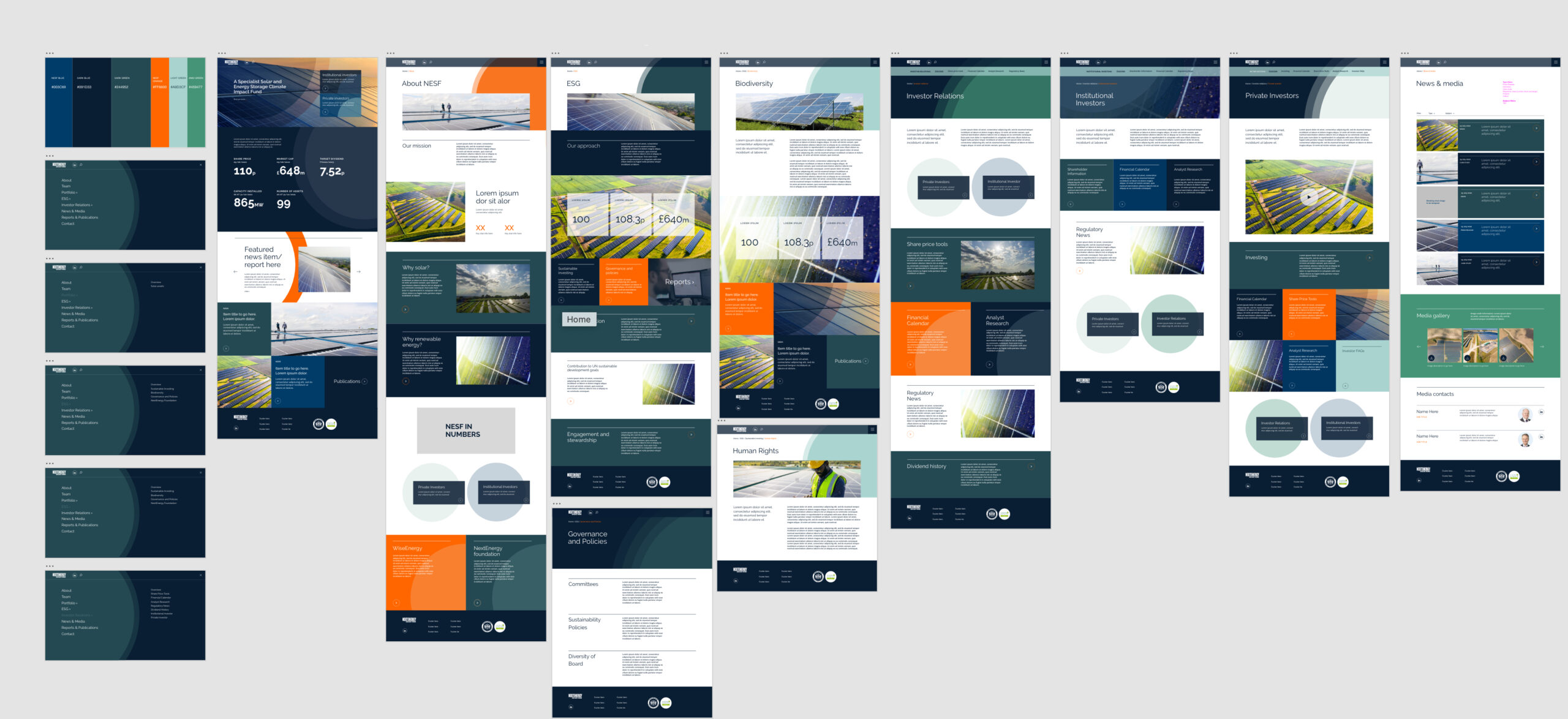
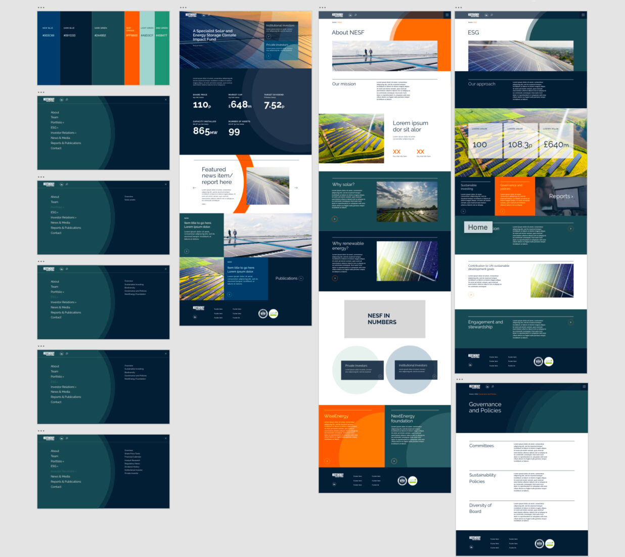
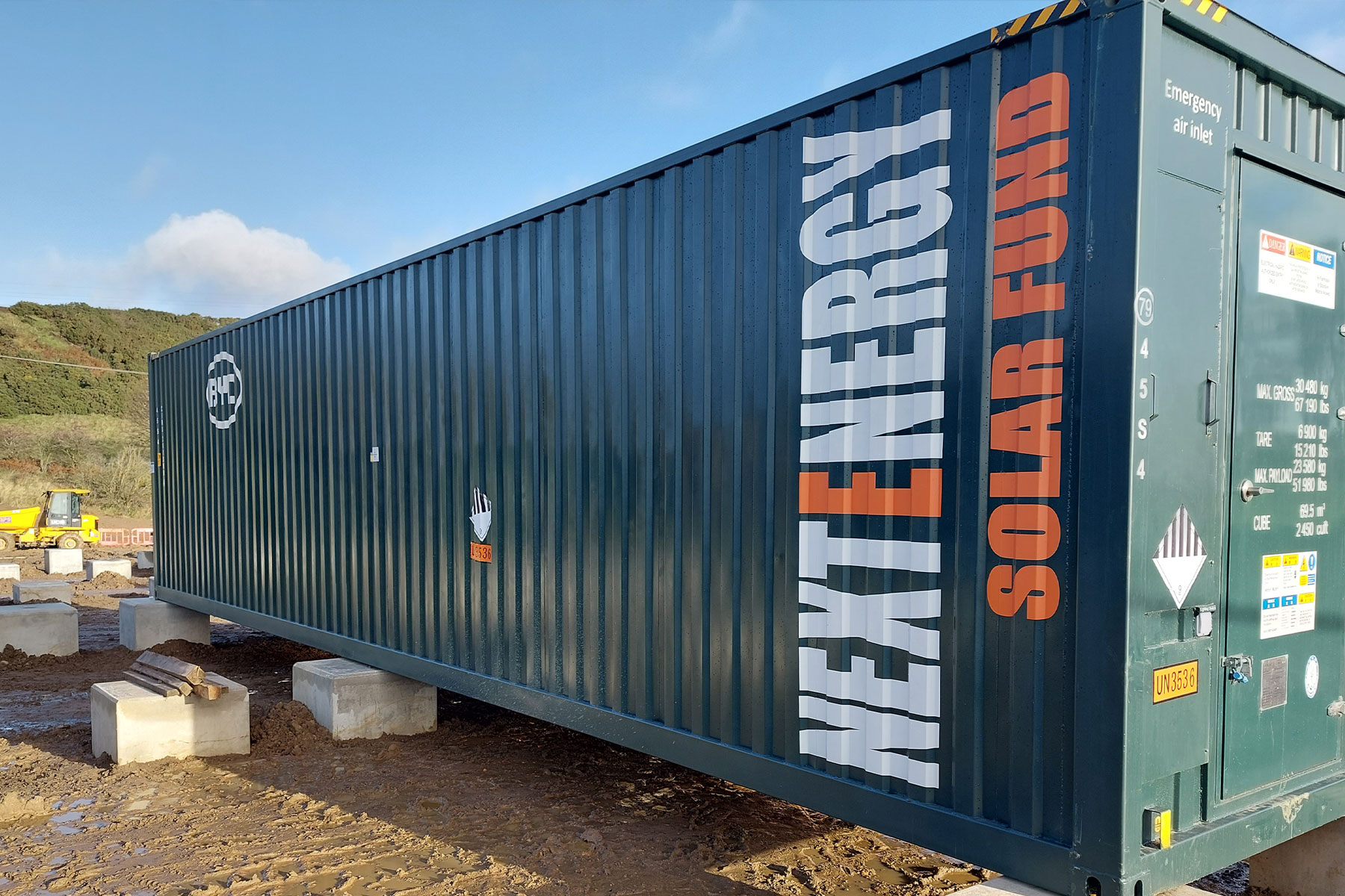
The refreshed visual identity builds on familiar brand elements while introducing a more contemporary design language. A refined colour palette, updated typography and a distinctive layered-circle motif create a cohesive system that works across the website and wider communications.
A deeper navy gives the established core orange greater contrast and impact, while a spectrum of greens reinforces NESF’s commitment to sustainability. Together, the colours balance financial credibility with a clear connection to clean energy.
Raleway, an elegant sans-serif typeface, brings clarity and confidence to headings and prominent statements. Inspired by solar energy, the layered-circle motif adds a distinctive visual signature. Its flexible use across imagery, colour combinations and crops creates a dynamic design element that brings consistency while allowing the brand to adapt to different content and contexts.


Making complex information accessible
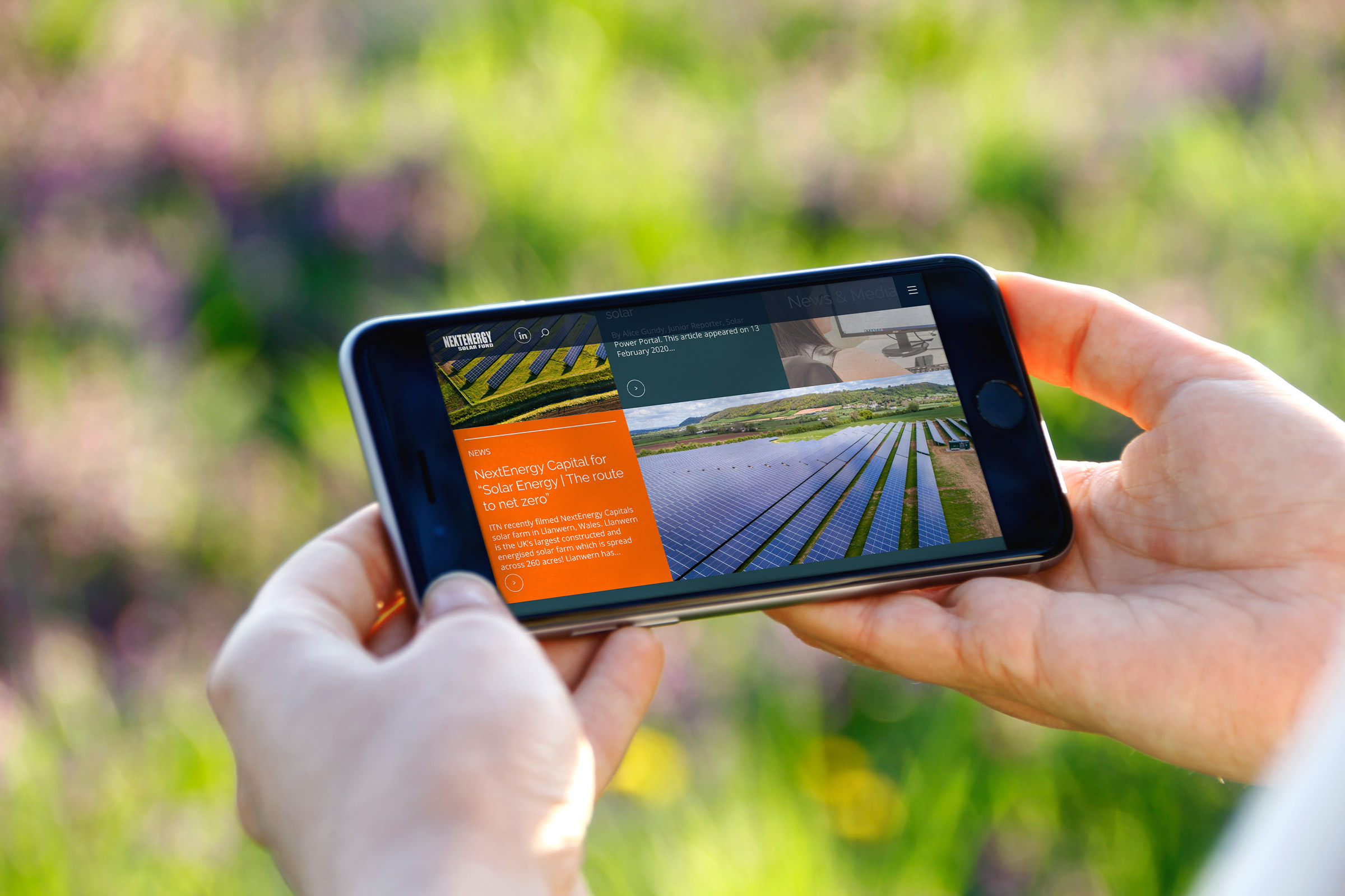
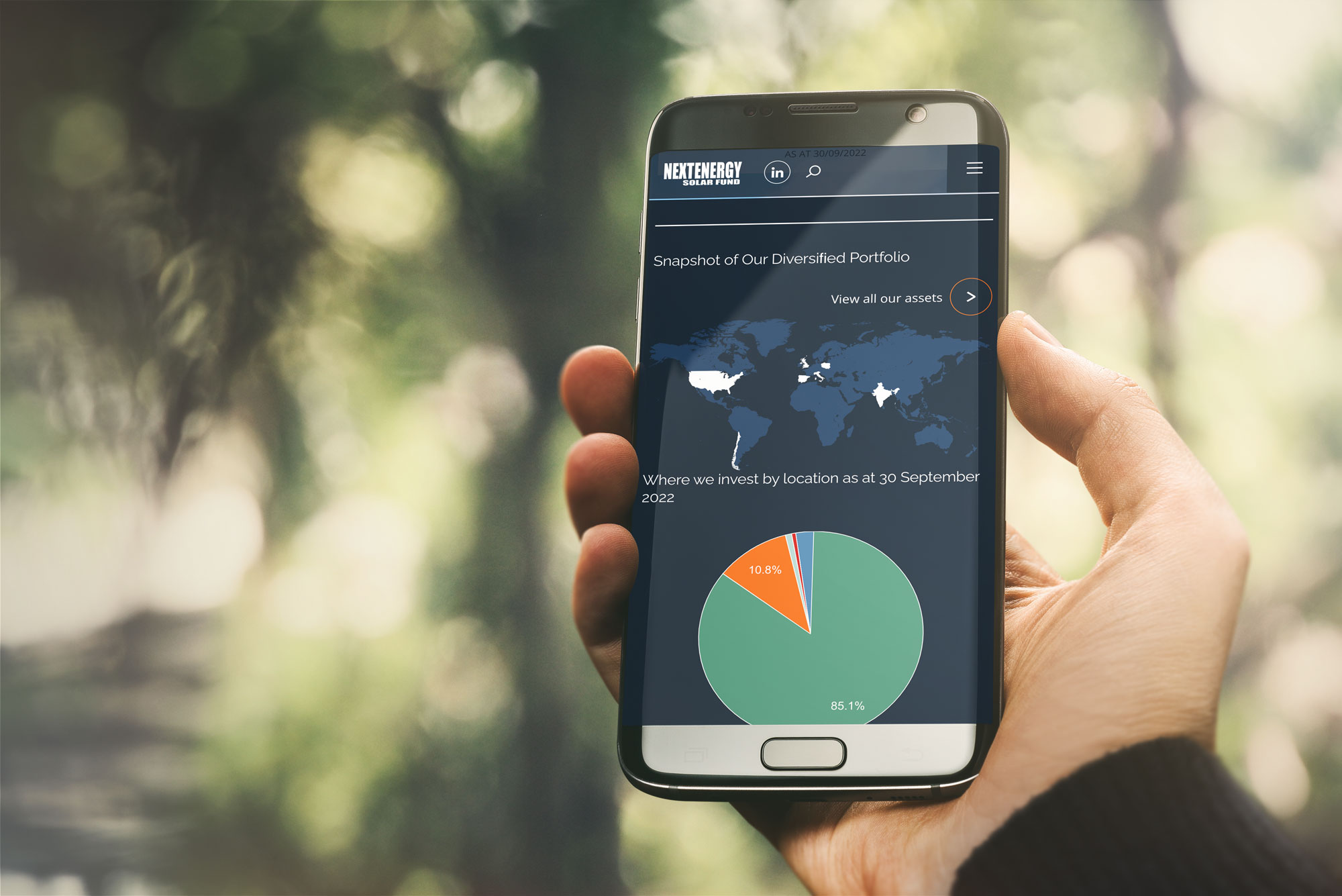
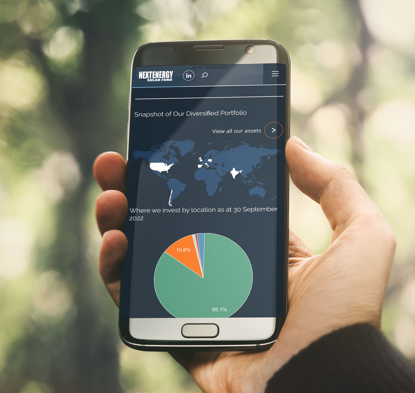
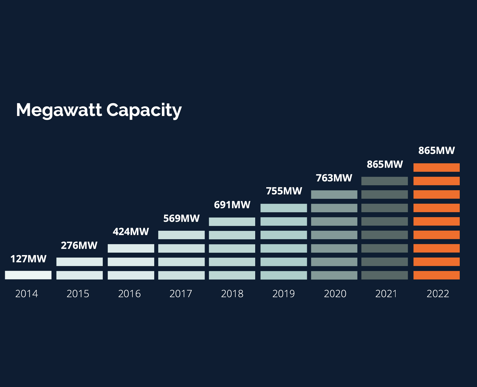
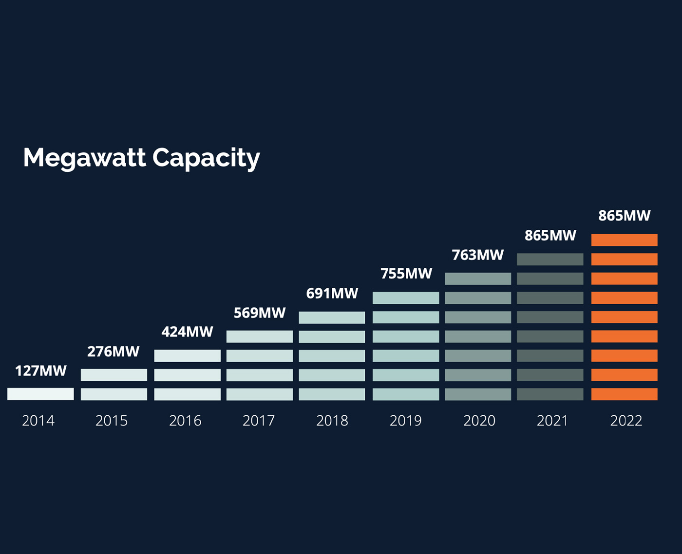
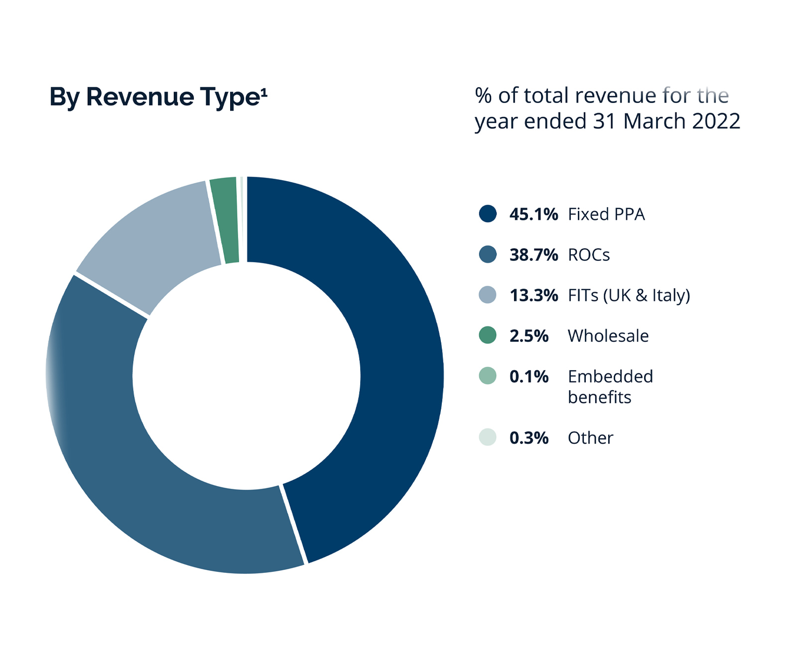
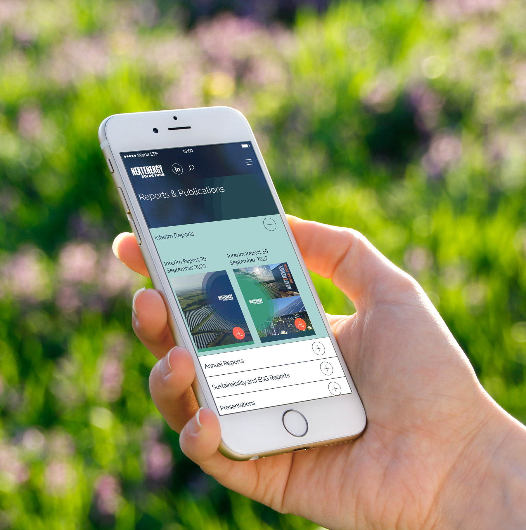
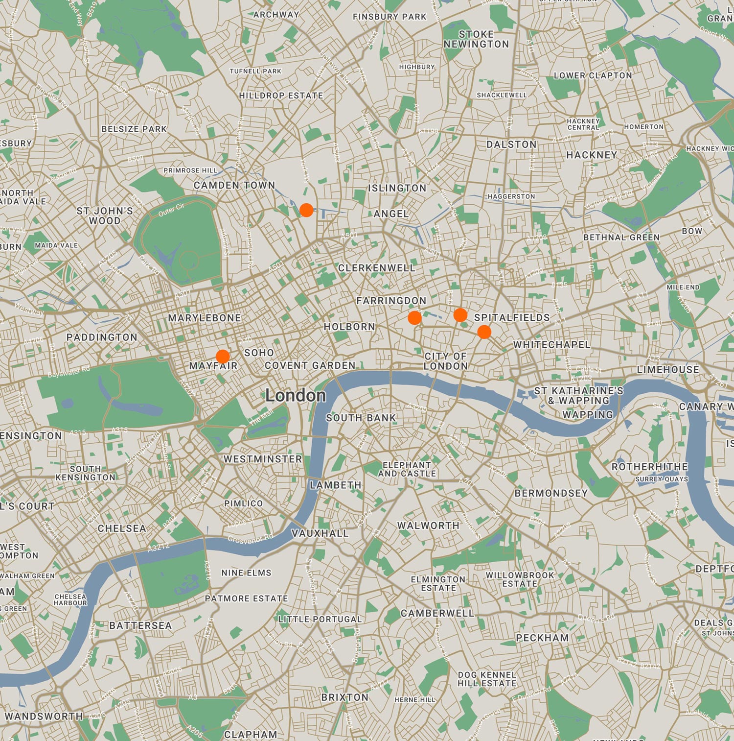
With a global audience and detailed financial information to communicate, the website uses infographics, maps and iconography to make key messages easier to understand. Financial graphs were designed to remain clear and legible across desktop and mobile, helping investors engage with performance data wherever they access the site. Interactive-style asset maps provide an at-a-glance view of NESF’s international portfolio, making the scale and geographical reach of its renewable energy investments easier to explore.
Visit website