Building a brand for sustainable futures.
For 25 years, Temple has been helping organisations navigate the relationship between development, the environment and sustainability.
Following growth and acquisitions, the consultancy had evolved significantly. Its brand needed to reflect the business Temple had become and its ambitions for the future.
We refreshed Temple’s identity and digital presence, bringing its people and expertise together under one confident brand while reflecting its collaborative approach to sustainable places.
Building the brand from within
For Temple, bringing its people on the journey was fundamental.
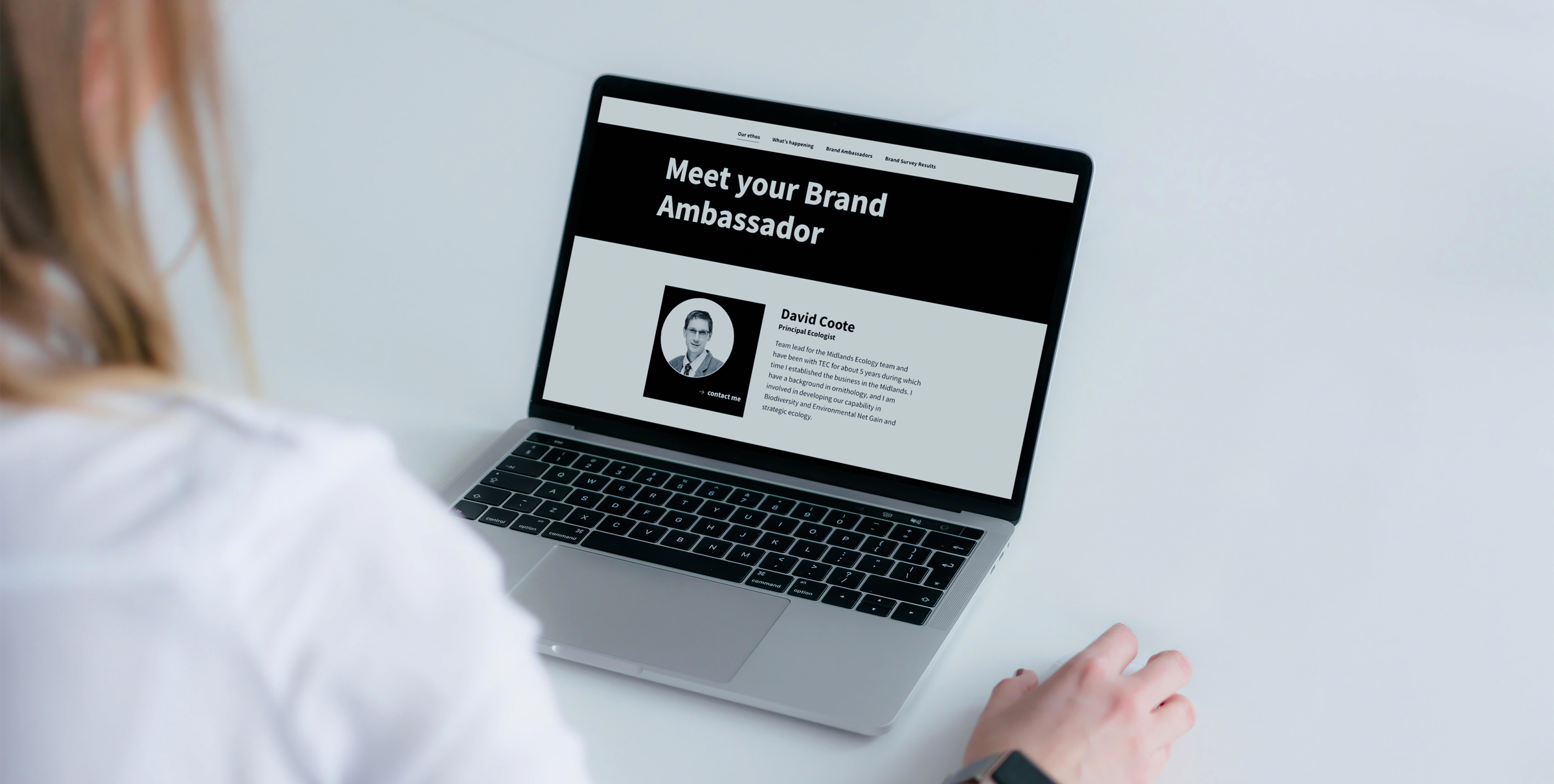
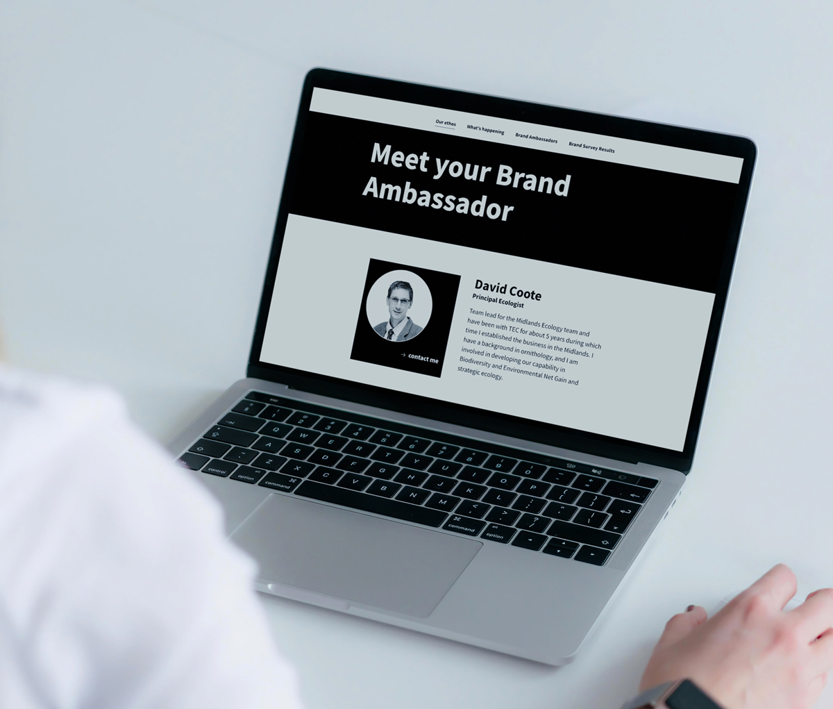
We created a dedicated brand microsite so the whole business could follow the project, contribute ideas and share experiences.
Workshops with staff explored everything from website structure to how different areas of expertise should be represented.
Brand ambassadors provided feedback and helped test ideas as the identity developed.
The result was a deeper understanding of how Temple’s people think, collaborate and work with clients.
Where the built and natural worlds meet
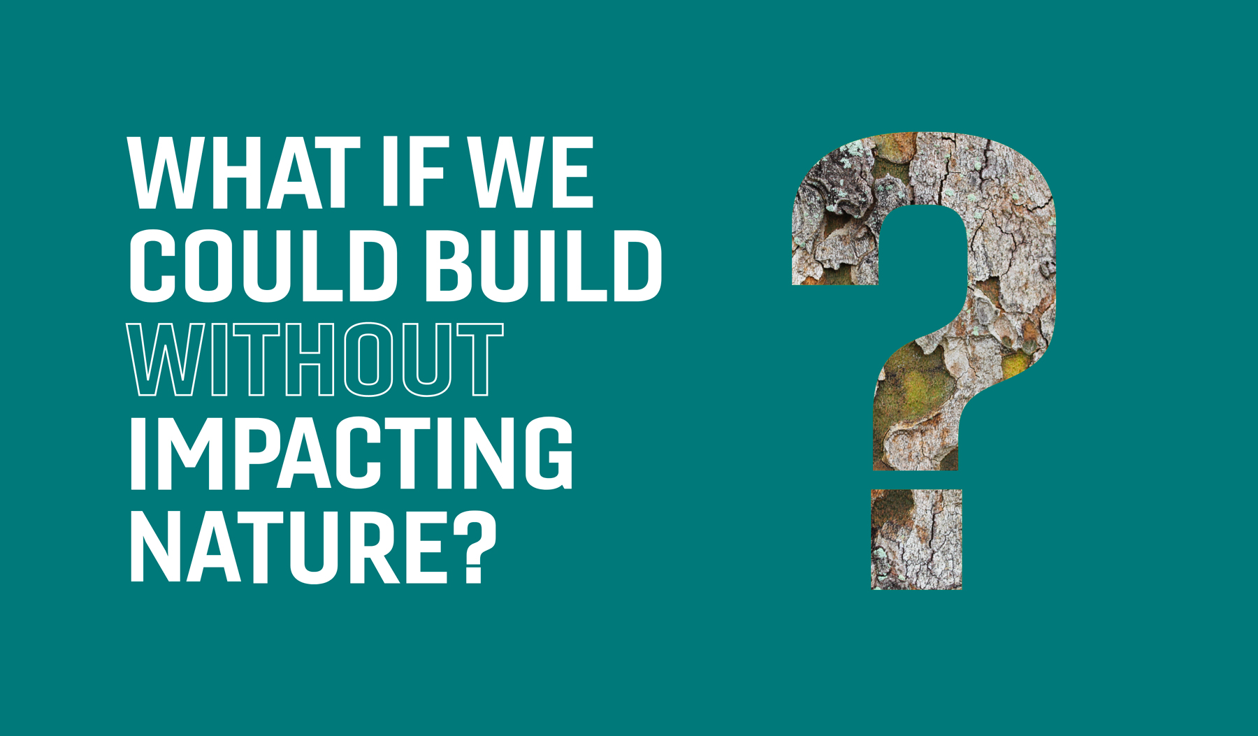
Temple operates where the built environment meets the natural world, so the brand needed to express that relationship.
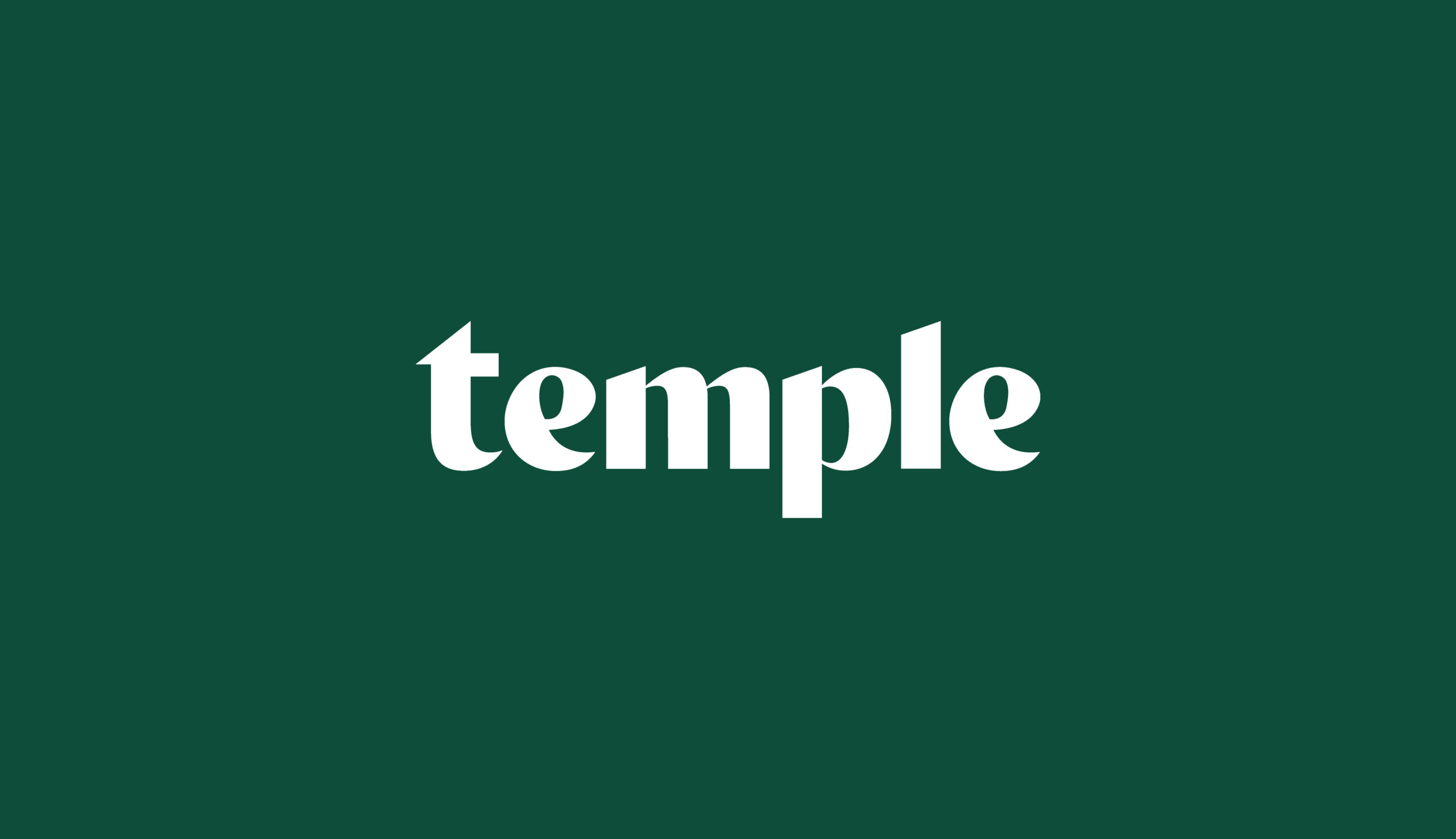
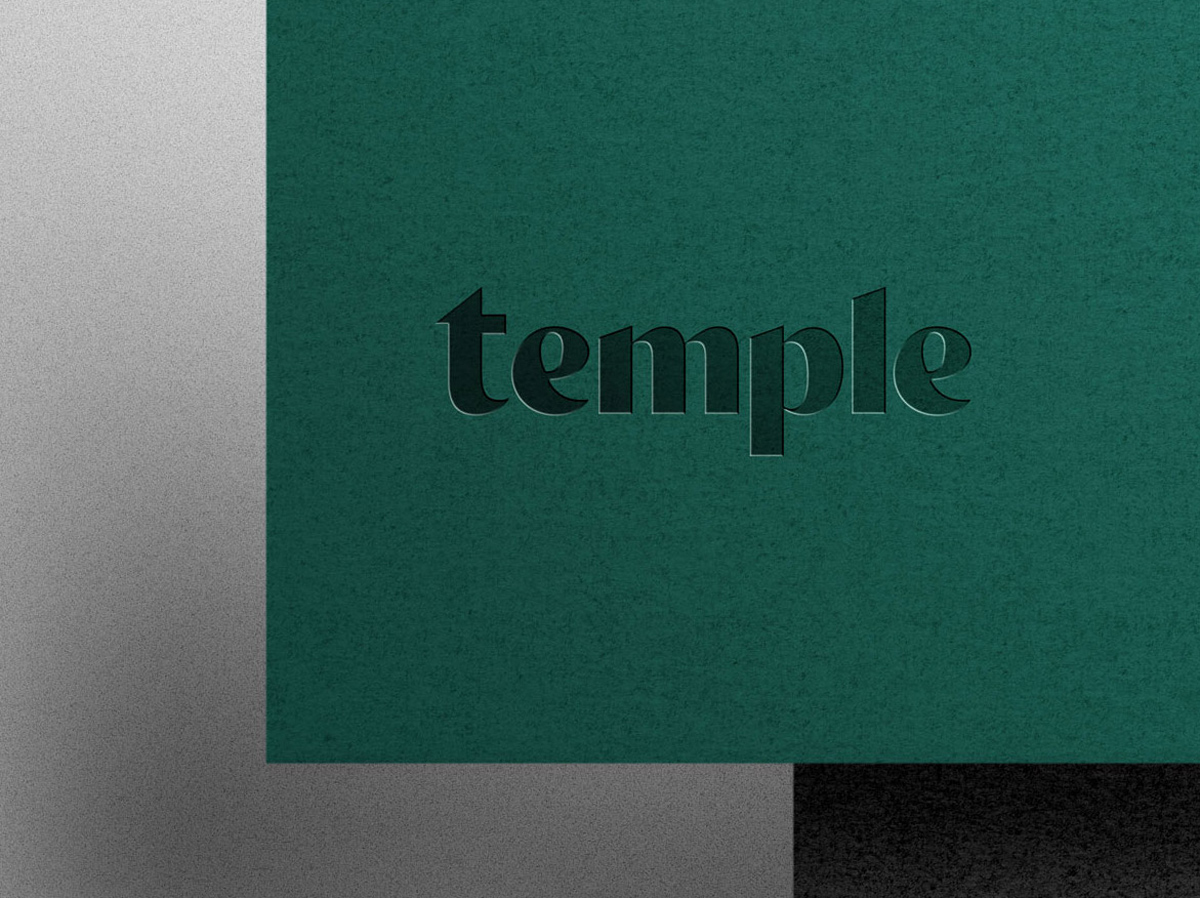
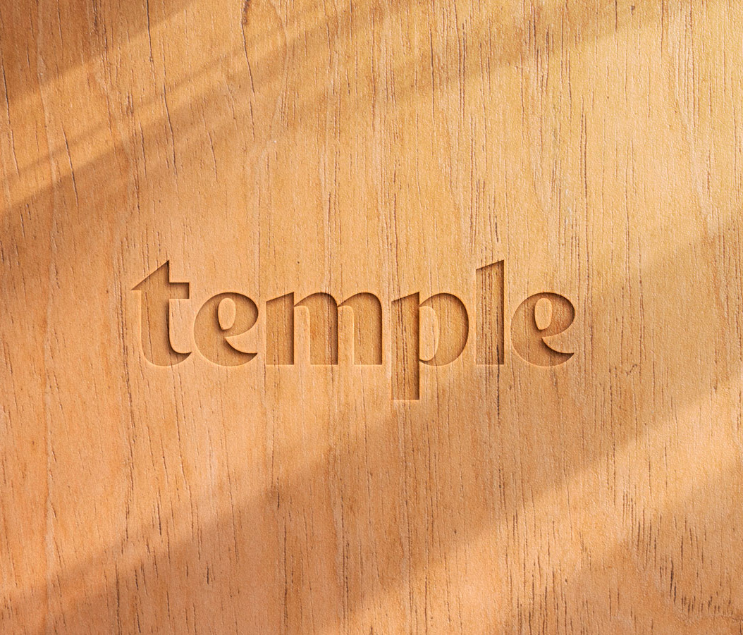
The new logo combines built-environment precision with softer organic forms inspired by nature, creating an identity that feels both technical and human.
We also evolved the name from Temple Group to simply temple. This introduced a more approachable and contemporary expression of the business.
Creating a flexible visual language
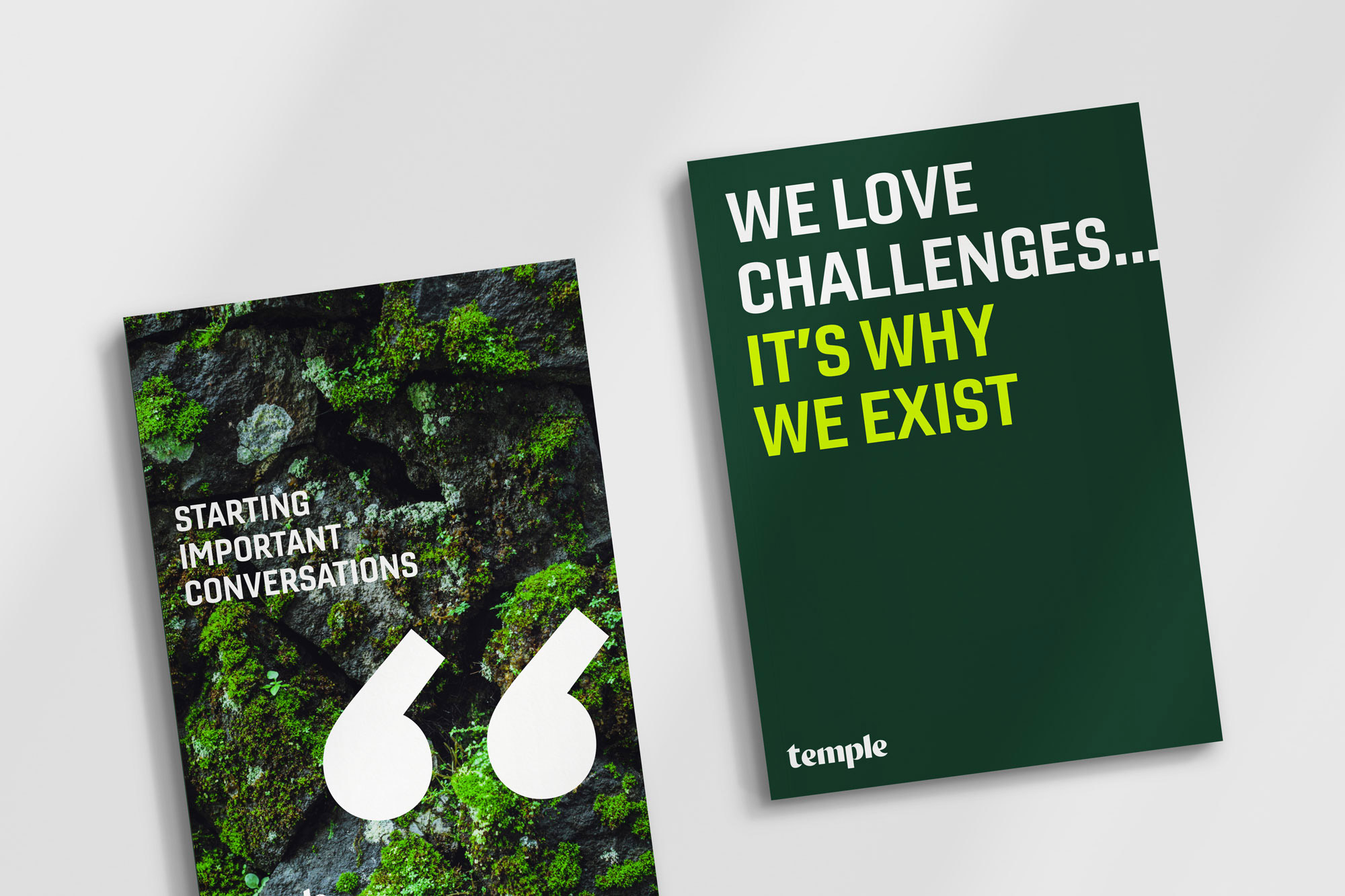
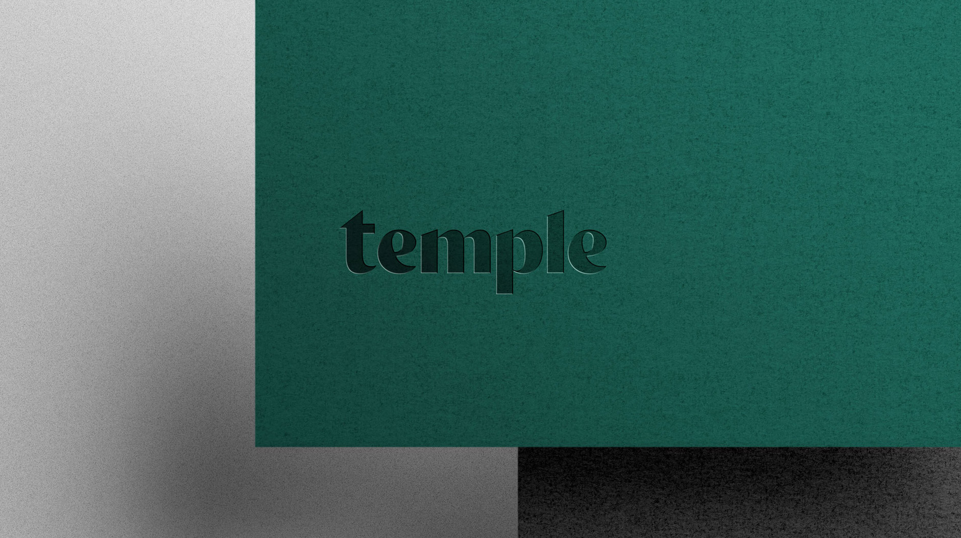
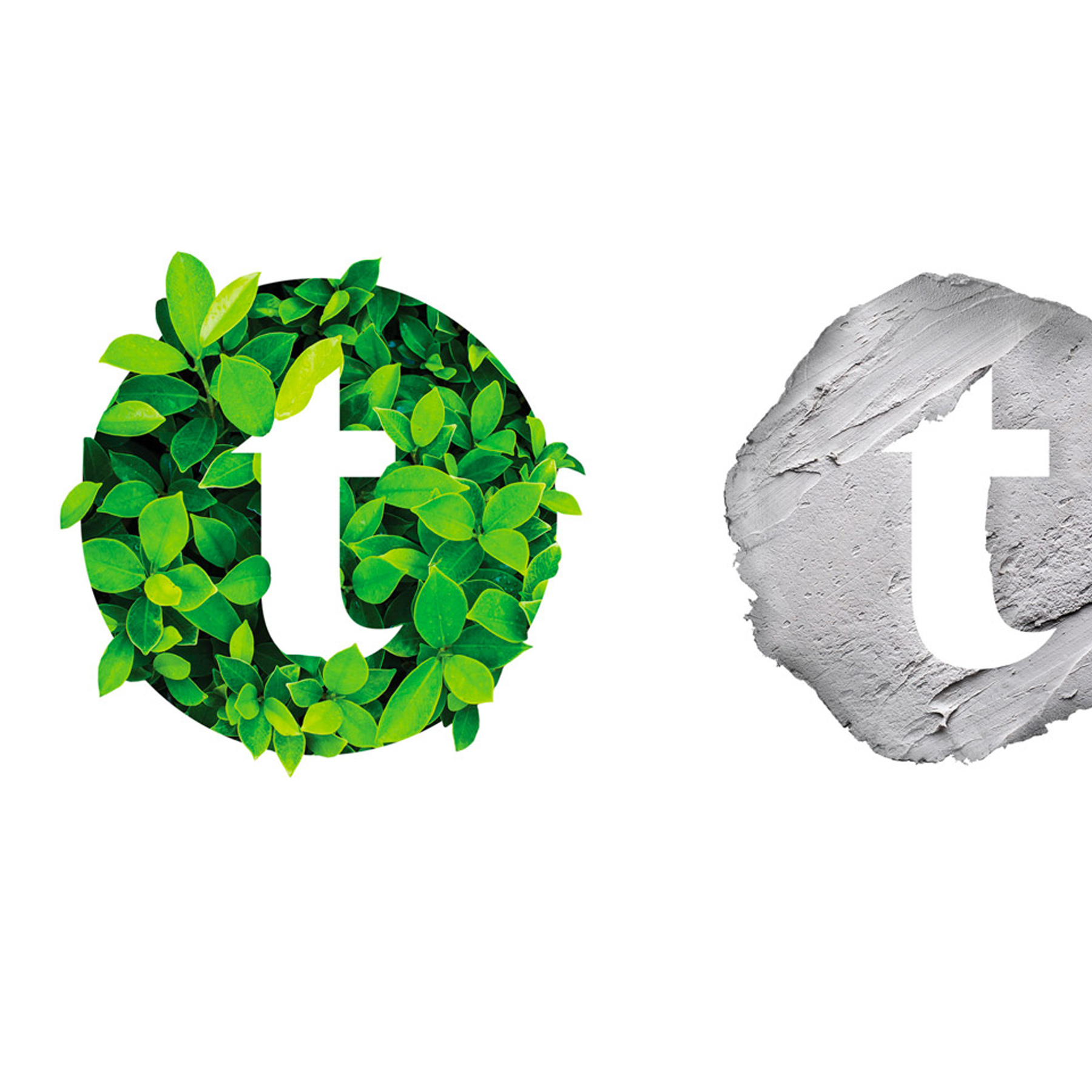
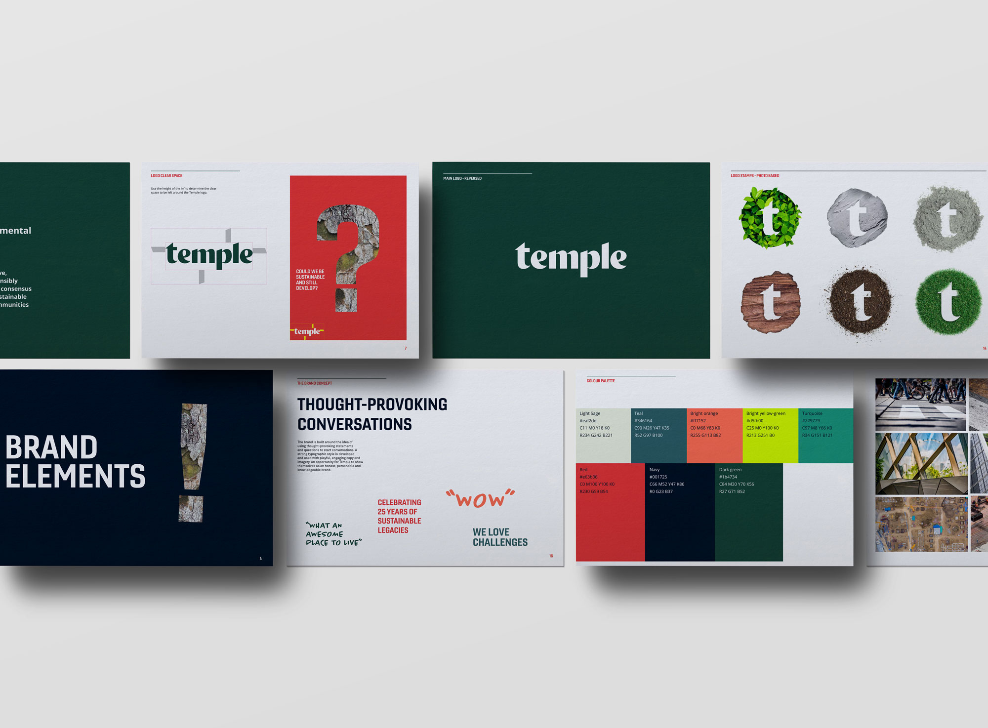
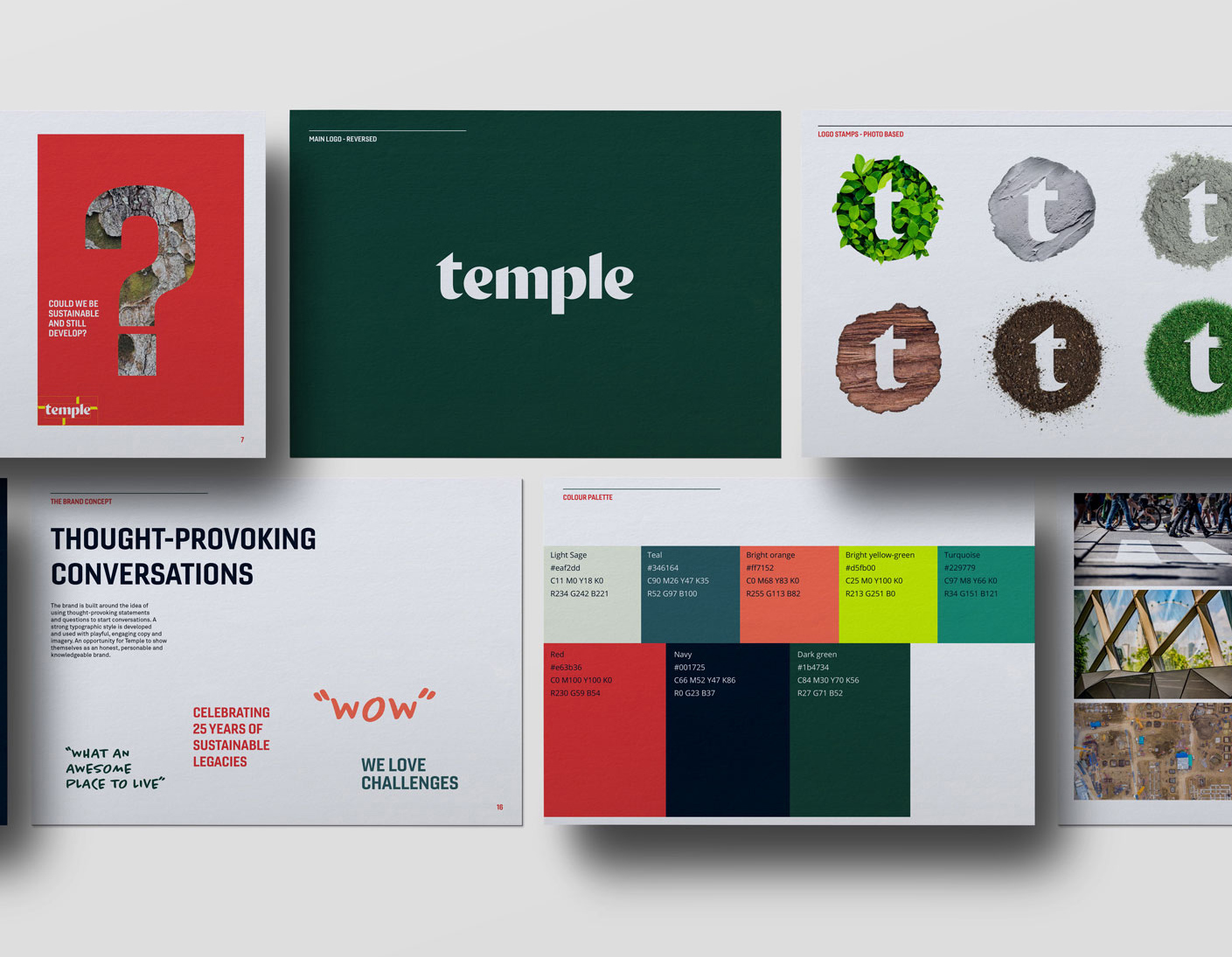
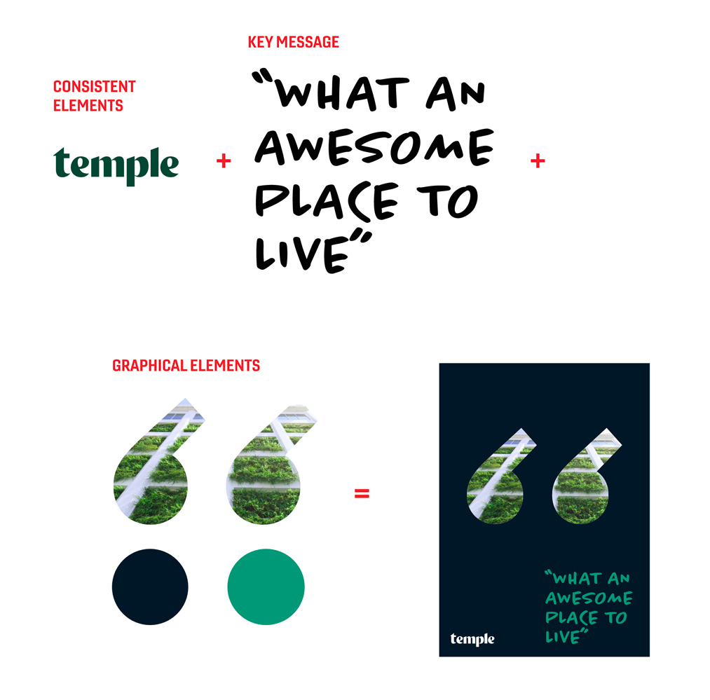
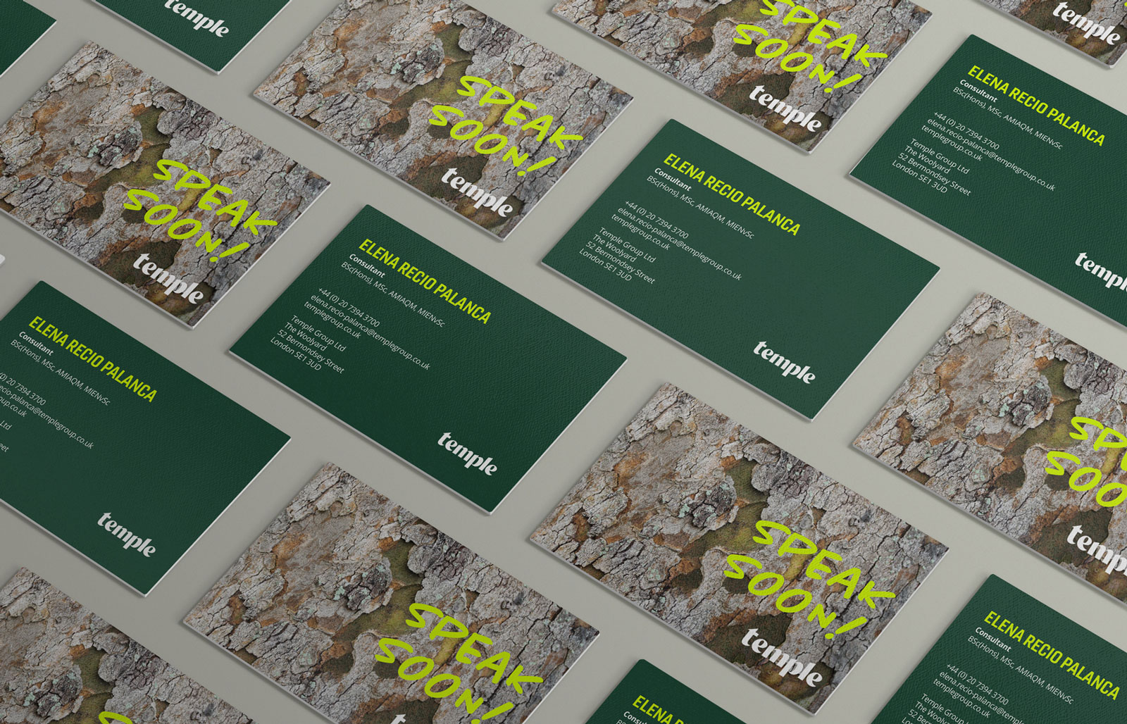
The logo’s ‘t’ became a series of secondary brand stamps, combined with textures inspired by the environments in which Temple works.
A flexible palette moves between sophisticated and playful tones, while imagery draws from the consultancy’s sectors, landscapes and materials.
Together, these elements create a brand that can feel authoritative or more expressive depending on the context.
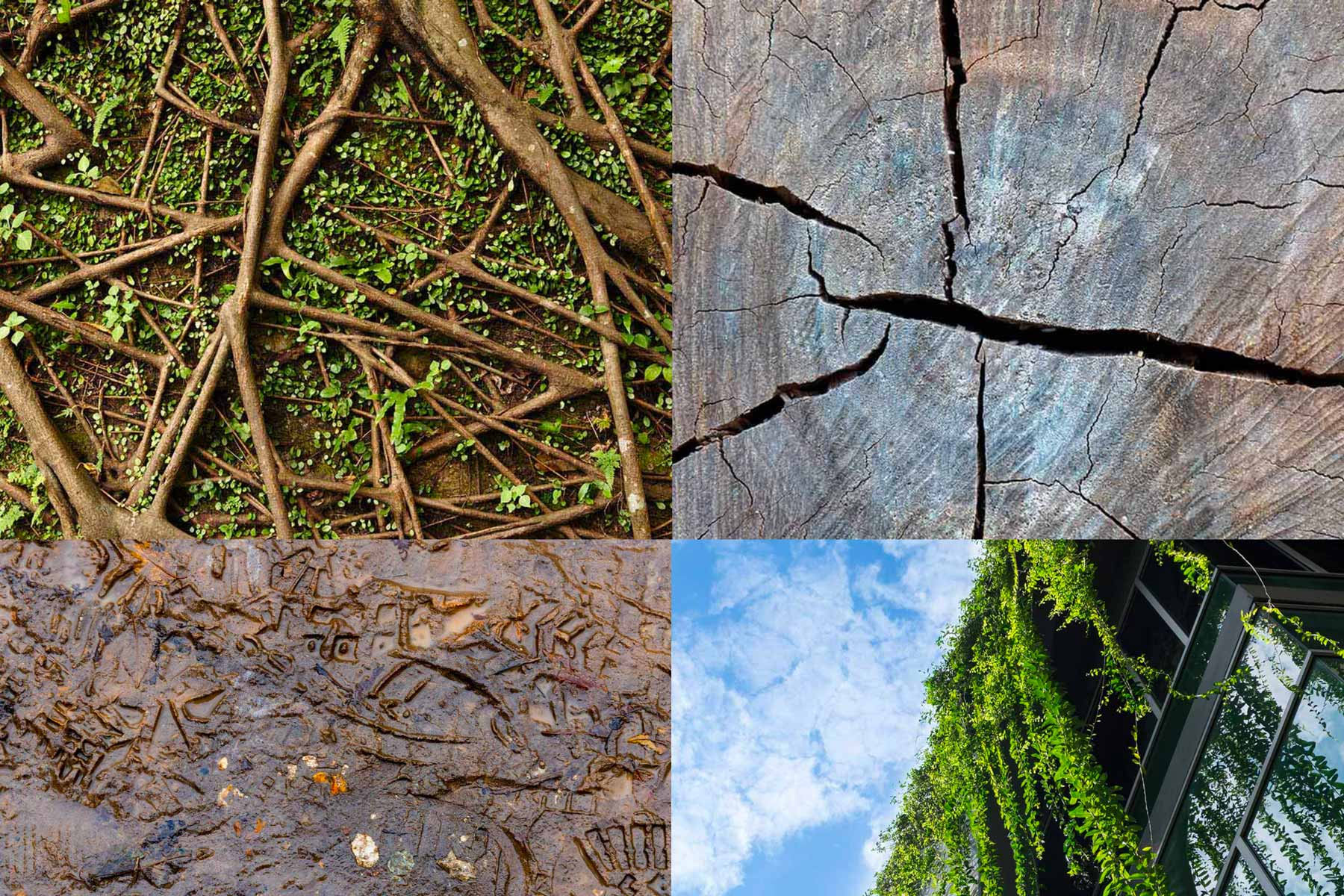
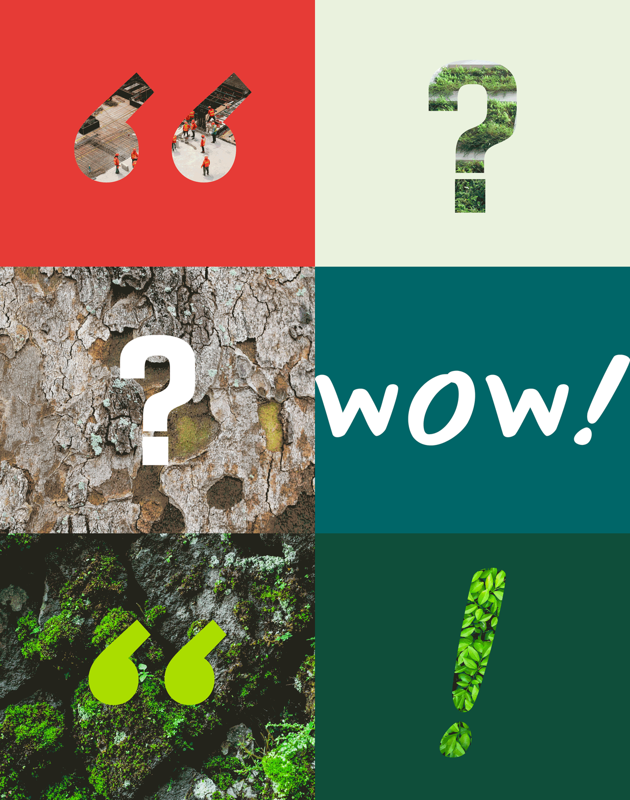
The imagery is inspired by the sectors and services Temple covers. Textures drawn from the materials Temple works with offer flexibility, allowing them to be used as standalone visuals or in combination with the conversational elements.
Giving the brand a voice
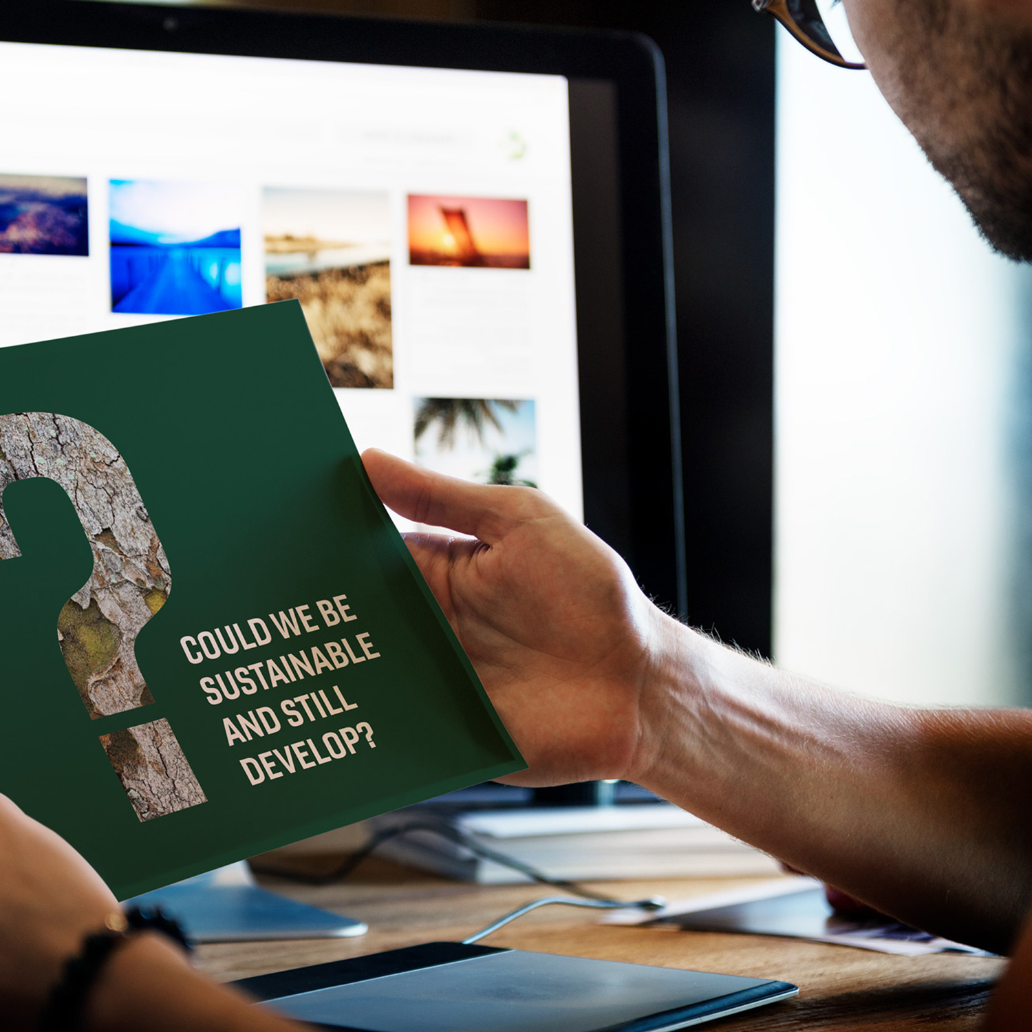
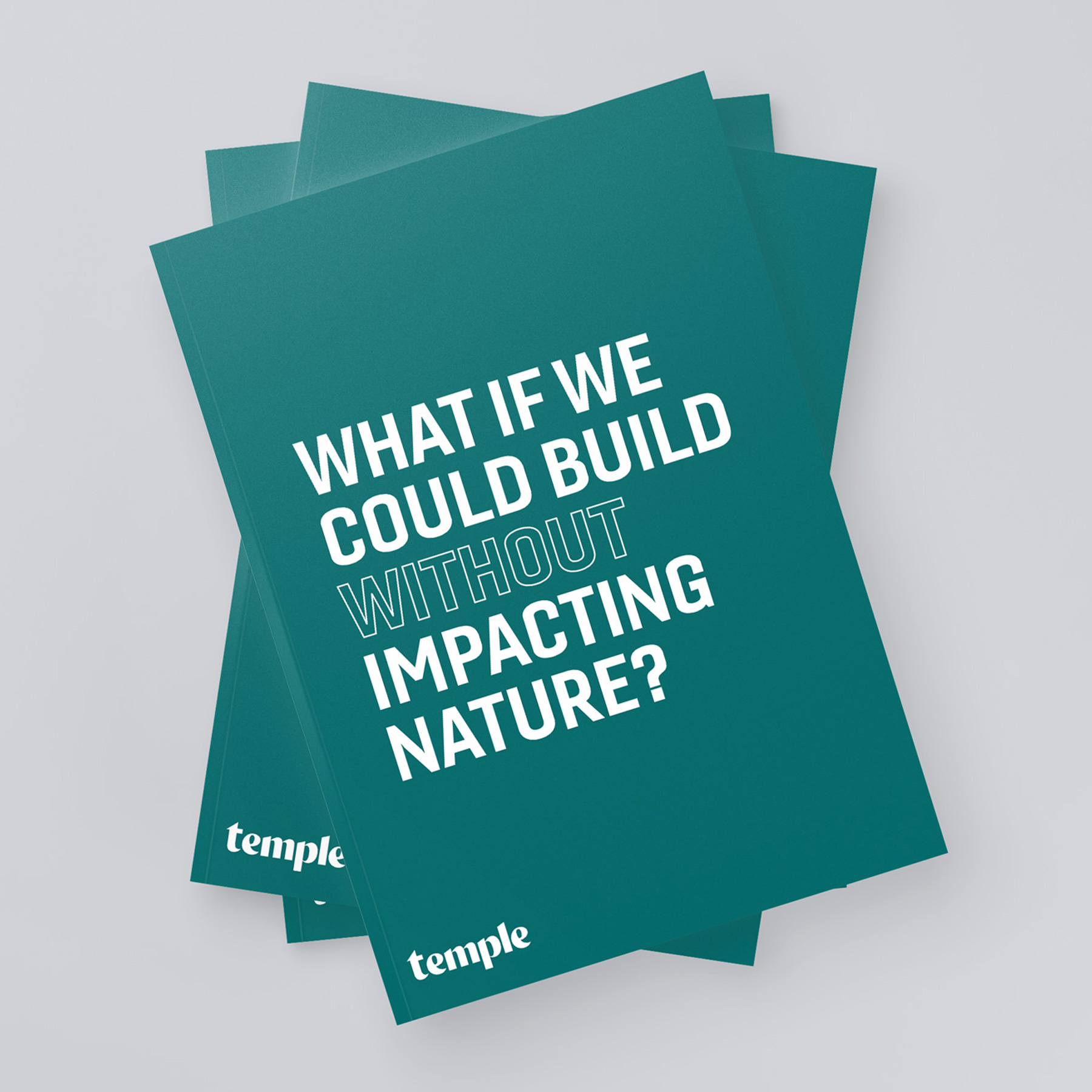
Questions and statements became an integral part of the identity, creating bold graphic moments while reflecting the way Temple works with its clients – listening, challenging and finding solutions together.
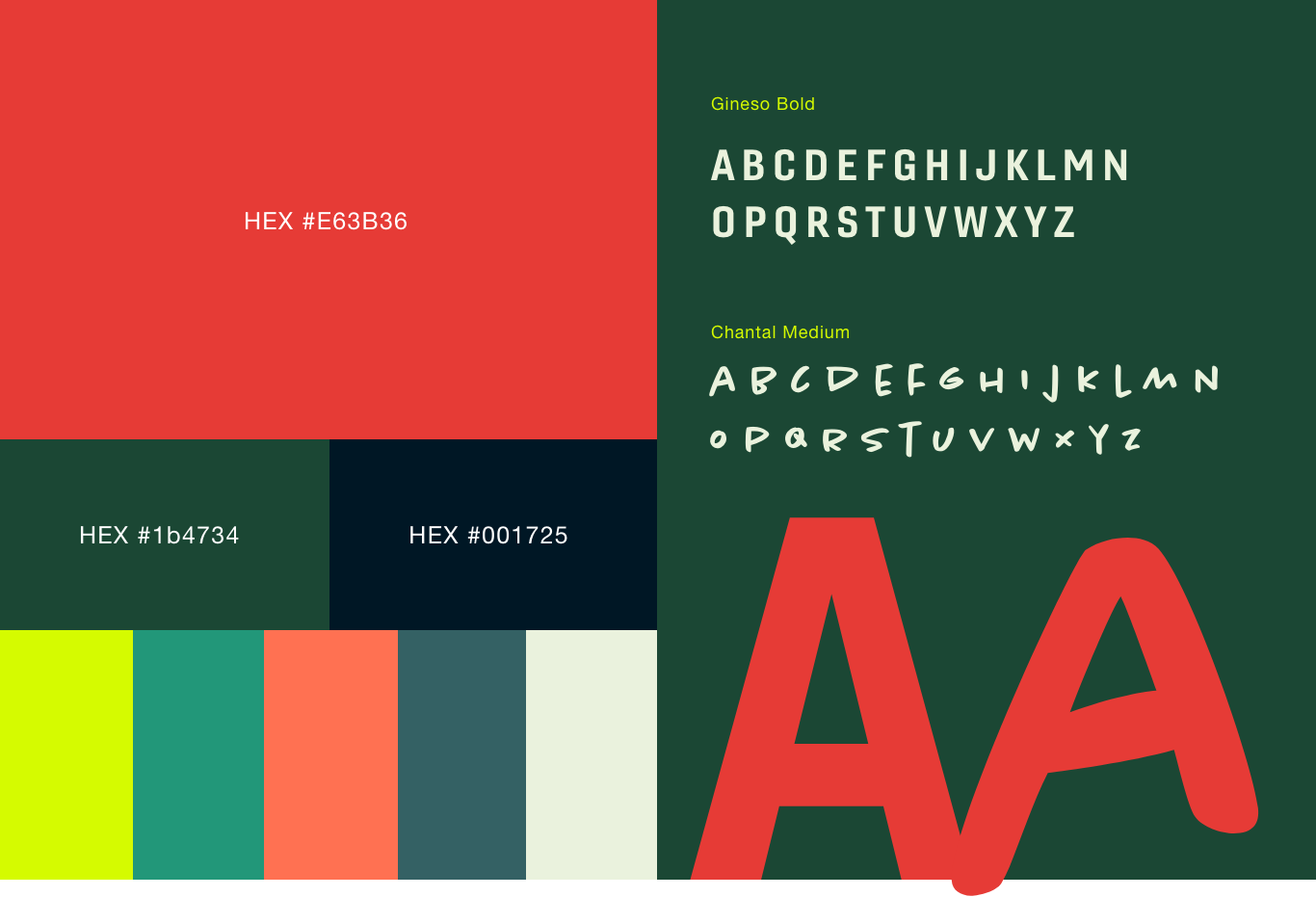
Two complementary typefaces allow the brand to shift naturally between conversation and statement, balancing approachability with authority.
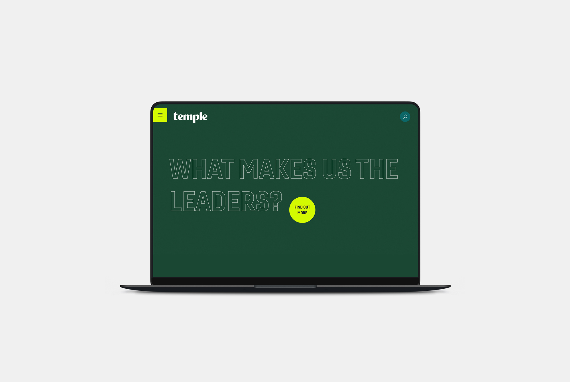
Bringing Temple together digitally
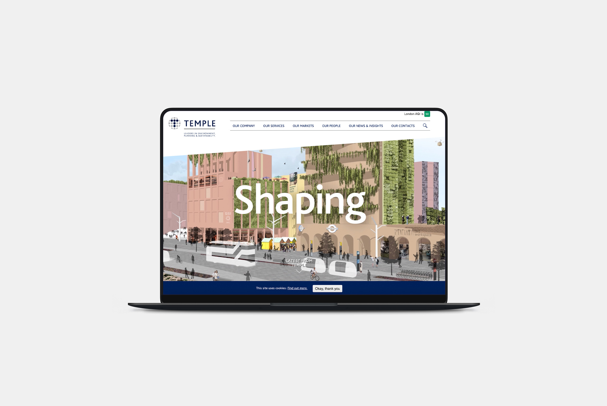
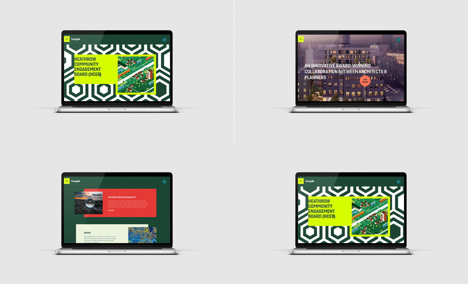
Staff workshops helped shape the website structure, giving individual disciplines space while making the breadth of Temple’s expertise easier to understand.
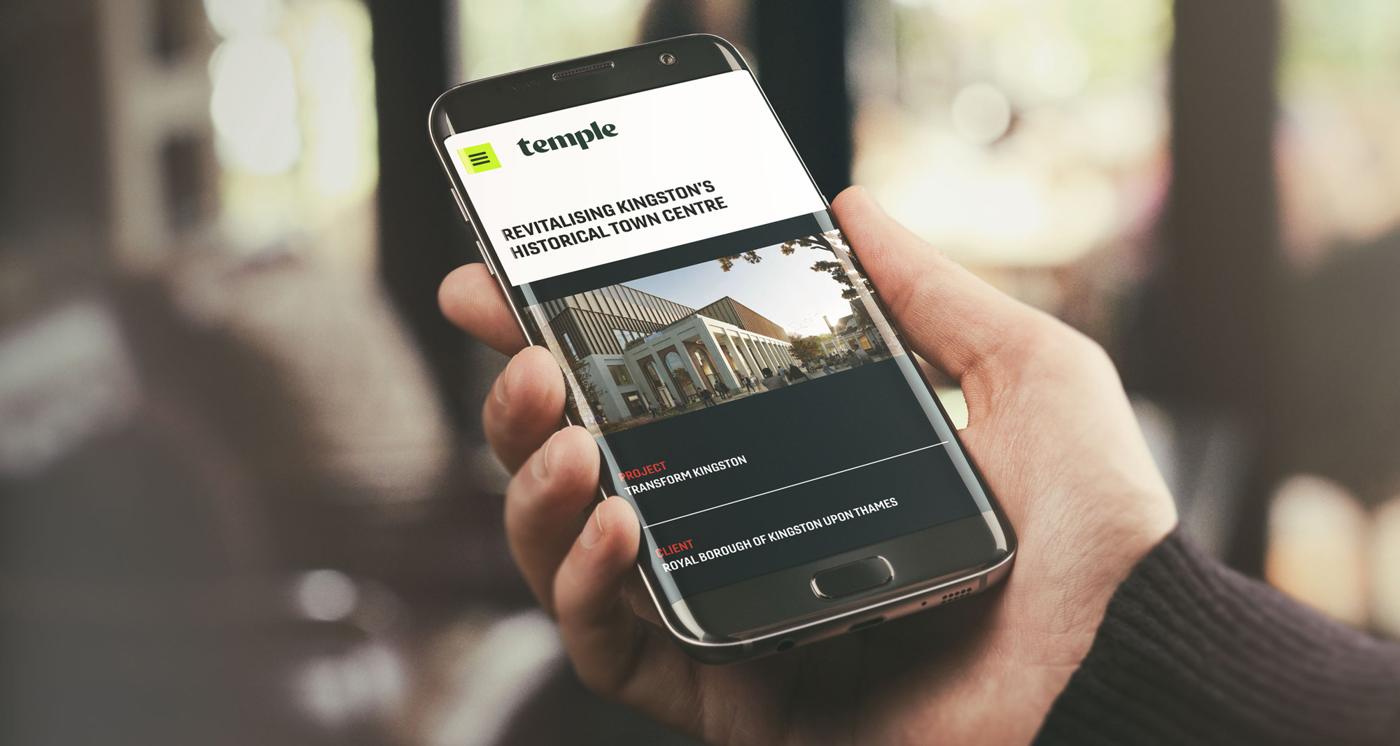
The visual language was translated into a flexible digital experience using typography, colour, imagery and the new graphic devices.
The result makes Temple’s expertise easier to explore while giving the business a stronger expression of who it is.


A brand designed to evolve
Temple needed an identity capable of bringing a growing organisation together while remaining flexible across audiences.
Confident but approachable, structured but flexible, the new brand reflects the balance between built and natural environments at the heart of Temple’s work and can evolve alongside the business.