Creating a new brand identity and website for one of Europe’s leading independent law firms.
Defined from the outset by a clear strategic focus and an entrepreneurial spirit, the firm needed a visual identity that reflected its ambition. Our role was to translate these defining qualities into a cohesive and compelling visual language.
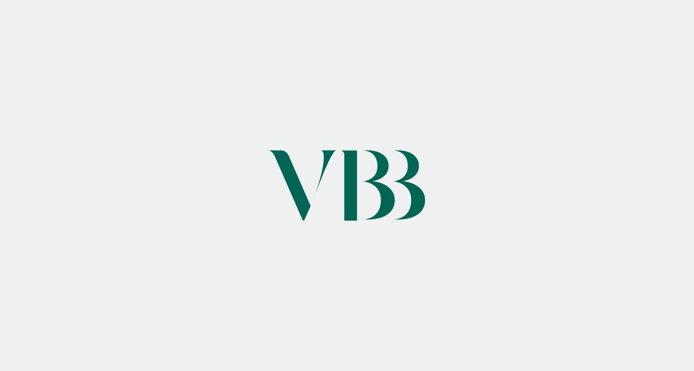
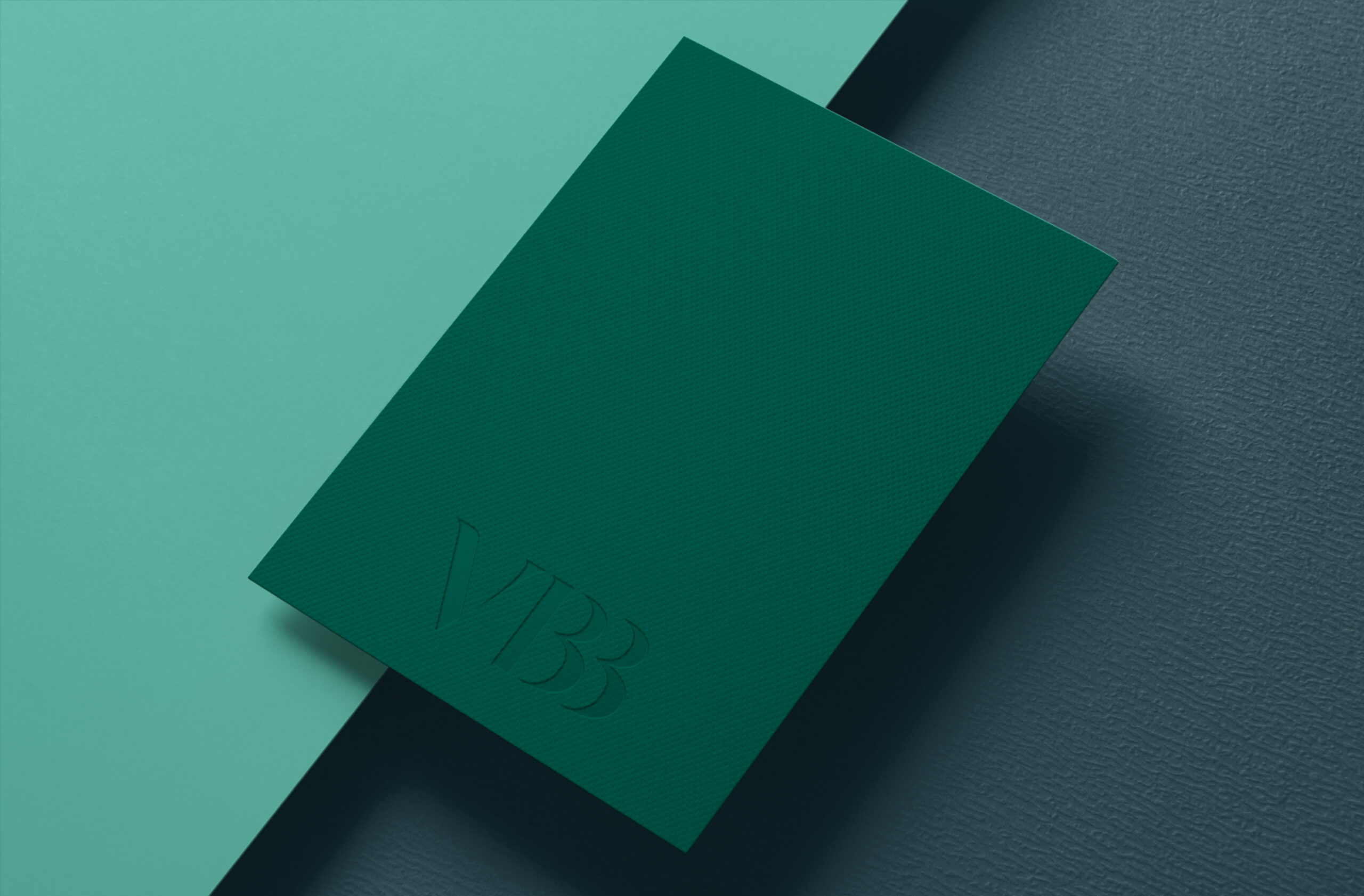
We created a new logo inspired by the firm’s art collection, using expressive thick and thin brushstroke-like lines to form an abstract, distinctive, and elegant mark. The fluid design introduces a more approachable and personable identity, reflecting the firm’s open, collaborative, and supportive nature while setting it apart with a unique visual presence.
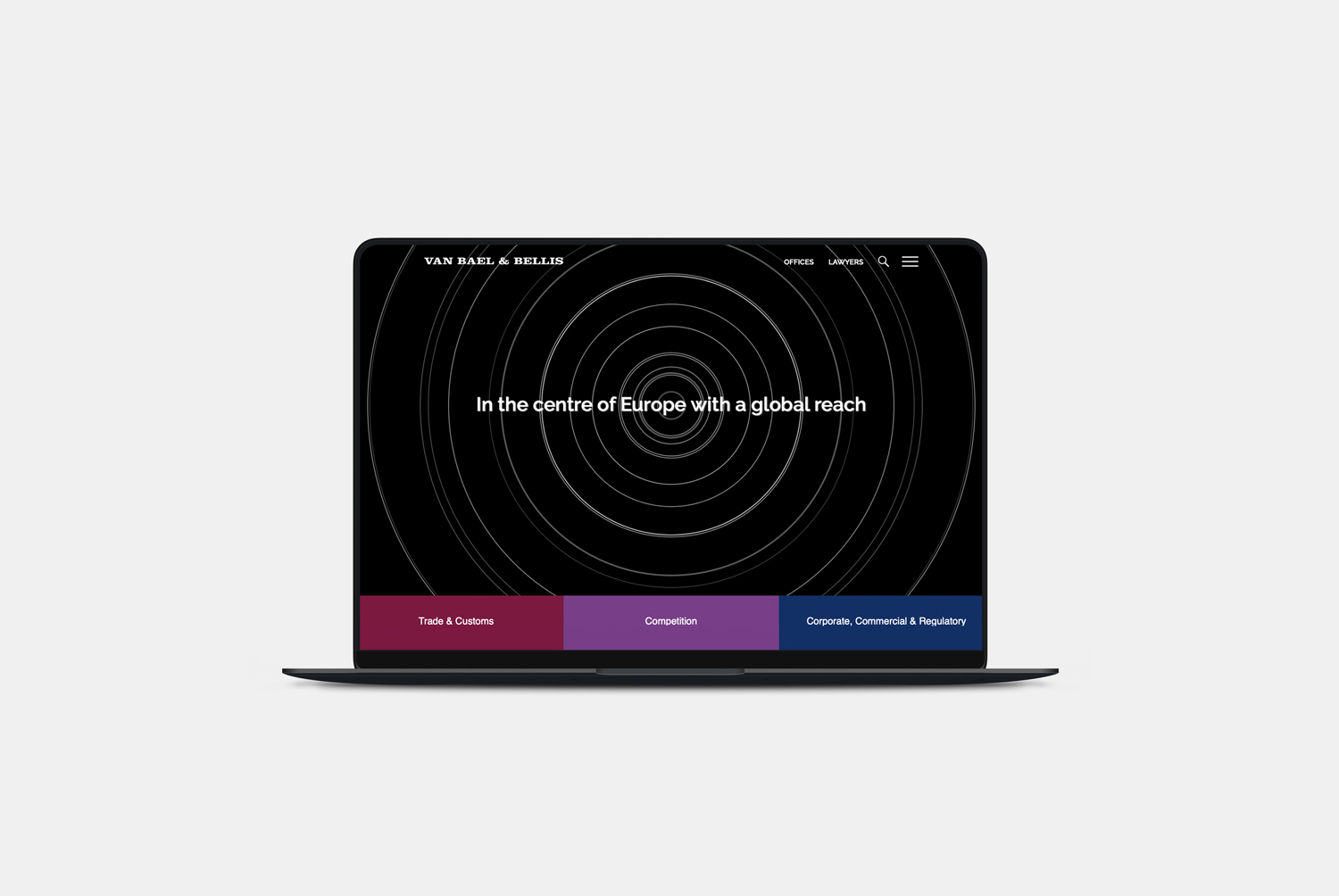
We undertook extensive research into VBB, developing a thorough understanding of its brand positioning, target market, strategic ambitions, and long-term aspirations. A series of workshops was conducted across the firm to gather insights and build a shared understanding of the brand at every level of the organisation.
Brand Ambassadors were appointed to represent different areas of the firm, helping to communicate updates, gather feedback, and encourage engagement throughout the rebranding process. This ensured the project remained collaborative and inclusive, with staff actively involved in shaping the evolving brand.
To support this initiative, we developed a dedicated Brand Ambassador website that provided regular project updates, showcased work in progress, and created a central platform where staff could ask questions and share feedback.

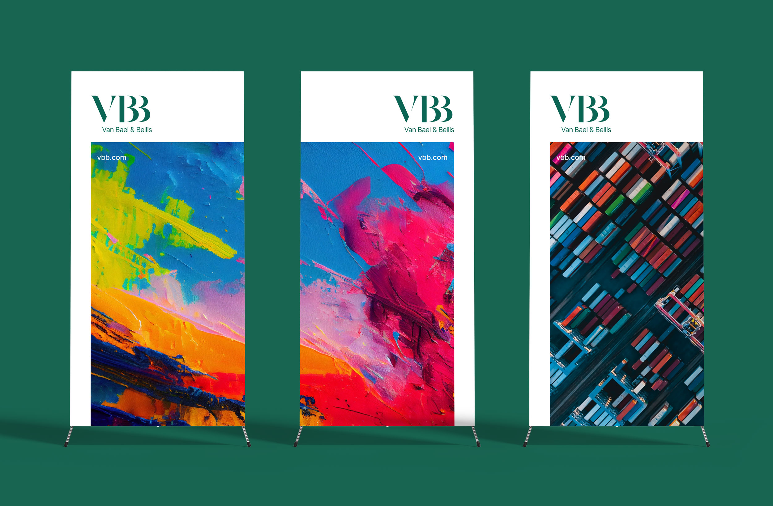
Inspired by the firm’s founder’s extensive art collection, displayed throughout the office, the new brand draws on the character and creativity that define the business. This subtle reference celebrates the firm’s heritage and personality, creating a distinctive identity that reflects both its history and its forward-looking ambitions.
People photography was captured in a relaxed, natural style to create a warm and approachable first impression. Used across the main profile pages, the imagery reflects the firm’s friendly, personable culture and reinforces its commitment to building genuine relationships with clients.
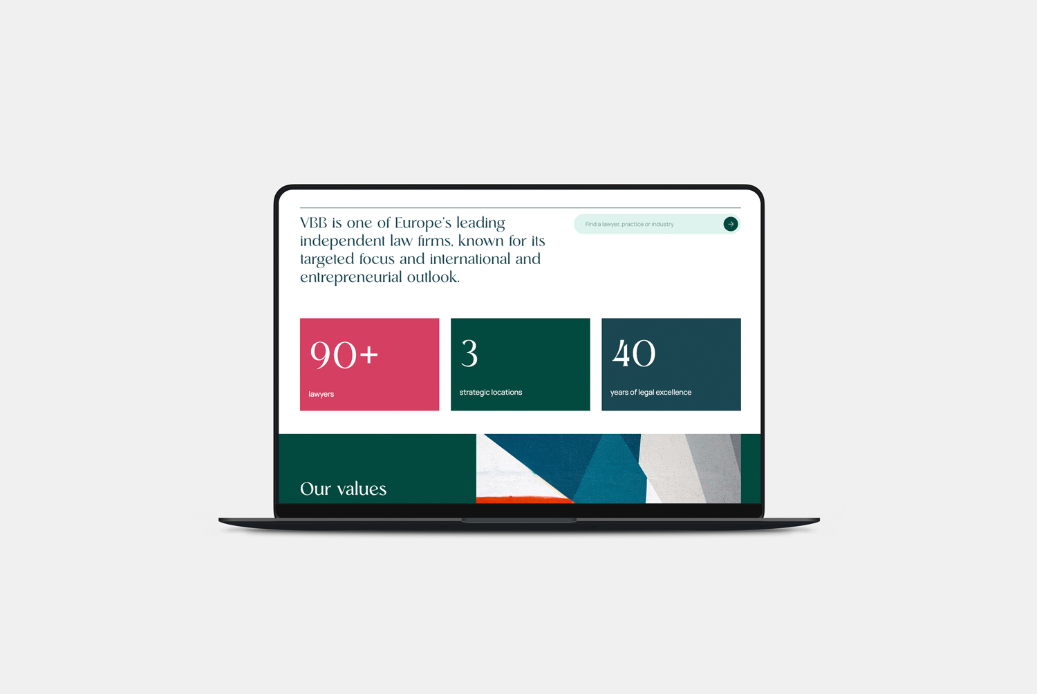
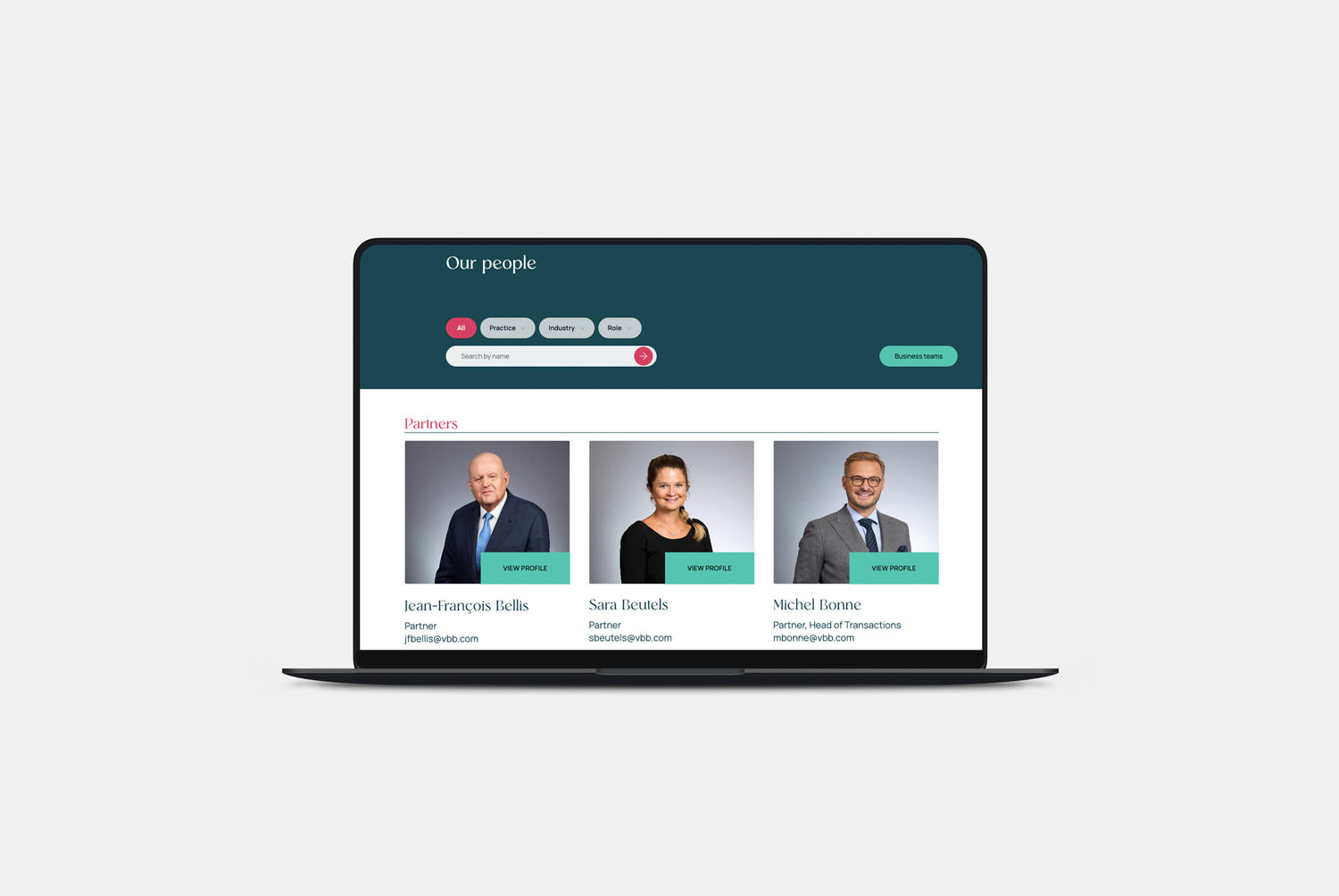
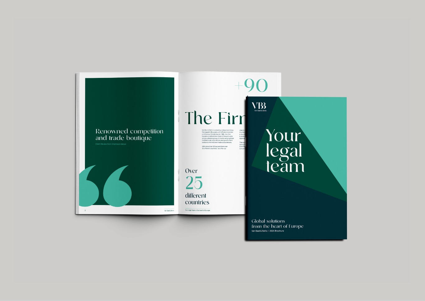
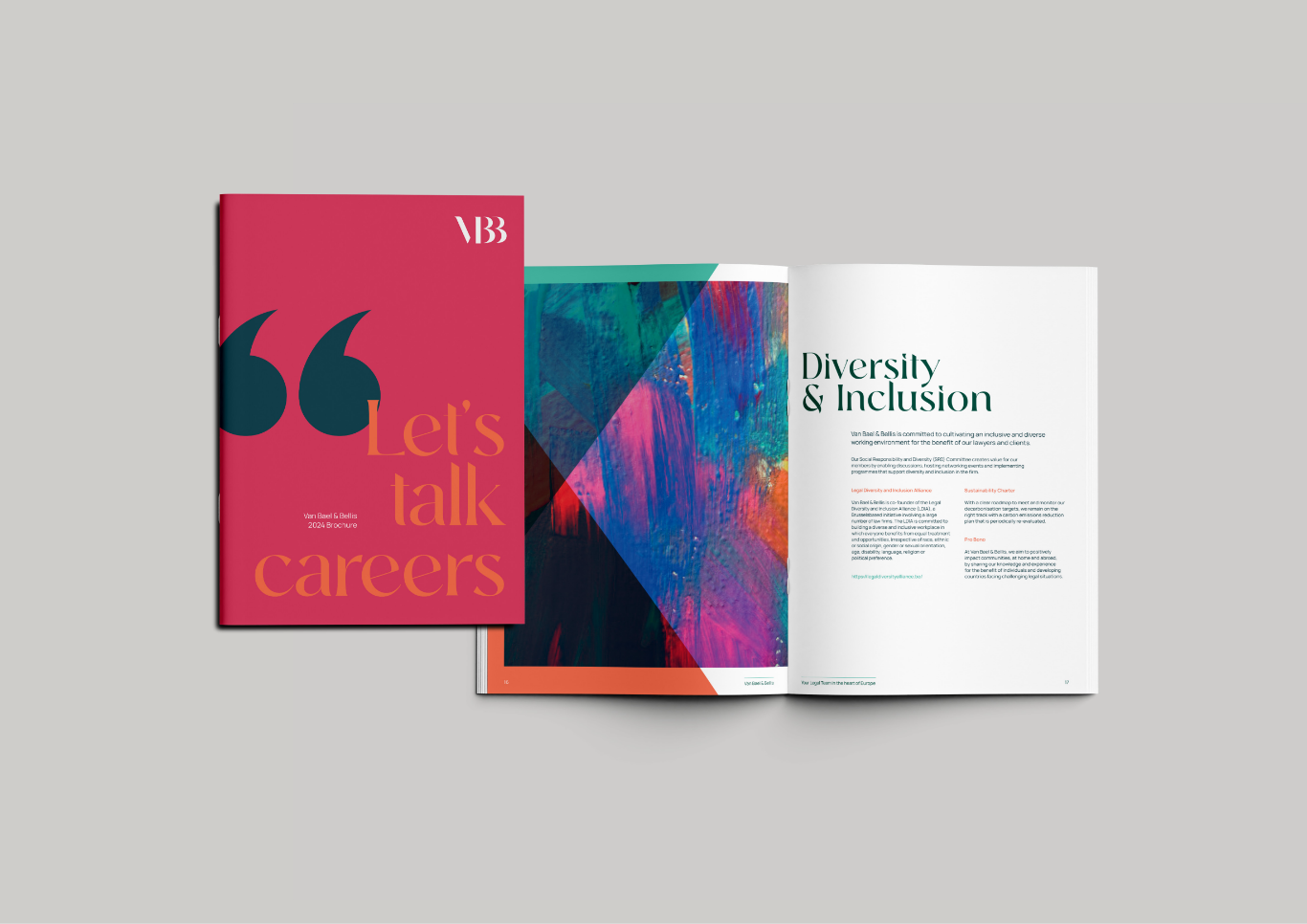
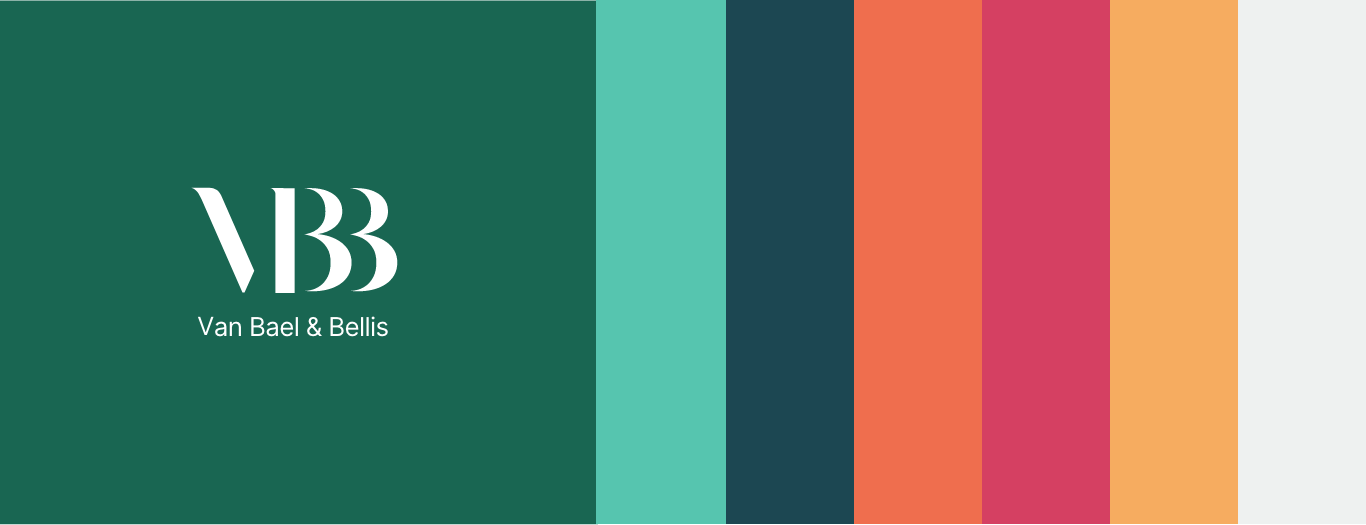
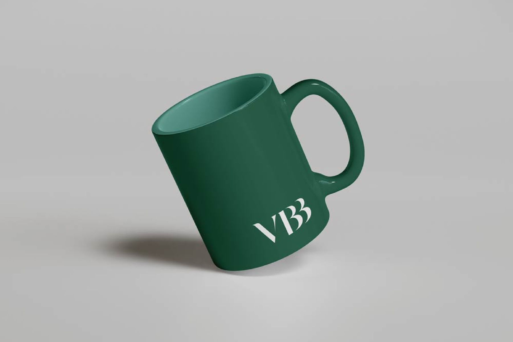
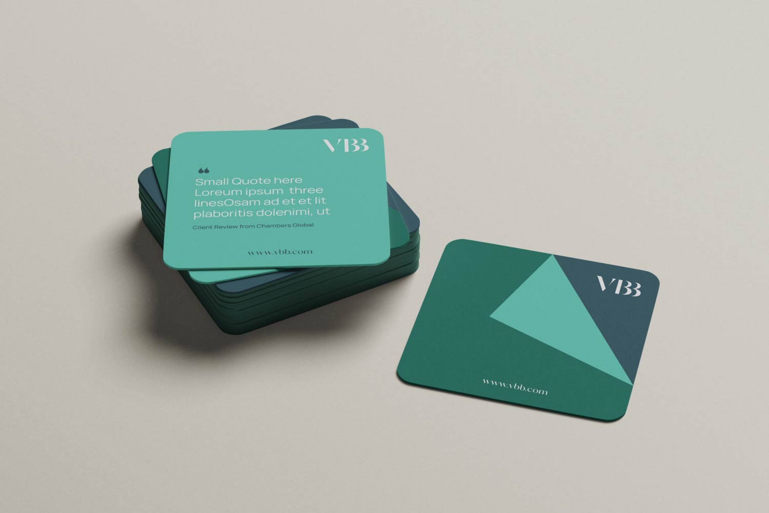
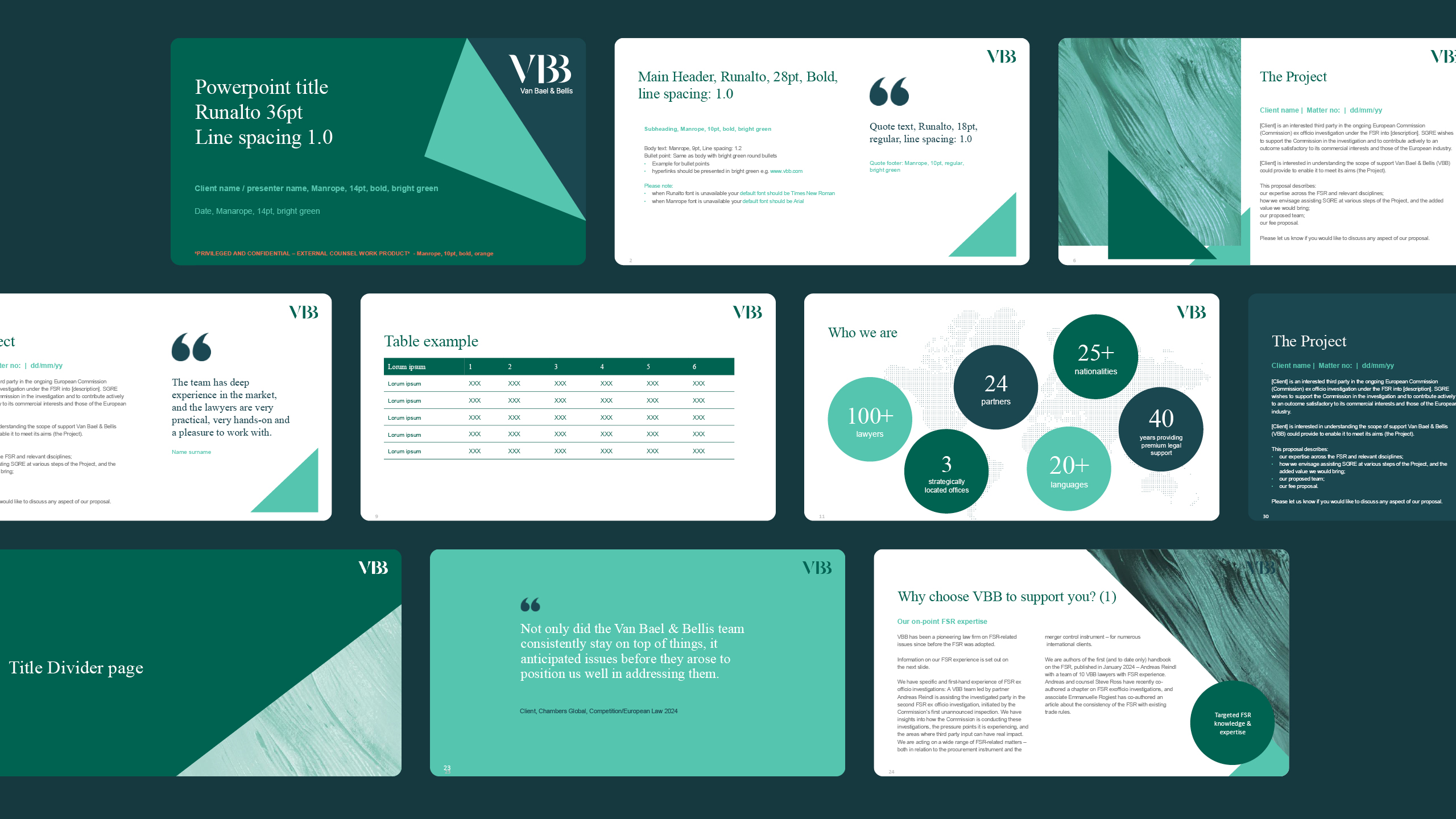
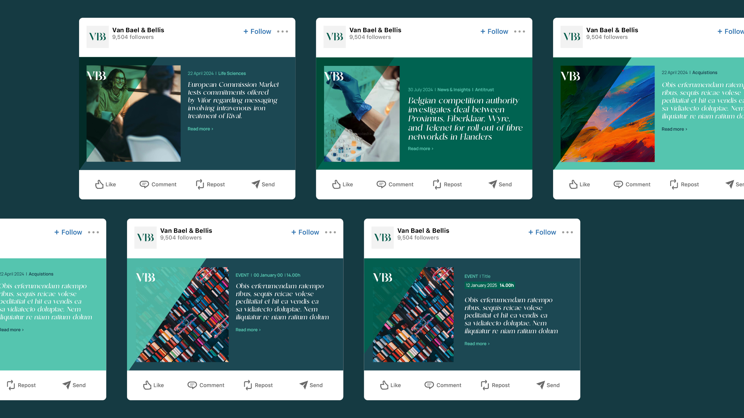
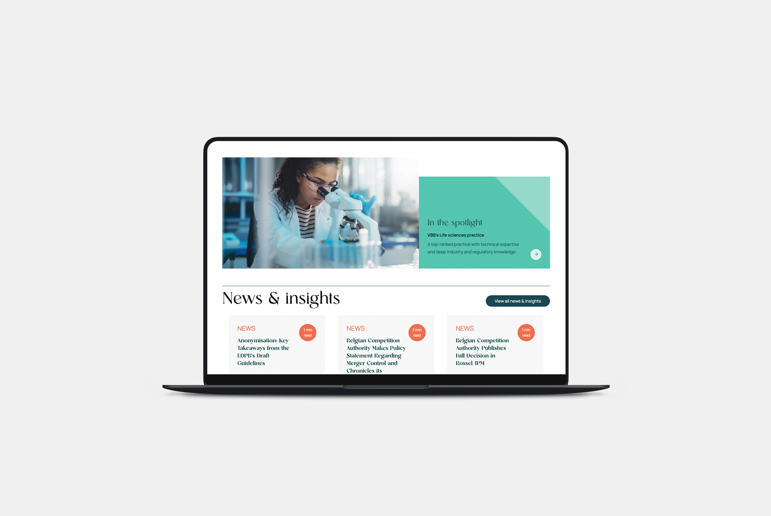
The rich dark green has long been an integral part of the firm’s identity, making it essential to retain as a connection to its heritage. Building on this foundation, we introduced a complementary palette of contemporary colours that softens and modernises the brand while adding warmth and vibrancy. The refreshed colour palette reflects the firm’s dynamic character and reinforces its ambition to remain a market leader.
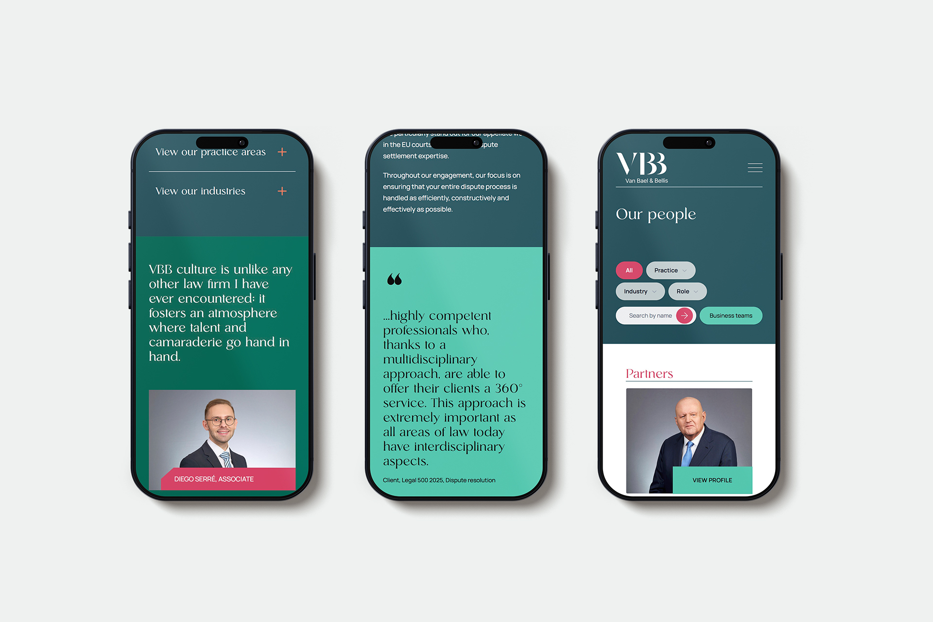
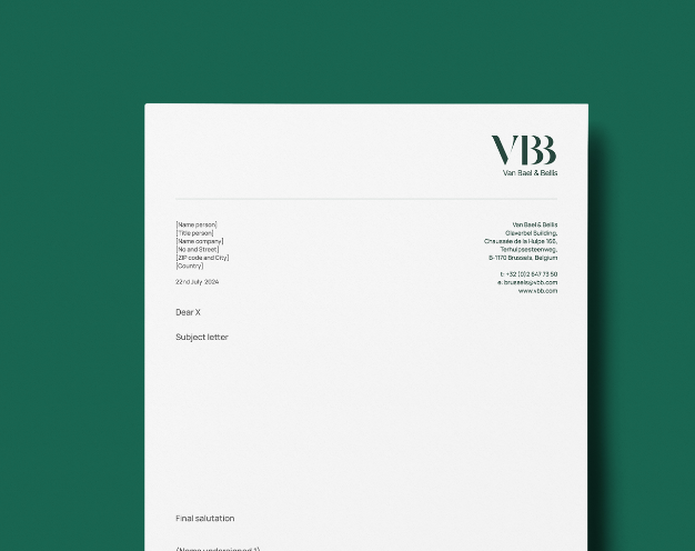
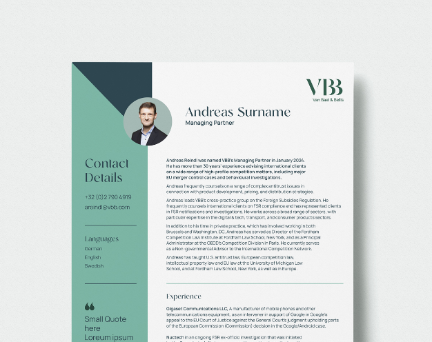
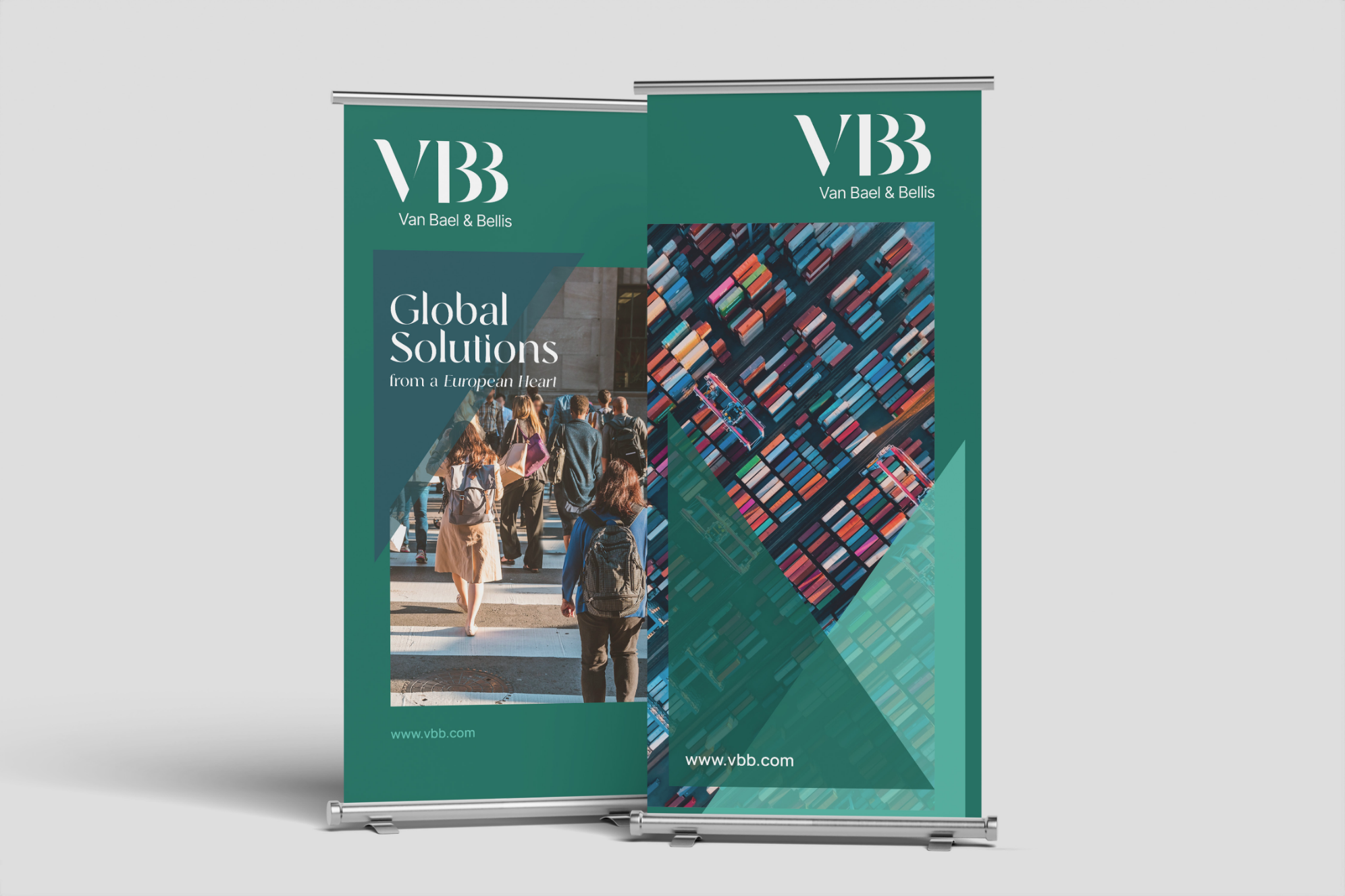
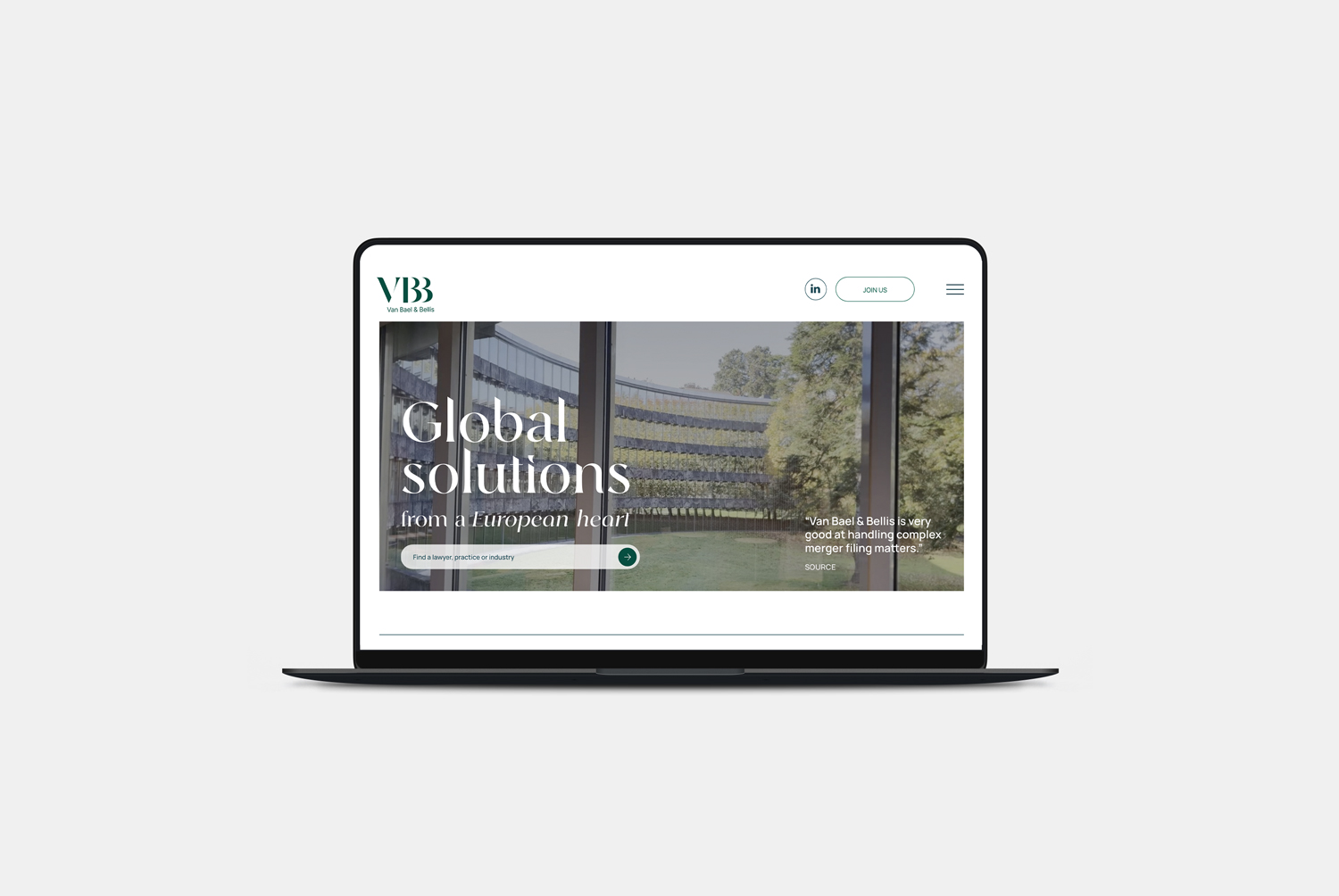
We selected a bespoke display serif typeface to bring a sense of luxury, modernity, and elegance to the brand. Used for headlines and key messaging, it creates a distinctive visual impact while balancing the clean, contemporary sans serif typeface used for body copy. Together, the pairing introduces warmth, sophistication, and personality, giving the brand a refined yet approachable character.