Giving an established brand a new lease of life.
A fresh perspective
Capsticks is a leading UK law firm specialising in public sector and regulated industries, with particular expertise in healthcare, social housing, local government and professional regulation.
Established in 1979, the firm has built a strong reputation for providing specialist legal advice to organisations delivering essential services.
Having undergone a rebrand two years earlier, Capsticks approached Chalk to take its visual identity further. The foundations were in place, but there was an opportunity to introduce greater flexibility, personality and creative expression across its communications.
The challenge was to build on an established identity, rather than reinvent it, creating a brand that felt more confident, vibrant and approachable.

Room to express
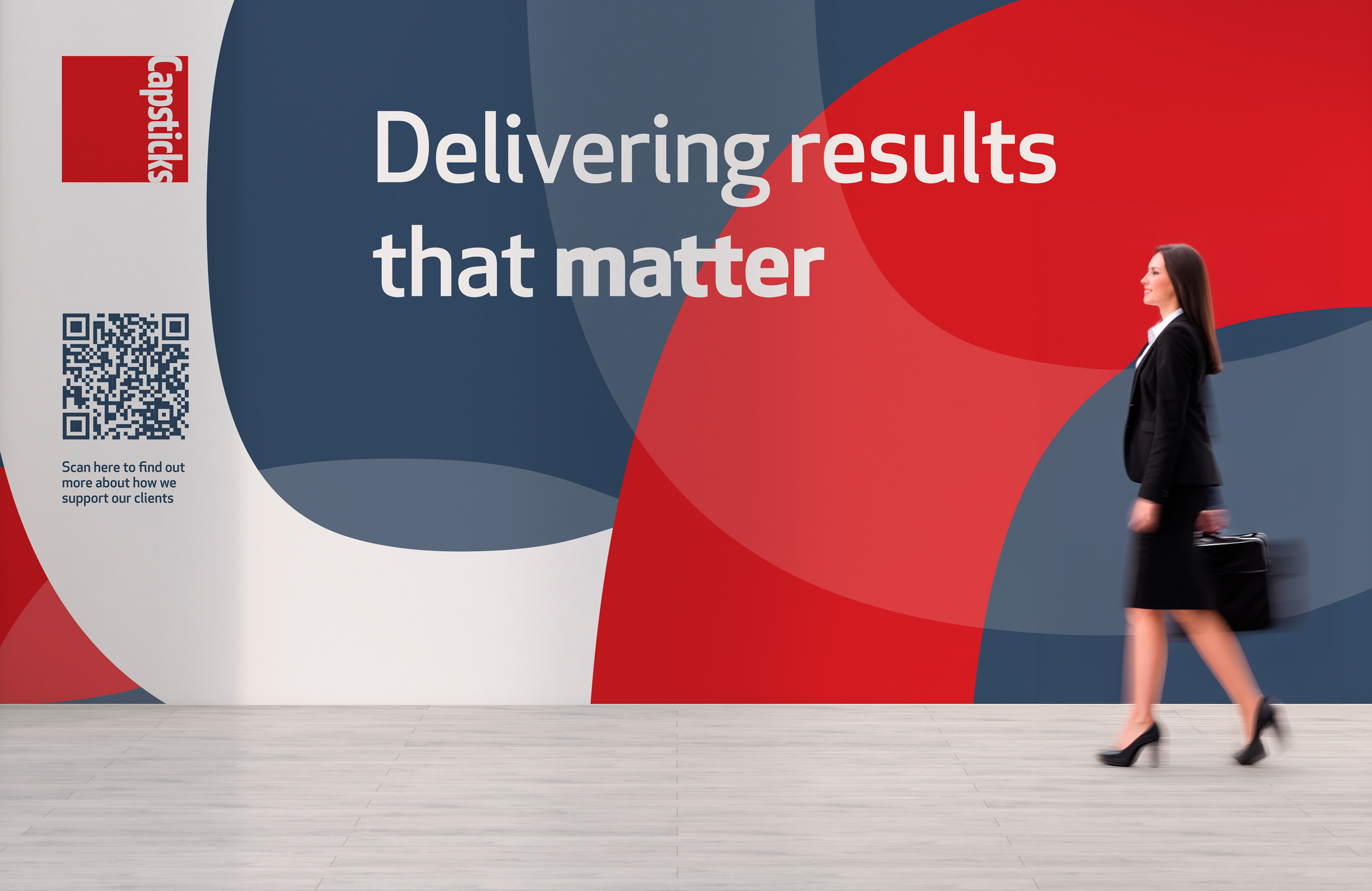
Our approach was to give the existing brand more freedom, introducing a richer visual language that could adapt to different audiences, messages and environments.
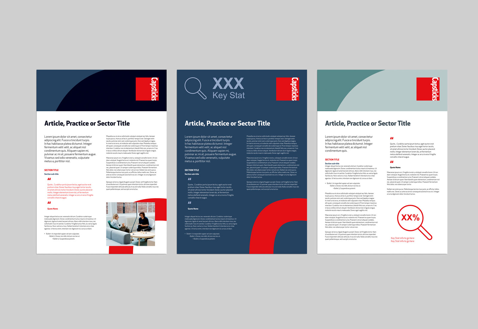
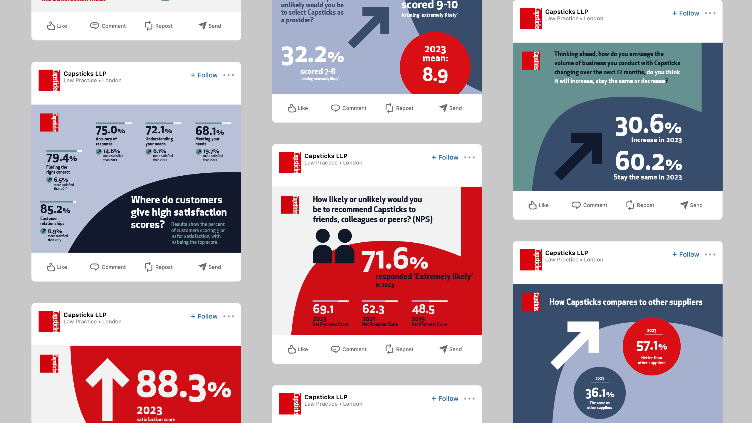
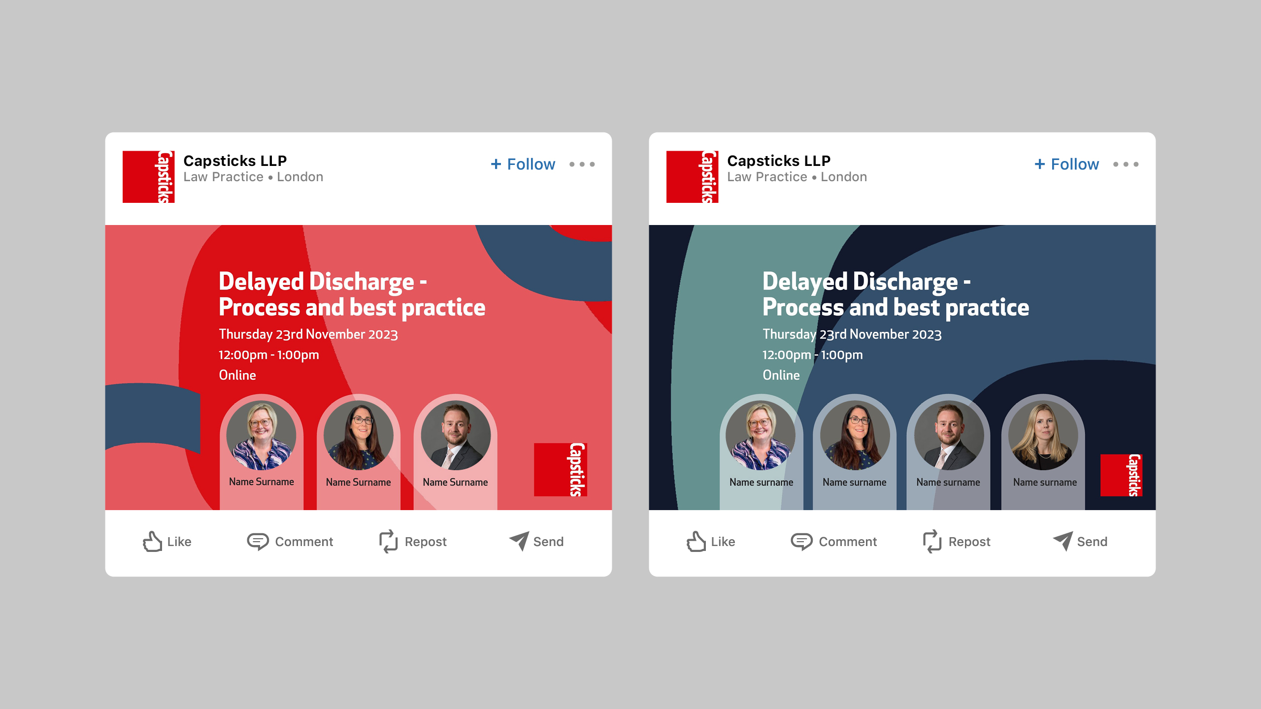
We expanded the use of secondary colours, developed a more expressive approach to typography and introduced iconography to bring greater clarity and character to communications.
These elements worked together to create a more distinctive and flexible identity, giving Capsticks the freedom to communicate with greater impact while retaining the familiarity and credibility of its established brand.
Beyond the everyday
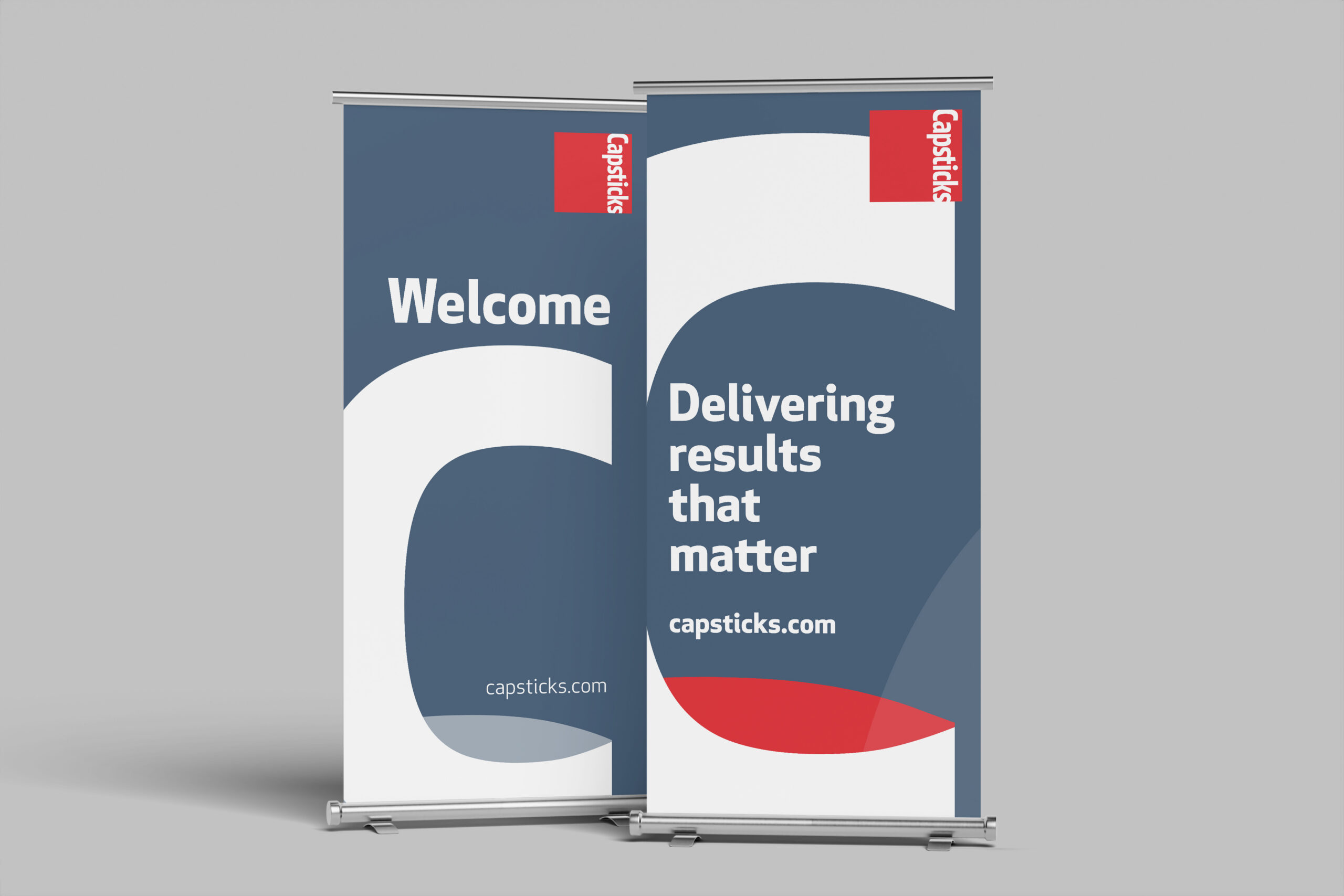
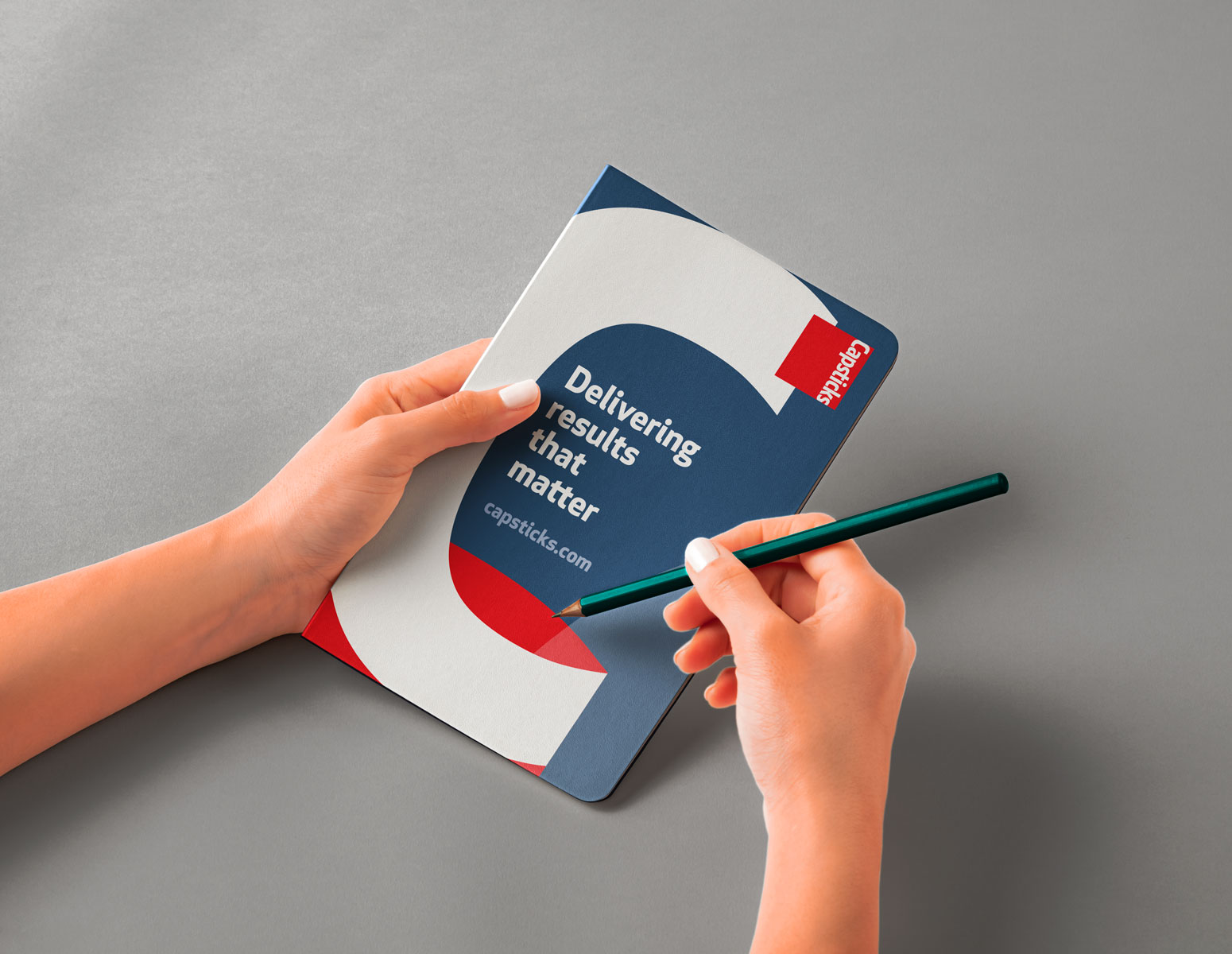
Chalk applied the refreshed identity across a wide range of marketing materials, bringing greater consistency and creative energy to the firm’s communications.
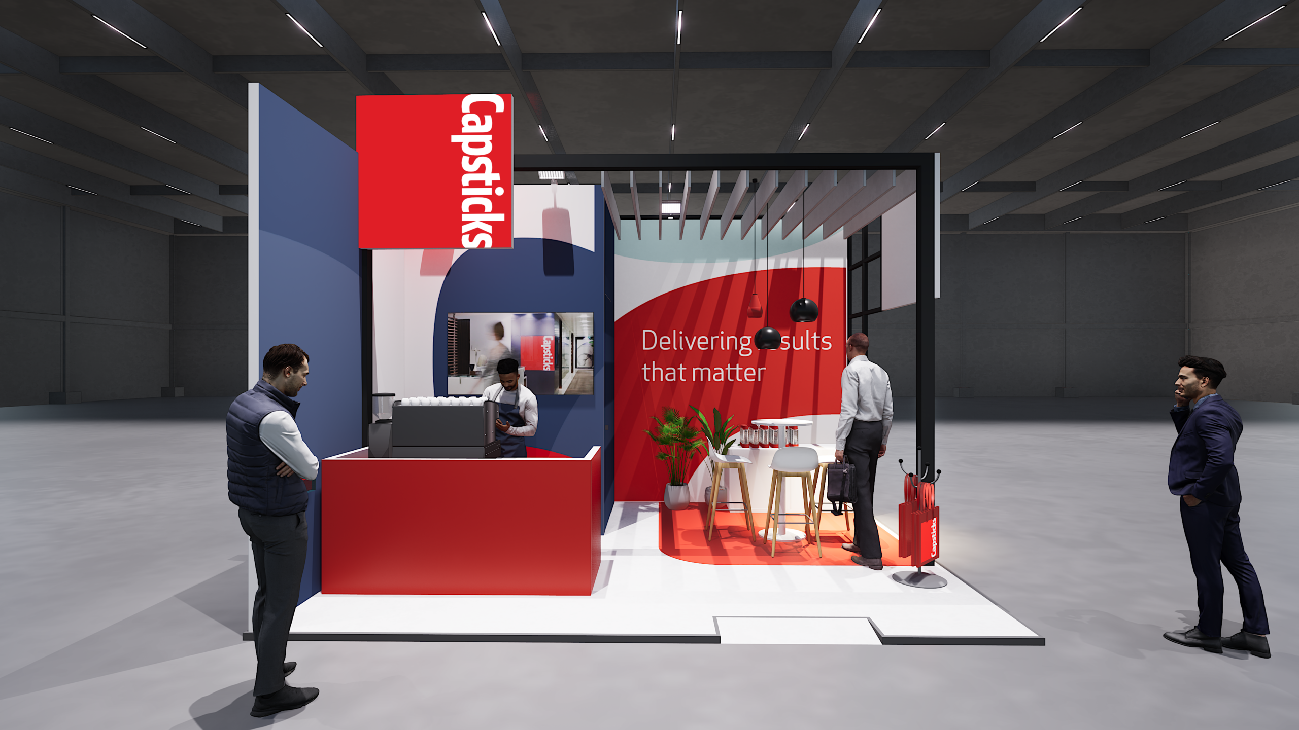
Exhibitions and events presented a particular opportunity to bring the brand to life.
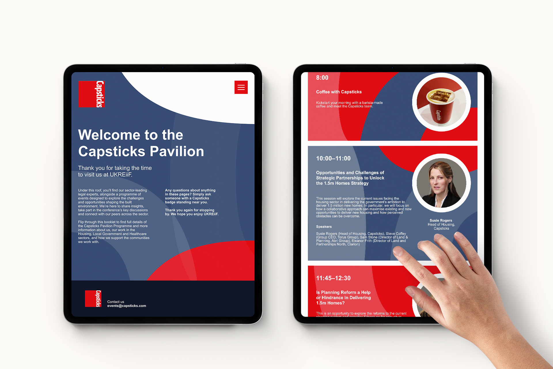
We designed a series of exhibition stands that combined bold graphics and confident messaging with more engaging visitor experiences. Interactive e-books and online resources introduced a digital dimension, allowing visitors to explore relevant information and engage with the firm’s expertise beyond traditional printed materials.
The result was a more dynamic approach to event communications, bringing together physical and digital experiences in a consistent visual language.

A brand with more to say
The refreshed identity gave Capsticks a more versatile and engaging platform for its marketing communications.
By building on the strengths of the existing brand, Chalk introduced greater confidence, consistency and creative freedom, helping the firm present its expertise in a more distinctive and approachable way.
An evolution rather than a reinvention, giving an established brand fresh energy and a stronger presence across every touchpoint.