Evolving the identity of a 300-year-old law firm – celebrating its heritage while creating a more confident, contemporary brand for the future.
A 300-year history
With a history stretching back 300 years, Boodle Hatfield has built an enviable reputation as one of the UK’s leading law firms.
That heritage is an important part of the firm’s identity, but Boodle Hatfield was also looking firmly to the future. It wanted to grow its client base, strengthen its digital presence and create a more contemporary expression of the brand – without losing the character and reputation built over three centuries.
We worked with the firm to refresh its visual identity and create a new website that could bring those two worlds together: celebrating its history while presenting a confident, modern and forward-looking business.
Understanding the audience
The starting point was understanding Boodle Hatfield’s clients and how they interacted with the firm.
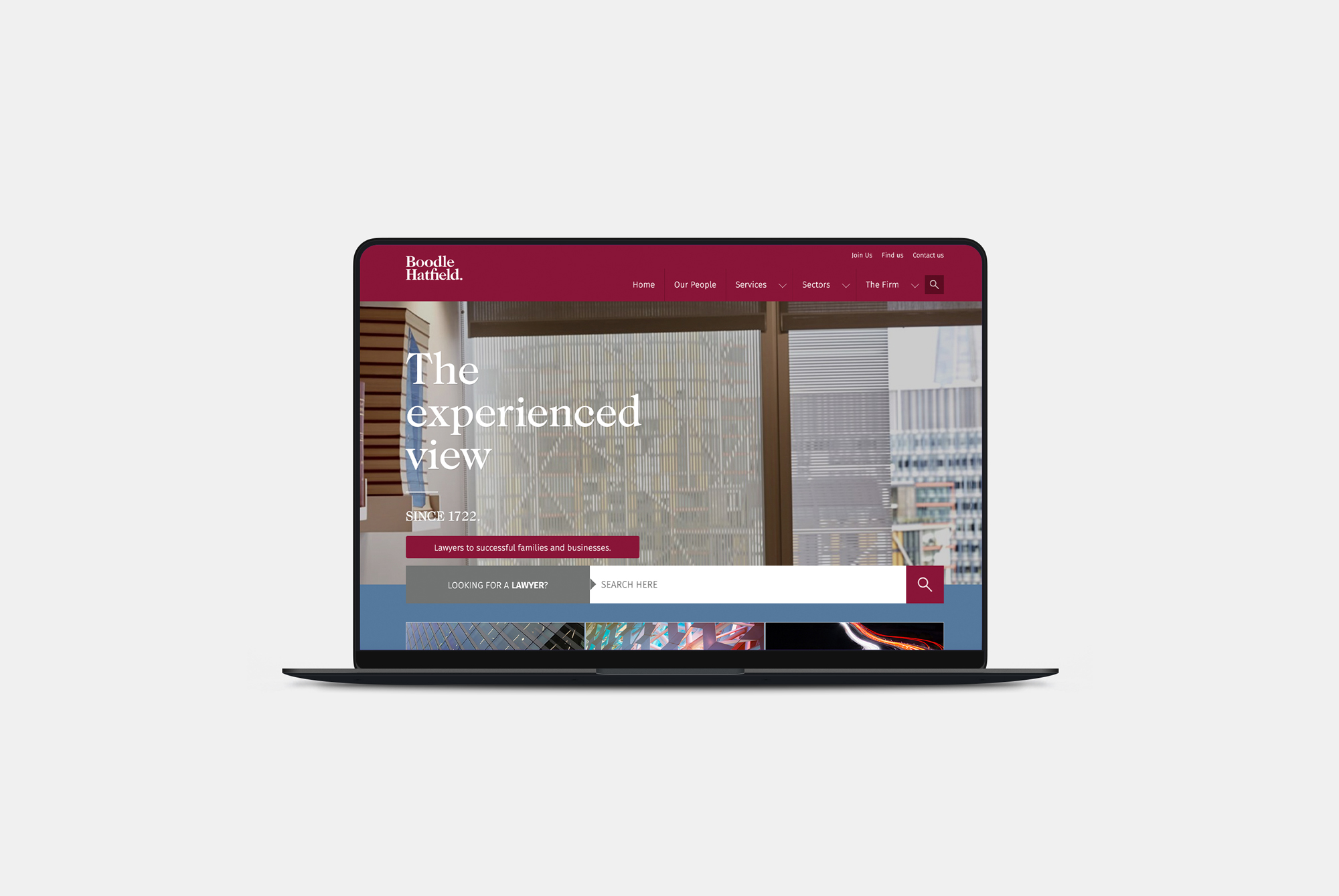
Working with key stakeholders, we explored audience priorities and website journeys. These insights informed a clearer structure that made expertise easier to discover and connected the firm’s different services.
Cross-selling was central to the strategy, with clearer pathways between related expertise helping visitors understand the wider ways Boodle Hatfield could support them.



Bringing heritage and modernity together
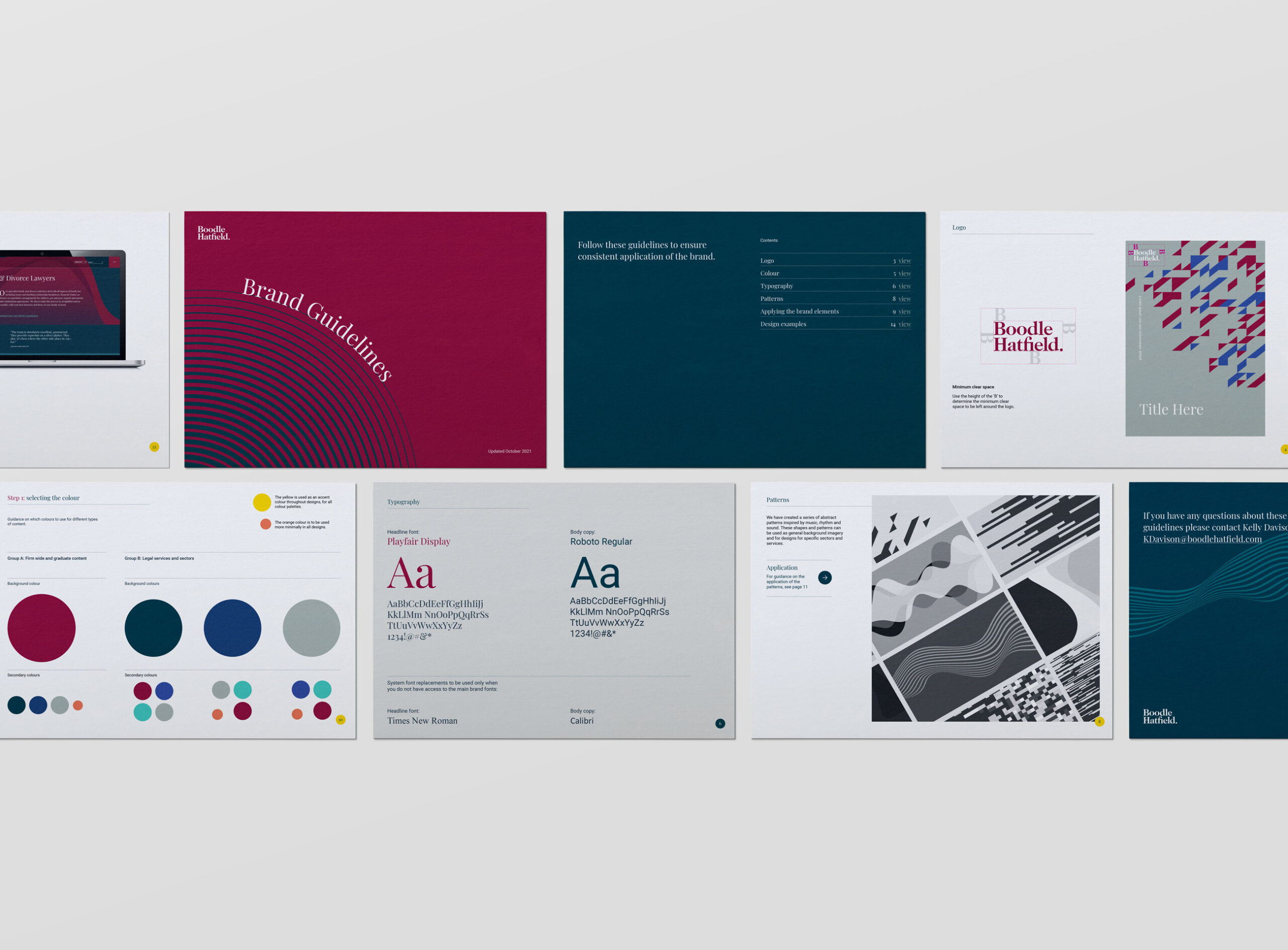
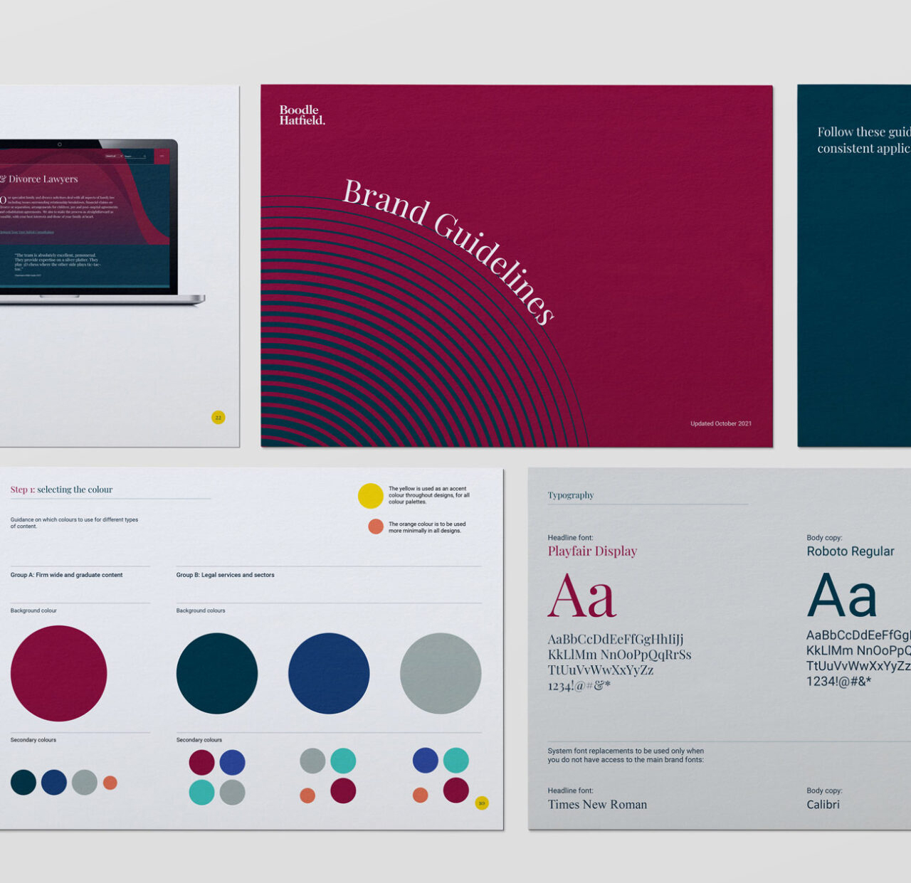
The existing Boodle Hatfield logo carried considerable recognition and equity, so rather than reinventing it, we focused on building a richer and more distinctive visual world around it.
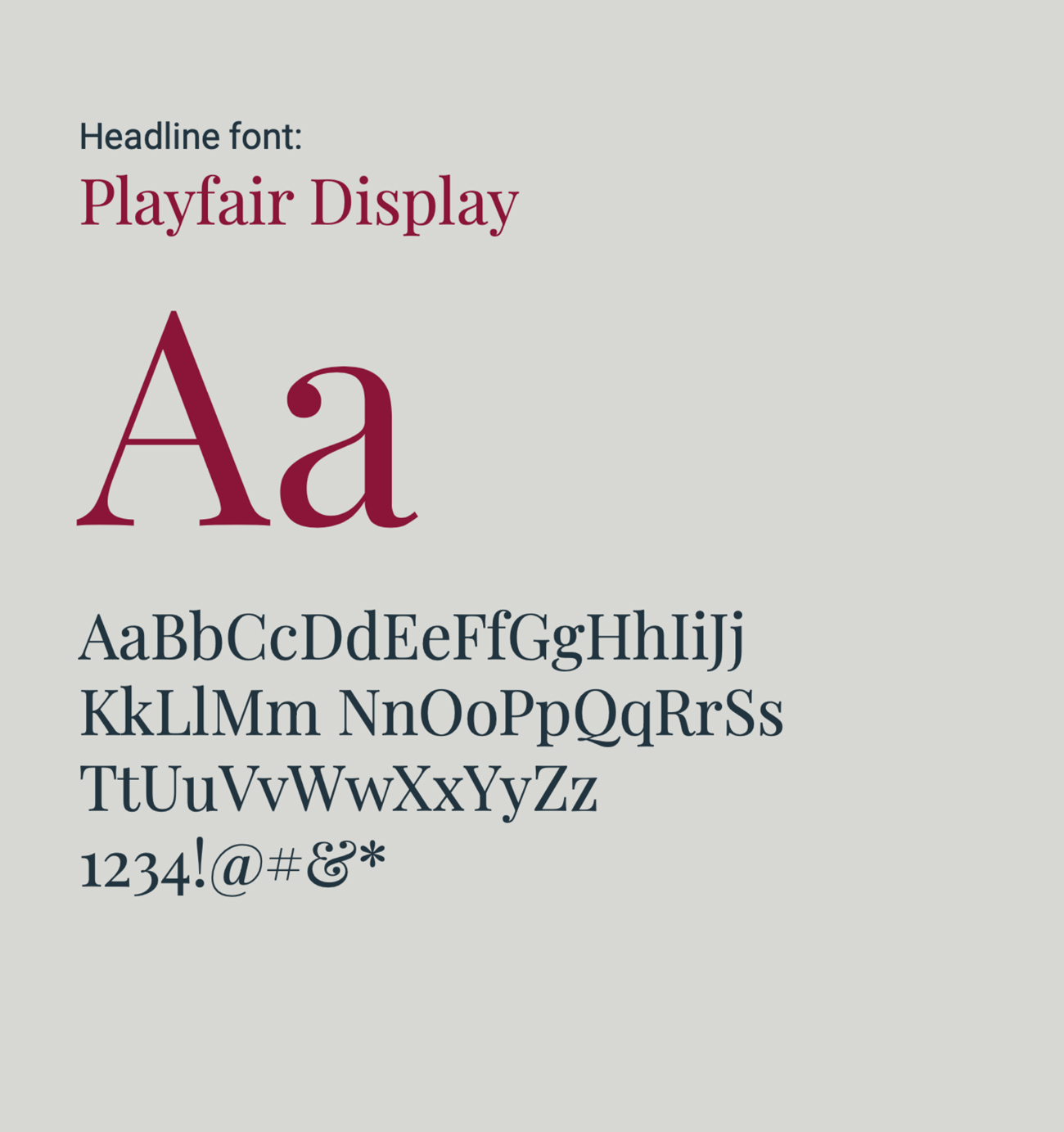
Typography became an important part of that balance.
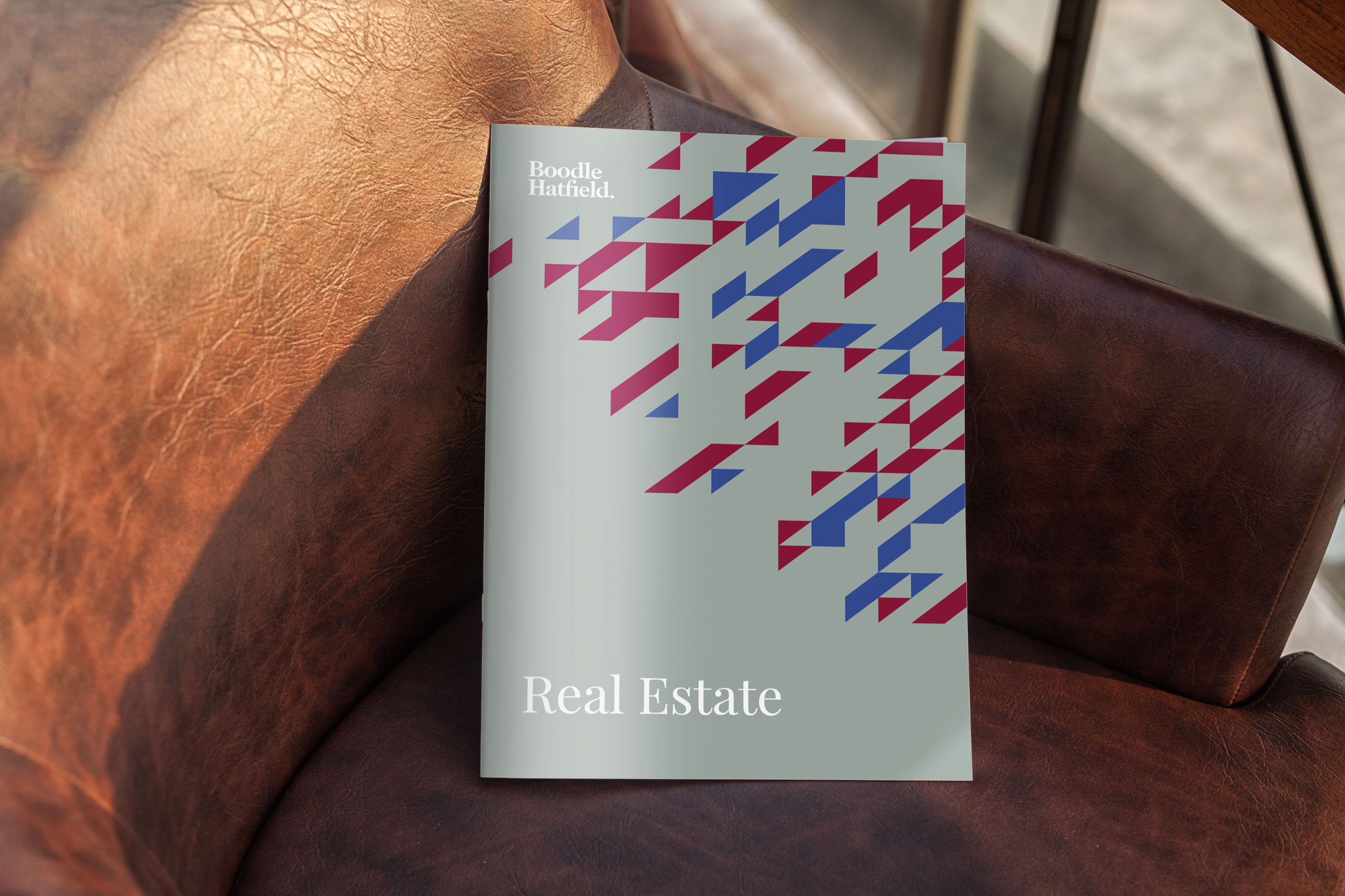
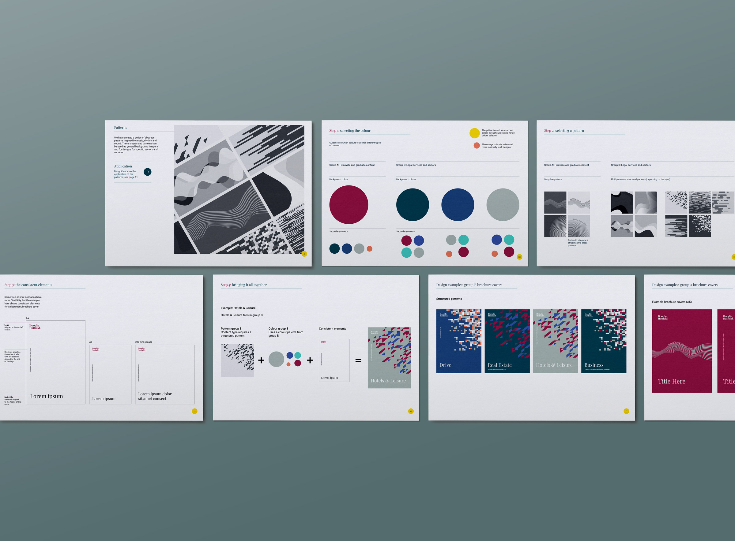
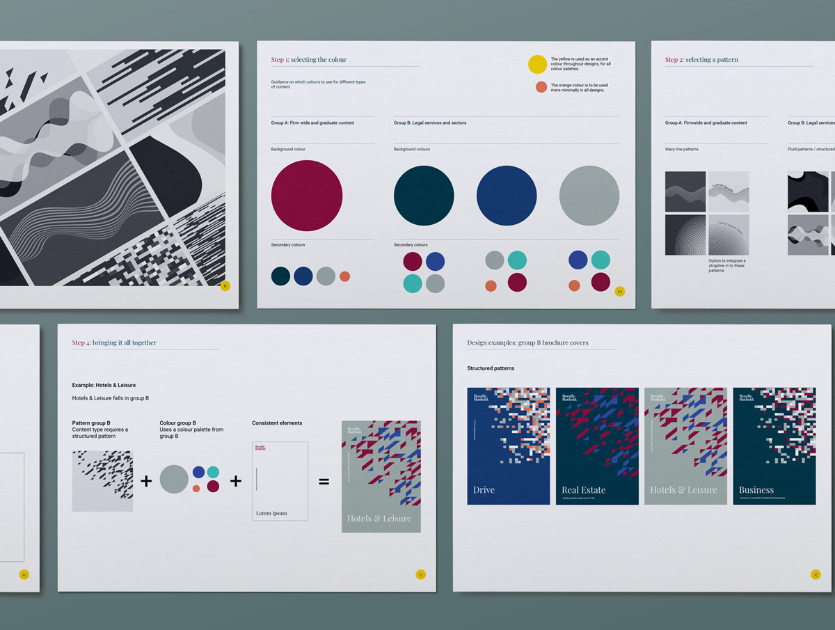
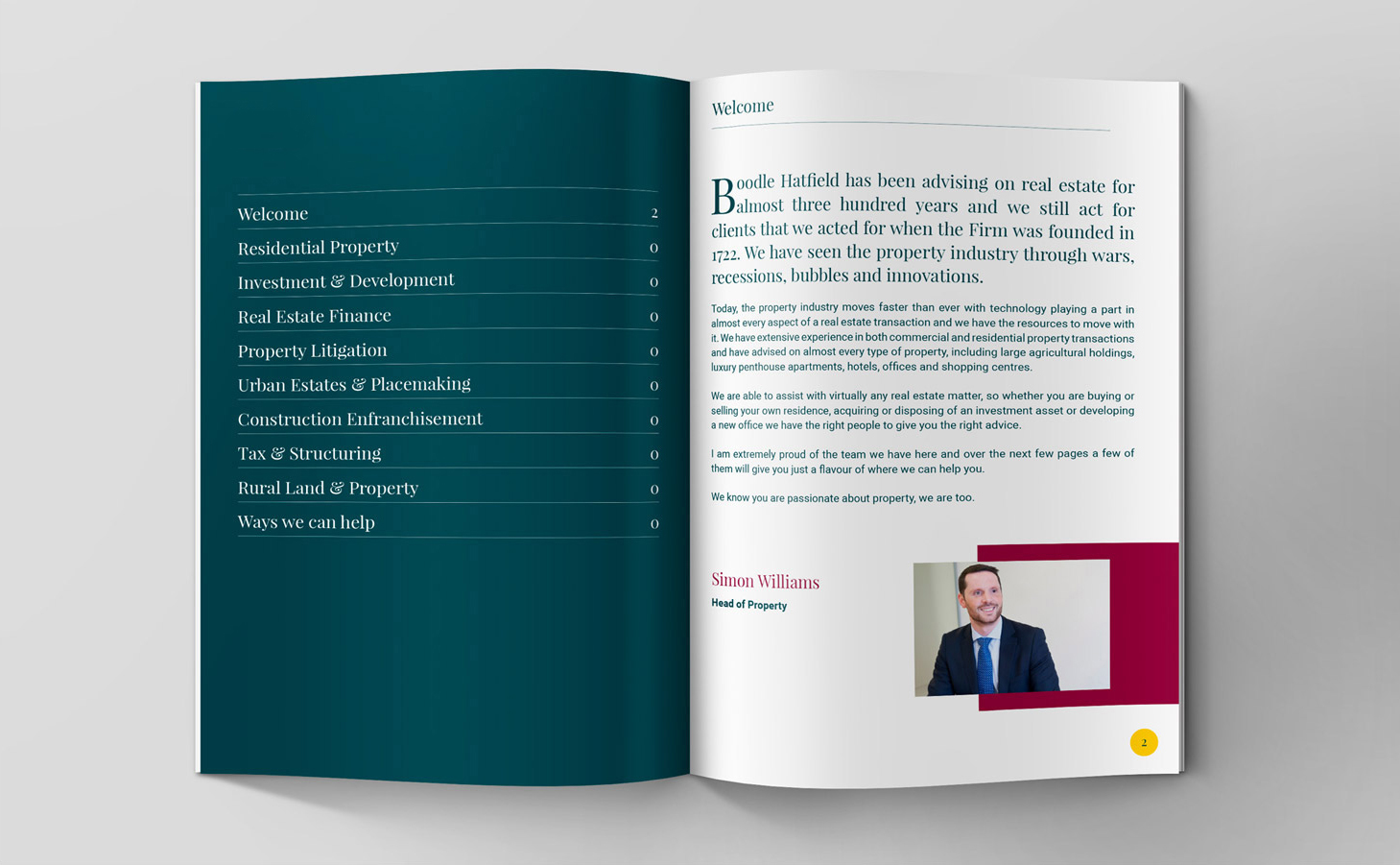
A contemporary sans serif was paired with a more traditional serif, creating a visual relationship between past and present. Details such as oversized drop caps introduced a subtle editorial quality, while a refreshed colour palette brought greater depth and flexibility to the identity.
A rich dark green became a defining brand colour, complemented by brighter accents that added energy and helped create a more contemporary feel.
Together with a new approach to imagery, iconography and print, these elements created a cohesive visual system that could evolve the brand while remaining unmistakably Boodle Hatfield.
Creating a more connected digital experience
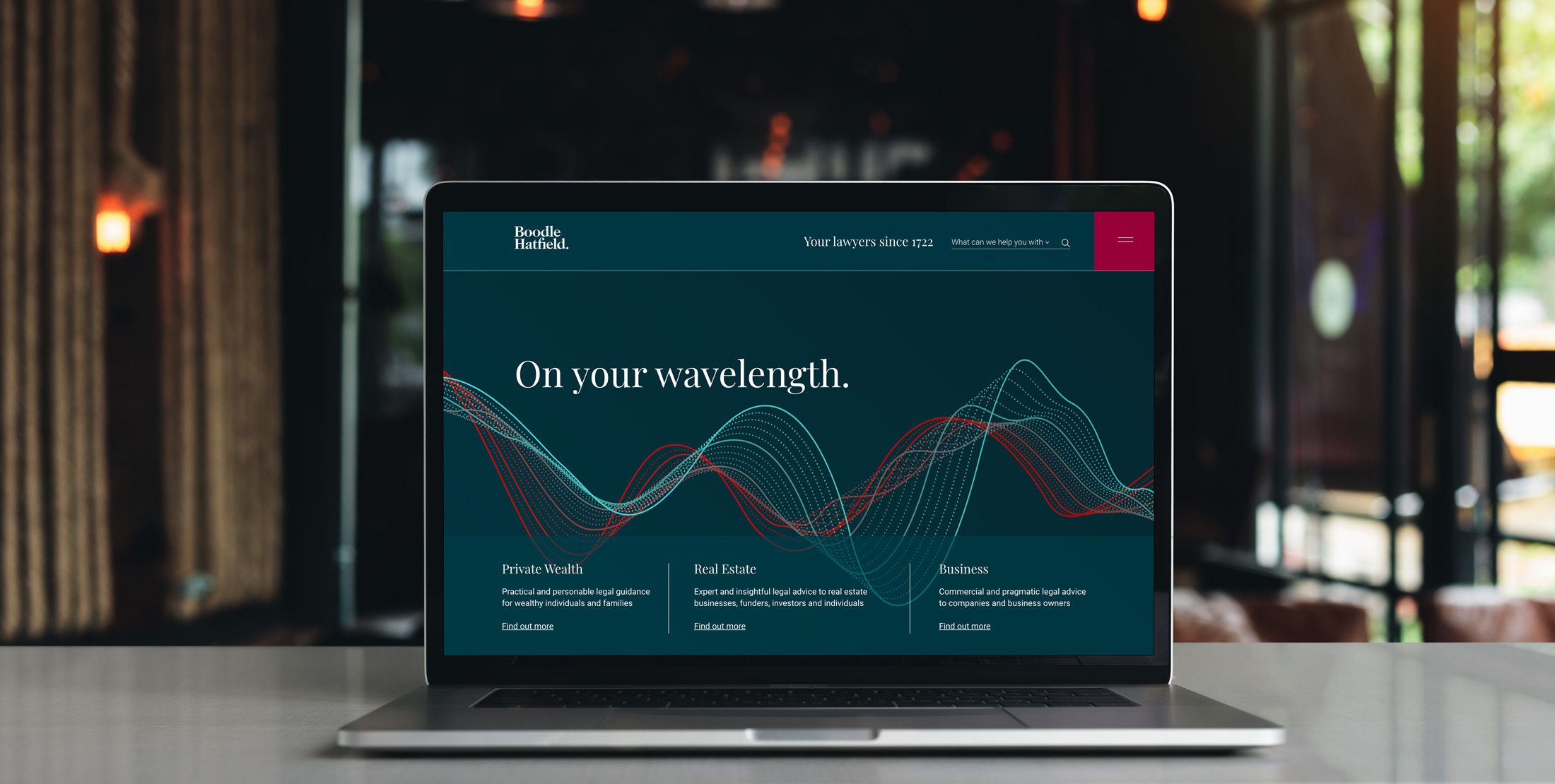
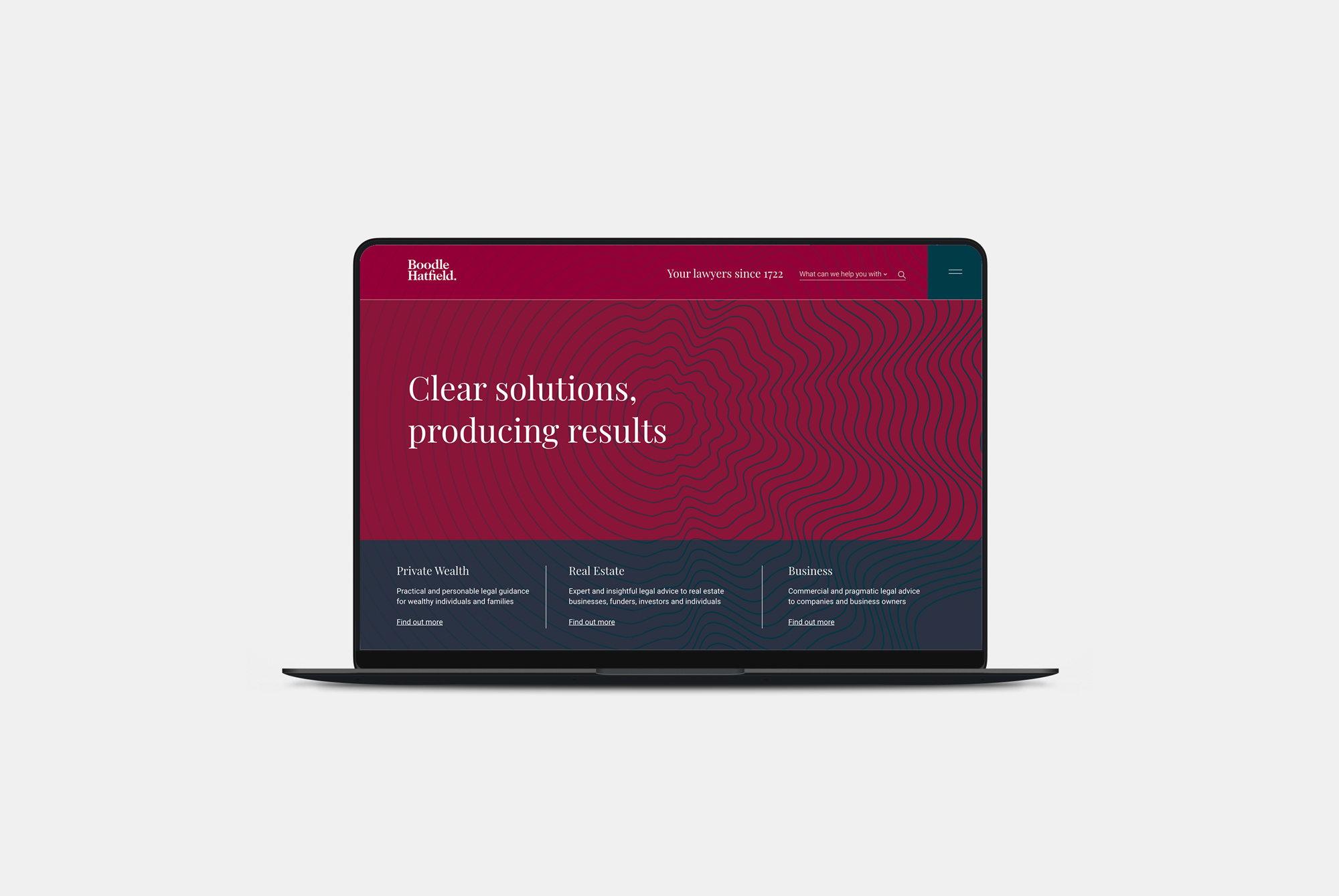
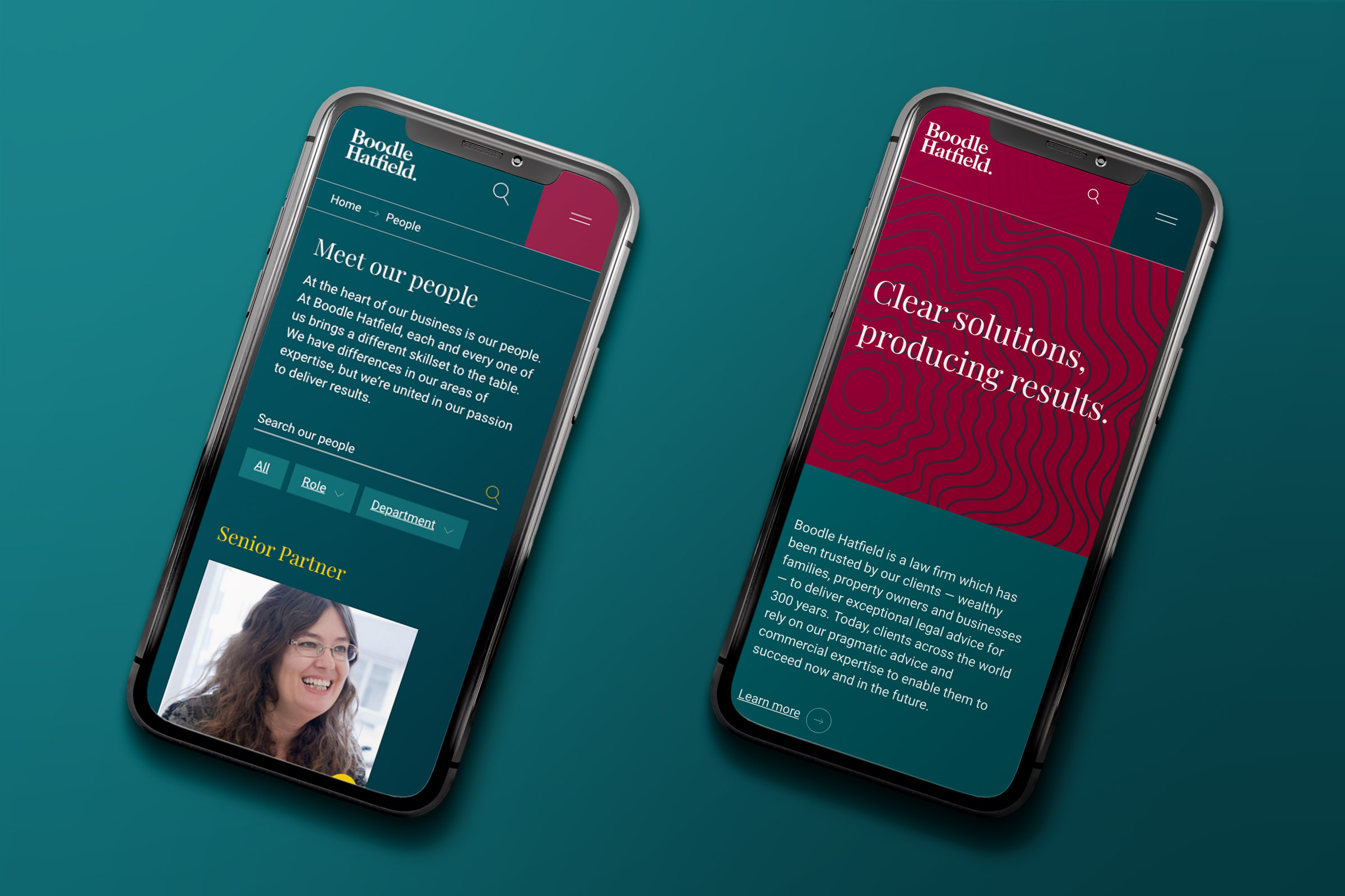
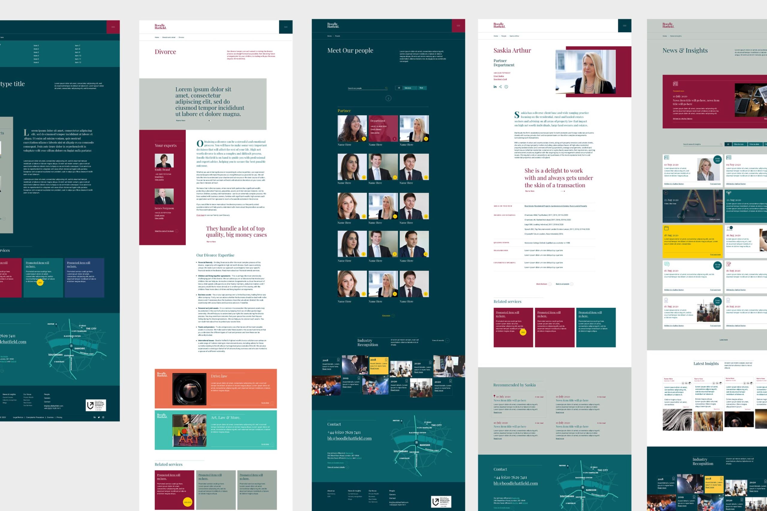
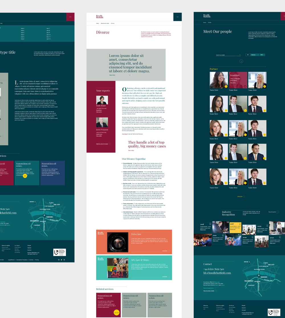
The new identity was brought to life through a website designed to feel sophisticated, intuitive and engaging.
Light and dark layouts create pace and contrast, while bespoke iconography simplifies navigation.
Related expertise and content are surfaced throughout, supporting greater discovery and cross-selling between practice areas.
Performance was considered alongside design and usability, resulting in a faster and more effective digital platform.


Finding a creative idea that connects past and present
To give the identity an additional layer of personality, we developed a creative concept around music.
Music provided a natural way to connect generations: rooted in tradition, but continually evolving.
The idea influenced imagery and communications, expressing both the firm’s heritage and contemporary outlook.
Celebrating 300 years
The launch of the refreshed brand coincided with a remarkable milestone: Boodle Hatfield’s 300th anniversary.
We created a dedicated anniversary identity to sit alongside the refreshed brand and celebrate the occasion.
At its heart was a bespoke ‘300’ stencil graphic: a window through the identity that looked both backwards at the firm’s history and forwards to its future.
The anniversary identity was rolled out across the campaign and became part of an award-winning piece of marketing.




A contemporary expression of an established name
The refreshed identity and website gave Boodle Hatfield a more confident, contemporary platform: celebrating 300 years of history while looking firmly towards the next chapter.