Building a brand for the UK’s leading commercial real estate law firm.

From the foundations up.
As a specialist commercial real estate law firm, Maples Teesdale brings focused expertise and a modern perspective to a complex and fast-moving sector. However, its existing brand and website no longer reflected the firm’s specialist offering or the way it wanted to be perceived.
A comprehensive refresh provided the opportunity to bring greater clarity and consistency to its positioning, creating a distinctive identity and digital experience that better communicated its expertise, personality and forward-thinking approach.
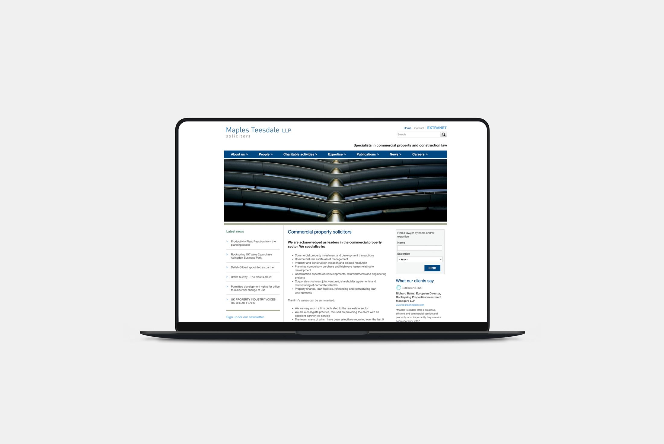
A series of workshops with the Maples Teesdale team, involving staff at all levels, established a shared understanding of the firm’s ambitions and priorities. Customer interviews added an external perspective, revealing how the firm was perceived and where its future potential lay. These insights informed a strategic review of the firm’s positioning, values, tone of voice and social media strategy, providing a clear foundation for the brand refresh and new website.



A distinctive identity with a forward-thinking edge
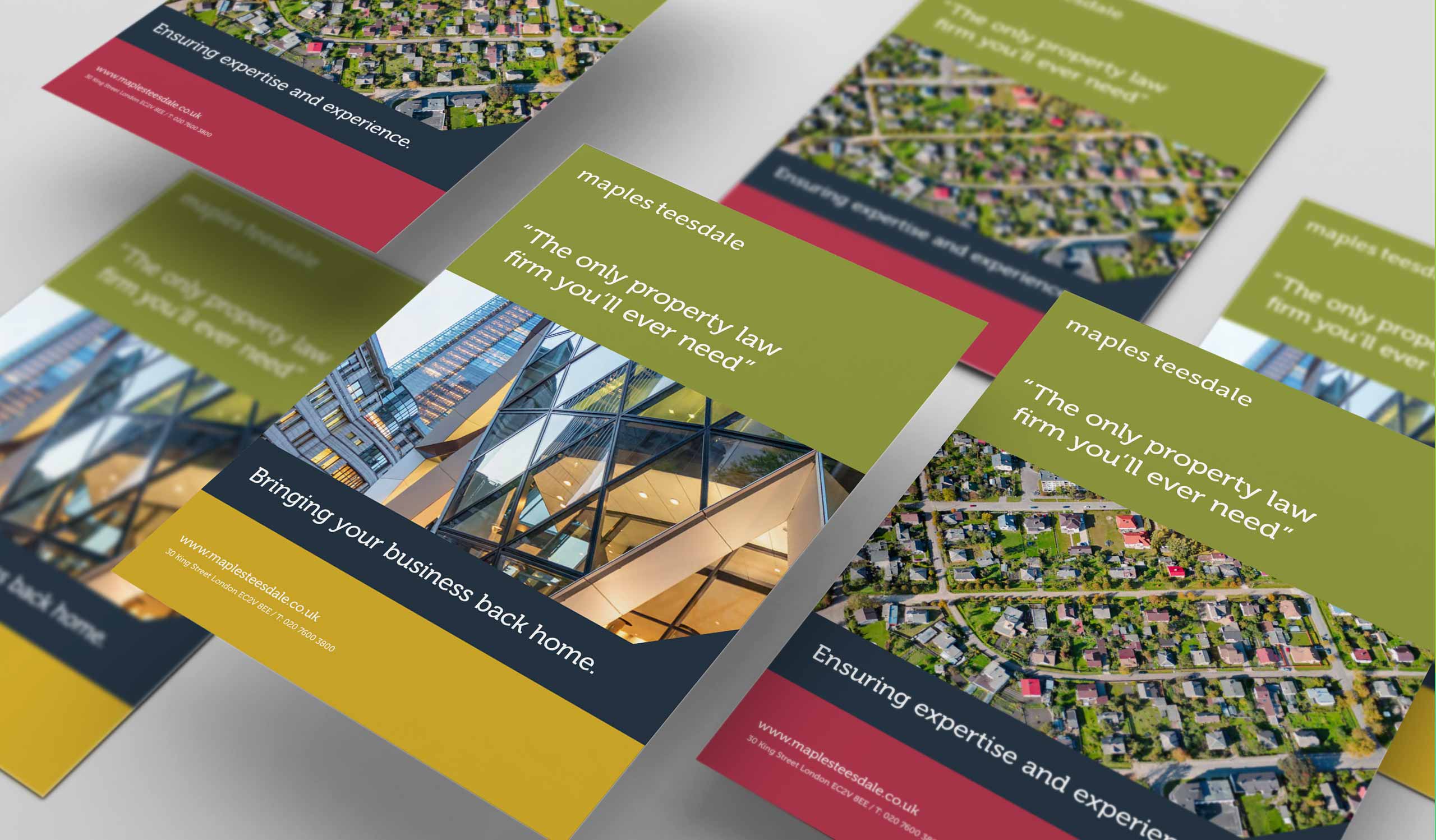
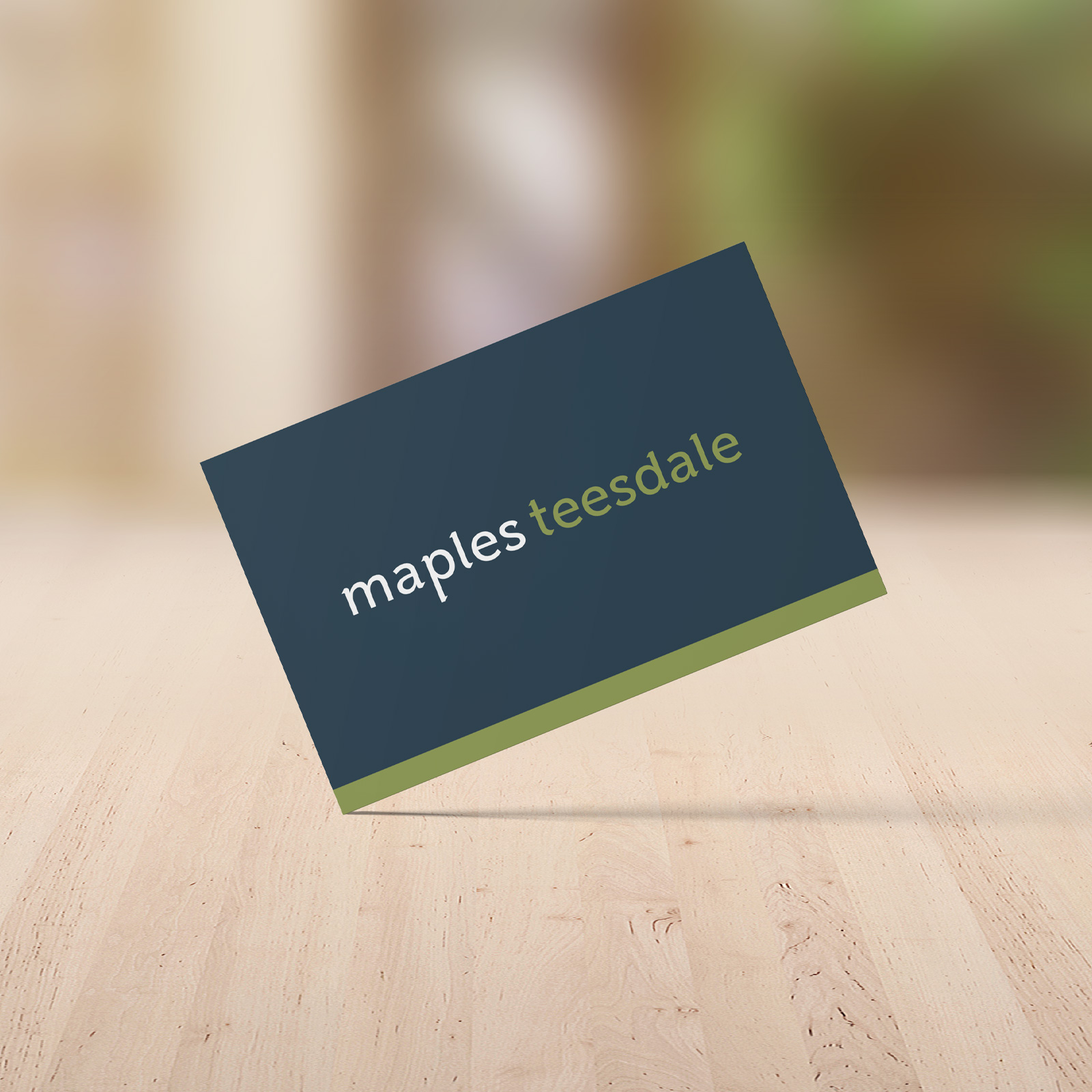
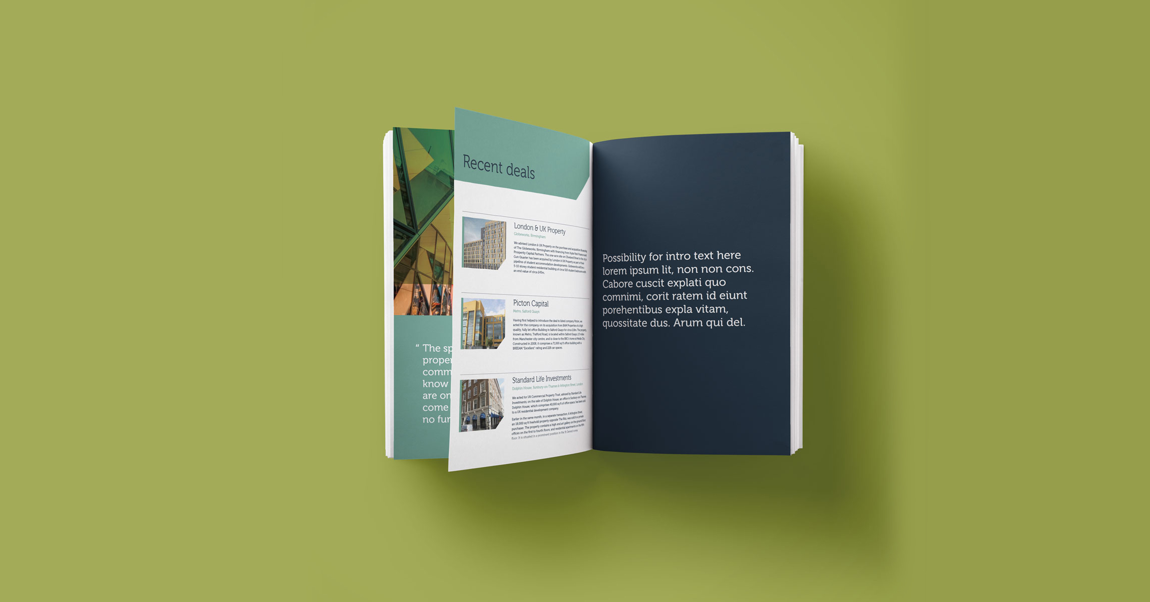
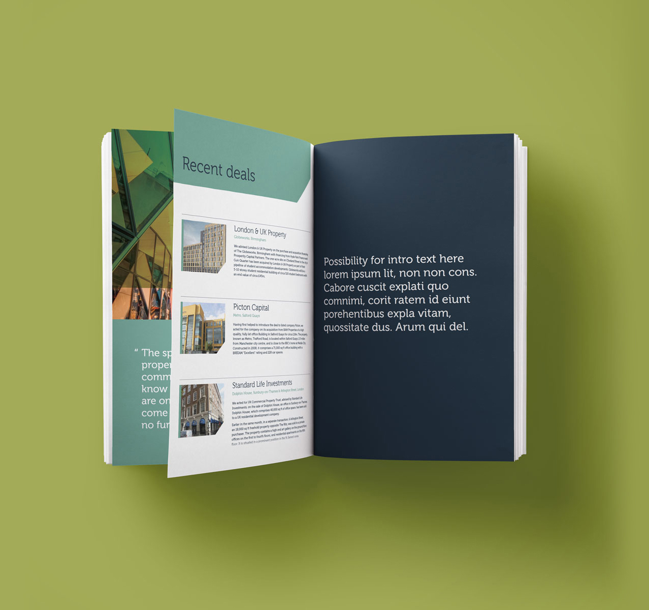
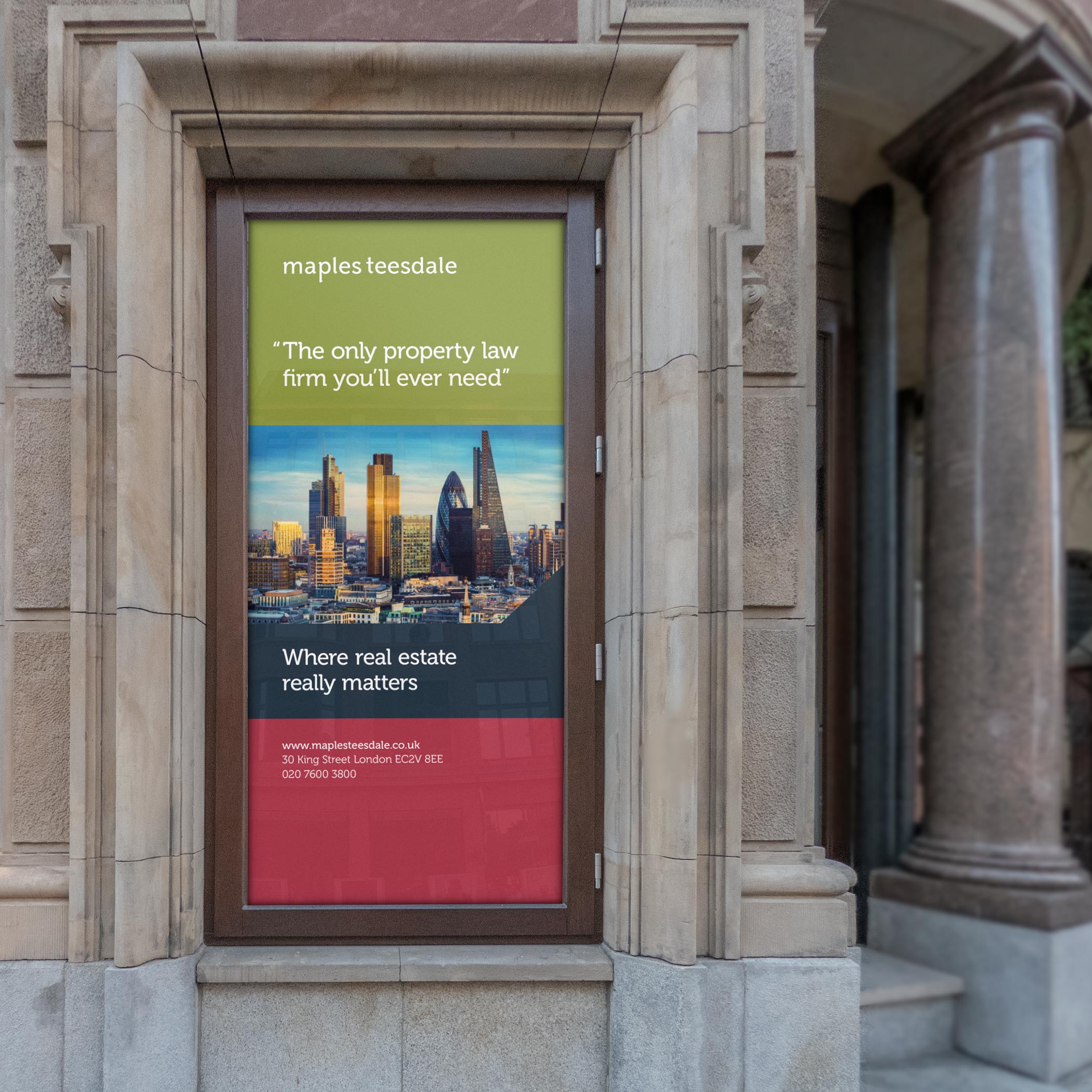
The refreshed identity balances specialist expertise with a more vibrant, approachable personality. Distinctive diagonal details in the typography introduce a sense of movement and forward momentum, expressing the firm’s progressive outlook. This motif extends across imagery, iconography and a bespoke brand mark, creating a cohesive visual language that gives Maples Teesdale greater distinction and consistency across its communications.




A cohesive brand across every touchpoint.
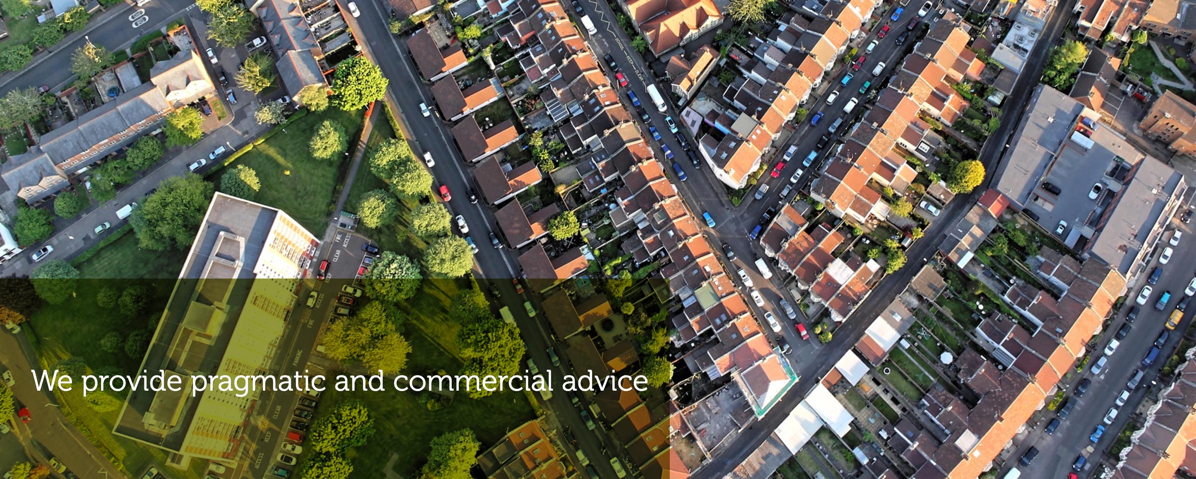
A carefully selected photography suite reinforced this angular theme, with considered crops and focal points helping to communicate the firm’s modern approach to commercial real estate. The identity was applied across a wide range of touchpoints, supported by a suite of templates designed to bring consistency to communications across all media. Alongside the visual refresh, the tone of voice was refined to create a clear, knowledgeable and personable way of communicating with clients and prospects.







A more intuitive digital experience.
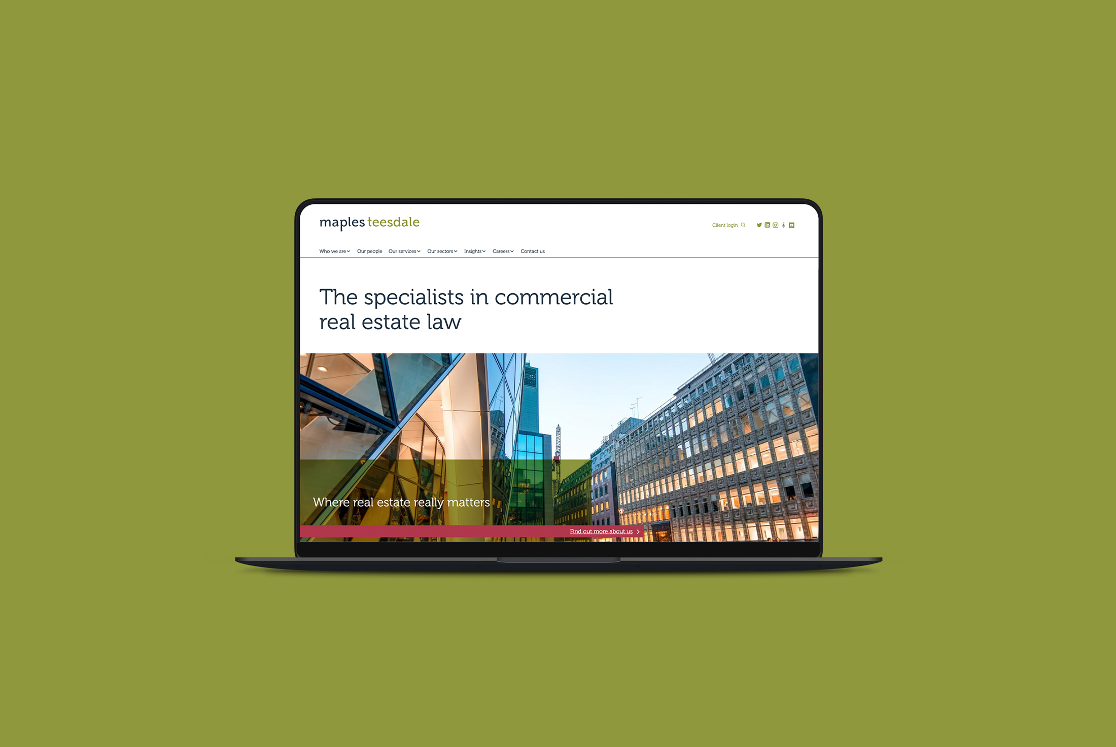
Close collaboration with the Maples Teesdale marketing team established a clear understanding of the firm’s sectors, services and audience needs. Extensive end-user research and structural analysis informed the website architecture, organising content around the information visitors needed most. The result is an intuitive, user-focused digital experience that brings the firm’s expertise into sharper focus while providing a cohesive foundation for its wider marketing and social media strategy.

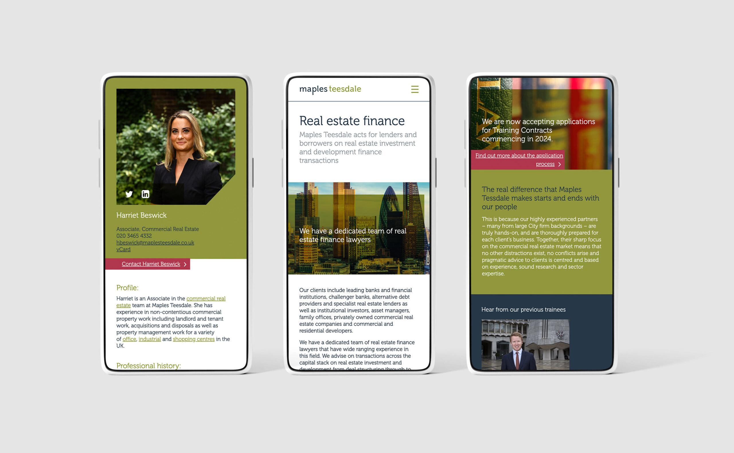
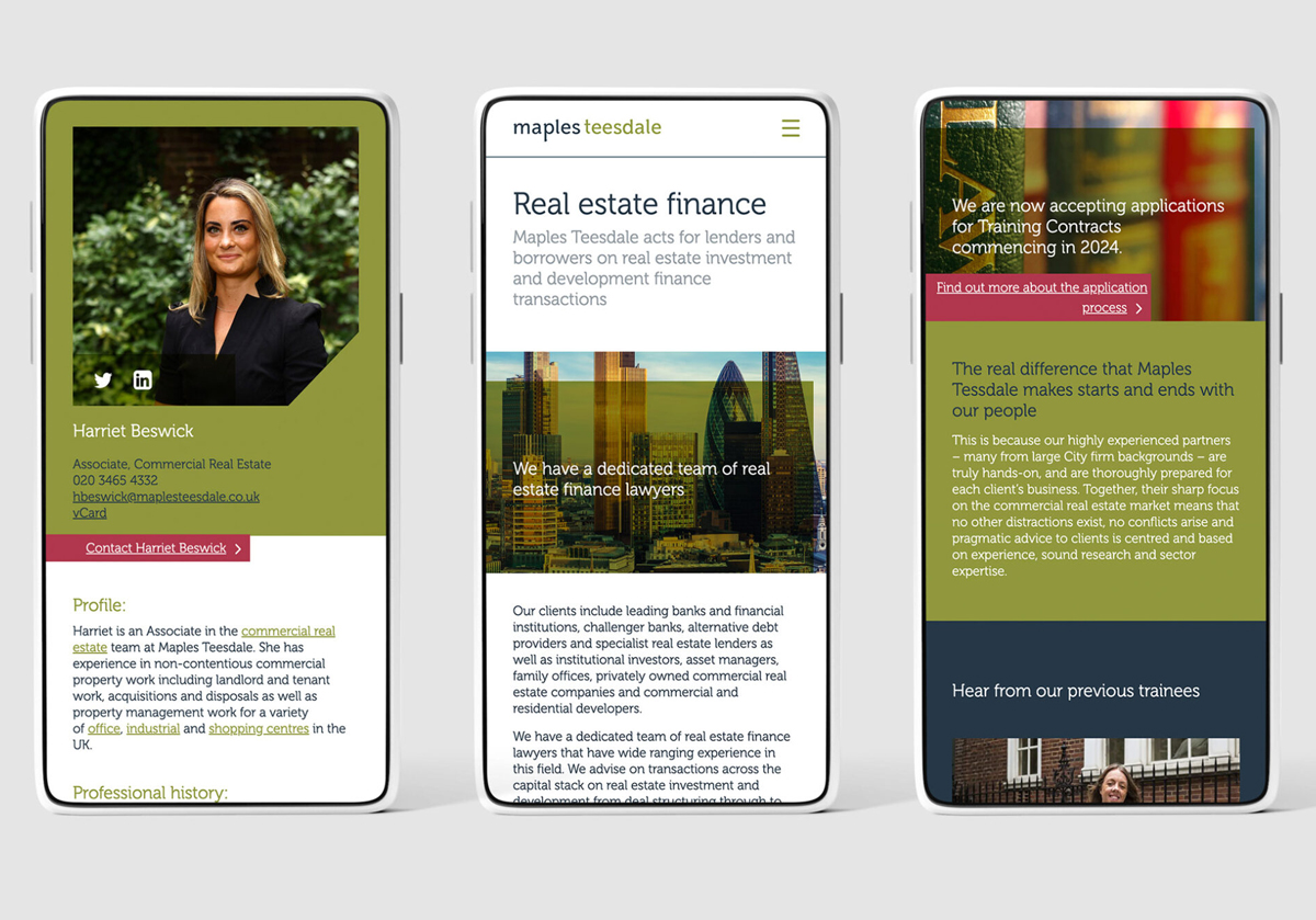
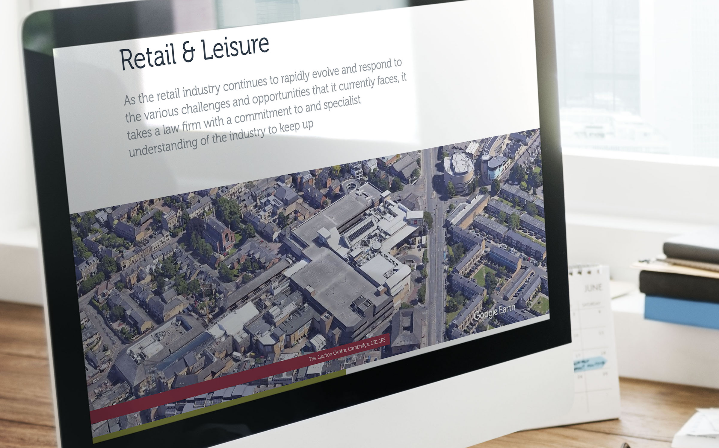
Google Earth aerial video offers visitors a more informative and engaging way to explore the properties and developments at the heart of the firm’s work. By revealing each project in its wider geographical context, the footage helps users understand its location, surroundings and relationship to the area — bringing details that static photography alone cannot convey into sharper focus. Across the website, diagonal graphic details break up straight-edged colour blocks, carrying a defining feature of the refreshed identity into the digital experience and maintaining a consistent visual connection to the wider brand.


A stronger foundation for future growth.
The result is a cohesive brand and digital platform that better reflects Maples Teesdale’s specialist expertise and forward-thinking approach. With a distinctive visual identity, a more accessible website and consistent communications across all channels, the firm now has a stronger foundation from which to engage its audiences and support its continued growth.