A bold and playful new identity for a placemaking consultancy that has always done things differently.
For more than two decades, The Means has been creating better places for people to live, work and spend time. Working across an unusually diverse mix of projects, sectors and communities, its approach combines experience with an appetite for doing things differently.
The business had evolved considerably, but its identity no longer reflected the energy, creativity or breadth of its work.
We partnered with The Means to create a new brand and digital presence that could capture its personality, communicate its expertise and give the business a much more distinctive presence in the market.
Finding the character behind the business
Before developing the identity, we wanted to understand what made The Means different.
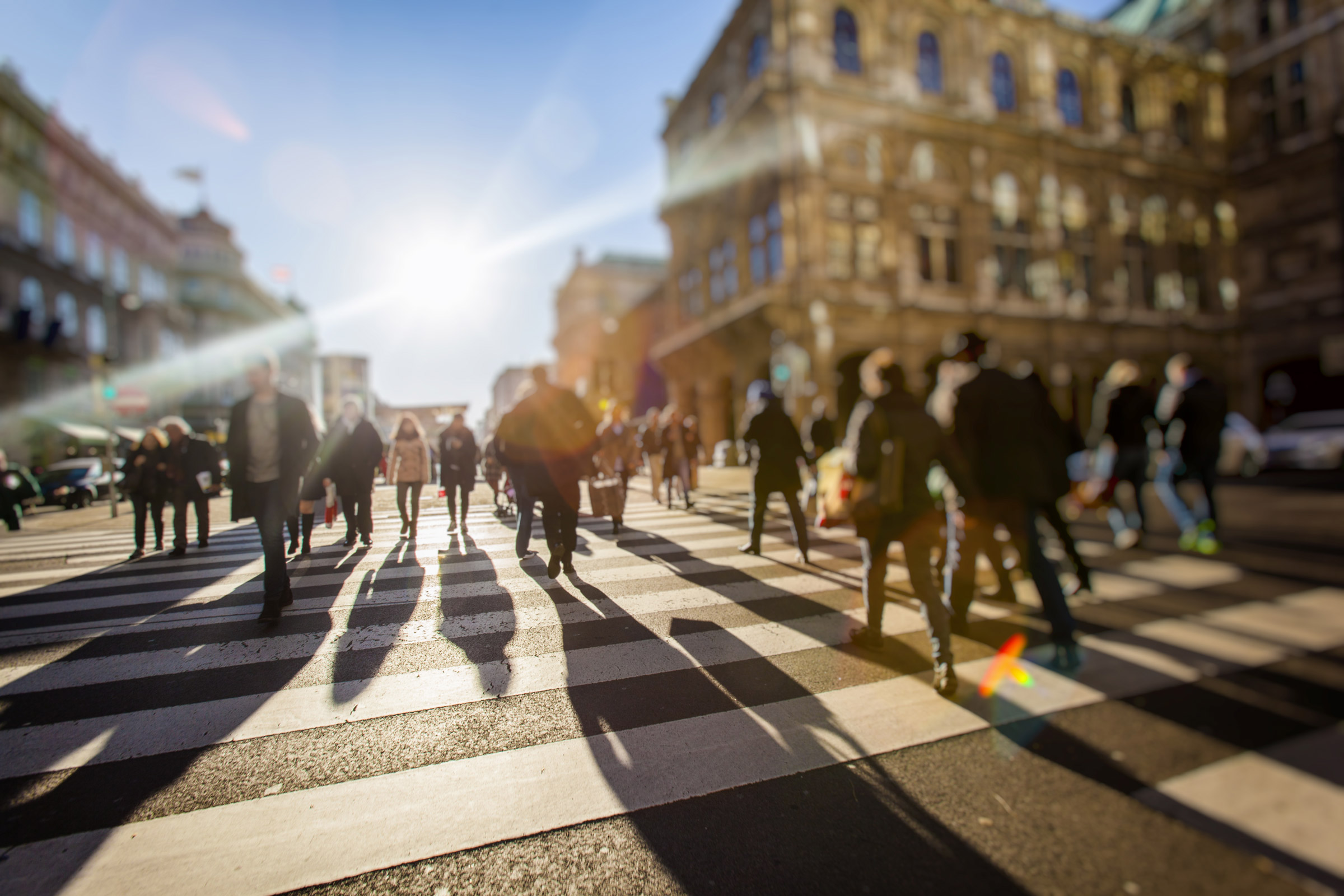
Through conversations with the team and key stakeholders, we explored its projects, clients, culture and ambitions. What emerged was a business with a distinctive combination of qualities: experienced yet entrepreneurial, confident yet adaptable, and serious about delivering great places without taking itself too seriously.
That balance became central to the new identity.
Rather than creating something overly corporate or conventional, we wanted the brand to reflect the energy and versatility that The Means brings to its work.
Creating an identity with room to play
Typography sits at the heart of the new brand.
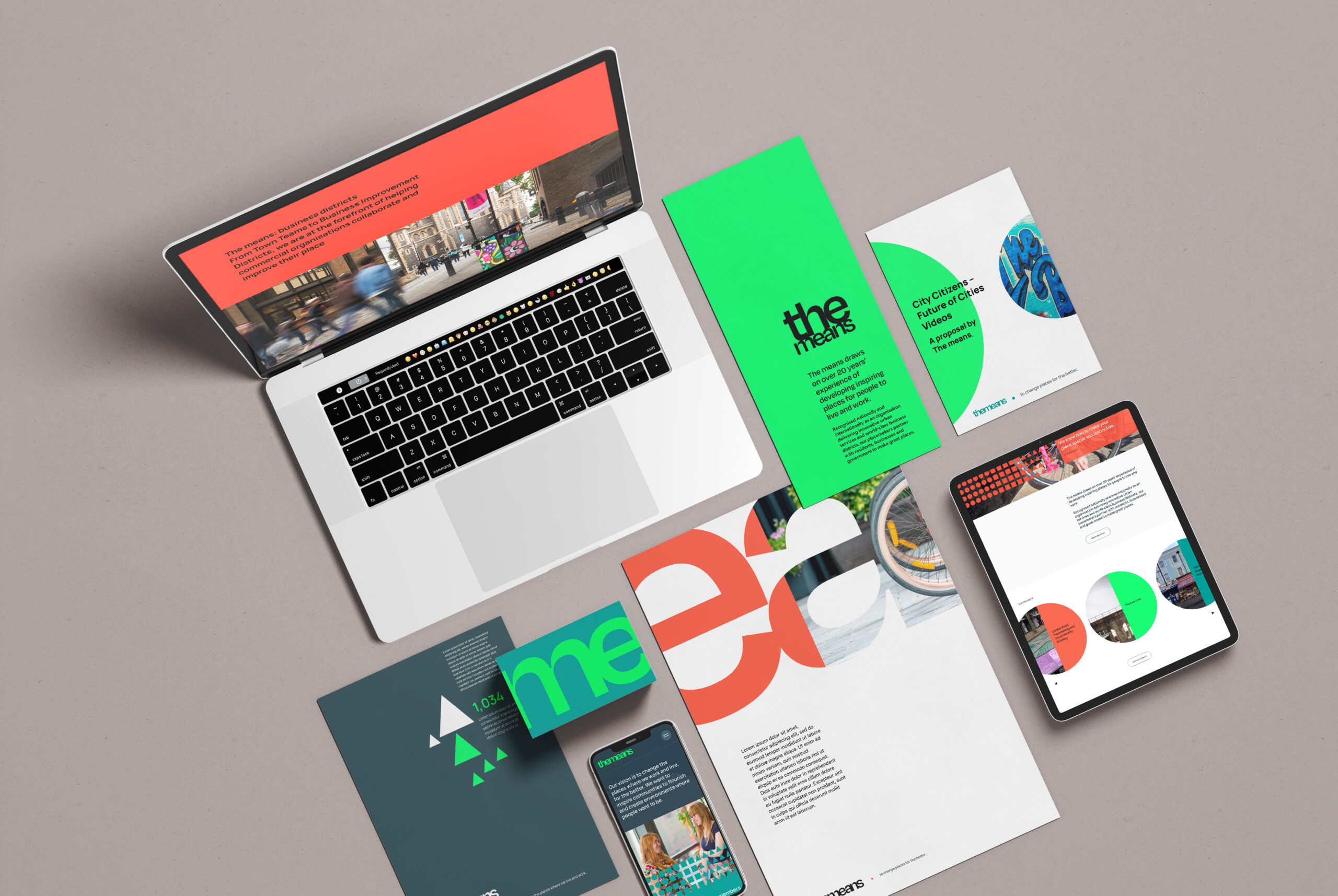
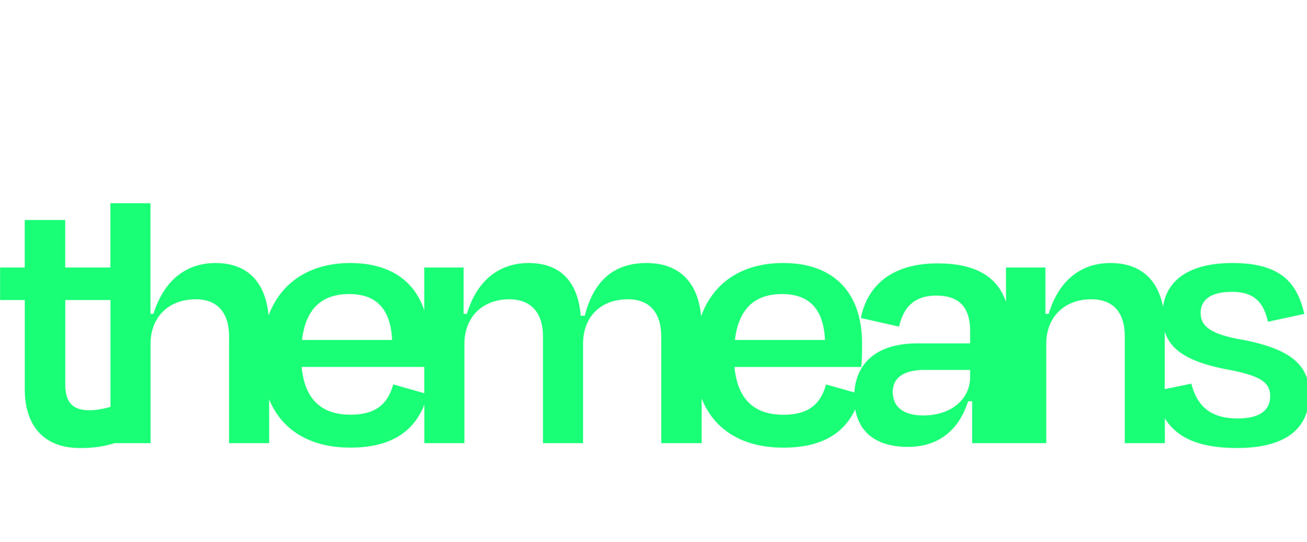
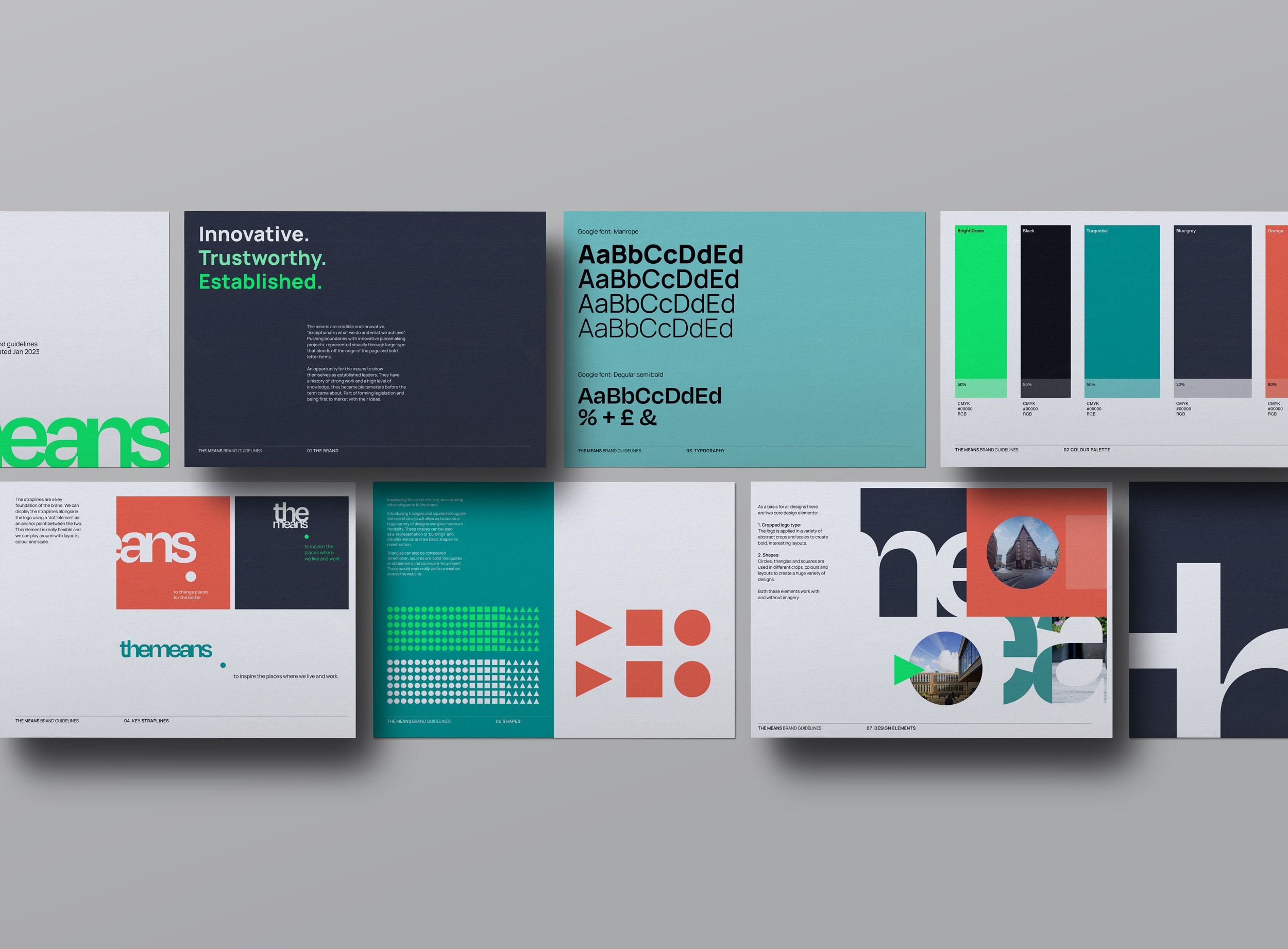
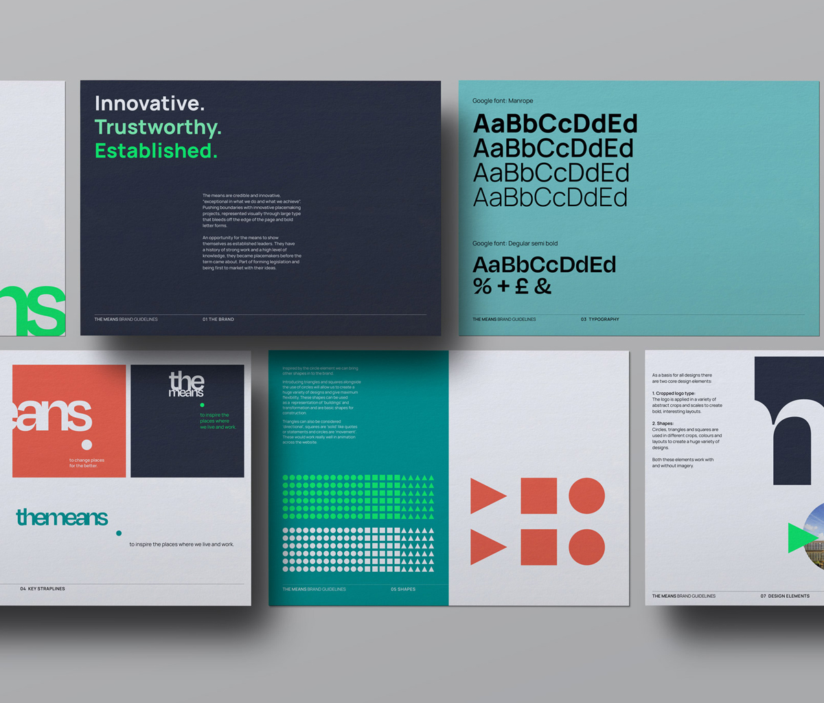
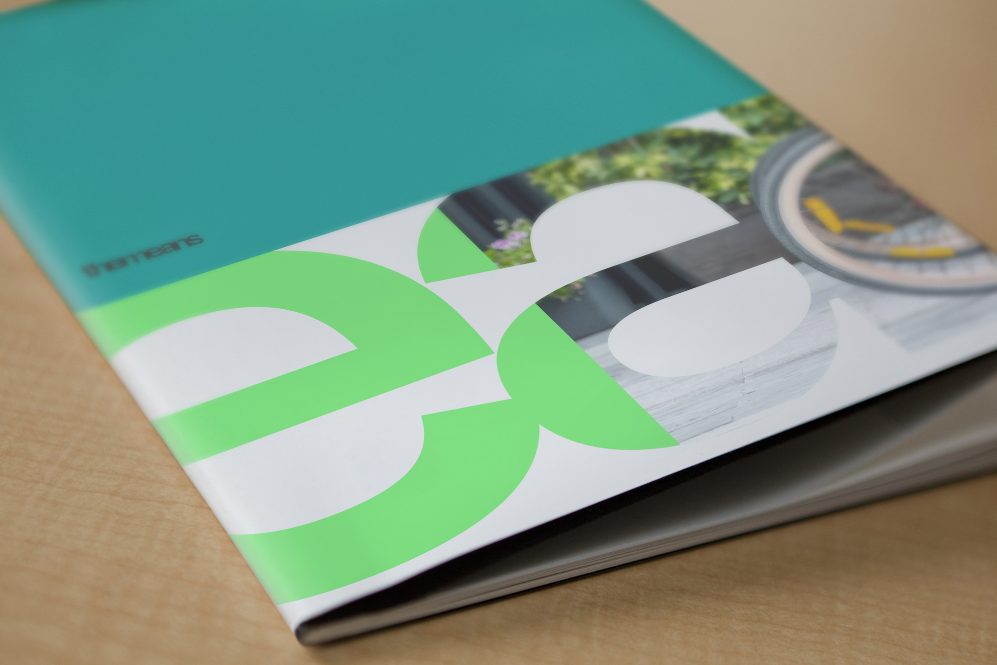
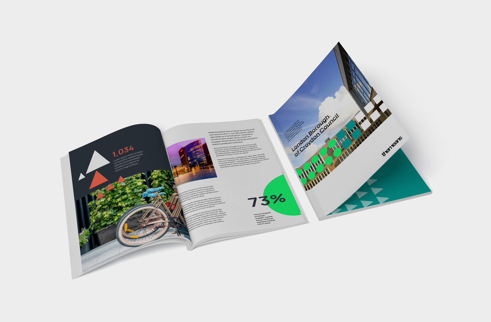
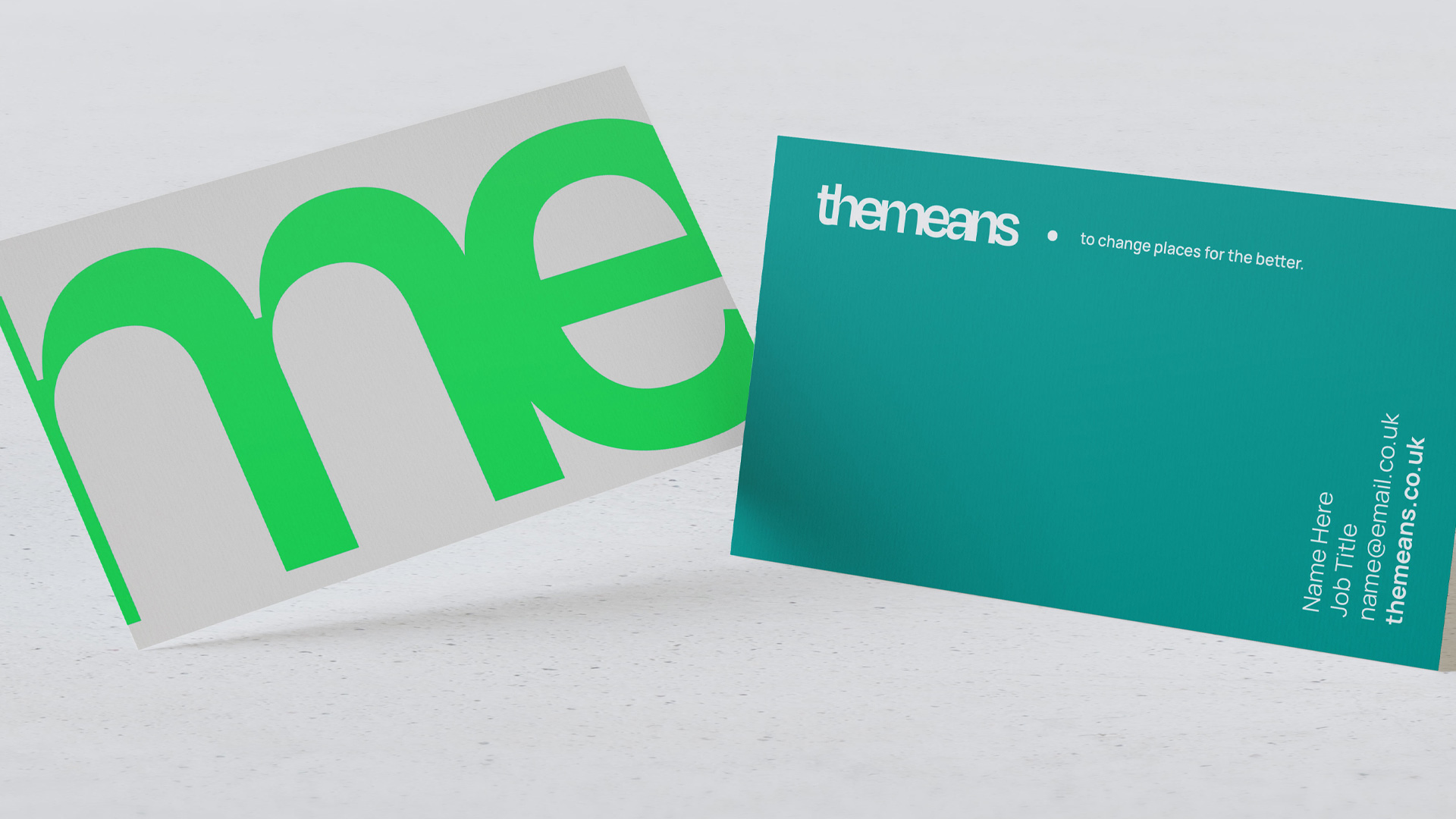
We created a bold typographic logo with horizontal and stacked variations, giving the identity the flexibility to adapt across different formats and environments. Cropped, enlarged and layered with imagery, the logo becomes a graphic device in its own right – creating compositions that feel energetic, confident and recognisably The Means.
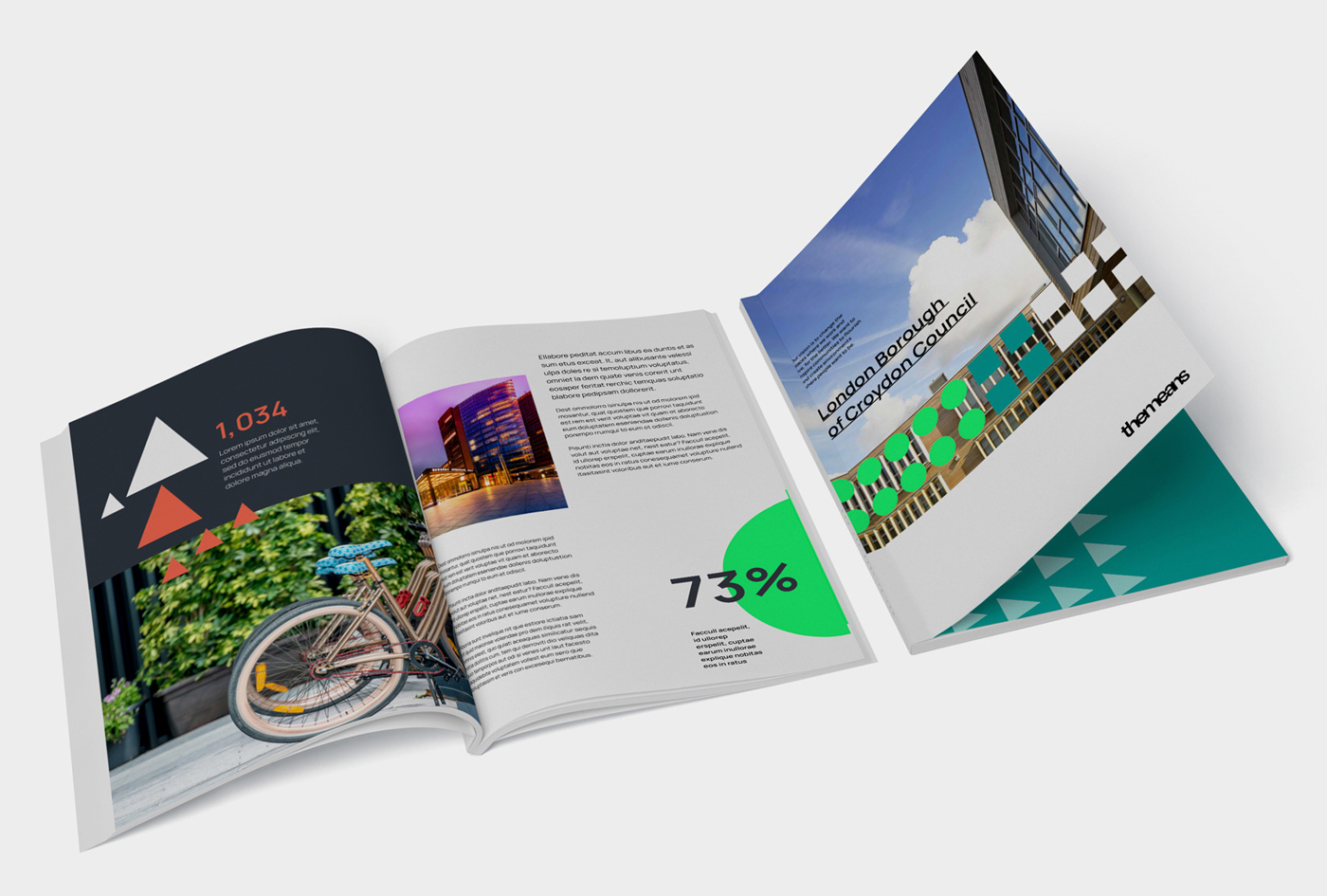
A family of geometric shapes adds another layer to the visual language. Inspired by the built environment, these elements can frame imagery, highlight information and bring structure to everything from infographics and presentations to digital content.
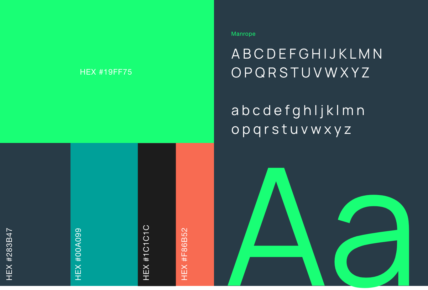
Together, the typography, shapes and colour palette create a flexible visual toolkit – playful when it needs to be, but with enough restraint to work in more formal settings.
Making the brand work in the real world
A successful identity has to do more than look good. It needs to work for the people using it every day.
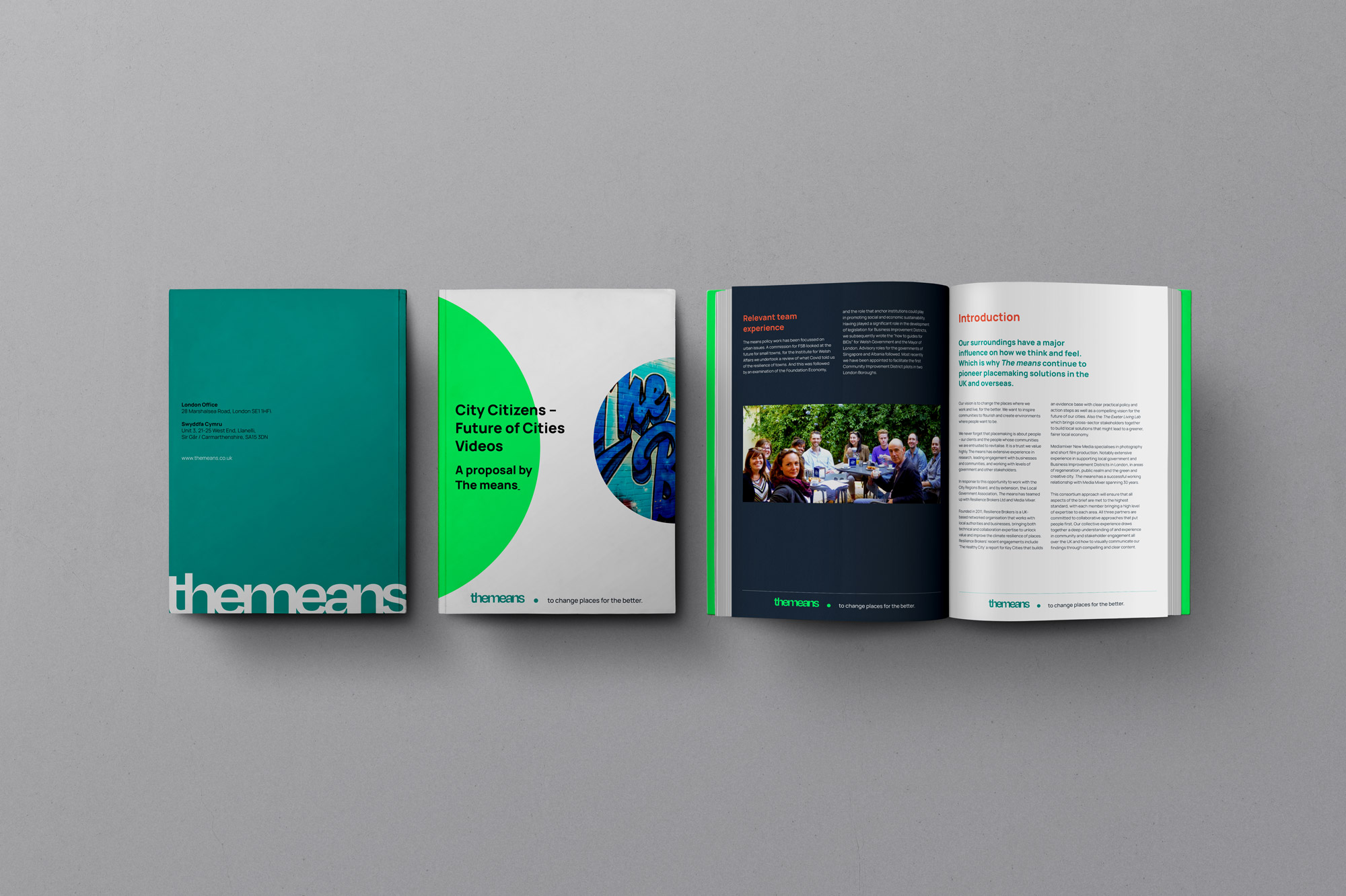
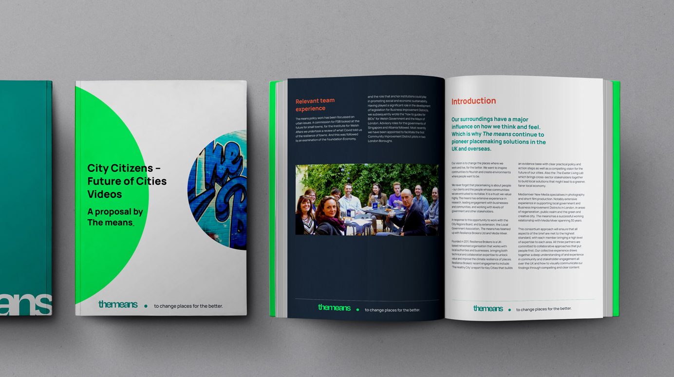
We developed the new brand across business cards, presentations, templates, infographics and other communications, creating a system that gave The Means plenty of creative freedom while maintaining consistency.
For pitch documents and presentations in particular, we introduced clear grid systems and adaptable templates that the team could manage themselves. The result is a brand that can dial its personality up or down depending on the audience, without losing its distinctive character.
Bringing the experience online
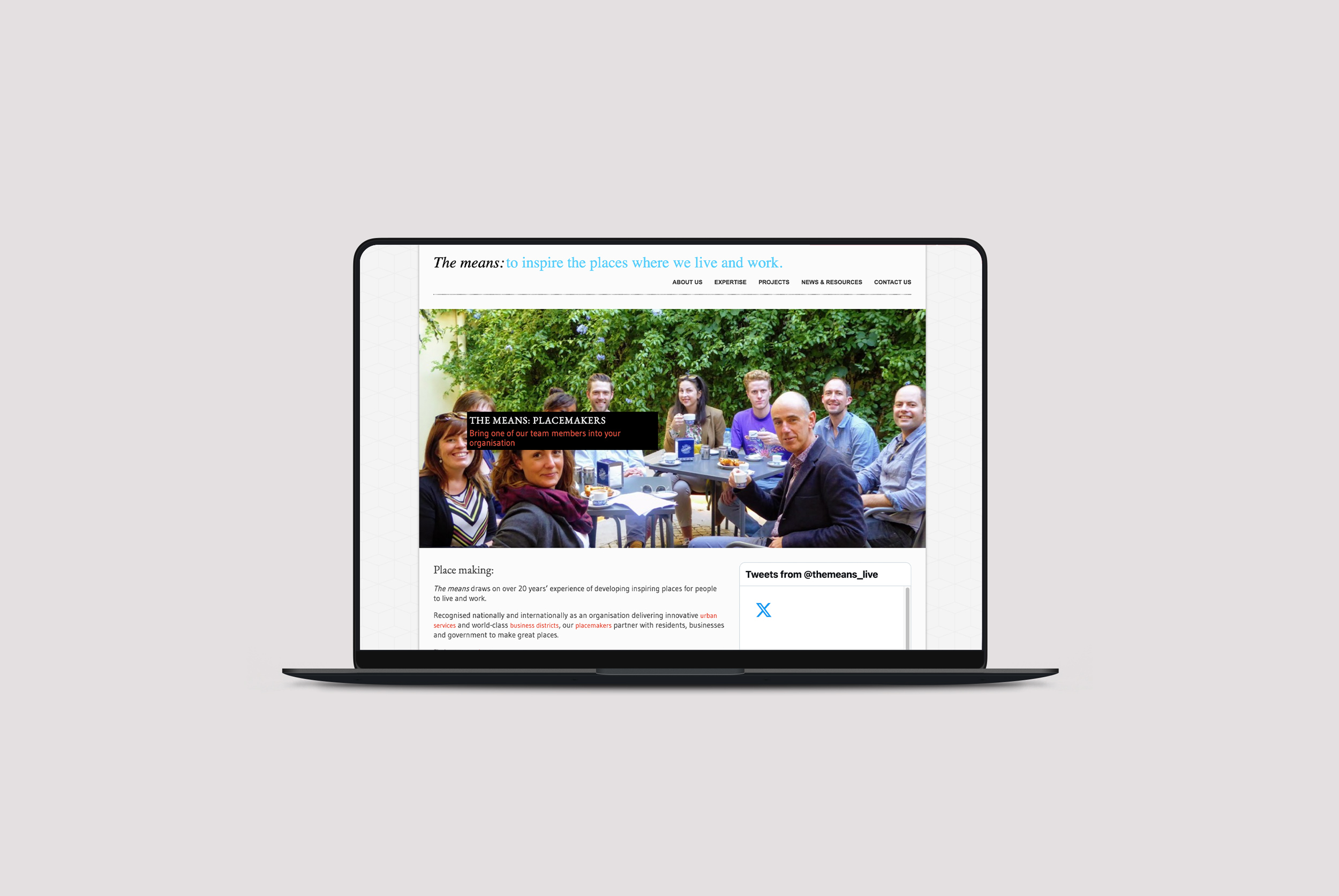
With the visual identity established, we turned our attention to The Means’ website.
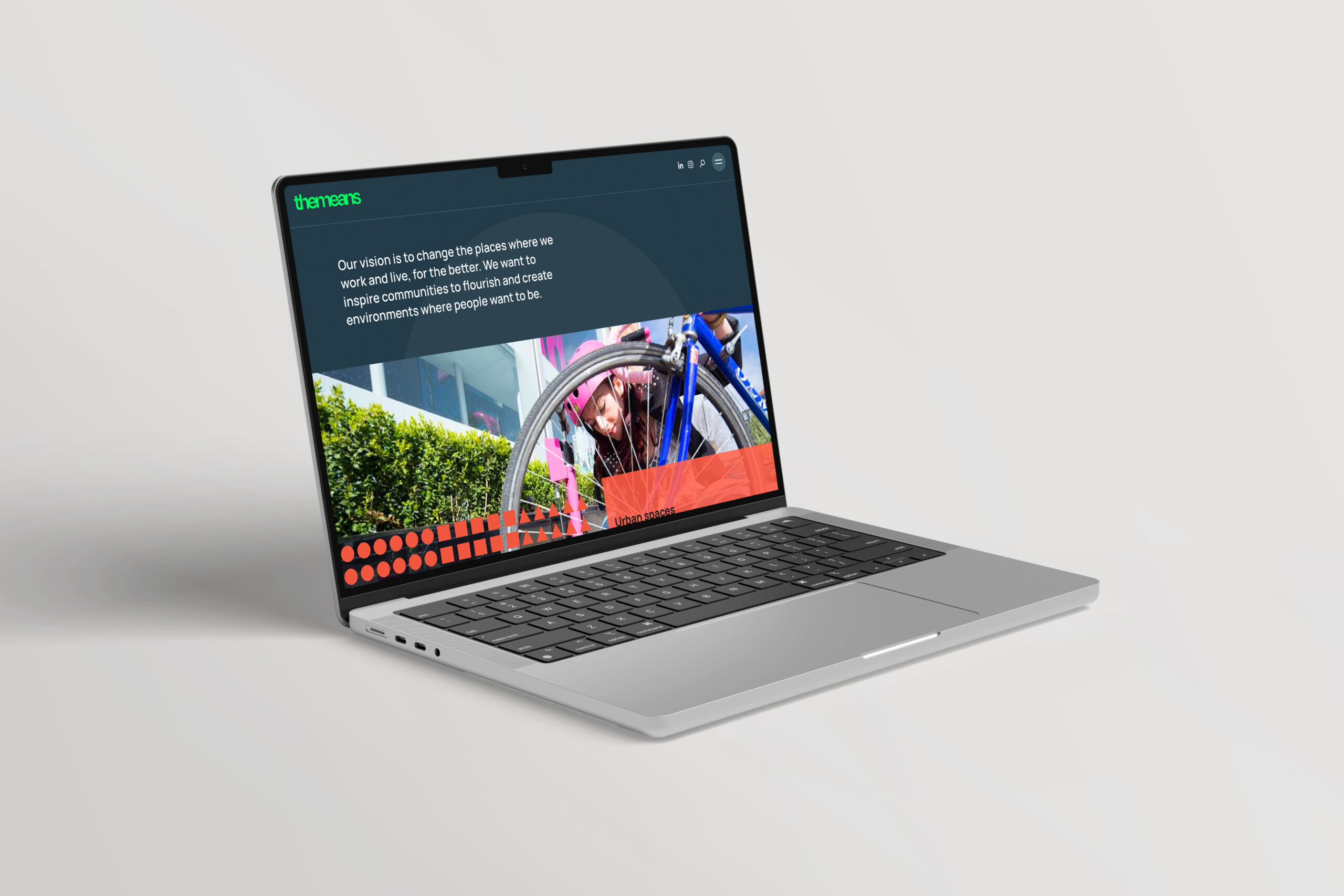
We began by reviewing the existing structure and identifying opportunities to simplify the experience, before translating the new brand into a more engaging digital environment.
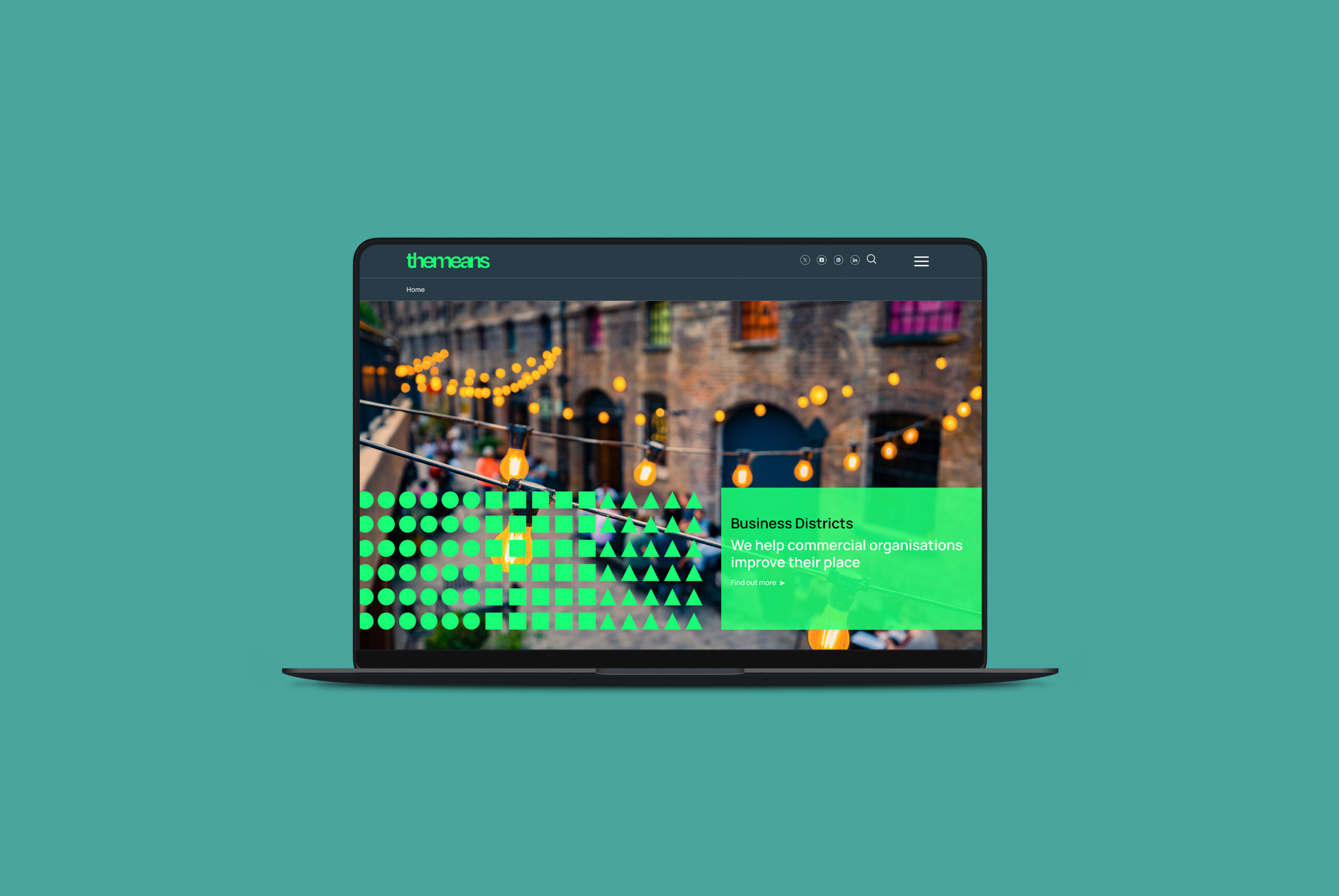
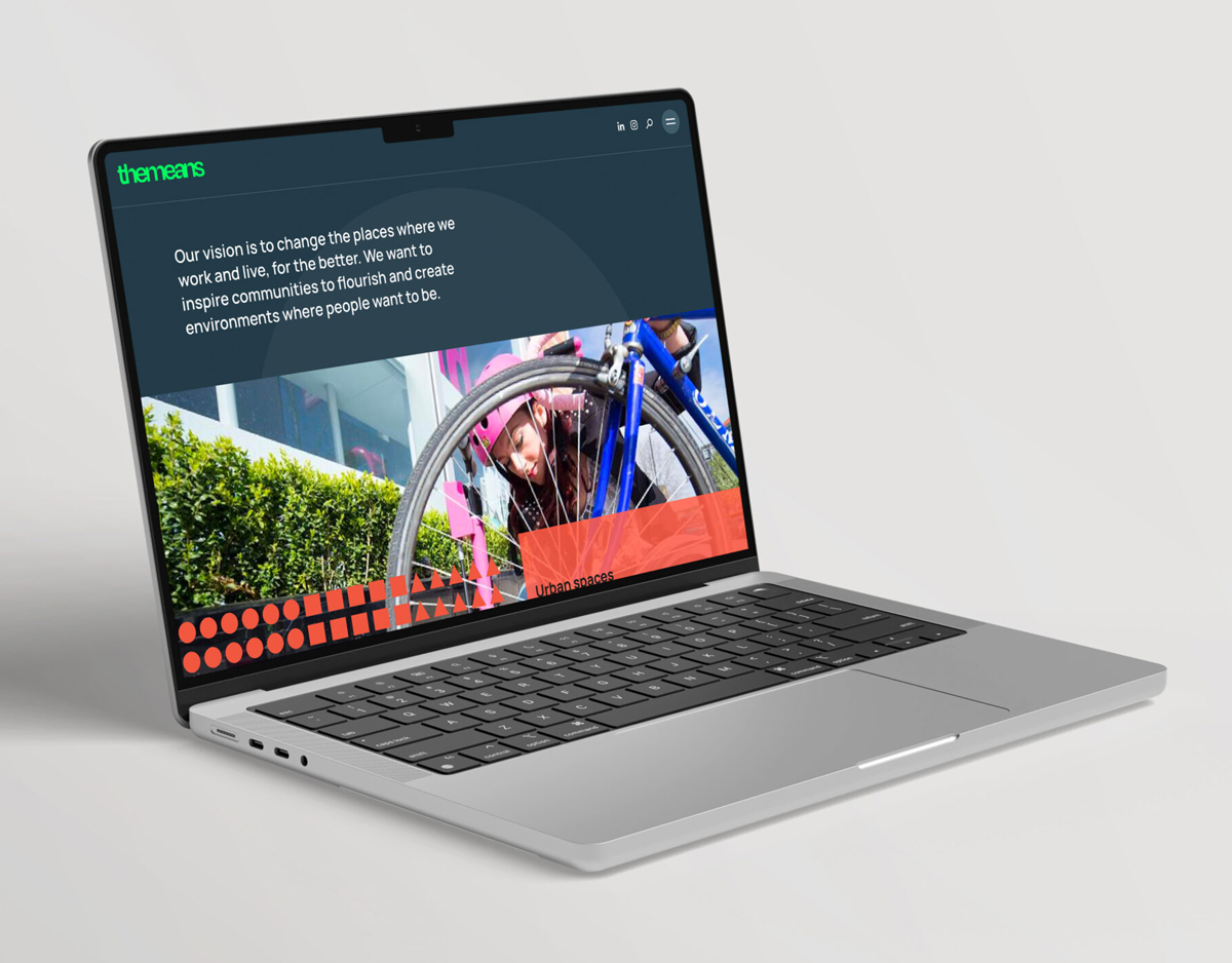
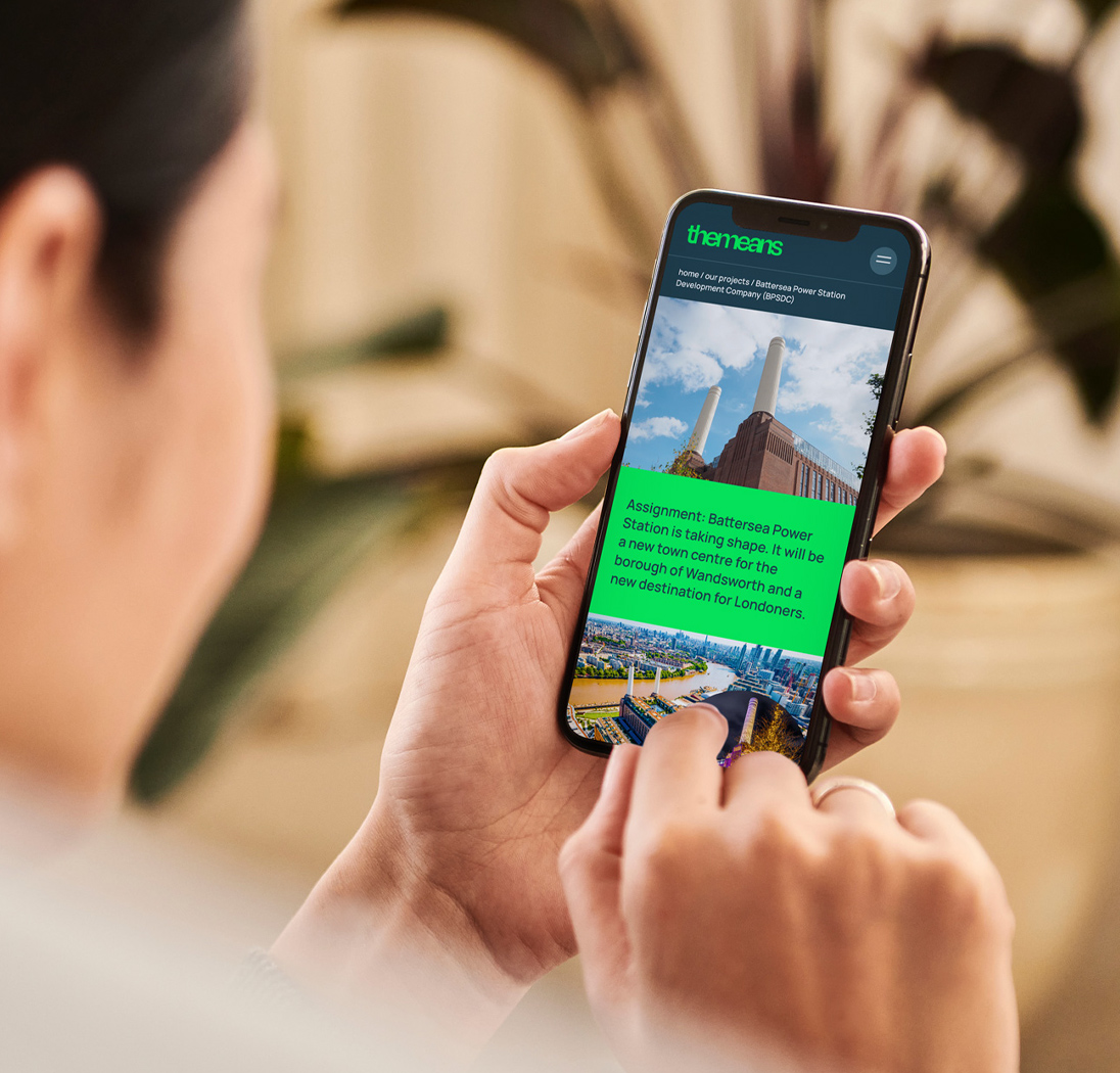
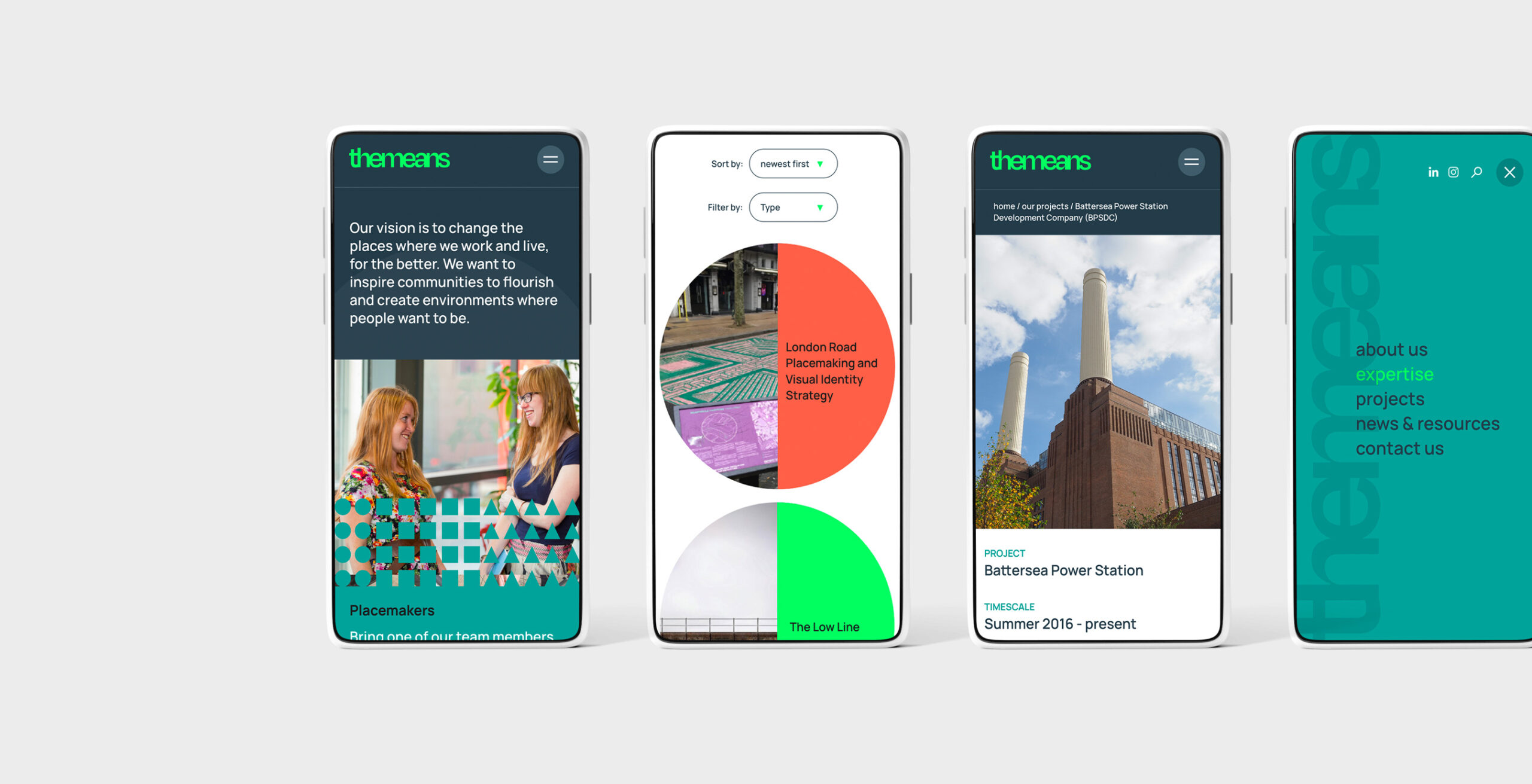
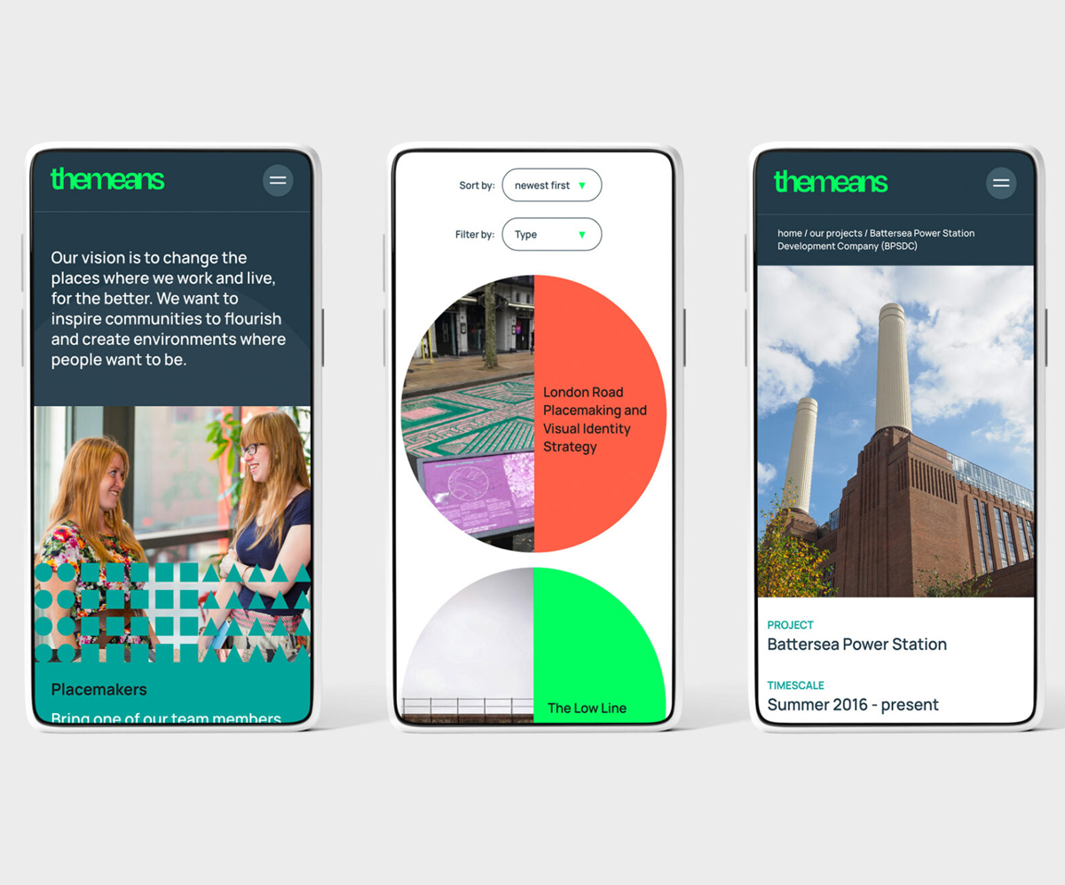
Shapes, patterns, movement and interactive elements bring the identity to life throughout the site, while the design gives the company’s work much greater prominence.
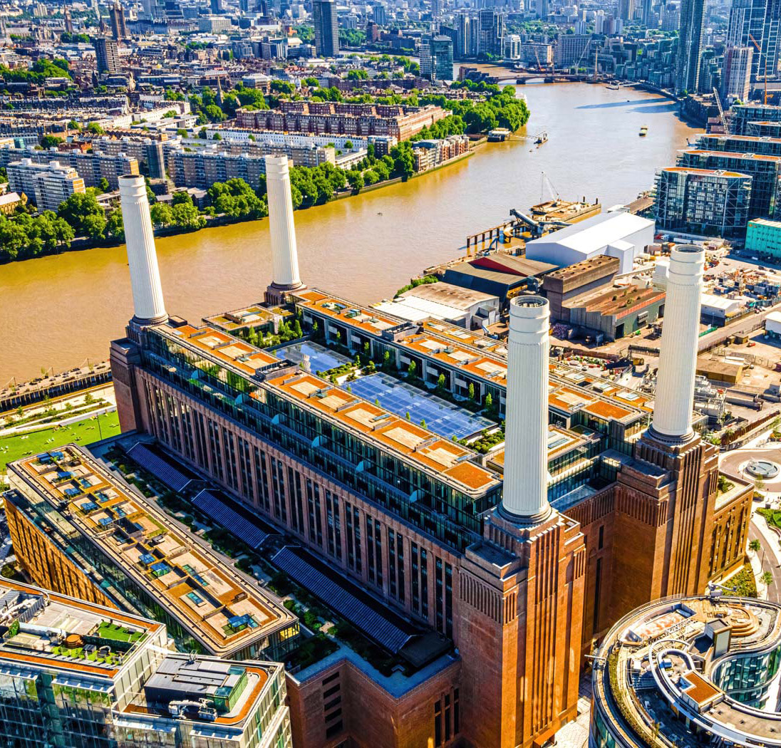
Projects are central to The Means’ story, so we created a more visual way to explore them, including interactive before-and-after treatments and opportunities to bring client and expert perspectives into individual case studies.
The result is a website that doesn’t simply carry the new identity – it extends it.
A brand as varied as the work behind it
The new identity gives The Means a much stronger platform for communicating who they are and what they bring to placemaking.
Flexible, energetic and full of personality, the brand can adapt across audiences, sectors and applications while remaining unmistakably The Means.
Most importantly, it reflects the character of the business behind it: experienced, collaborative, inventive and always looking for a better way to make great places happen.