Rouse, a global IP firm, required a brand to reflect their vibrant personality.
Chalk began the process with a brand workshop to discuss and understand the firms’ work and history, their values and what they champion together with what they wanted to communicate to their staff and clients. This was then used to begin developing an identity that visualised the different dimensions of the company. We wanted to bring out the character and values of Rouse; a firm that does not sit in the typical, hierarchal law firm model, a firm that we felt deserved an identity that communicated this.
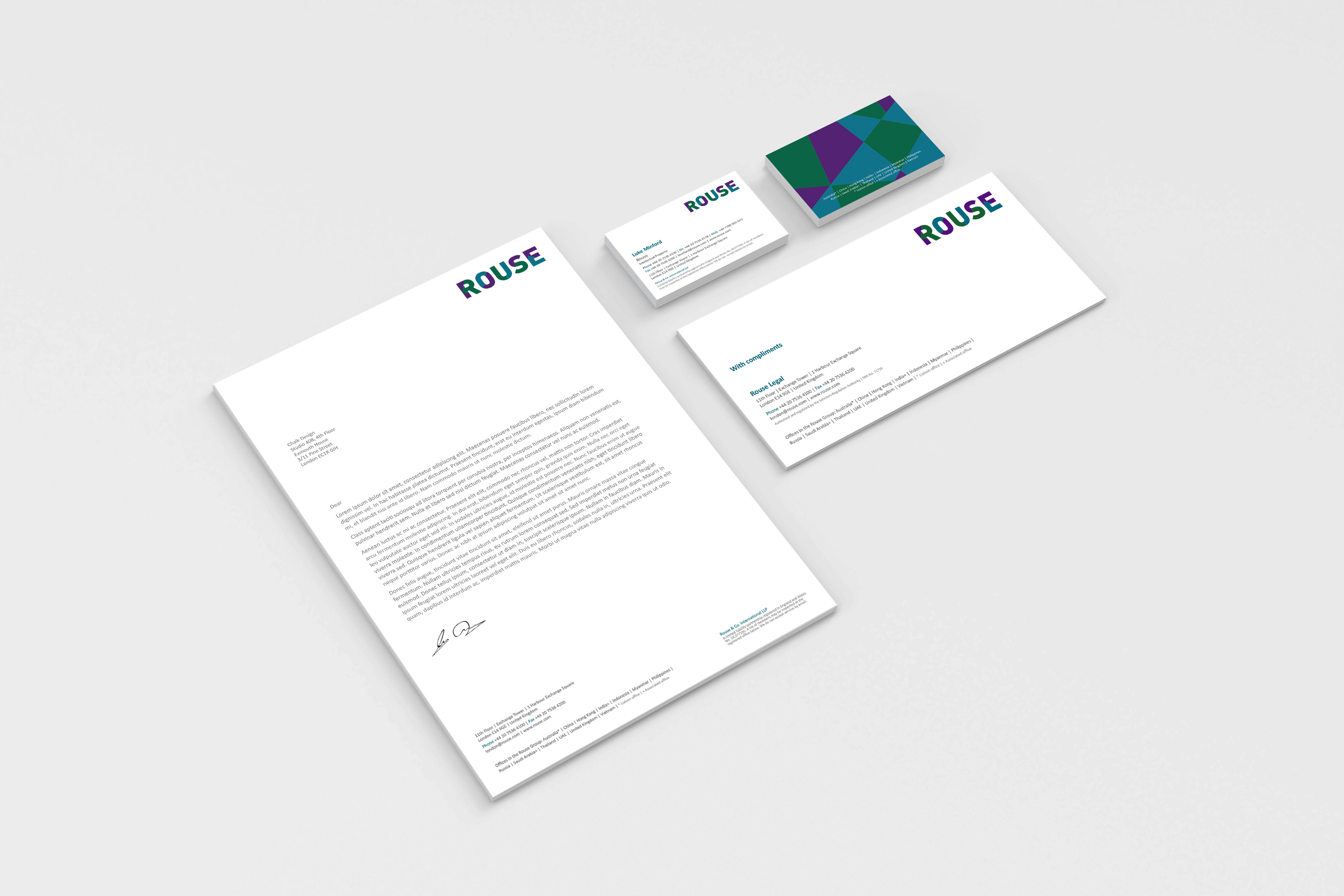
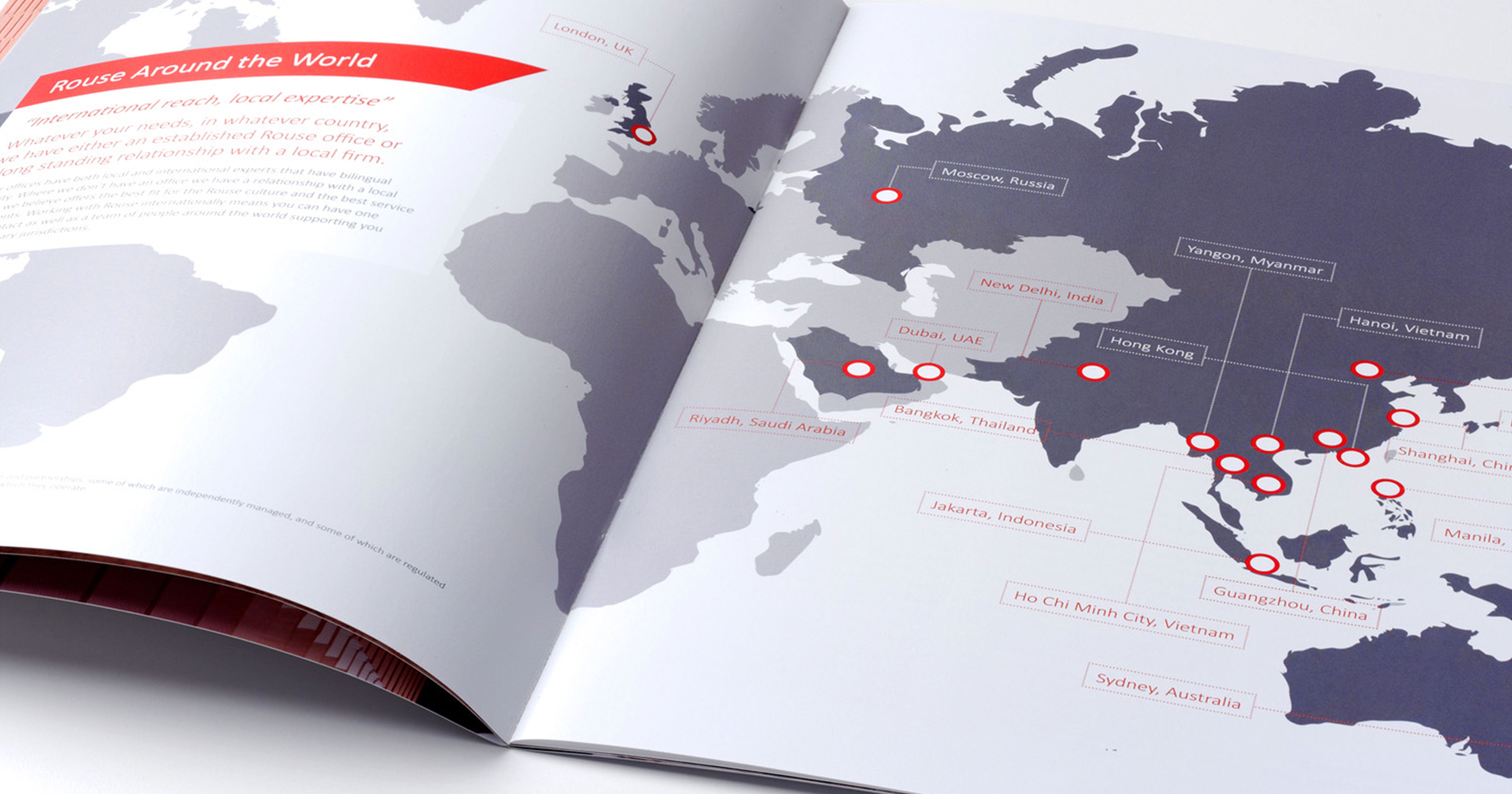
From initial creative concepts culminated a vibrant identity that represented the openness and unconventional attitudes of the company. An identity that could use interchangeable backgrounds and colour scheme to fit their context with the primary design being a multi-dimensional pattern using strong, vibrant colours to match the characters of the firm's leaders, staff and clients alike. Secondary colour palettes with the same pattern were used for the identities of their international offices to give a sense of individualism whilst maintaining overall unity. The new branding was applied to stationary, business cards, event collateral, and of course, their website.
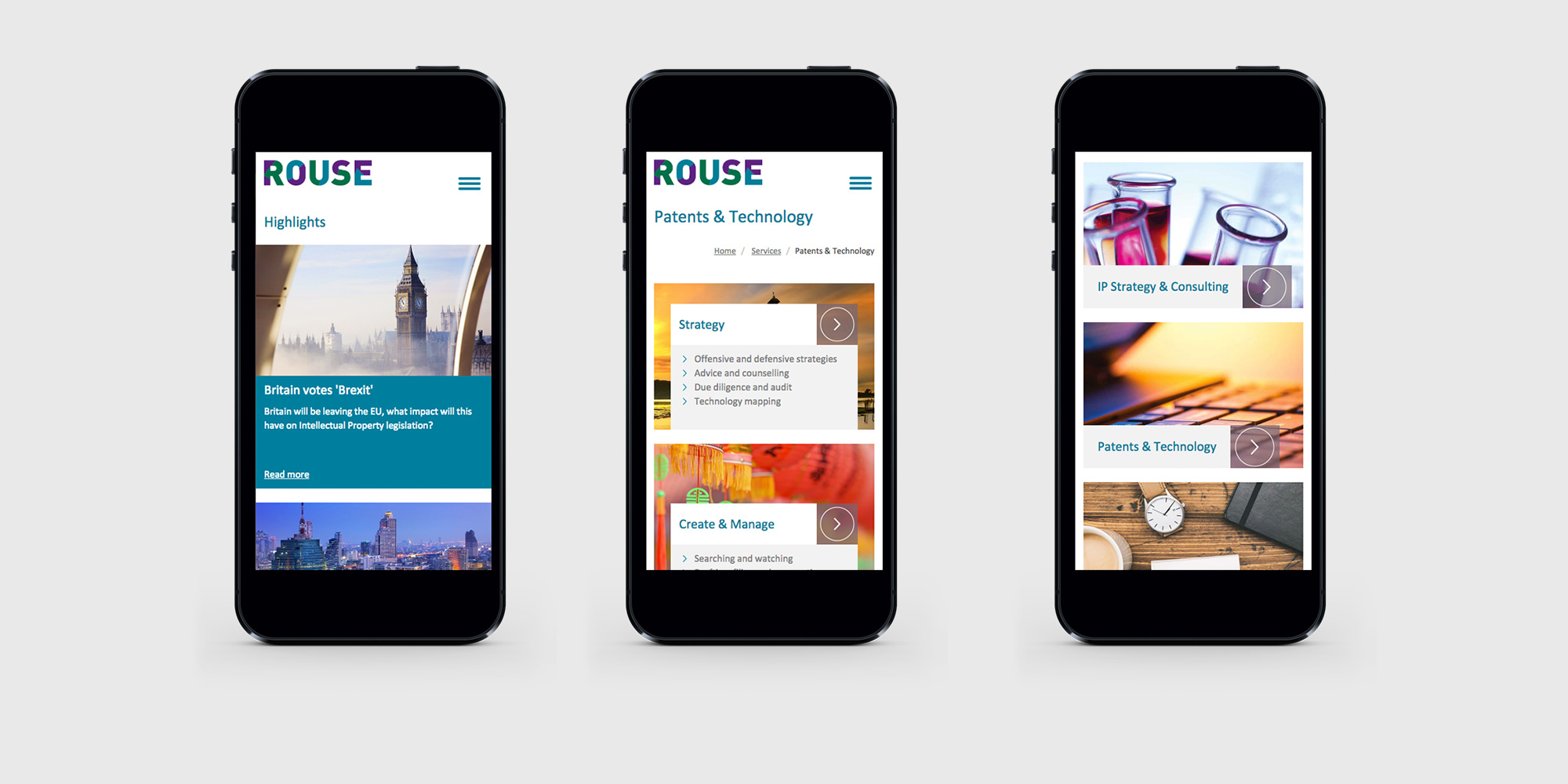
As a result of the success of the Rouse re-brand, Chalk were asked to completely rebuild and redesign the Rouse website to be more in line with the fresh and clean feel of identity. We were first tasked with decluttering the homepage which we addressed through carefully considered design choices and streamlined navigation. The site also needed to be responsive and more directed towards services.
Fundamental to the re-design was creating a website that functioned as a far more powerful tool for their marketing department, providing the client with content template flexibility allowing them to upload any amount of content without any design restrictions and tailoring the site to direct visitors towards their services.