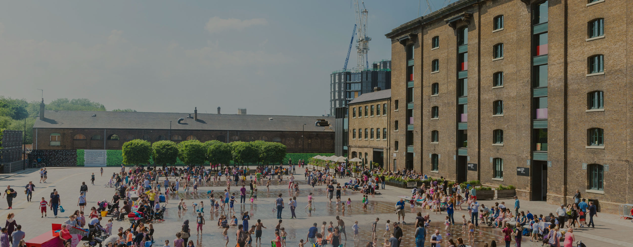
King’s Cross – One of the hottest places to live, eat and socialise in London at present, largely due to the extensive re-development of the area overseen by property development experts, Argent.
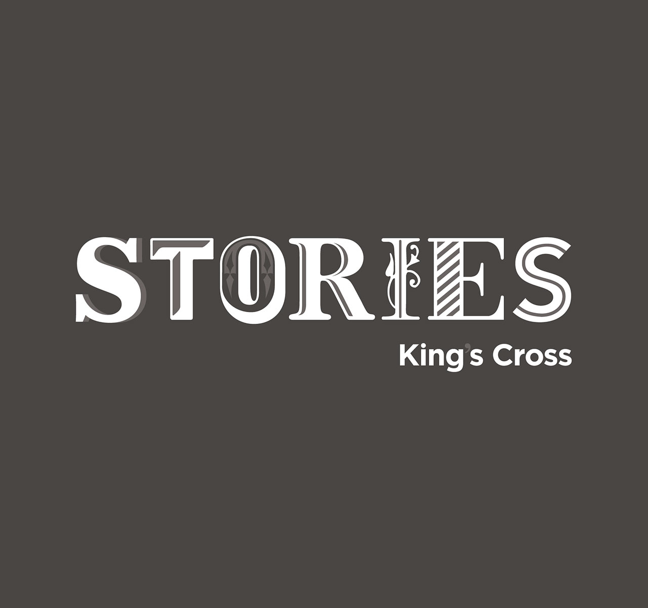
Following the success of last years’ ‘Journey’s’ events at King’s Cross, ‘Stories’ was to be the years overarching brand for the King’s Cross events programme. This was an identity that needed to be fun and suitable for all ages, that needed to be eye-catching and embrace various styles and genres as a reflection of the events.
Without doubt a fun but challenging brief for our creatives, we all went to childhood and back recalling our favourite stories, their illustrations and what they evoked for us. With the subject of ‘stories’ being one that is as old as time we explored different typography through the ages and created an identity that combined different typographical styles to communicate how variety, age and genre can still all fall under the same umbrella.
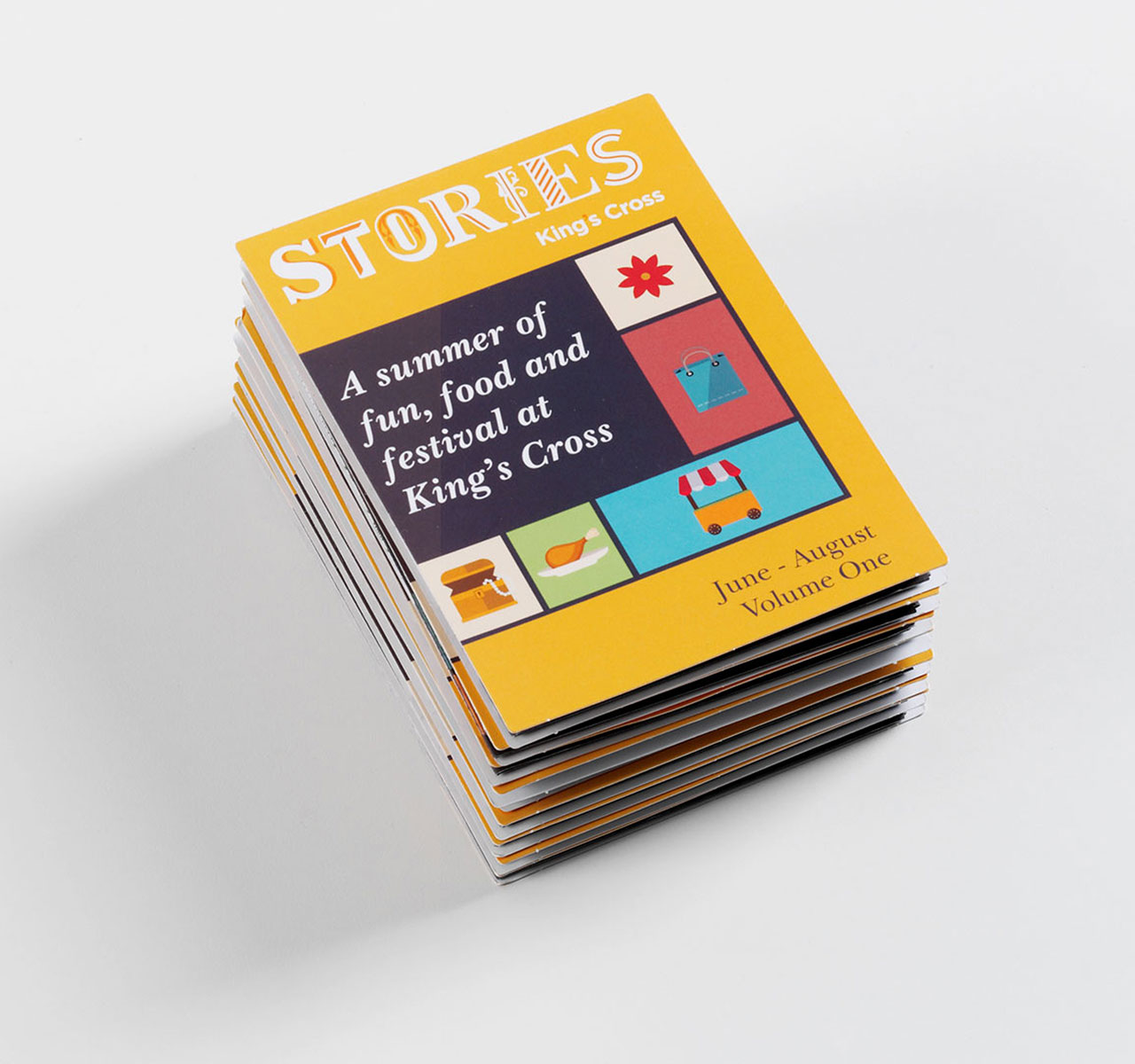
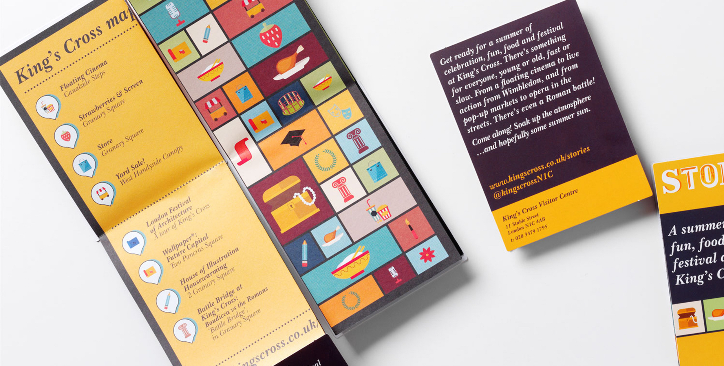
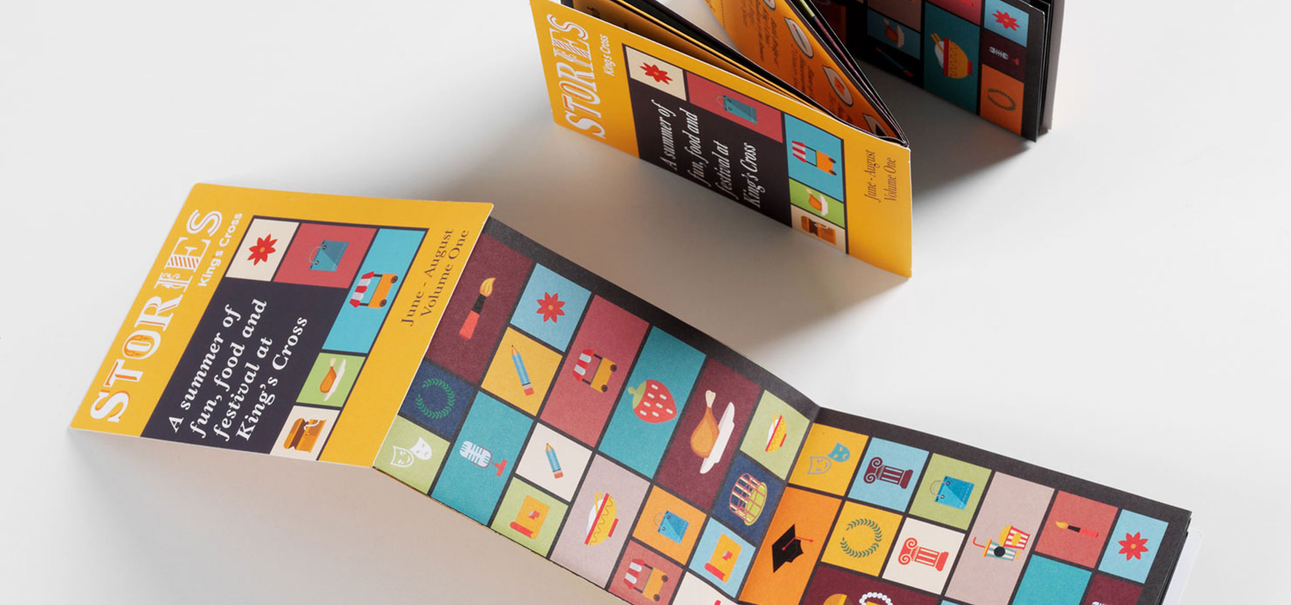
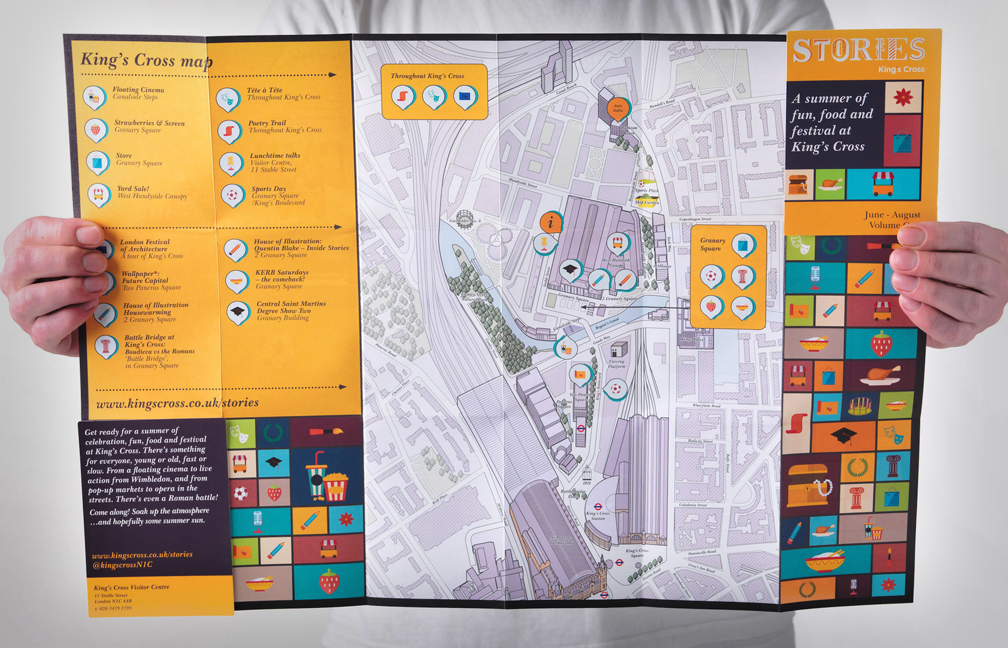
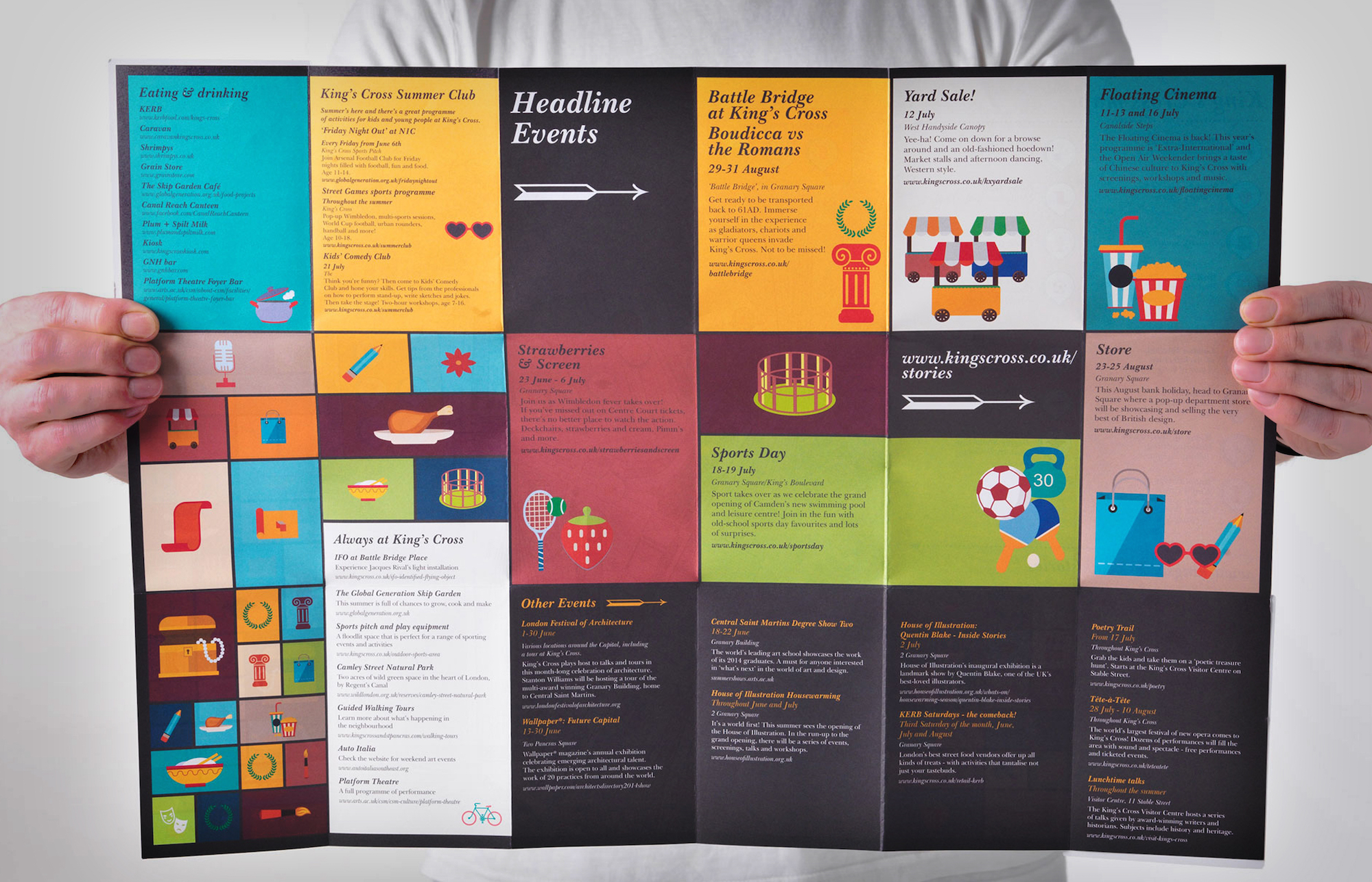
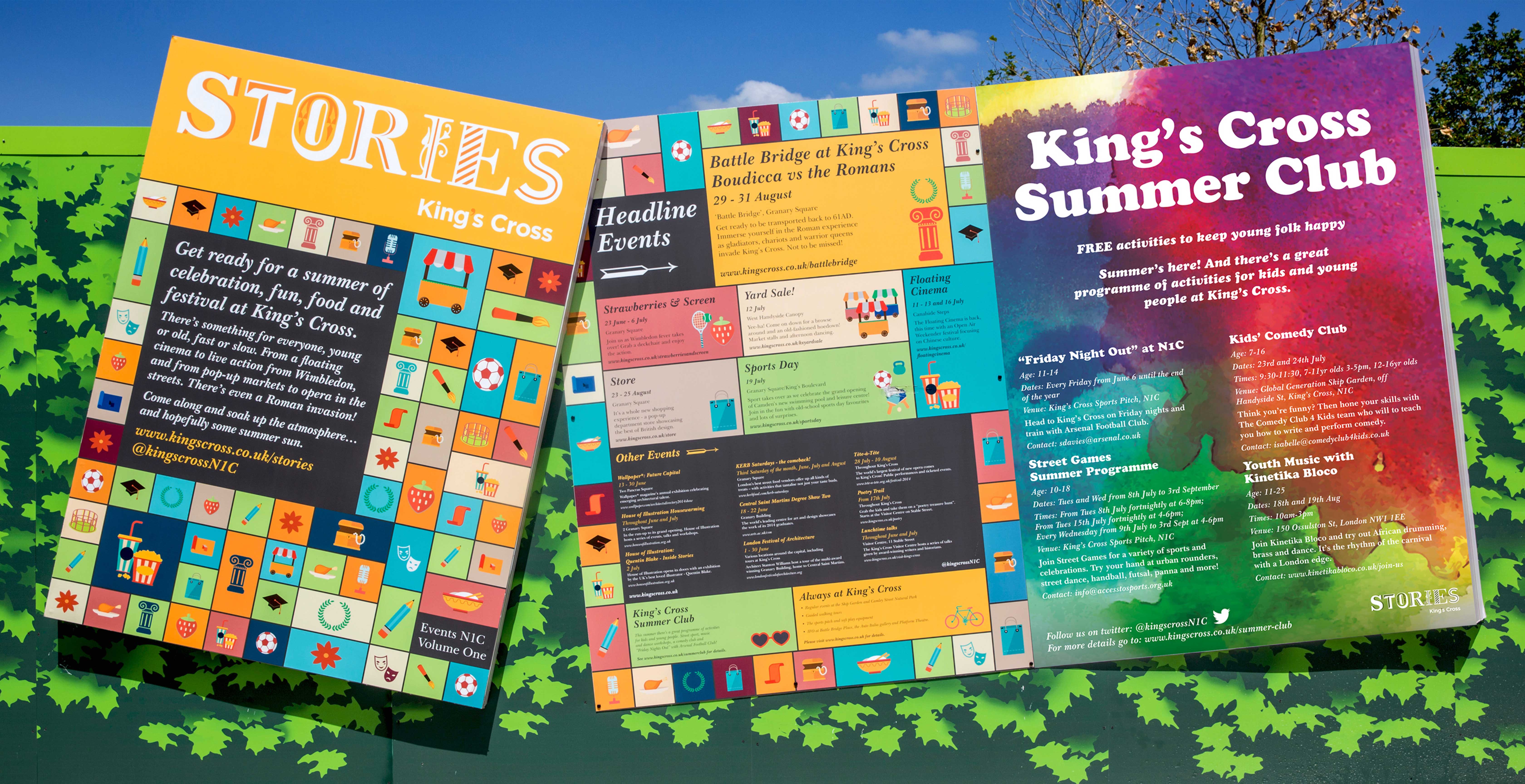
Leading on from the main identity we developed seasonal colour palettes that could be implemented throughout collateral as each new seasonal events programme was promoted. Playful, colourful iconography was brought in that correlated with the planned events to complement the identity on various marketing pieces such as the huge ‘story-book’ spread hoardings around the King’s Cross area. We also designed a ‘z-card’ events programme that was distributed to residents and visitors in the area, an e-newsletter mailer and a suite of web adverts to help promote the events throughout London.
