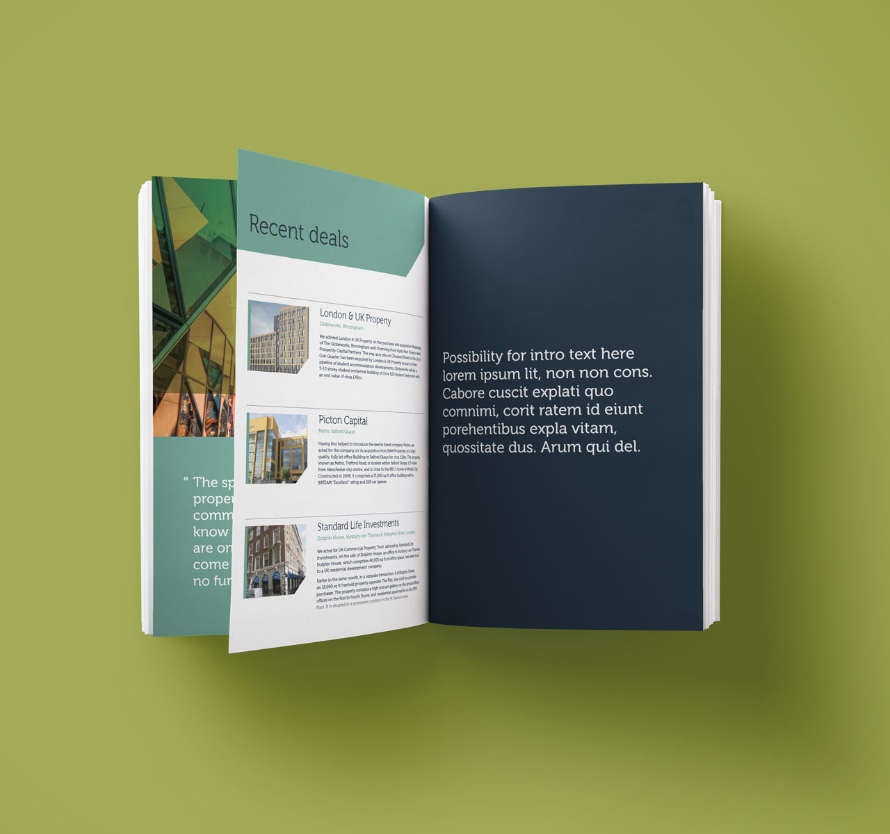
Maples Teesdale required a complete brand refresh and a new website to represent their modern and specialist approach to their sector. A vibrant, clean and approachable identity was created to represent their core values. A new simplified responsive website was also designed and developed after extensive end-user research, structural analysis and establishing of the key requirements for the needs of the site. HTML responsive newsletters were also developed to aid in their multi-channel marketing requirements alongside a suite of printed collateral.
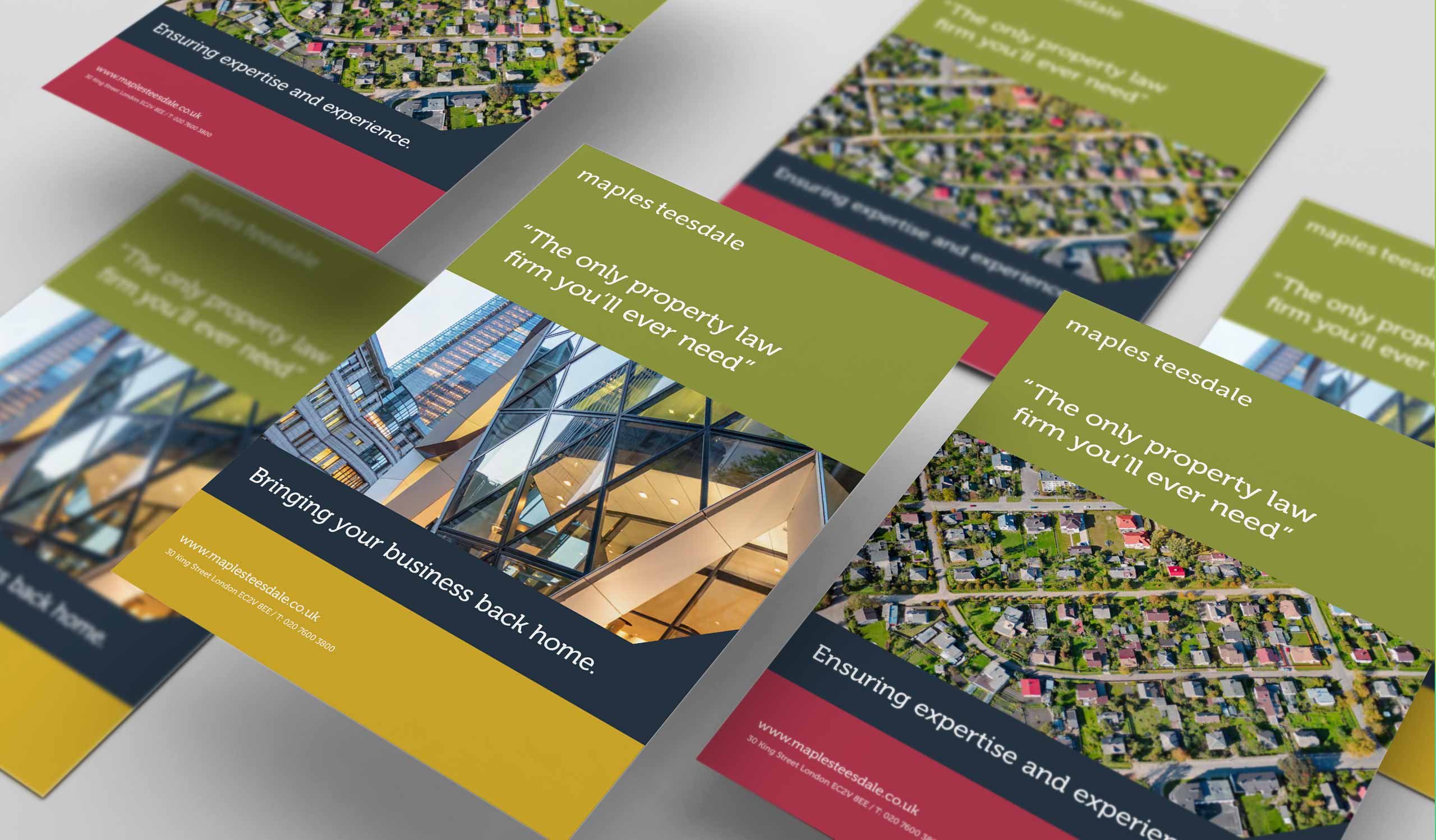
The website (and all print collateral) has recently had a brand refresh, introducing a new secondary colour palette, an update typographic style and the use of animations to bring its sector experience to life. New straplines were also created to refresh the tone of voice.