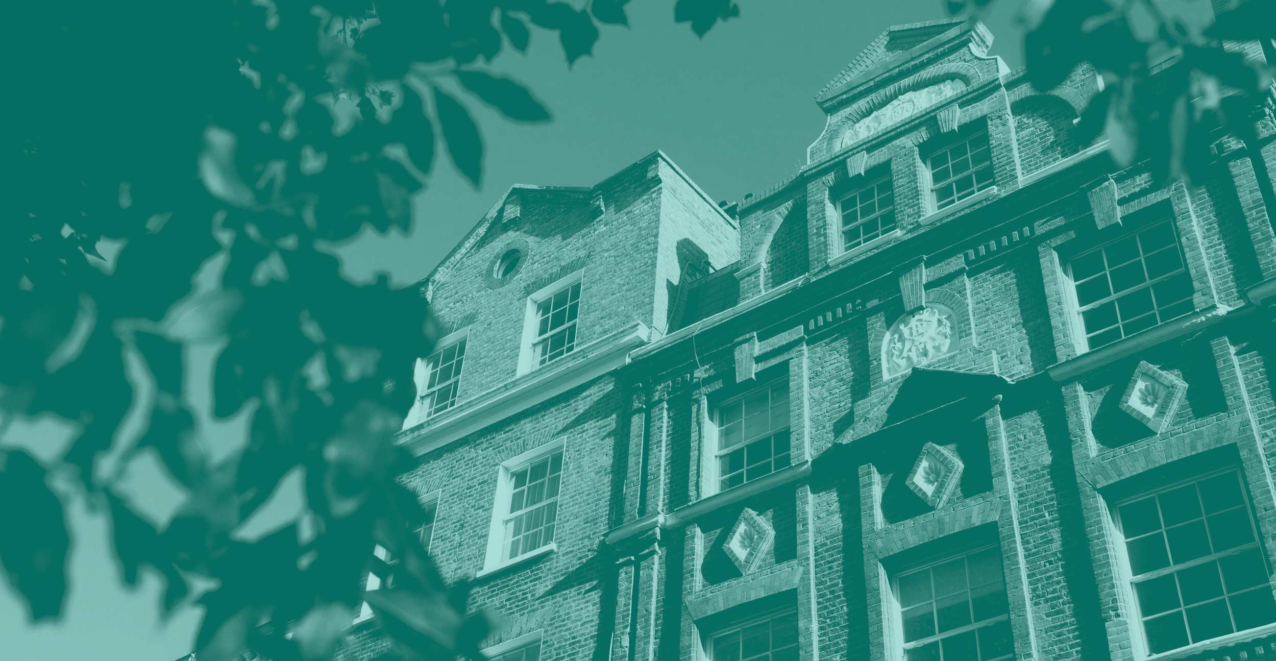
Kensington and Chelsea council were building a new BID (Business Improvement District) proposal designed to secure significant investment in the local area. They were keen to use the funding to regenerate and promote recovery in the neighbourhood after the challenges posed on account of COVID-19.
BACKGROUND
We were asked to design a brand and a visual identity for their BID proposal team and associated vote-inspiring collateral.

WHAT WE DELIVERED
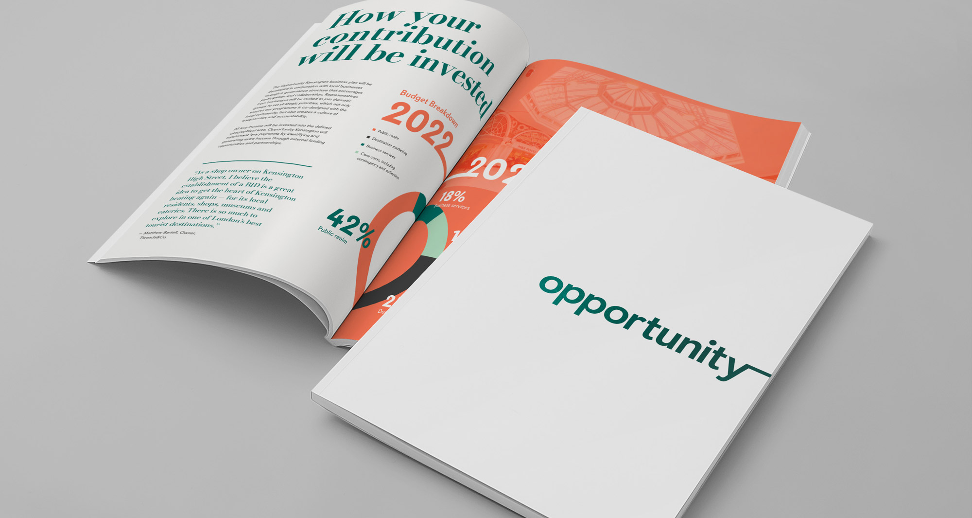
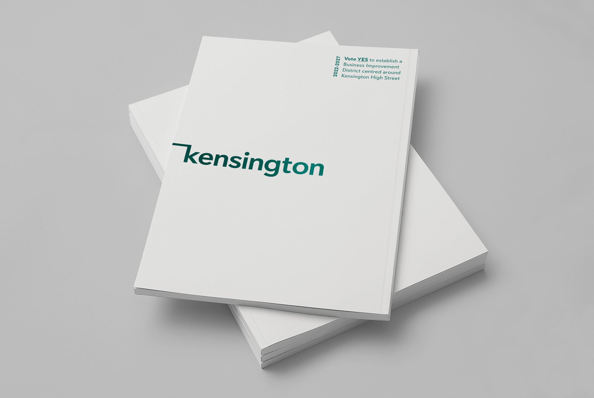
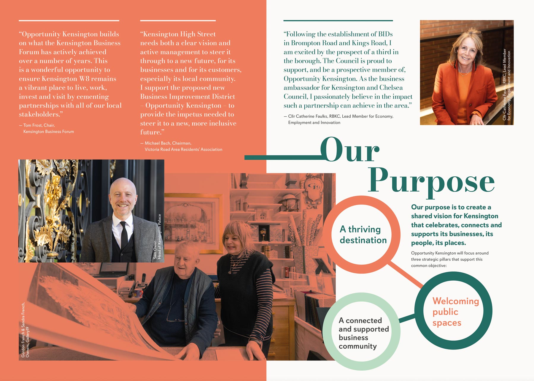
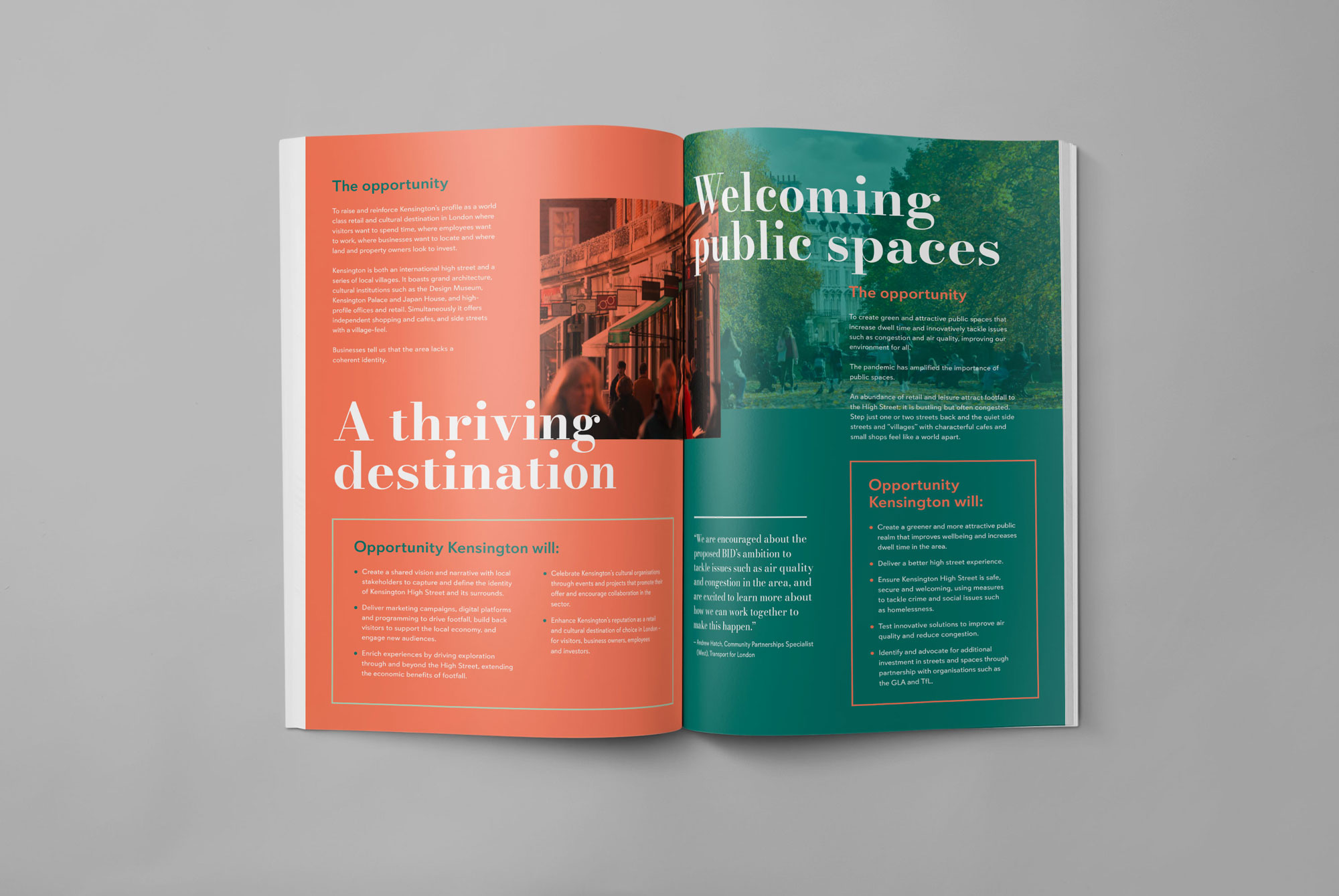
After undertaking research with local businesses and the council, we delivered a brand for the BID which combined the heritage and prestige of the area with a dynamic and modern feel. We conceptualised the title ‘Opportunity Kensington’ and delivered this in a unique basterdised typeface which leans on the significance of connections: connections between businesses, between individuals, and between the past and the future.
The palette used continued the theme of connections, merging a primary palette of sophisticated colours with an injection of highlight shades highlighting innovation and progression.

In addition to the brand, name, and colour palette, our focus was on building the BID proposal itself. This piece was due to be printed so we designed an impactful ‘teaser’ cover to encourage interaction. The main challenge was that no one had heard of this bid and so a teaser approach was taken with the design via an eye-catching and minimal foil-blocked front cover, focusing on the word ‘opportunity’.
NOW
The ballot was emphatically won with 88% of voting businesses being in favour, reflecting 98% of the rateable value of businesses.